1 Overview
This is the second part of the introduction to ggplot2, written for the palaeobiology master students at Uni Erlangen. You can find the first part on the evolvED homepage.
Here, we will dive a little bit deeper into ggplot2 and see how we can modify the default output of ggplot. In the end you will be able to personalise a plot to fit your needs, enabling you to produce publication ready plots within the R environment.
You can find all exercises, solutions, and source code for this introduction in my github repository.
Please note that ggplot might be a gateway drug to the tidyverse. Unfortunately, this is neither an introduction to the tidyverse nor an exhaustive report showing you every detail of ggplots. If needed, I can provide an intro to the tidyverse within the next weeks. Ggplot offers the chance to produce any graph you can think of. Use your power wisely.
2 Retrospect
In part 1, we’ve learned how to call a ggplot with ggplot() and add various layers to it. We’ve learned how to map data to aesthetics to answer a few basic questions. An alternative approach to mapping aesthetics was facetting. We dealt with various geometries including trend lines, boxplots, histograms, barplots, and line plots. We looked a bit under the hood of ggplot when we examined the statistics of each geom.
3 Scales
Scales control the mapping from data to aesthetics. They take your data and transform it into visuals, like size, colour, position or shape. Scales also produce the axes and legends. We already produced plots without actively modifying the underlying scales, which still resulted in nice plots. However, modifying scales gives us much more control, and is the first thing you should think about when you want to modify a plot.
3.1 Modifying scales
Whenever we don’t specify a scale in our ggplot() call, ggplot uses the default scale. If you want to override the defaults, you’ll need to add the scale ourself. You can do that with our + operator.
ggplot(mpg, aes(displ, hwy)) +
  geom_point(aes(colour = class)) +
  scale_x_continuous("This is my label for the x-axis") +
  scale_y_continuous("This is my label for the y-axis")
There exists a specific naming scheme for scales made up of three pieces, each separated by an underscore "_".
scaleThe name of the aesthetic (e.g.,
colour,shapeorx)The name of the scale (e.g.,
continuous,discrete,brewer)
RStudio makes your life easier by giving you suggestions when you type scale. Just select the one you need.
3.2 Guides
The component of a scale that we want to modify quite often is the guide, the axis or legend associated with the scale. As mentioned before, ggplot produces those for you by default (note that this is a big difference to base R, where you have to do everything by your own when it comes to legends). The important part here is that you used a clear mapping between your data and aesthetics, so that ggplot understands what we want it to do. We can modify every component of the axis and legend:
 .
.
3.2.1 Labels/ titles
The first argument to the scale function, name, is the axes/legend title:
ggplot(mpg, aes(displ, hwy)) +
  geom_point(aes(colour = class)) +
  scale_x_continuous("This is my label \n for the x-axis") +
  scale_y_continuous("Hello World!")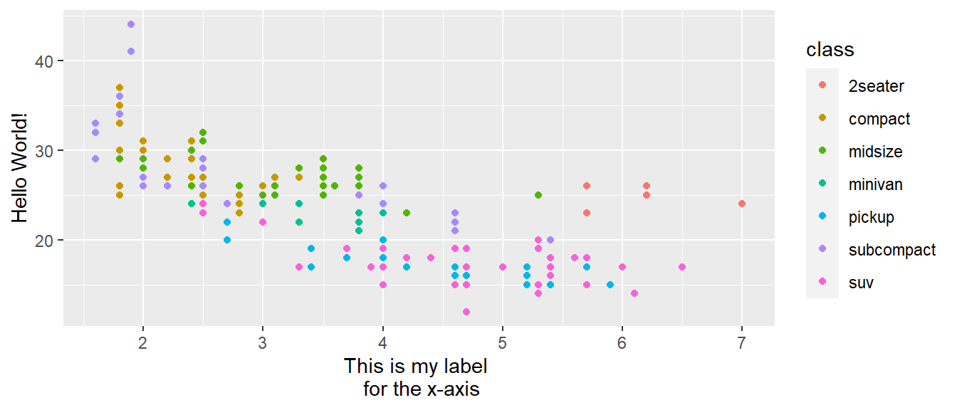
As you will do this quite ofte, people have already produced shortcuts for you: xlab(), ylab() and labs().
my_plot <- ggplot(mpg, aes(displ, hwy)) + geom_point(aes(colour = class))
my_plot +
xlab("My first X axis") +
ylab("My first Y axis")
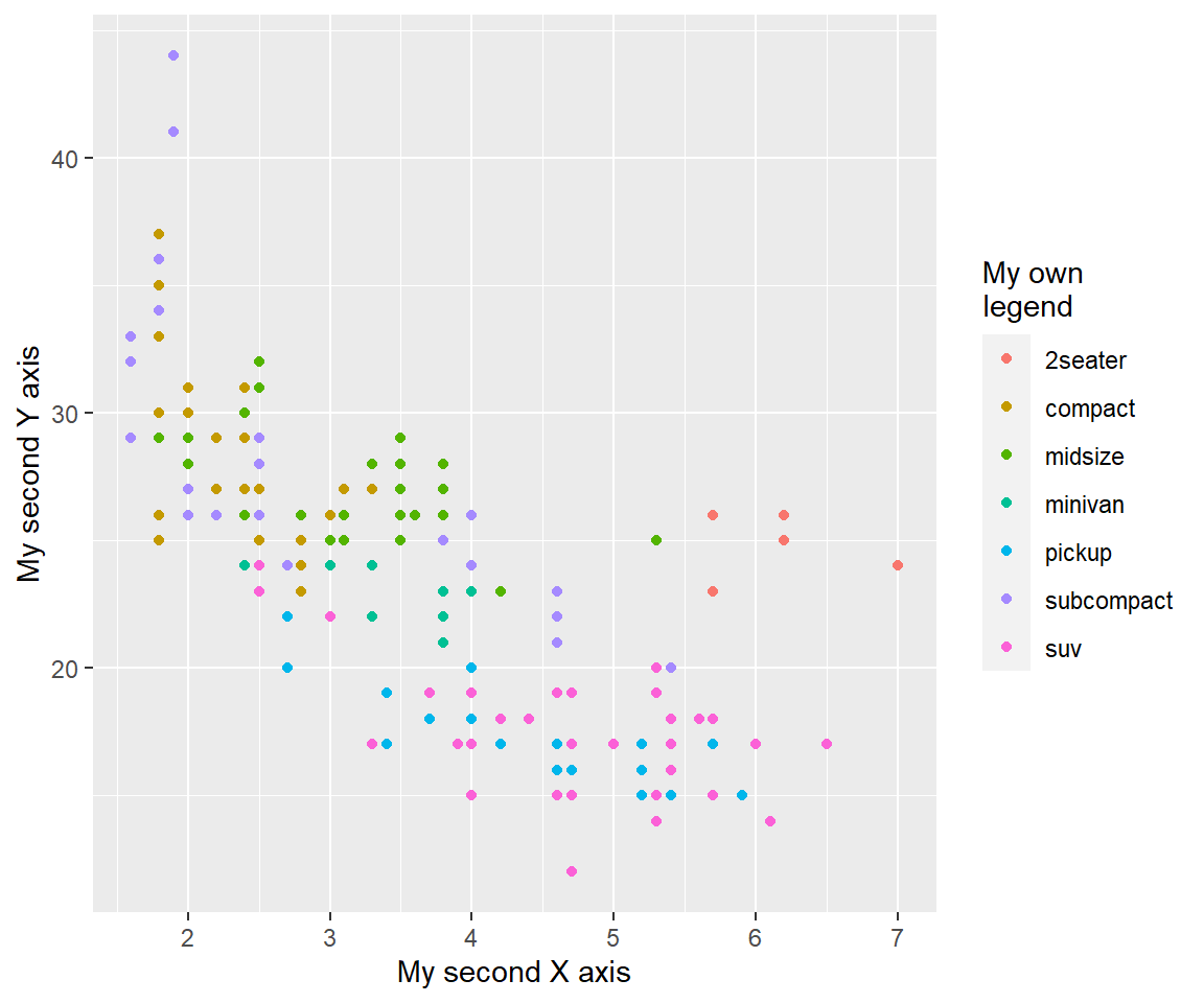
my_plot + labs(x = "My second X axis", y = "My second Y axis", colour = "My own\nlegend")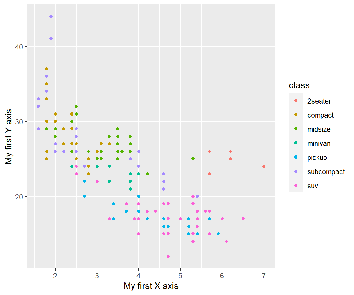
To remove axis labels, you have to set x or y = NULL. If you set them = "", you will produce an empty space instead of removing the label.
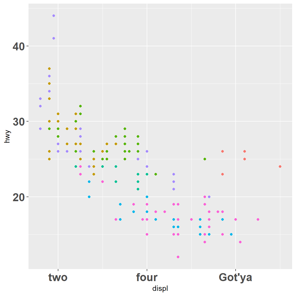
3.2.2 Breaks/ labels
The breaks argument controls which values appear as tick marks on axes and keys on legends. Each break has an associated label, controlled by the labels argument. If you set labels, you must also set breaks; otherwise, if data changes, the breaks will no longer align with the labels.
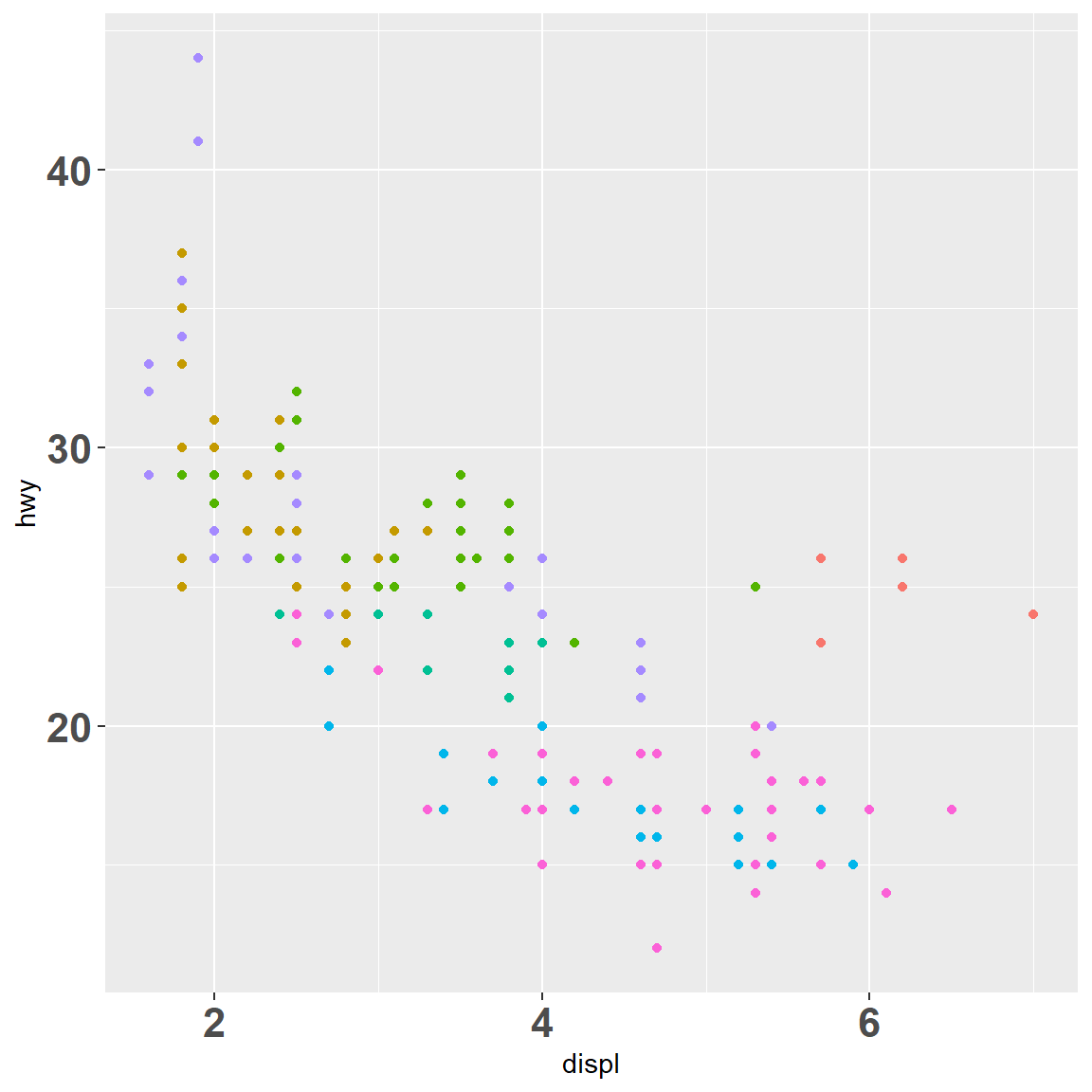
my_plot
my_plot + scale_x_continuous(breaks = c(2, 4, 6))
my_plot + scale_x_continuous(breaks = c(2, 4, 6), labels = c("two", "four", "Got'ya"))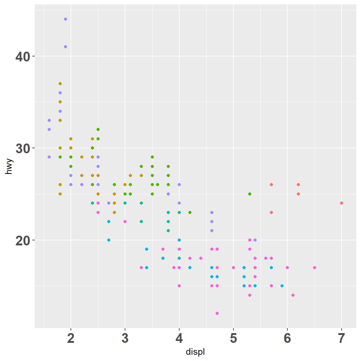
Same with legend breaks:
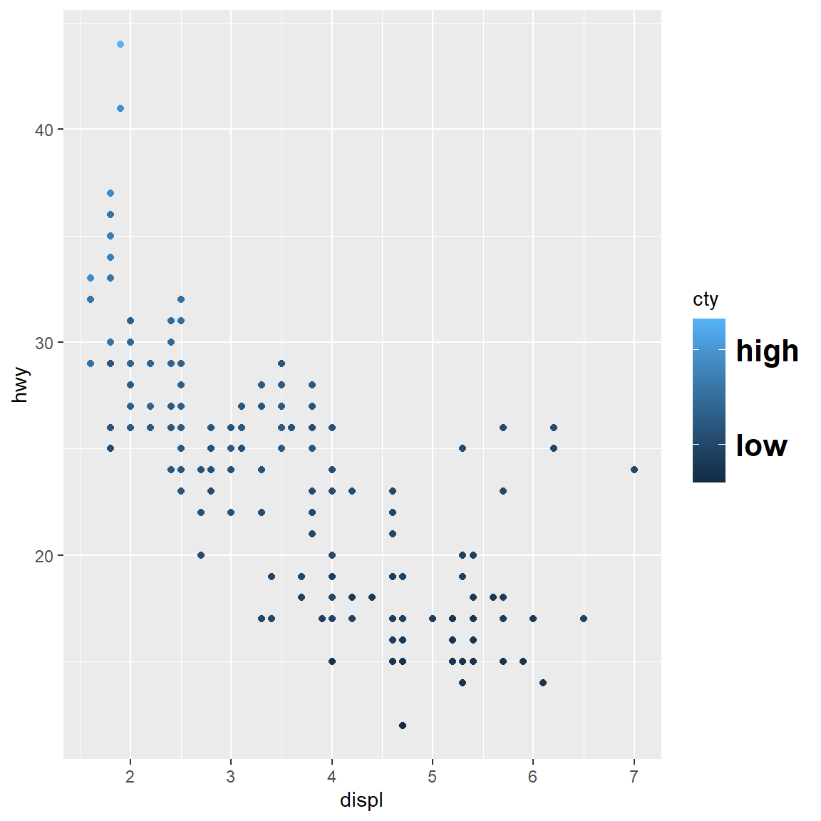
my_plot
my_plot + scale_colour_continuous(breaks = c(15, 30))
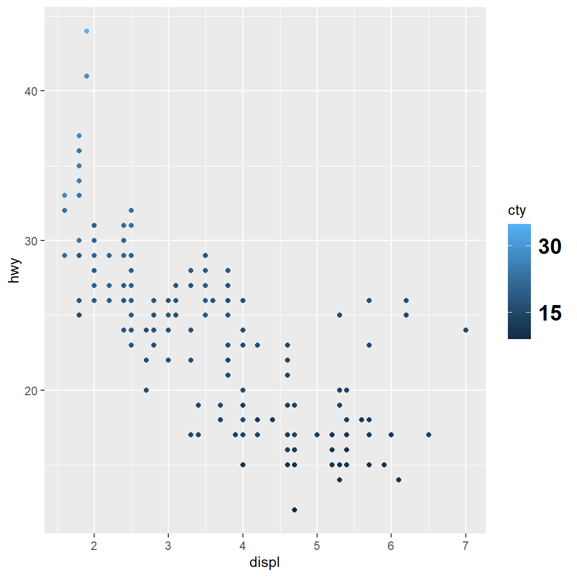
my_plot + scale_colour_continuous(breaks = c(15, 30), labels = c("low", "high"))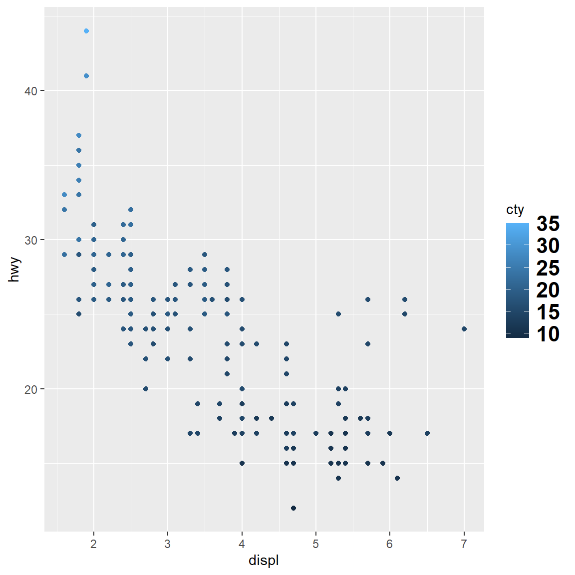
3.3 Scale transformations
It might be helpful to transform your data when plotting, to see patterns emerging. This is particularly interesting in your exploratory analysis part, where you just plot things and then see where this is going. With ggplot2, you don’t have to do this manually before plotting. Transforming your scales will save you time and energy, while ggplot2 makes nice line breaks and everything. Every continuous scale takes a trans argument, allowing the use of a variety of transformations:
ggplot(diamonds, aes(price, carat)) +
  geom_bin2d() +
  scale_x_continuous(trans = "log10") +
scale_y_continuous(trans = "log2")![]()
There are shortcuts for the most common: scale_x_log10(), scale_x_sqrt() and scale_x_reverse() (and similarly for y.)
3.4 Colours
Colours are a difficult topic and it’s always good to have the underlying basics of colour theory in your mind when you produce a plot for a presentation, website or a publication. I’ve found myself quite often spending hours and hours trying out different colours for one plot. Luckily, ggplot2 offers some sensitive defaults and shortcuts. We will spent a bit more time on colours now, as they are really important when it comes to plots.
3.4.1 Continuous
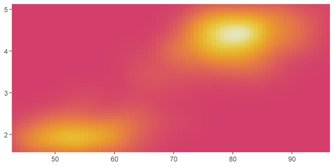
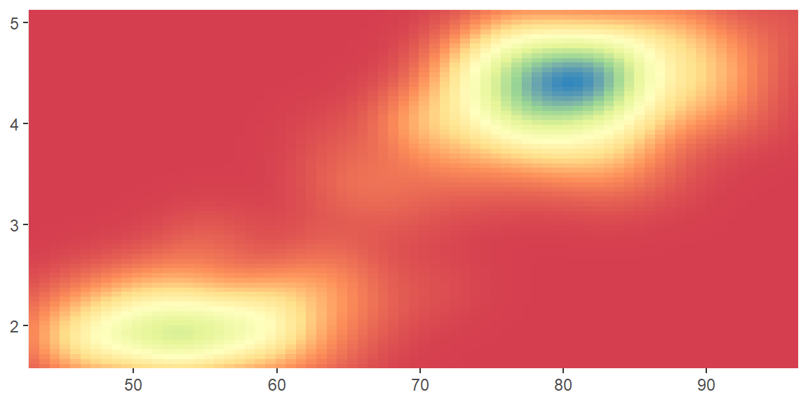
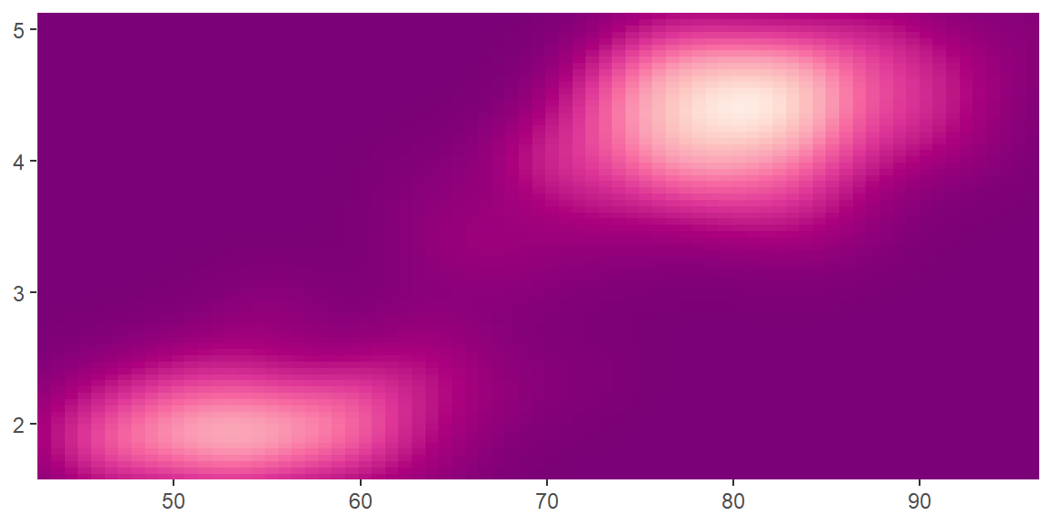
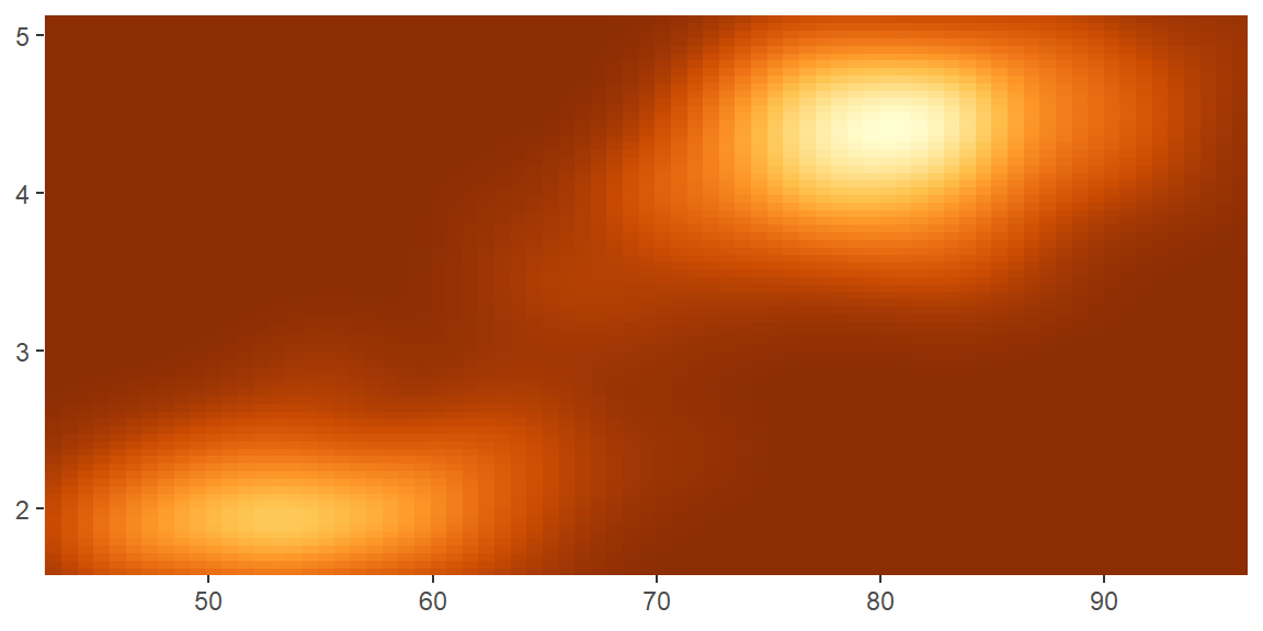
Colour gradients are often used to show the height of a 2d surface. In the following example we’ll use the surface of a 2d density estimate of the faithful dataset (Azzalini and Bowman 1990, within the ggplot2 package), which records the waiting time between eruptions and during each eruption for the Old Faithful geyser in Yellowstone Park. I hide the legends and set expand to 0, to focus on the appearance of the data. This expands to plot to allign with the axis lines, instead of having some space there by default.
erupt <- ggplot(faithfuld, aes(waiting, eruptions, fill = density)) +
  geom_raster() +
  scale_x_continuous(NULL, expand = c(0, 0)) +
  scale_y_continuous(NULL, expand = c(0, 0)) +
  theme(legend.position = "none")
There are four continuous colour scales:
scale_colour_gradient()andscale_fill_gradient(): a two-colour gradient, low-high (light blue-dark blue). This is the default scale for continuous colour, and is the same asscale_colour_continuous(). Argumentslowandhighcontrol the colours at either end of the gradient.
erupt
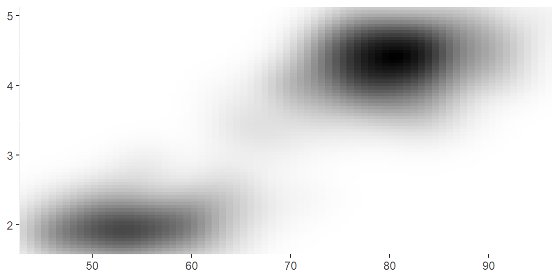
erupt + scale_fill_gradient(low = "white", high = "black")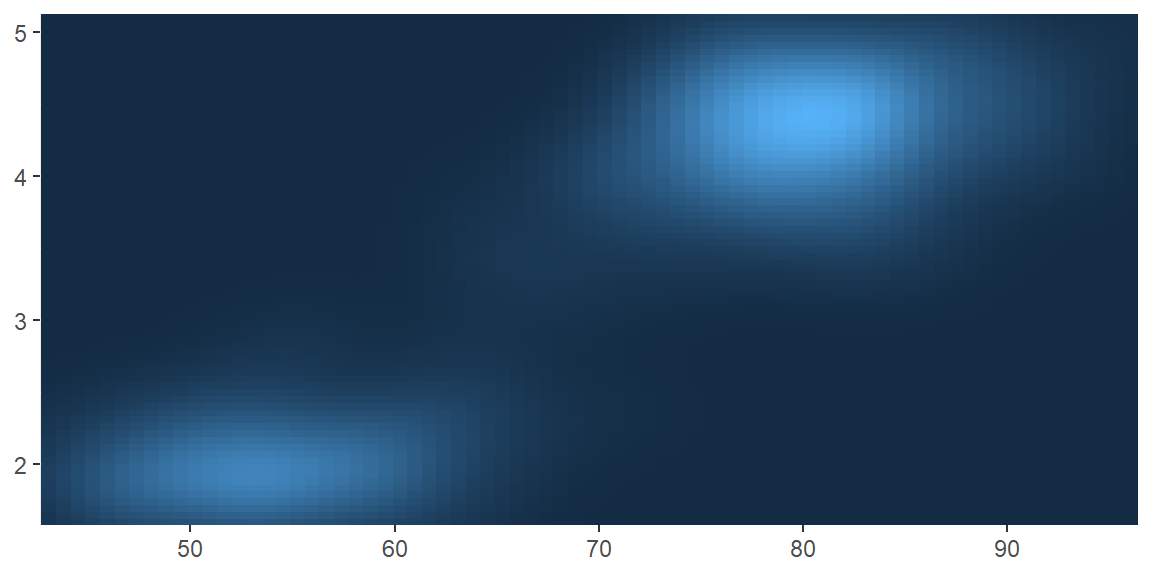
scale_colour_gradient2()andscale_fill_gradient2(): a three-colour gradient, low-med-high (default is red-white-blue). As well as low and high colours, these scales also have a mid colour for the colour of the midpoint. The midpoint defaults to 0, but can be set to any value with the midpoint argument.
mid <- median(faithfuld$density)
erupt + scale_fill_gradient2(midpoint = mid, low = "darkred", mid = "darkgreen",
high = "darkblue") 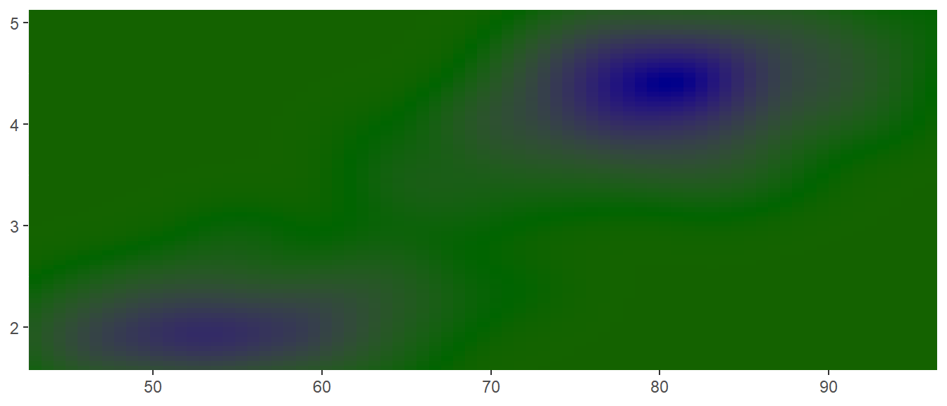
scale_colour_gradientn()andscale_fill_gradientn(): a custom n-colour gradient. This is useful if you have colours that are meaningful for your data (just ask Nussaibah about her terrain map), or you’d like to use a palette produced by another package (like colorspace or RColorBrewer).
erupt + scale_fill_gradientn(colours = terrain.colors(7))
erupt + scale_fill_gradientn(colours = colorspace::heat_hcl(7))
erupt + scale_fill_gradientn(colours =  RColorBrewer::brewer.pal(7, "Spectral"))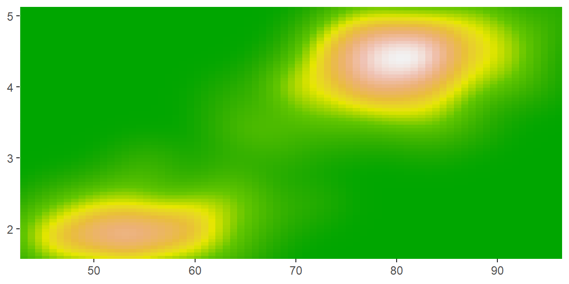
scale_color_distiller()andscale_fill_distiller()apply the ColorBrewer colour scales to continuous data. You use it the same way asscale_fill_brewer(), described later.
erupt + scale_fill_distiller()
erupt + scale_fill_distiller(palette = "RdPu")
erupt + scale_fill_distiller(palette = "YlOrBr")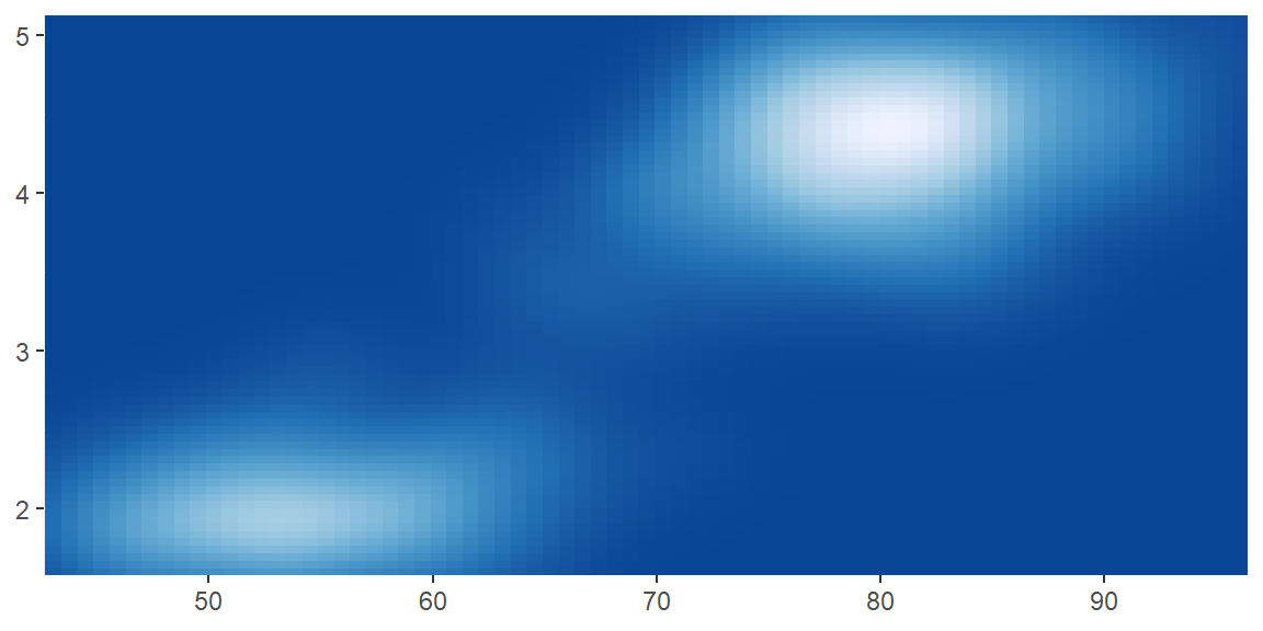
3.4.2 Discrete
There are four colour scales for discrete data:
- The default colour scheme,
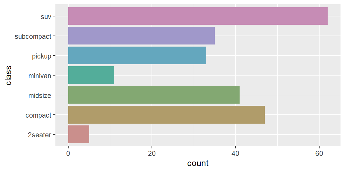
scale_colour_hue(), picks evenly spaced hues around the HCL colour wheel. This works well for up to about eight colours, but after that it becomes hard to tell the different colours apart. You can control the default chroma and luminance, and the range of hues, with theh,candlarguments:
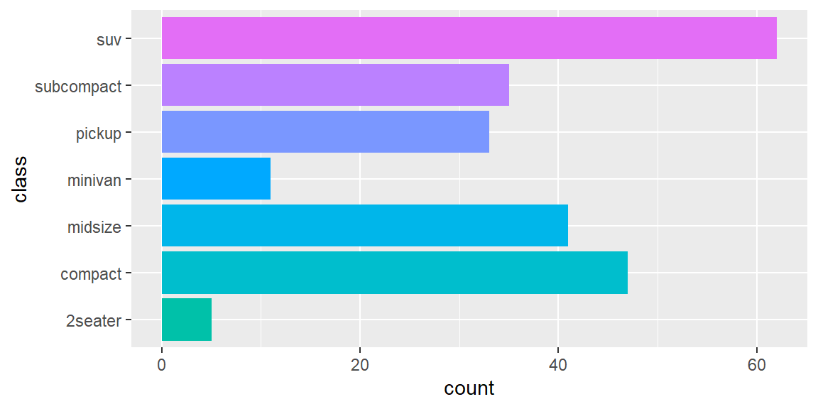
my_bars
my_bars + scale_fill_hue(c = 40)
my_bars + scale_fill_hue(h = c(180, 300))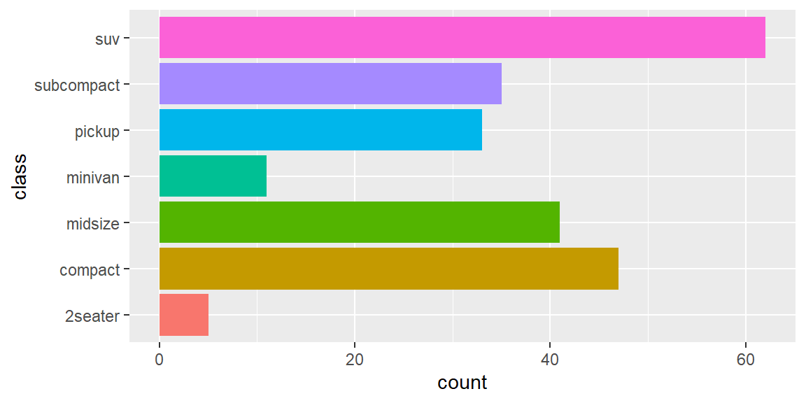
scale_colour_brewer()uses handpicked ColorBrewer colours, from the RColorBrewer package. These colours have been designed to work well in a wide variety of situations, although the focus is on maps and so the colours tend to work better when displayed in large areas.scale_colour_grey()maps discrete data to grays, from light to dark.scale_colour_manual()is useful if you have your own discrete colour palette. You can even use them with colours inspired by Wes Anderson movies, as provided by the wesanderson package.
Instead of mapping a colour palette to your data, you can use thevaluesparameter ofscale_colour_manual()(orscale_fill_manual(), depending on your aesthetics) to manually specify the values that the scale should produce:
my_plot + scale_colour_manual(values = wesanderson::wes_palette("BottleRocket1"))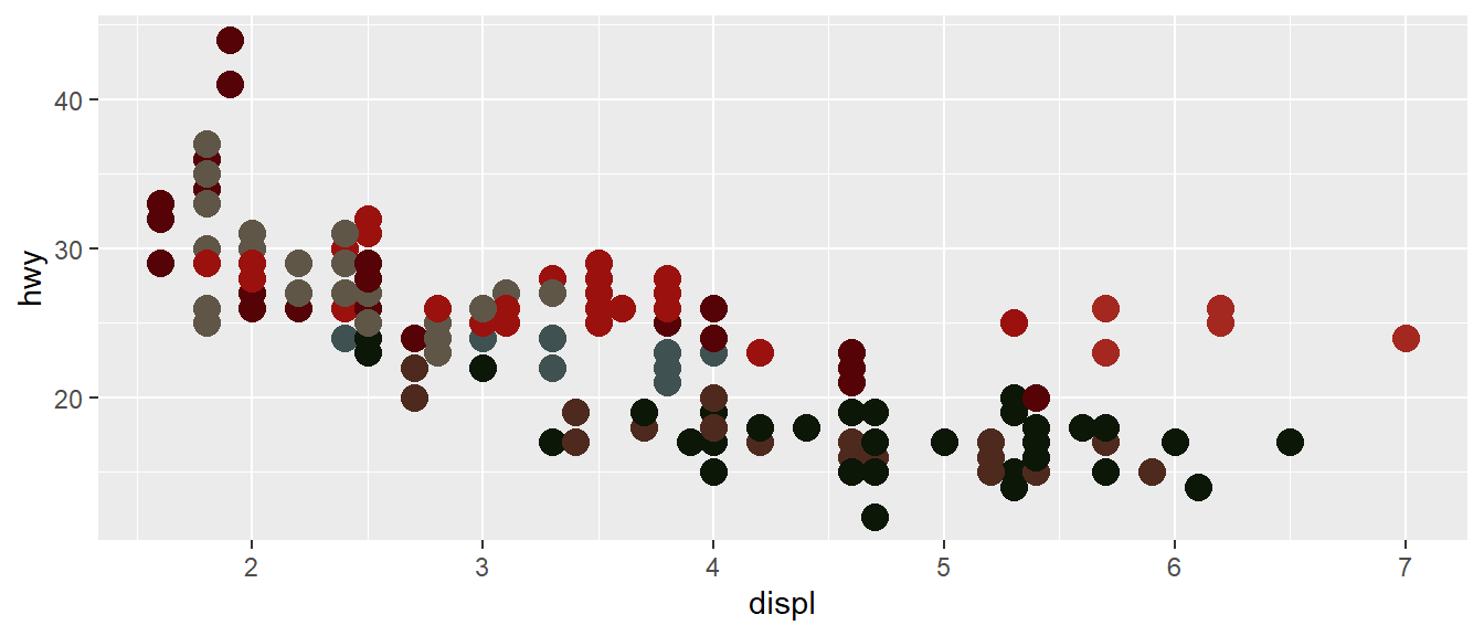
my_bars +
  scale_fill_manual(values = c("coral", "orange", "darkgreen", "steelblue", "#ba855e", "#919108", "#f25ad8"))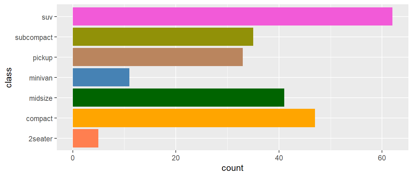
You can steel colours from your favourite artist using the colortheft webpage.
Like I already mentioned, it is always important to think about what you want to visualise and what message you want to convey. There is not the one colour palette to fit all your needs, play around with them and see what fits. Also: bright colours work well for points, but are overwhelming on bars. Subtle colours work well for bars, but are hard to see on points.
4 Legends
While axes and legends share most parameters, some options only apply to legends, as they are more complex than axes.
A legend can display multiple aesthetics (e.g. colour and shape), from multiple layers, and the symbol displayed in a legend varies based on the geom used in the layer.
Axes always appear in the same place. Legends can appear in different places, so you need some global way of controlling them.
Legends have considerably more details that can be tweaked, e.g., vertical vs horizontal display, number of columns, size of the keys…
4.1 Layout
A number of settings that affect the overall display of the legends are controlled through the theme system. You’ll learn more about themes towards the end of this file, but for now, all you need to know is that you modify theme settings with the theme() function.
The position and justification of legends are controlled by the theme setting legend.position, which takes values right, left, top, bottom, or none (no legend).
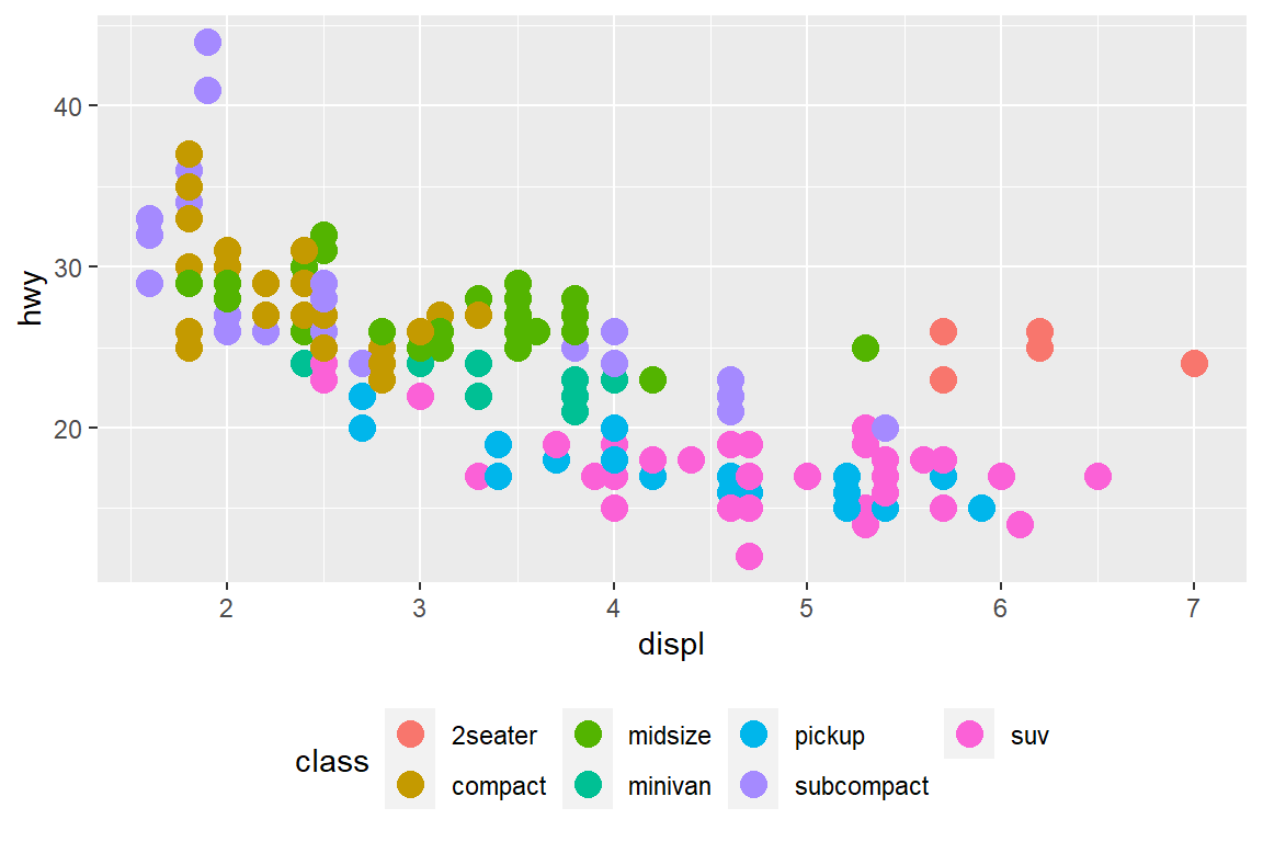
my_plot + theme(legend.position = "right") # default
my_plot + theme(legend.position = "bottom")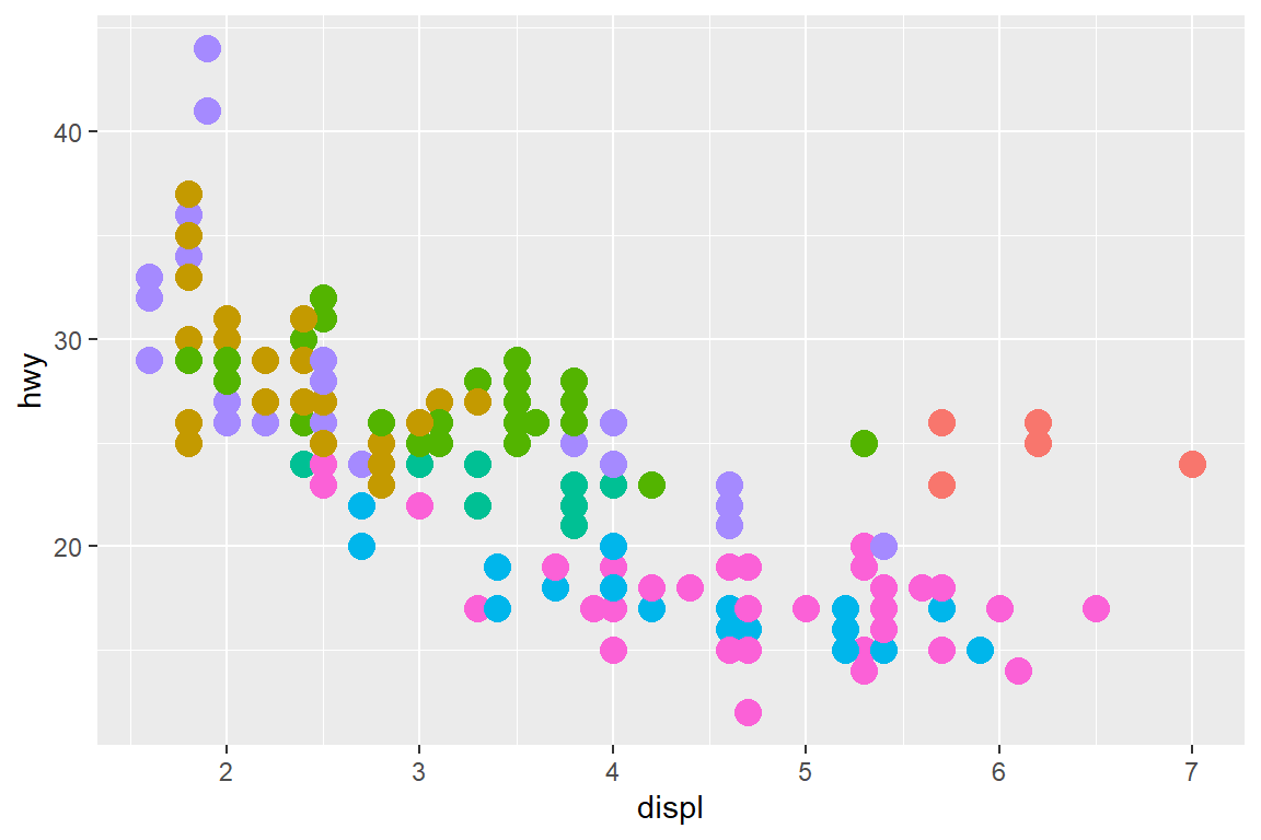
my_plot + theme(legend.position = "none") 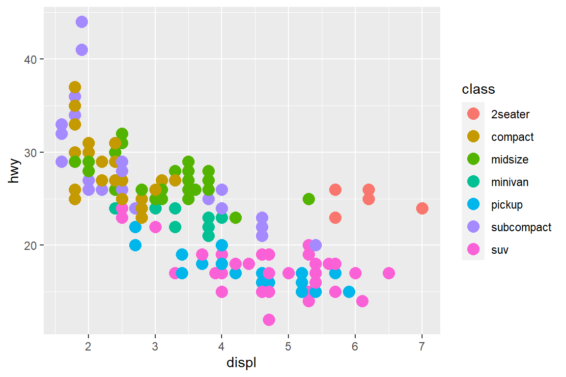
Setting the legend.position to “none” within the theme() call has the advantage that you don’t have to set show.legend = FALSE for every geom.
4.2 Guides
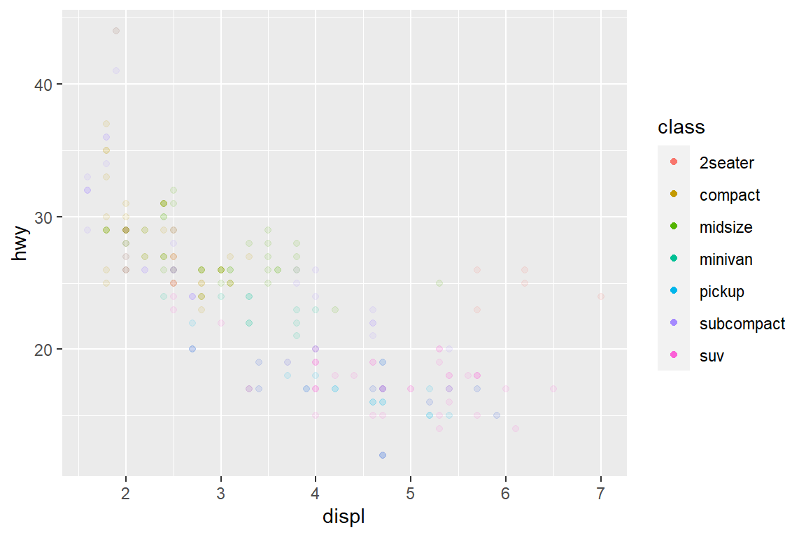
The guide functions, guide_colourbar() and guide_legend(), offer additional control over the fine details of the legend. As you sometimes want the geoms in the legend to display differently to the geoms in the plot, you can override them and set them to a new value. You can do this using the override.aes parameter of guide_legend().
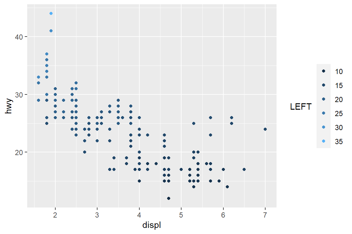
my_plot
my_plot + guides(colour = guide_legend(override.aes = list(alpha = 1)))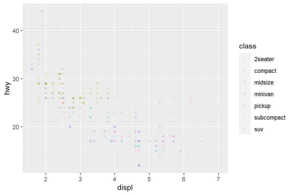
You can override the default guide using the guide argument of the corresponding scale function, or more conveniently, the guides() helper function. guides() works like labs(): you can override the default guide associated with each aesthetic.
my_plot
my_plot + scale_colour_continuous(guide = guide_legend(title = "LEFT", title.position = "left"))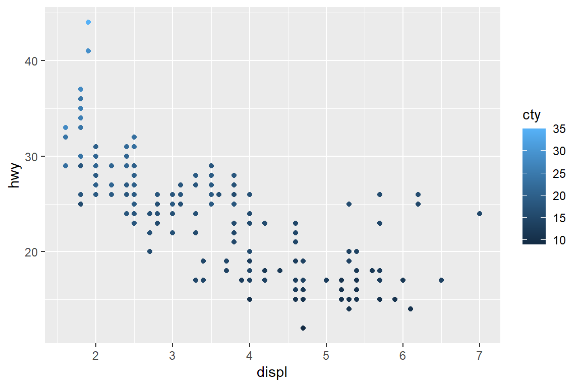
The most useful options for guide_legend are:
1. nrow or ncol which specify the dimensions of the table. byrow controls how the table is filled: FALSE fills it by column (the default), TRUE fills it by row.
reversereverses the order of the keys. This is particularly useful when you have stacked bars because the default stacking and legend orders are different by default.override.aesoverrides some of the aesthetic settings derived from each layer. This is useful if you want to make the elements in the legend more visually prominent.keywidthandkeyheight(along withdefault.unit) allow you to specify the size of the keys. These are grid units, e.g.unit(1, "cm").
5 Coordinate systems
Coordinate systems define the environment your plots are displayed. There are two types of coordinate system: Linear coordinate systems preserve the shape of geoms and non-linear systems change them.
5.1 Linear
There are three linear coordinate systems: coord_cartesian(), coord_flip(), coord_fixed().
5.1.1 Zooming
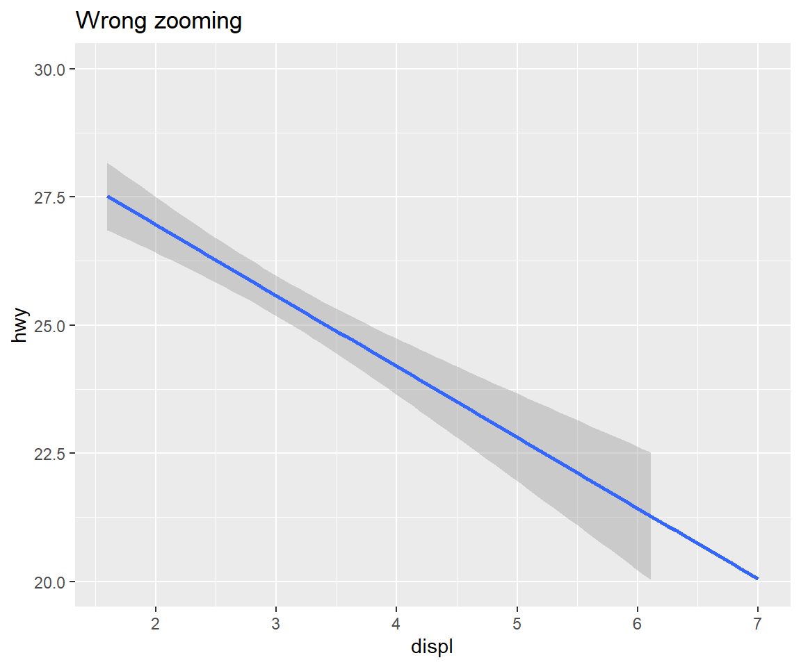
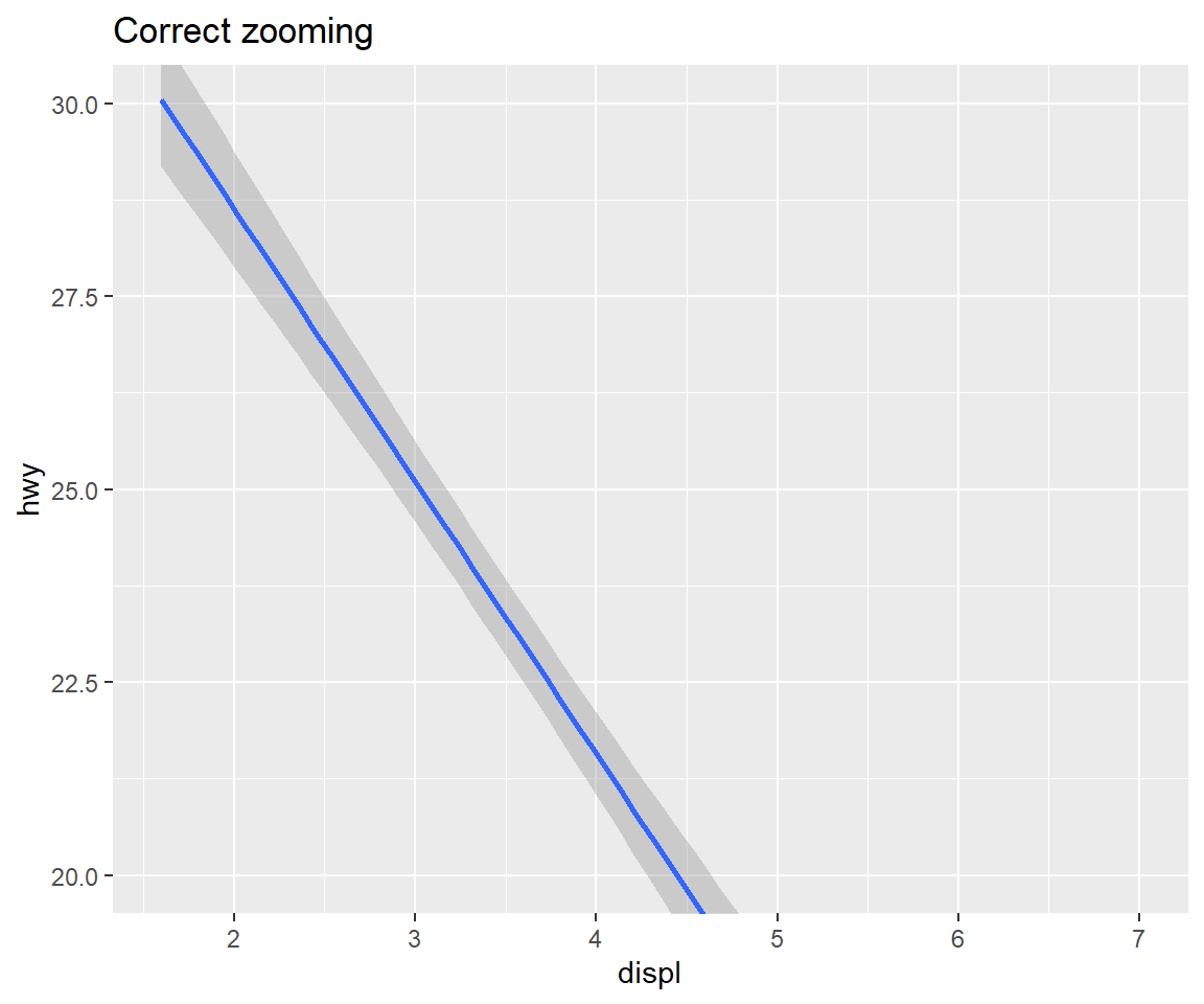
You can use coord_cartesian() to zoom into a plot. You might be tempted to zoom into a plot using scale limits, but this is not a good idea: When setting scale limits, any data outside the limits is thrown away; but when setting coordinate system limits we still use all the data, but we only display a small region of the plot. Setting coordinate system limits is like looking at the plot under a magnifying glass.
my_reg <- ggplot(mpg, aes(displ, hwy)) +
  geom_smooth(method = "lm")
my_reg + labs(title ="Raw plot")
my_reg + labs(title = "Wrong zooming") + scale_y_continuous(limits = c(20,30))
## Warning: Removed 100 rows containing non-finite values (stat_smooth).my_reg + labs(title = "Correct zooming") + coord_cartesian(ylim = c(20,30))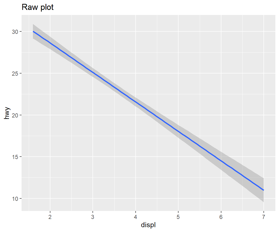
5.1.2 Axis flipping
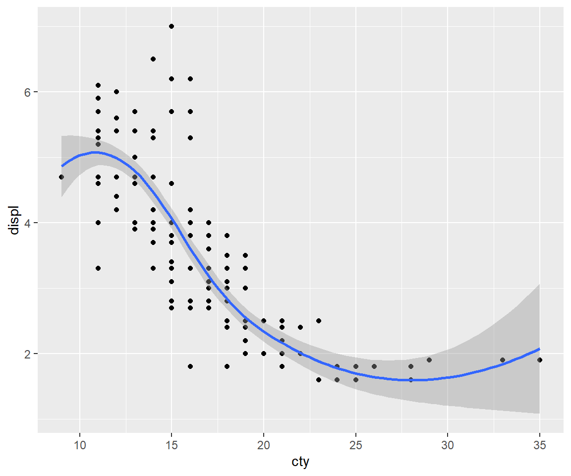
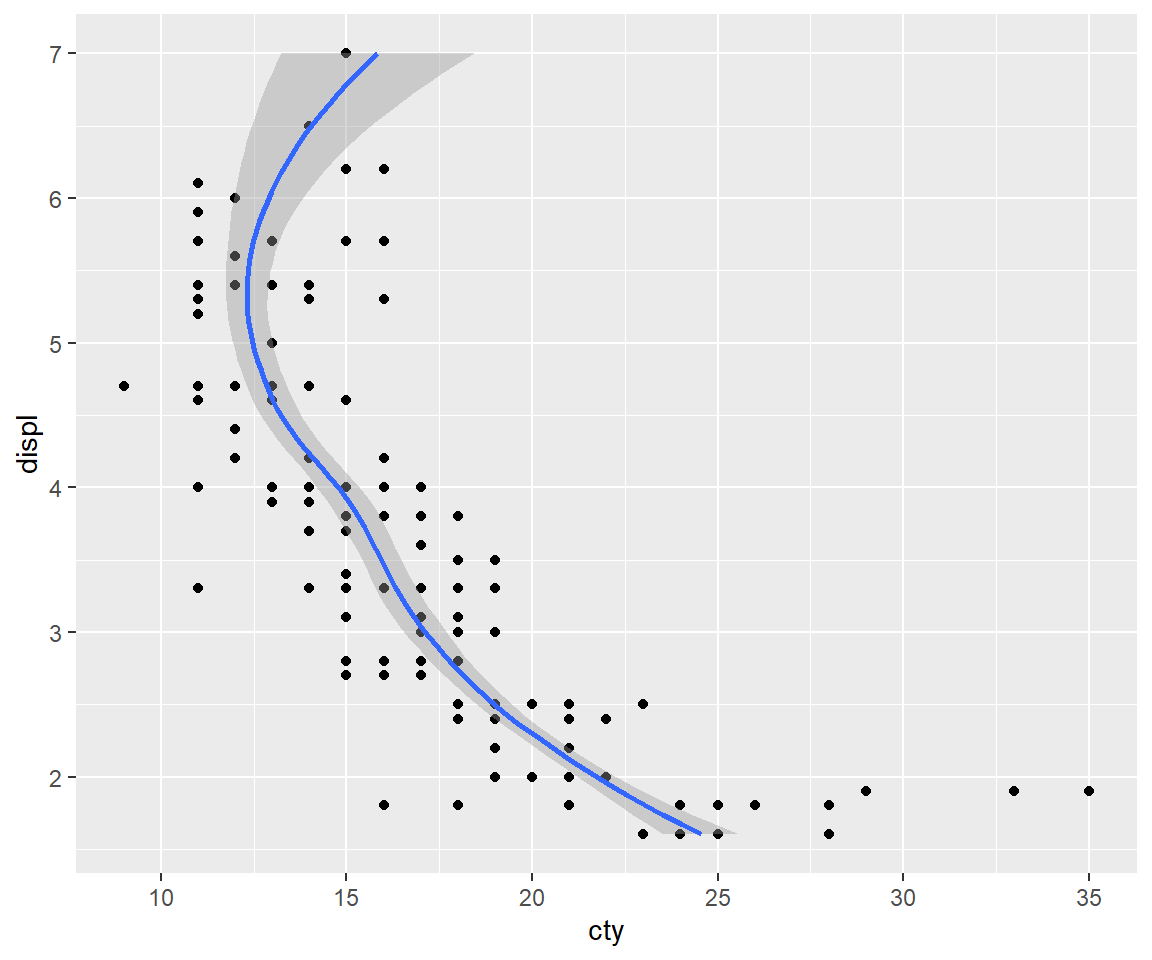
If you want to rotate the plot 90 degrees, you can use coord_flip() to exchange the x and y axes. Compare this with just exchanging the variables mapped to x and y:
ggplot(mpg, aes(displ, cty)) +
  geom_point() +
  geom_smooth()
# Exchanging cty and displ rotates the plot 90 degrees, but the smooth
# is fit to the rotated data.
ggplot(mpg, aes(cty, displ)) +
  geom_point() +
  geom_smooth()
# coord_flip() fits the smooth to the original data, and then rotates
# the output
ggplot(mpg, aes(displ, cty)) +
  geom_point() +
  geom_smooth() +
  coord_flip()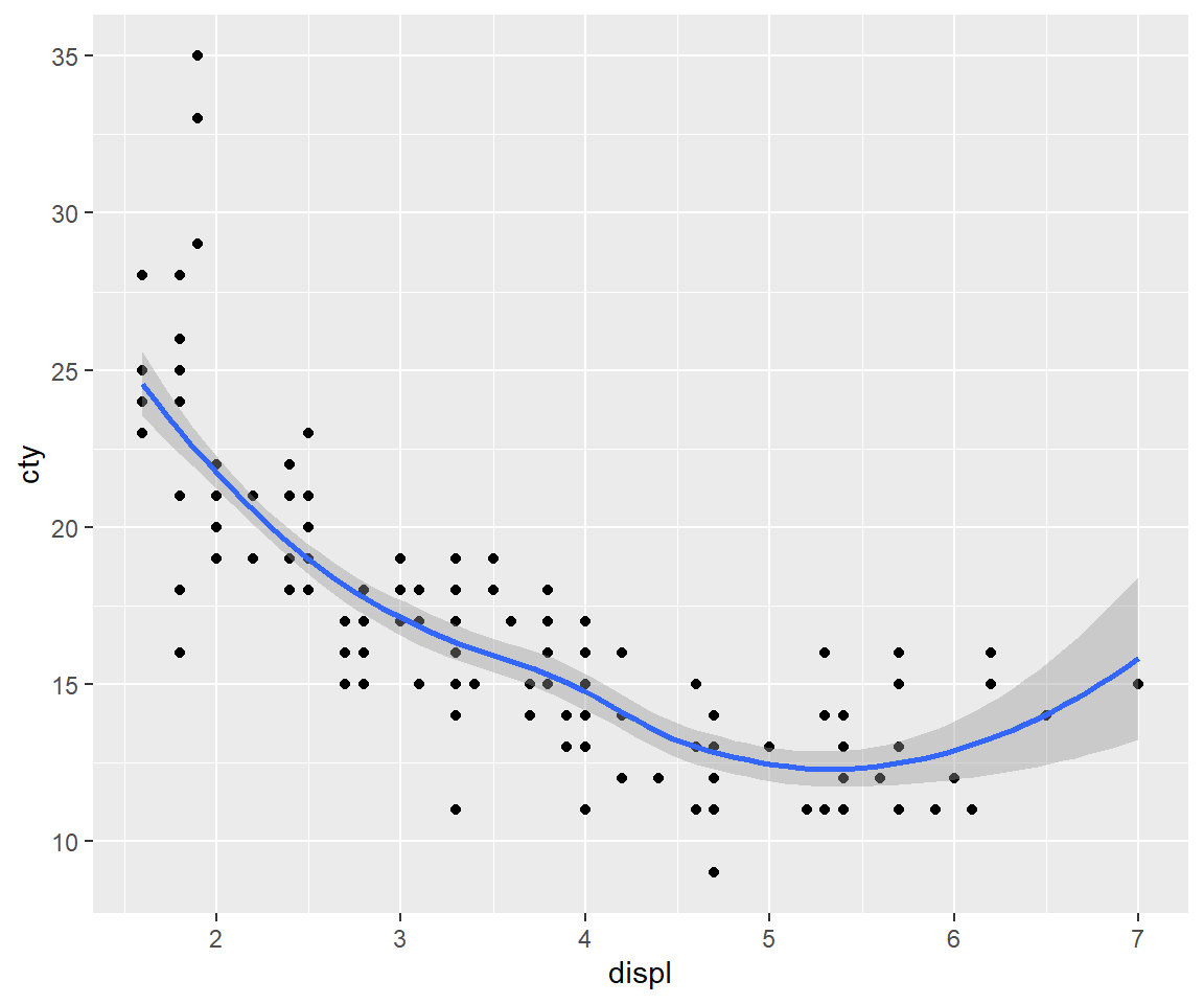
5.1.3 Equal scales
coord_fixed() fixes the ratio of length on the x and y axes. The default ratio ensures that the x and y axes have equal scales: i.e., 1 cm along the x axis represents the same range of data as 1 cm along the y axis. The aspect ratio will also be set to ensure that the mapping is maintained regardless of the shape of the output device. See the documentation of coord_fixed() for more details.
5.2 Non-linear
Unlike linear coordinates, non-linear coordinates can change the shape of geoms. For example, in polar coordinates a rectangle becomes an arc; in a map projection, the shortest path between two points is not necessarily a straight line.
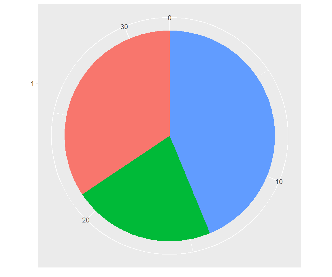
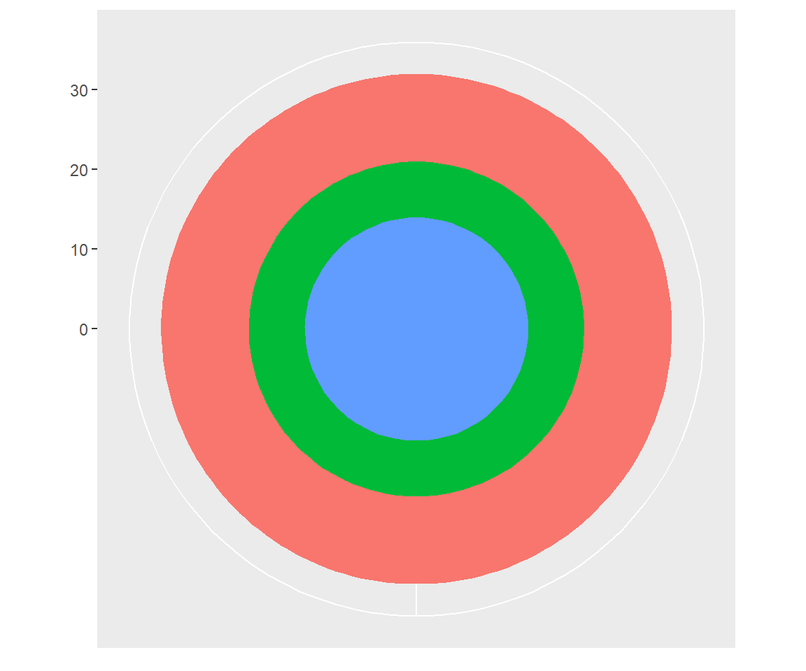
5.2.1 Polar coordinates
Using polar coordinates gives rise to pie charts and wind roses (from bar geoms), and radar charts (from line geoms). The code below shows how we can turn a bar into a pie chart or a bullseye chart by changing the coordinate system.
base <- ggplot(mtcars, aes(factor(1), fill = factor(cyl))) +
  geom_bar(width = 1) +
  theme(legend.position = "none") +
  scale_x_discrete(NULL, expand = c(0, 0)) +
  scale_y_continuous(NULL, expand = c(0, 0))

# Stacked barchart
base

# Pie chart
base + coord_polar(theta = "y")

# The bullseye chart
base + coord_polar()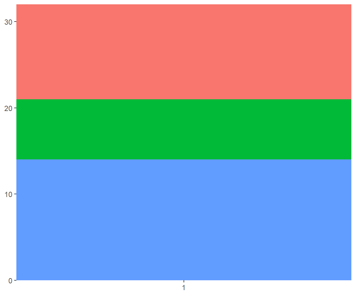
5.2.2 Map projections
Maps are intrinsically displays of spherical data. Simply plotting raw longitudes and latitudes is misleading, so we must project the data. There are two ways to do this with ggplot2:
coord_quickmap()is a quick and dirty approximation that sets the aspect ratio to ensure that 1m of latitude and 1m of longitude are the same distance in the middle of the plot. This is a reasonable place to start for smaller regions, and is very fast.
# Prepare a map of italy
itmap <- ggplot(map_data("italy"), aes(long, lat, group = group)) +
  geom_polygon(fill = "white", colour = "black") +
  xlab(NULL) + ylab(NULL)

# Plot it in cartesian coordinates
itmap
# With the aspect ratio approximation
itmap + coord_quickmap()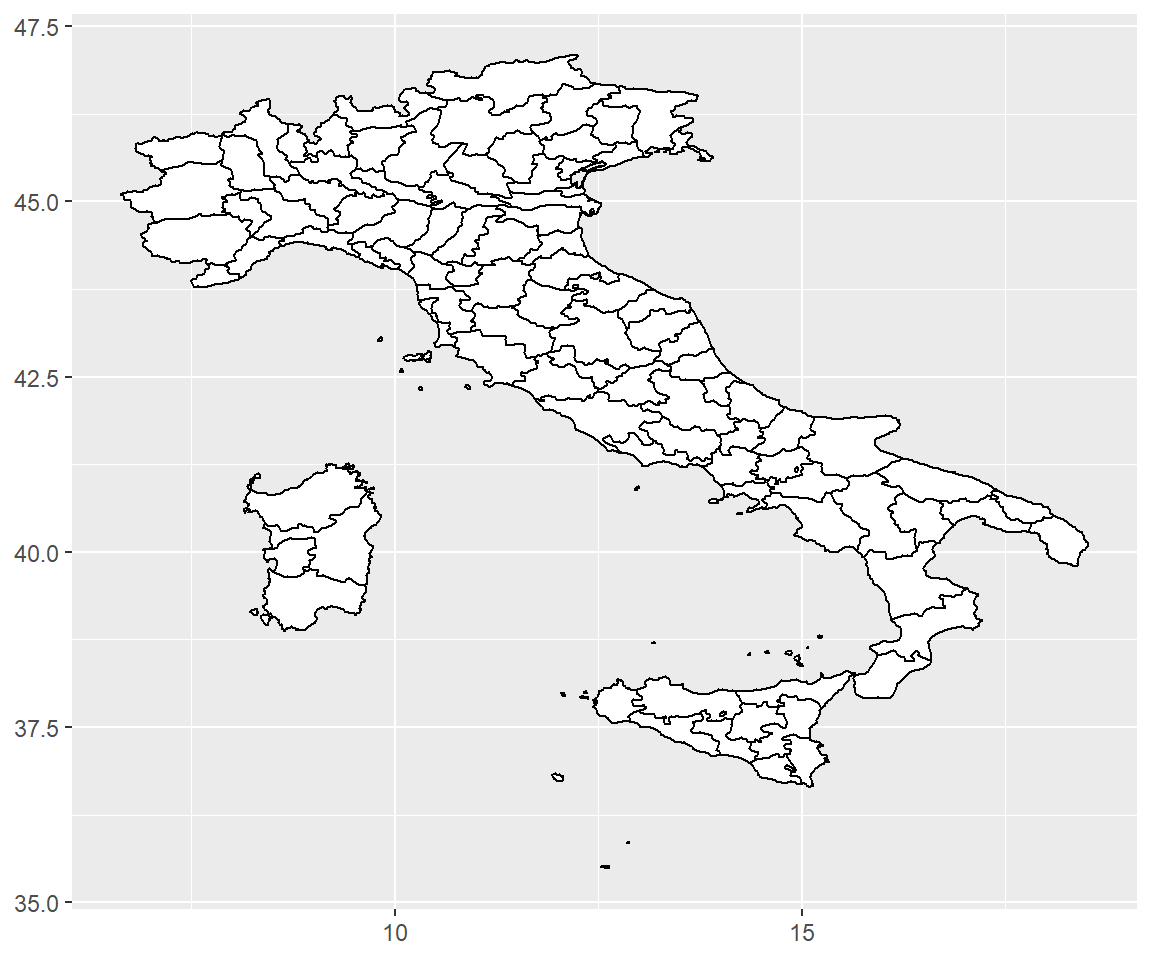
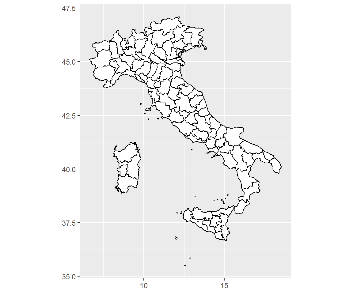
coord_map()uses the mapproj package, https://cran.r-project.org/package=mapproj to do a formal map projection. It takes the same arguments asmapproj::mapproject()for controlling the projection. It is much slower thancoord_quickmap()because it must munch the data and transform each piece. Normallycoord_quickmap()should be sufficient.
6 Themes
Themes give you control over the non-data elements of your plot. The theme system does not affect how the data is rendered by geoms, or how it is transformed by scales. Themes don’t change the perceptual properties of the plot, but they do help you make the plot aesthetically pleasing or match an existing style guide. This allows you, e.g., to meet the style demands of the journal you want to publish in. Themes give you control over things like fonts, ticks, panel strips, and backgrounds.
6.1 Predefined themes
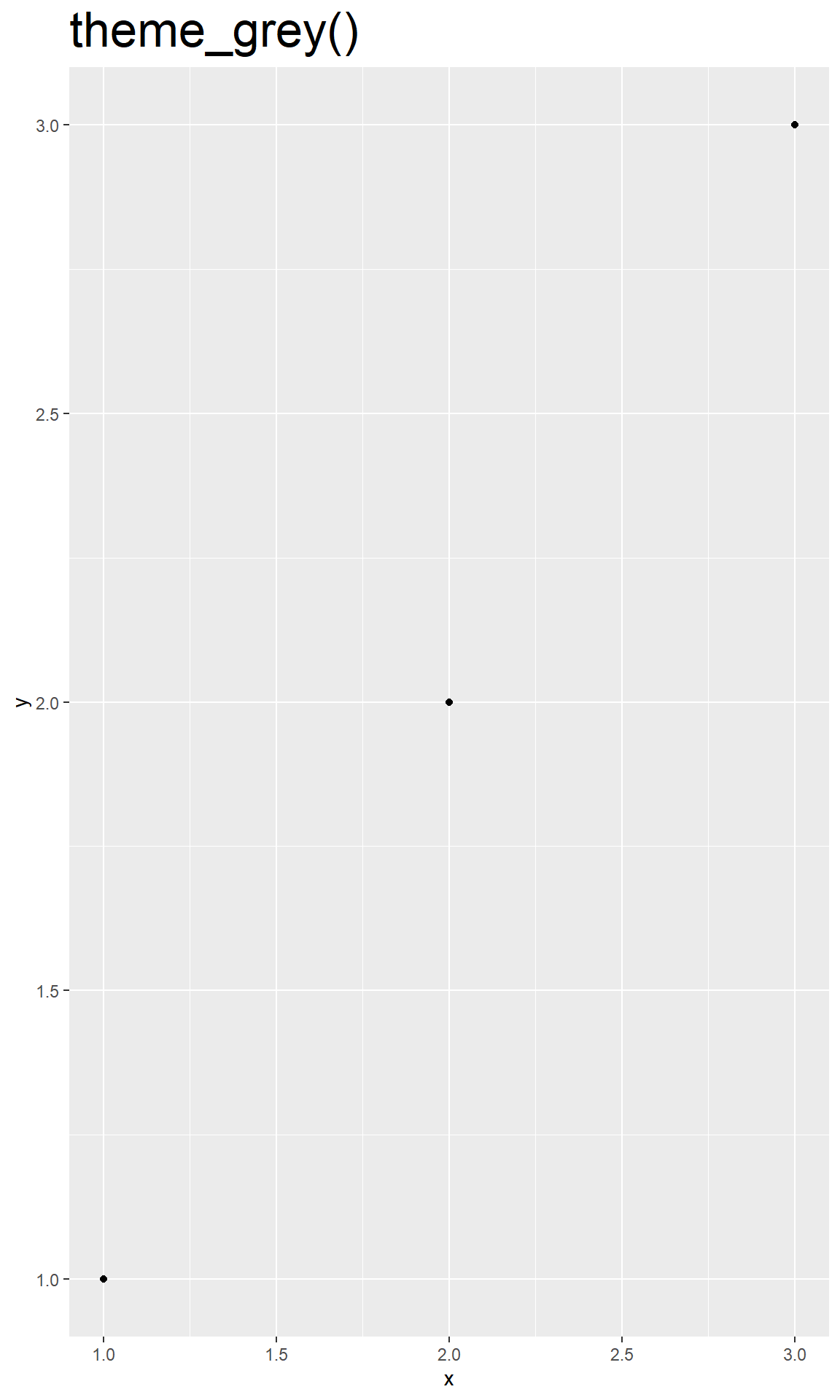
ggplot2 comes with a number of built in themes. The most popular is theme_grey(), the signature default ggplot2 theme with a light grey background and white gridlines.
There are seven other themes built in to ggplot2 1.1.0:
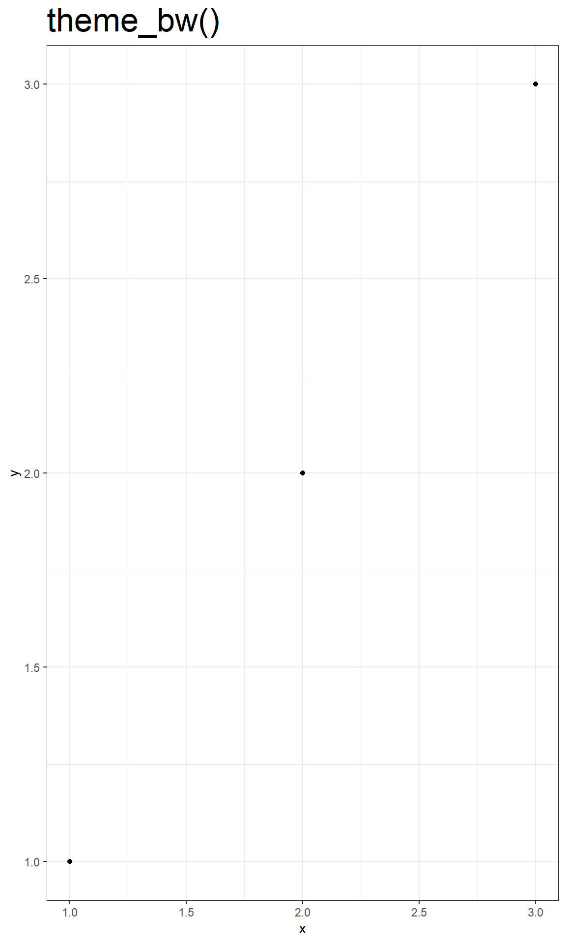
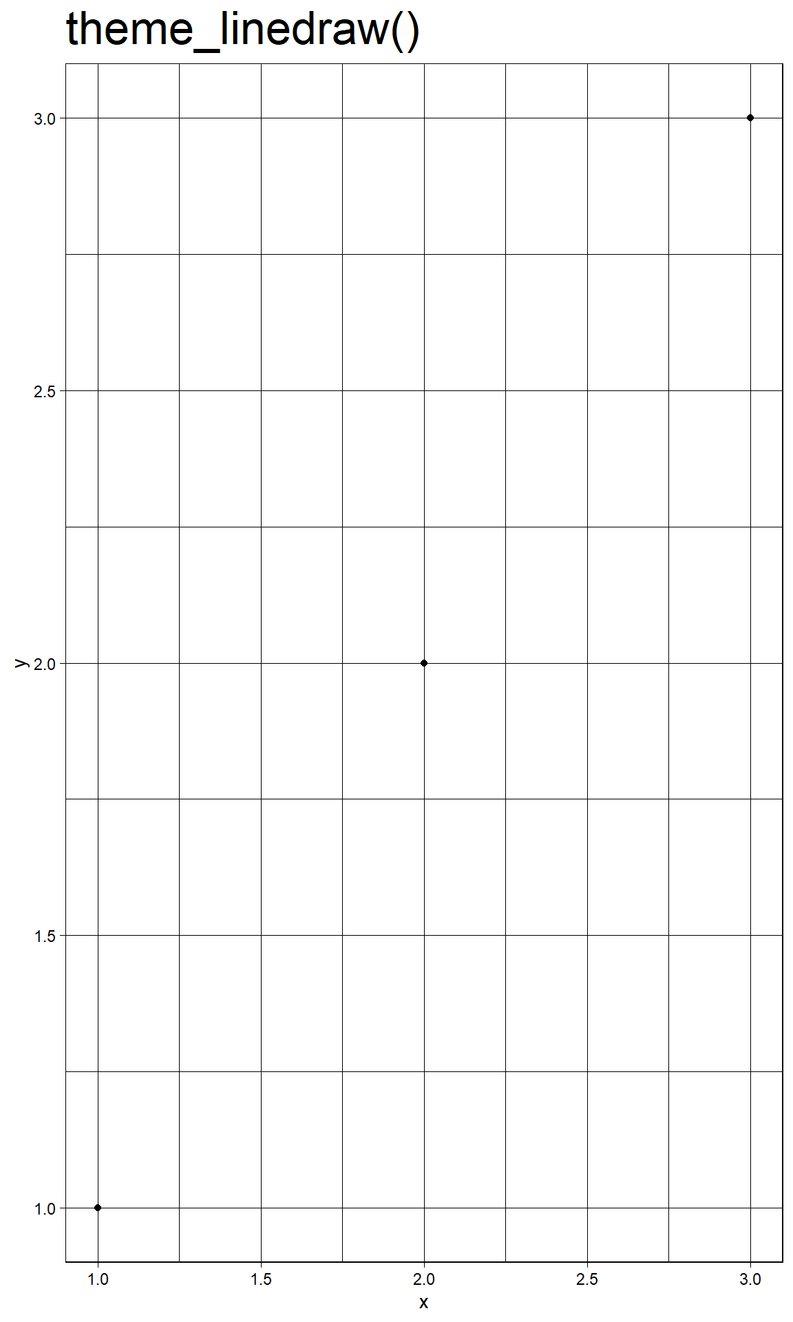
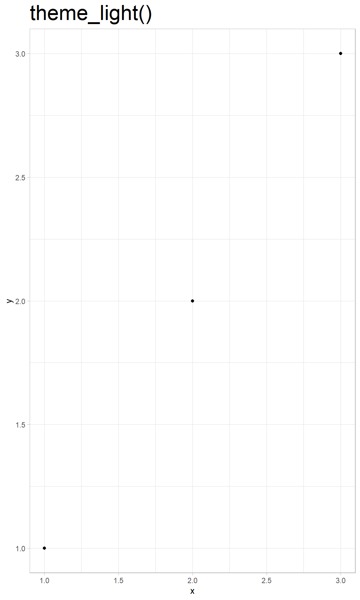
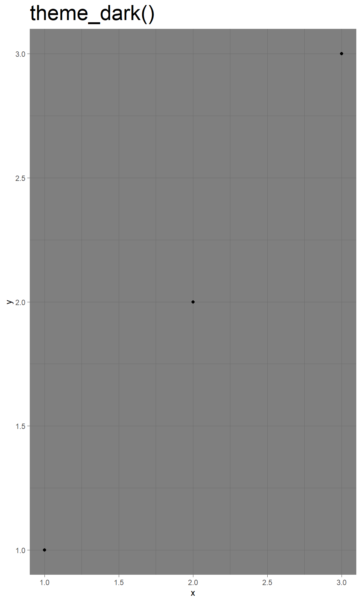
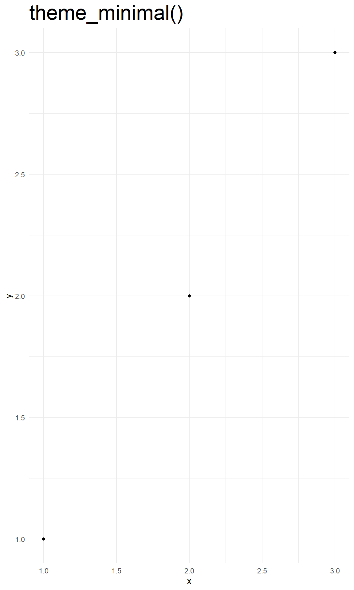
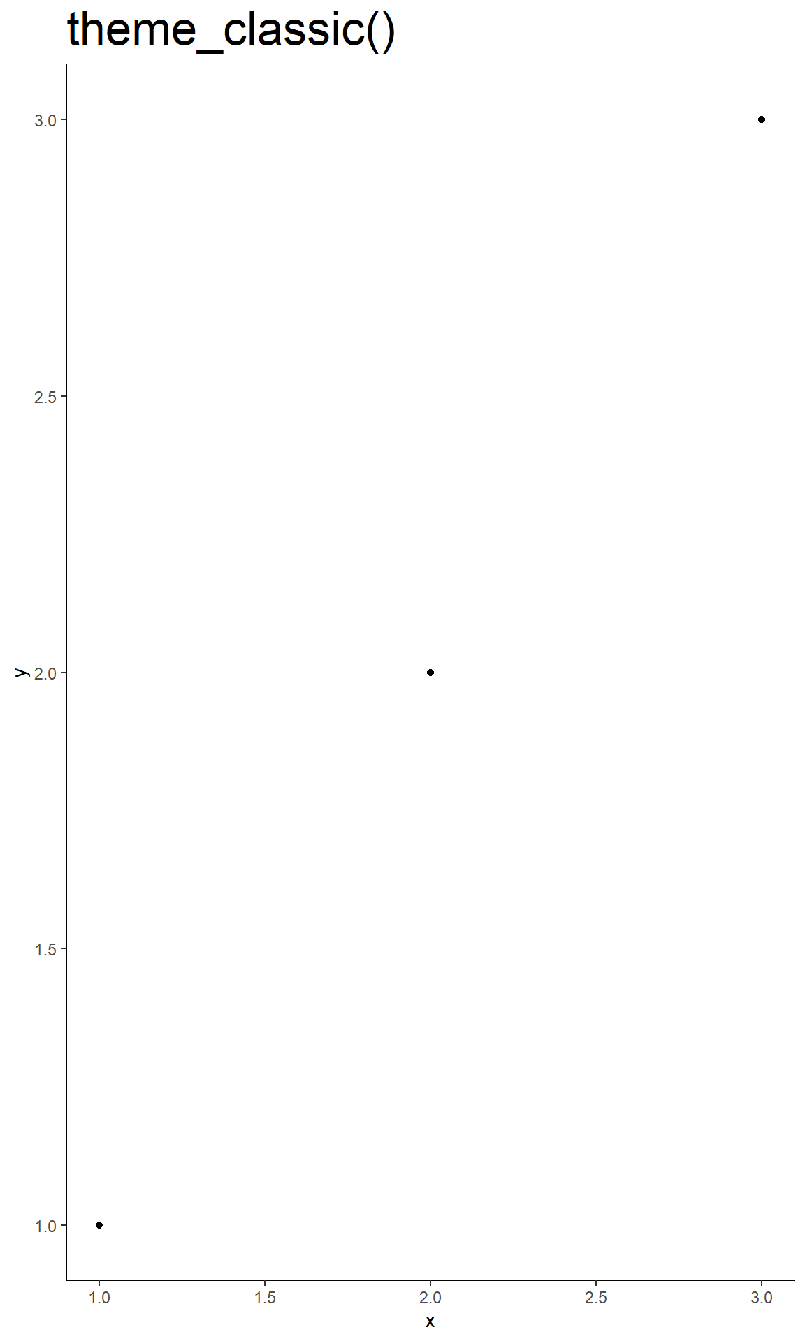
theme_bw(): a variation ontheme_grey()that uses a white background and thin grey grid lines.theme_linedraw(): A theme with only black lines of various widths on white backgrounds, reminiscent of a line drawing.theme_light(): similar totheme_linedraw()but with light grey lines and axes, to direct more attention towards the data.theme_dark(): the dark cousin oftheme_light(), with similar line sizes but a dark background. Useful to make thin coloured lines pop out.theme_minimal(): A minimalistic theme with no background annotations.theme_classic(): A classic-looking theme, with x and y axis lines and no gridlines.theme_void(): A completely empty theme.
As well as applying themes a plot at a time, you can change the default theme with theme_set(). For example, if you really hate the default grey background, run theme_set(theme_bw()) to use a white background for all plots.
You’re not limited to the themes built-in to ggplot2. You can find extentions on ggplot2 themes here.
6.2 Modify themes
The complete themes are a great place to start but don’t give you a lot of control. To modify individual elements, you need to use theme() to override the default setting for an element with an element function.
To modify an individual theme component you use code like plot + theme(element.name = element_function()). There are four basic types of built-in element functions: text, lines, rectangles, and blank. Each element function has a set of parameters that control the appearance:
element_text()draws labels and headings. You can control thefont family,face,colour,size(in points),hjust,vjust,angle(in degrees) andlineheight(as ratio of fontcase).element_line()drawslinesparameterised bycolour,sizeandlinetype.element_rect()drawsrectangles, mostly used for backgrounds, parameterised byfill colourandborder colour,sizeandlinetype.element_blank()draws nothing. Use this if you don’t want anything drawn, and no space allocated for that element.
There are around 40 unique elements that control the appearance of the plot. They can be roughly grouped into five categories: plot, axis, legend, panel and facet. Take a look at chapter 15.4 of the ggplot2 book to see them all.
7 Highlighting
To highlight data within you plot, you need to add an extra layer to it. We can to this using annotate(), the ggforce package, or the highlight package.
7.1 Annotate
annotate adds a single annotation to your plot, having the geom you specify. We can use filte() to a highlight a group of our data and then annotate the explanation (geom + text).
We can use annotate to provide a point in the plot and add text:
ggplot(mpg, aes(displ, hwy)) +
  geom_point(
    data = filter(mpg, manufacturer == "subaru"),
    colour = "orange",
    size = 3
  ) +
  geom_point() +
  # add orange margin
  annotate(geom = "point", x = 5.5, y = 40, colour = "orange", size = 3) +
  # add black point
  annotate(geom = "point", x = 5.5, y = 40) +
  # add text
  annotate(geom = "text", x = 5.6, y = 40, label = "subaru", hjust = "left")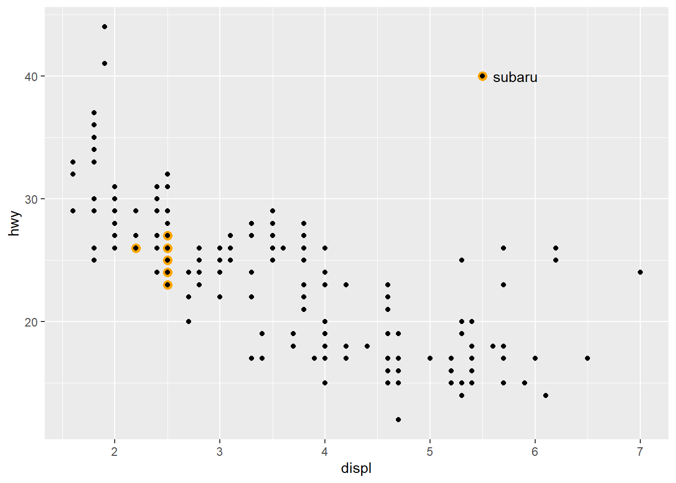
You can produce arrows, rectangles, text and many more geoms with `annotate()´.
7.2 Group labeling
The ggforce package contains a lot of useful tools to extend ggplot2 functionality, including functions such as geom_mark_ellipse() that overlays a plot with circular highlight marks. For example:
ggplot(mpg, aes(displ, hwy)) +
  geom_point() +
  ggforce::geom_mark_ellipse(aes(label = cyl, group = cyl))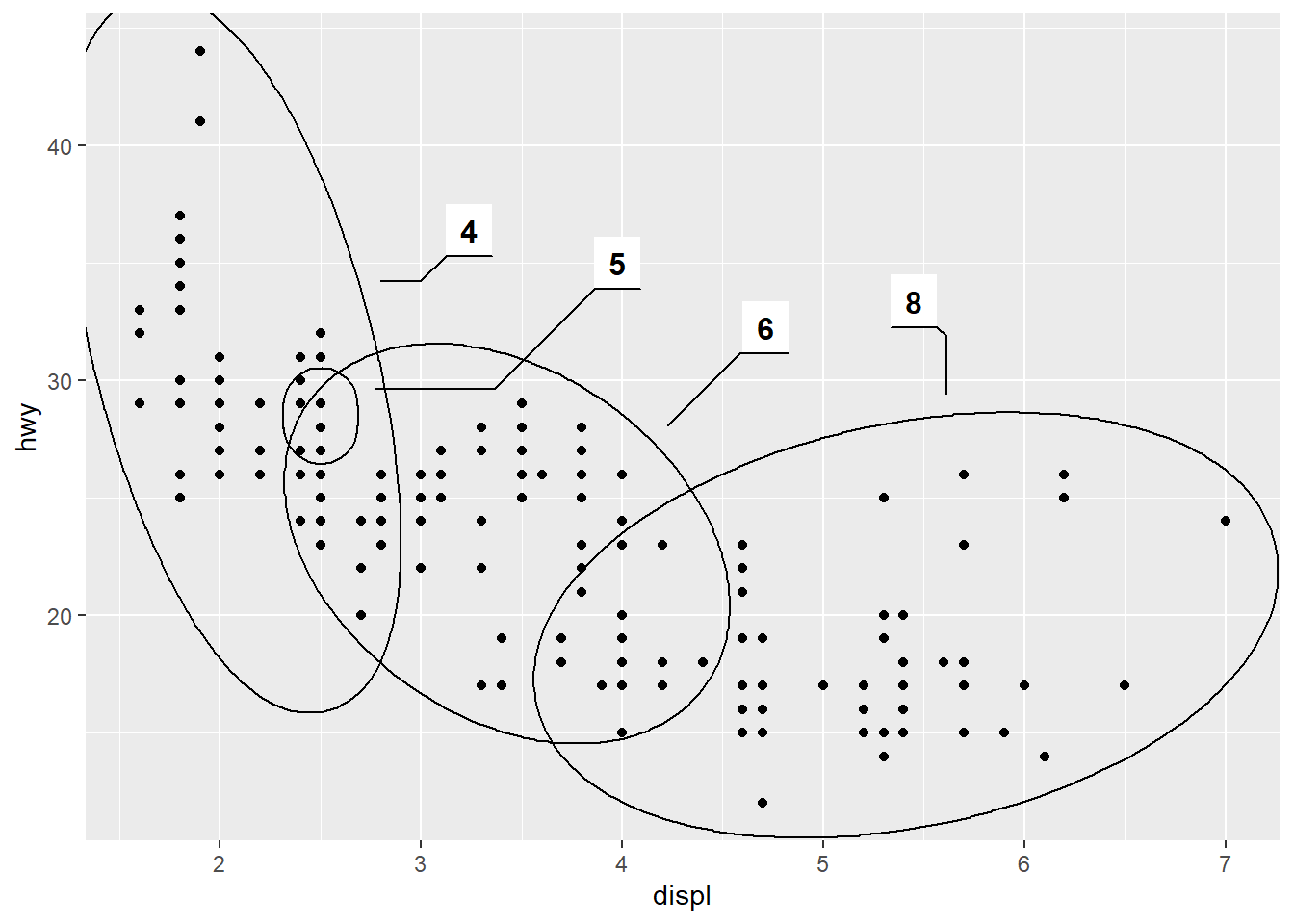
8 Saving
You can save your plot using ggsave(). ggsave() is optimised for interactive use: you can use it after you’ve drawn a plot. It has the following important arguments:
The first argument,
path, specifies the path where the image should be saved. The file extension will be used to automatically select the correct graphics device.ggsave()can produce.eps,.pdf,.svg,.wmf,.png,.jpg,.bmp, and.tiff.widthandheightcontrol the output size, specified in inches. If left blank, they’ll use the size of the on-screen graphics device.For raster graphics (i.e.
.png,.jpg), thedpiargument controls the resolution of the plot. It defaults to 300, which is appropriate for most printers, but you may want to use 600 for particularly high-resolution output, or 96 for on-screen (e.g., web) display.
You can specify which plot you want to save using the plot argument:
p <- ggplot(mpg, aes(displ, hwy)) +
  geom_point()

ggsave(plot = p, file = "my_cool_plot.png")
If you don’t specify the plot argument, ggsave() will use the last plot you created.
ggplot(mpg, aes(displ, hwy)) +
  geom_point()

ggsave(file = "my_cool_plot.png")
9 Advantage of ggplot
The main idea that lies behind ggplot is the grammar of graphics: Each plot can be made from the same few components:

Aesthetics
Geometries
Statistics
Scaling
Faceting
Themes
This enables us to break down each and every plot into chunks/ components, and in return we can produce each and every plot when we just tell ggplot what components to draw. This is a very powerful tool and very different from the base R approach. Additionally, it forces you to think about your data before plotting, instead of just throwing it into a function like hist(). One of the biggest advantages of gplot2 is that you don’t have to open Adobe Illustrator, Corel Draw or any other software to modify your plots outside of R. If you produce the whole plot using ggplot2, you can be sure that your plot follows your data and that you didn’t add any mistakes while modifying your plot. Everybody can reproduce your plot with your code and can see that it is valid. When a reviewer wants you to add some changes to your plot, you can just add a line to your code instead of saving it as a pdf, loading it into Adobe Illustrator, modifying the plot there, adding the changes, saving it as a png etc… Yes, this can result in big chunks of code, but the pros outweigh the cons here. There is a lot of theory behind ggplot. But once you overcome this theory you can control and modify anything you like on your plot while beeing on the safeside when it comes to reproducibility.