1 Introduction
This is the third part of a series where I work through the practice questions of the second edition of Richard McElreaths Statistical Rethinking. Each post covers a new chapter. There are already some awesome sources for this book online like Jeffrey Girard working through the exercises of the first edition, or Solomon Kurz leading through each example of the book with the brms and the tidyverse packages. You can even watch the lectures of McElreath on Youtube and work through the homework and solutions.
However, so far I couldn’t find a source providing solutions for the practice questions of the second edition, or the homework practices, in a tidy(-verse) way. My aim here is therefore to provide solutions for each homework and practice question of the second edition, using the tidyverse and the rethinking packages. The third part of the series will cover chapter 4, which corresponds to week 2 of the lectures and homework.
McElreath himself states that chapter 4 provides the foundation for most of the examples of the later chapters. So I will spend a bit more time on this chapter and go a bit more into detail.
2 Homework
2.1 Question 1
The weights listed below were recorded in the !Kung census, but heights were not recorded for these individuals. Provide predicted heights and 89% intervals for each of these individuals. That is, fill in the table below, using model-based predictions.
| Individual | weight | expected height | 89% Interval |
|---|---|---|---|
| 1 | 46.95 | ||
| 2 | 43.72 | ||
| 3 | 64.78 | ||
| 4 | 32.59 | ||
| 5 | 54.63 |
We can use a linear regression model to predict height from weight. First, let’s load the census data and the new weights:
# data
data("Howell1")
d <- Howell1

# new data to predict from
new_weight <- c(46.95, 43.72, 64.78, 32.59, 54.63)
For the model, we use the same structur and priors as given on page 102. Further, we use all data (both juveniles and adults) and use quadratic approximation for the posterior.
# define the average weight
xbar <- d %>% summarise(xbar = mean(weight)) %>% pull

# model formula
m <- alist(
  height ~ dnorm(mu, sigma),
  mu <- a + b * (weight - xbar),
  a ~ dnorm(178, 20),
  b ~ dlnorm(0, 1),
  sigma ~ dunif(0, 50)) %>%
  # model fit using quadratic approximation
  quap(data = d)
Now we can calculate the posterior distribution of heights for each individual weight value in the table using the link() function, as explained on page 105. From these posterior distributions, we can calculate the mean and the 89% percentile interval using summarise_all().
# predict height
pred_height <- link(m, data = data.frame(weight = new_weight))

# calculate means
expected <- pred_height %>%
  as_tibble() %>%
  summarise_all(mean) %>%
  as_vector()

# calculate percentile interval
interval <- pred_height %>%
  as_tibble() %>%
  summarise_all(HPDI, prob = 0.89) %>%
  as_vector()
Now we just have to add the predicted values to the table:
table_height <- tibble(individual = 1:5, weight = new_weight, expected = expected,
                       lower = interval[c(TRUE, FALSE)], upper = interval[c(FALSE, TRUE)]) %>%
  knitr::kable(align = "cccrr")

table_height| individual | weight | expected | lower | upper |
|---|---|---|---|---|
| 1 | 46.95 | 158.2820 | 157.4741 | 159.0847 |
| 2 | 43.72 | 152.5848 | 151.8624 | 153.3348 |
| 3 | 64.78 | 189.7315 | 188.2463 | 191.0629 |
| 4 | 32.59 | 132.9531 | 132.2509 | 133.5896 |
| 5 | 54.63 | 171.8284 | 170.7715 | 172.8337 |
2.2 Question 2
Model the relationship between height (cm) and the natural logarithm of weight (log-kg). Use the entire Howell1 data frame, all 544 rows, adults and non-adults. Fit this model, using quadratic approximation. Use any model type from chapter 4 that you think useful: an ordinary linear regression, a polynomial or a spline. Plot the posterior predictions against the raw data.
First, let’s take a look at the data:
d %>%
  mutate(log.weight = log(weight)) %>%
  ggplot() +
  geom_point(aes(log.weight, height), alpha = 0.5) +
  theme_minimal()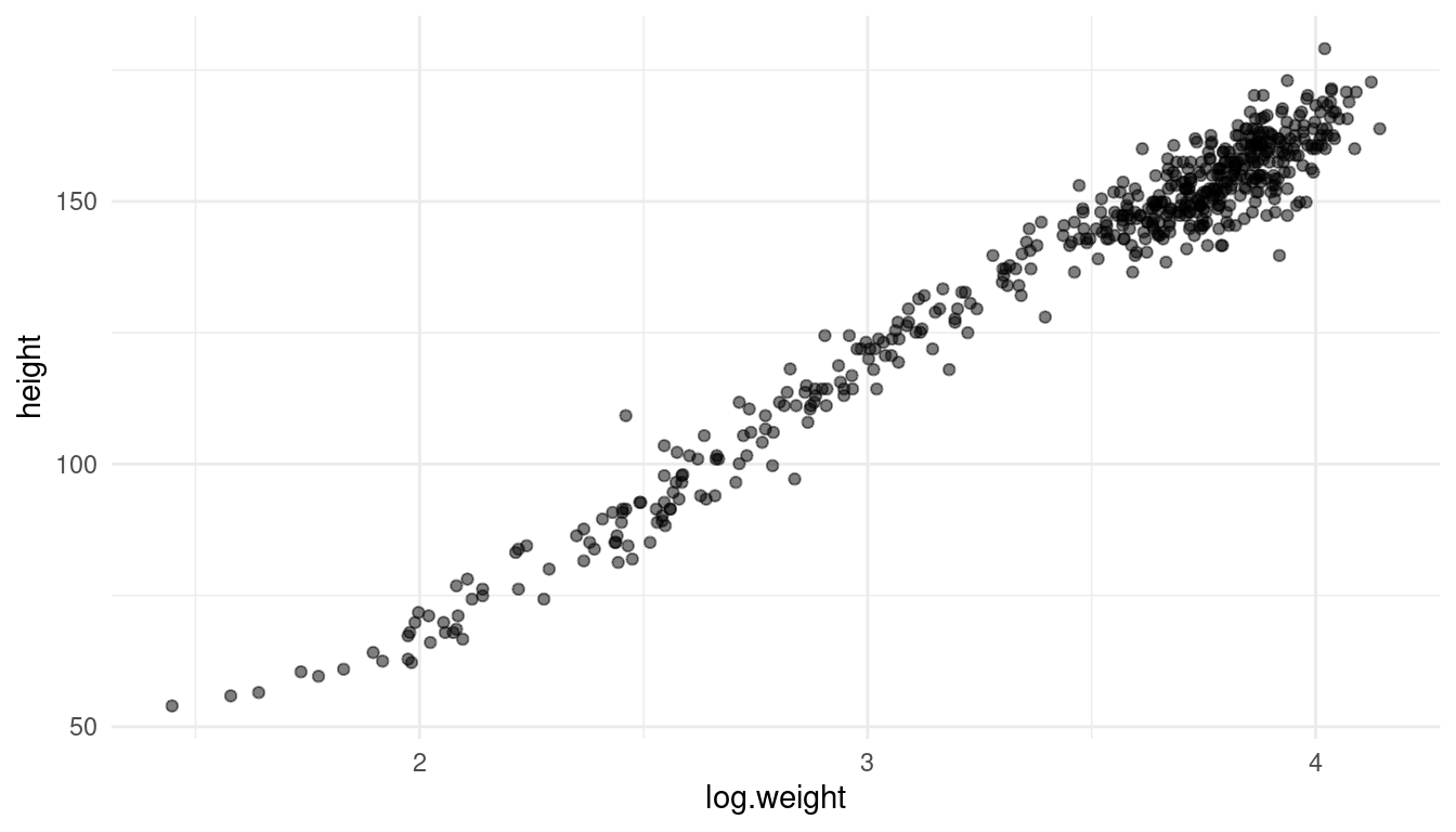
It actually looks like a decent linear relationship, so a simple linear regression should be sufficient. All we need to change from the previous model is to log-transform the weight.
m_log <- alist(
  height ~ dnorm(mu, sigma),
  mu <- a + b * log(weight),
  a ~ dnorm(178, 20),
  b ~ dlnorm(0, 1),
  sigma ~ dunif(0, 50)) %>%
  quap(data = d)
Let’s glimpse at the results:
precis(m_log) %>% as_tibble() %>%
  add_column(parameter = rownames(precis(m_log))) %>%
  rename("lower" = '5.5%', "upper" = '94.5%') %>%
  select(parameter, everything()) %>%
knitr::kable(align = "lcrrr")| parameter | mean | sd | lower | upper |
|---|---|---|---|---|
| a | -22.888331 | 1.3349032 | -25.021764 | -20.754898 |
| b | 46.821474 | 0.3825004 | 46.210164 | 47.432783 |
| sigma | 5.139592 | 0.1560738 | 4.890156 | 5.389028 |
Instead of trying to read these estimates, we can just visualise our model. Let’s calculate the predicted mean height as a function of weight, the 97% PI for the mean, and the 97% PI for predicted heights as explained on page 108.
As we will repeat these steps throughout the exercises, we can set up a function for the interval calculation:
# we better make a function out of it since we use it more often
tidy_intervals <- function(my_function, my_model, interval_type,
                           x_var, x_seq){
  # preprocess dataframe
  df <- data.frame(col1 = x_seq)
  colnames(df) <- x_var

  # calculate 89% intervals for each weight
  # either link or sim
  my_function(my_model, data = df) %>%
  as_tibble() %>%
  #  either PI or HPDI
  summarise_all(interval_type, prob = 0.89) %>%
  add_column(type = c("lower", "upper")) %>%
  pivot_longer(cols = -type, names_to = "cols", values_to = "intervals") %>%
  add_column(x_var = rep(x_seq, 2)) %>%
  pivot_wider(names_from = type, values_from = intervals)
}
And for the mean:
tidy_mean <- function(my_model, data){
  link(my_model, data) %>%
    as_tibble() %>%
    summarise_all(mean) %>%
    pivot_longer(cols = everything()) %>%
    add_column(x_var = data[[1]])
}
Now let’s use these functions to calculate the intervals:
# define weight range
weight_seq <- seq(from = min(d$weight), to = max(d$weight), by = 1)

# calculate 89% intervals for each weight
intervals <- tidy_intervals(link, m_log, HPDI,
                            x_var = "weight", x_seq = weight_seq)

# calculate mean
reg_line <- tidy_mean(m_log, data = data.frame(weight = weight_seq))


# calculate prediction intervals
pred_intervals <- tidy_intervals(sim, m_log, PI,
                                 x_var = "weight", x_seq = weight_seq)
Now we can plot the raw data, the posterior mean from, the distribution of mu (which corresponds to the 89% HPDI of the mean), and the region within which the model expects to find 89% of actual heights in the population.
ggplot(d) +
  geom_point(aes(weight, height), alpha = 0.5) +
  geom_ribbon(aes(x = x_var, ymin = lower, ymax = upper),
                alpha=0.8, data = intervals) +
  geom_ribbon(aes(x = x_var, ymin = lower, ymax = upper),
                alpha=0.2, data = pred_intervals) +
  geom_line(aes(x = x_var, y = value), data = reg_line, colour = "coral") +
  theme_light()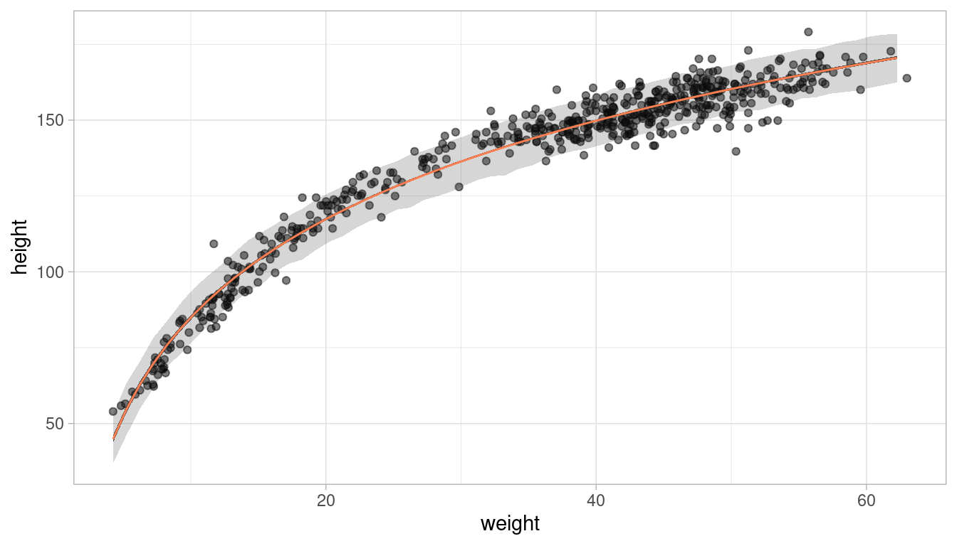
This looks like a decent fit. Let’s make a function of the ggplot, so we can call it later on:
plot_regression <- function(df, x, y,
                            interv = intervals, pred_interv = pred_intervals){
  ggplot(df) +
    geom_point(aes({{x}}, {{y}}), alpha = 0.5) +
    geom_ribbon(aes(x = x_var, ymin = lower, ymax = upper),
                alpha=0.8, data = interv) +
    geom_ribbon(aes(x = x_var, ymin = lower, ymax = upper),
                alpha=0.2, data = pred_interv) +
    geom_line(aes(x = x_var, y = value), data = reg_line, colour = "coral") +
    theme_light()
}
2.3 Question 3
Plot the prior predictive distribution for the polynomial regression model in Chapter 4. You can modify the prior predictive distribution. 20 or 30 parabolas from the prior should suffice to show where the prior probability resides. Can you modify the prior distributions of a, b1, and b2 so that the prior predictions stay within the biologically reasonable outcome space? That is to say: Do not try to fit the data by hand. But do try to keep the curves consistent with what you know about height and weight, before seeing these exact data.
Let us first recap how the polynomial regression model in Chapter 4 was built: The first thing was to standardise the predictor variables, in our case the weight variable. Additionally, we calculate the square of the standardised weight.
# standardise weight
d_stand <- d %>% mutate(weight_s = (weight - mean(weight)) / sd(weight),
                        weight_s2 = weight_s^2) %>%
  as_tibble()
And here’s the notation of the model with the priors used in the chapter:
# fit model
m_poly <- alist(height ~ dnorm(mu, sigma),
               mu <- a + b1 * weight_s + b2 * weight_s2,
               a ~ dnorm(178, 20),
               b1 ~ dlnorm(0, 1),
               b2 ~ dnorm(0, 1),
               sigma ~ dunif(0, 50)) %>%
  quap(data = d_stand)
To get the prior prediction, we can sample from the prior distribution using the extract.prior() function. We then pass these samples from the prior to the link function for the weight space we are interested in. As we want to try out various priors and how they affect the prediction, I’ll make a function that takes a model definition (an alist) and the number of predicted curves as argument.
modify_prior_poly <- function(my_alist, N) {

  # set seed for reproducibility
  set.seed(0709)

  # fit model
  m_poly <- my_alist %>%
    quap(data = d_stand)


  # make weight sequence with both standardised weight and the square of it
  weight_seq <- tibble(weight = seq(
    from = min(d_stand$weight),
    to =  max(d_stand$weight),
    by = 1
  )) %>%
    mutate(weight_s = (weight - mean(weight)) / sd(weight),
           weight_s2 = weight_s ^ 2)

  # extract samples from the prior
  m_poly_prior <- extract.prior(m_poly, n = N)

  # now apply the polynomial equation to the priors to get predicted heights
  m_poly_mu <- link(
    m_poly,
    post = m_poly_prior,
    data = list(
      weight_s = weight_seq$weight_s,
      weight_s2 = weight_seq$weight_s2
    )
  ) %>%
    as_tibble() %>%
    pivot_longer(cols = everything(), values_to = "height") %>%
    add_column(
      weight = rep(weight_seq$weight, N),
      type = rep(as.character(1:N), each = length(weight_seq$weight))
    )

  # plot it
  ggplot(m_poly_mu) +
    geom_line(aes(x = weight, y = height, group = type), alpha = 0.5) +
    geom_hline(yintercept = c(0, 272), colour = "steelblue4") +
    annotate(
      geom = "text",
      x = c(6, 12),
      y = c(11, 285),
      label = c("Embryo", "World's tallest person"),
      colour = c(rep("steelblue4", 2))
    ) +
    labs(x = "Weight in kg", y = "Height in cm") +
    theme_minimal()
}
We can now define our own model via an alist and then throw it into our function, and directly get the (visualised) output. Let’s start with the priors used in the chapter, with 40 predictive curves sampled from the priors.
alist(height ~ dnorm(mu, sigma),
      mu <- a + b1 * weight_s + b2 * weight_s2,
      a ~ dnorm(178, 20),
      b1 ~ dlnorm(0, 1),
      b2 ~ dnorm(0, 1),
      sigma ~ dunif(0, 50)) %>%
  modify_prior_poly(my_alist = ., N = 40)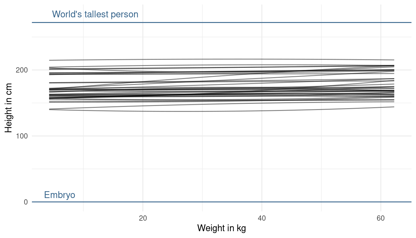
It seems like our priors are a bit too narrow as we do not cover the whole potential/ realistic space. So what we can do is decrease the prior on the mean of alpha a bit, while increasing its standard deviation:
alist(height ~ dnorm(mu, sigma),
      mu <- a + b1 * weight_s + b2 * weight_s2,
      a ~ dnorm(130, 35), # decrease mean and increase sd
      b1 ~ dlnorm(0, 1),
      b2 ~ dnorm(0, 1),
      sigma ~ dunif(0, 50)) %>%
  modify_prior_poly(my_alist = ., N = 40)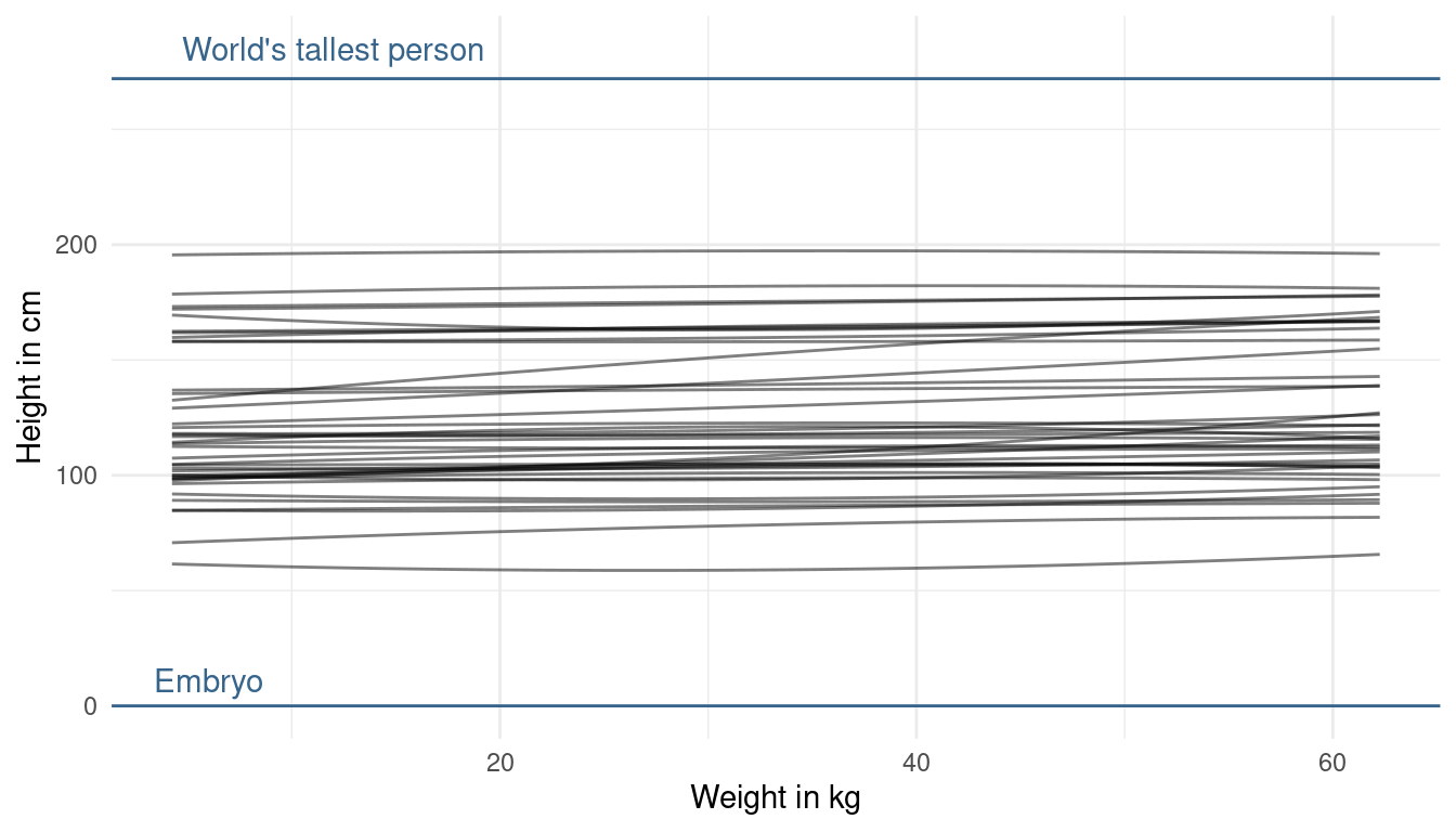
Now that looks more realistic to me, without knowing anything about the data. The prior on alpha now looks good to me, as we are expressing enough uncertainty now. The trend lines hower are a bit too straight (can you say that?) basically assuming no relationship between height and weight. But we already know, without looking at the data, that there is a positive relationship. This is prior knowledge we can and should use. So let’s try making the slope of our prior predictive lines a bit more positive. We can do so by adjusting the prior on beta1. Now to tune the prior for the log-normal distribution is quite difficult. If we decrease the standard deviation, our distribution gets less skewed, meaning that we get less values that are very high but also less values that are very low. Instead, we will directly change the mean of the log-normal. When we increase it, we increase the chance of getting higher values for the slope:
alist(height ~ dnorm(mu, sigma),
      mu <- a + b1 * weight_s + b2 * weight_s2,
      a ~ dnorm(130, 35),
      b1 ~ dlnorm(1, 1), # increase mean
      b2 ~ dnorm(0, 1),
      sigma ~ dunif(0, 50)) %>%
  modify_prior_poly(my_alist = ., N = 40)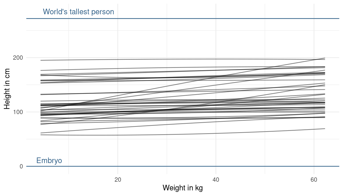
This looks better now. We are not too certain about the relationship, but at least we directly included our prior knowledge now. One last thing we could change is the prior on beta2. This prior affects the curvature of the line. But, taking into account what we know about the relationship, I am quite happy about the curvature. We could just force it to be positive by using a narrow log-normal distribution, because a negative value will result in a downwards curvature (= negative relationship).
alist(height ~ dnorm(mu, sigma),
      mu <- a + b1 * weight_s + b2 * weight_s2,
      a ~ dnorm(130, 35),
      b1 ~ dlnorm(1, 1),
      b2 ~ dlnorm(0, 0.5), # force positivity
      sigma ~ dunif(0, 50)) %>%
  modify_prior_poly(my_alist = ., N = 40)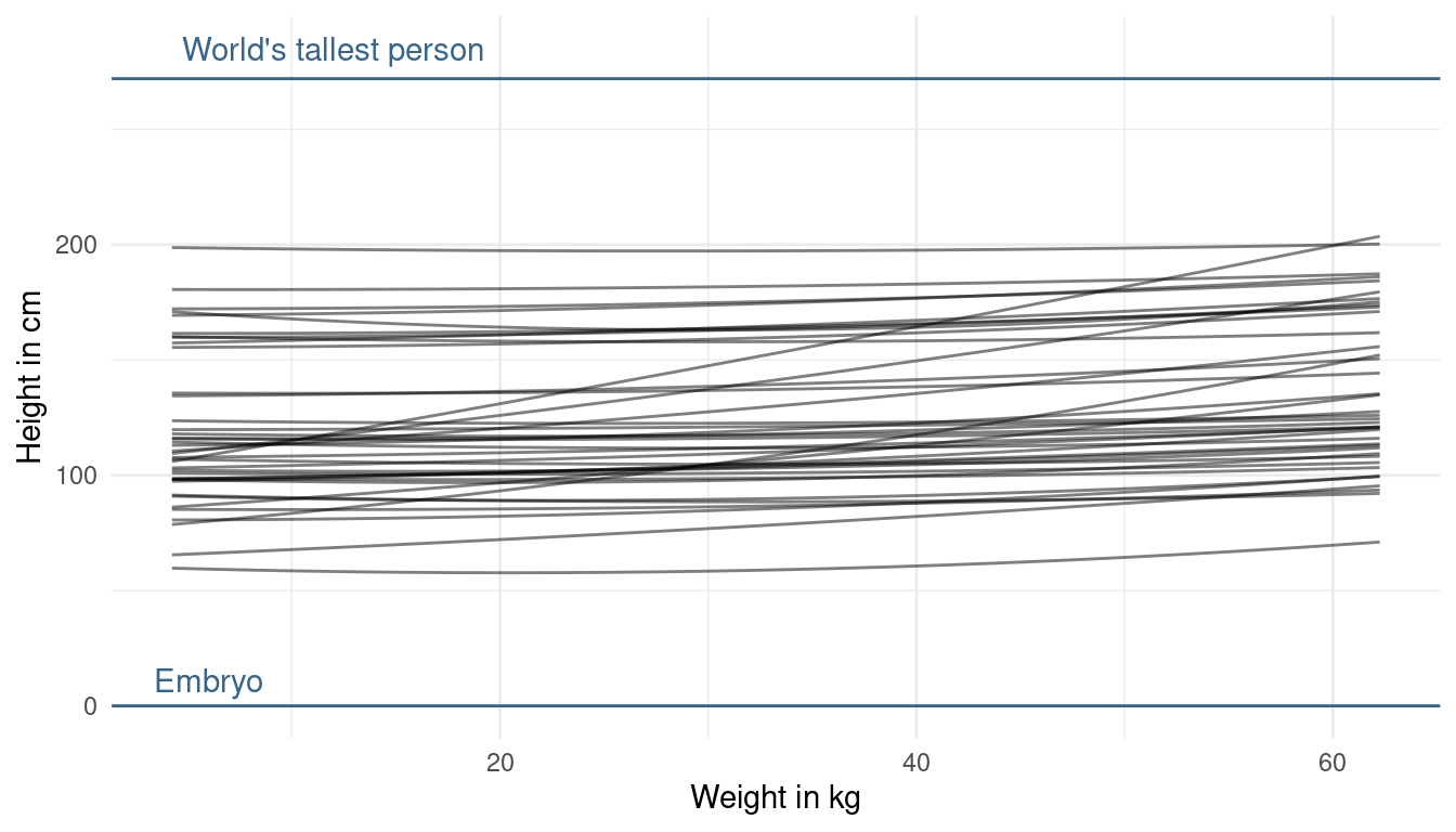
That’s it. This is my first exercise fuzzing with priors and it really forced me to think about my model assumption. This takes a lot of time, but will eventually result in better models.
3 Easy practices
3.1 Question 4E1
In the model definition below, which line is the likelihood?
\(y_{i} ∼ Normal(μ,σ)\)
\(μ ∼ Normal(0,10)\)
\(σ ∼ Exponential(1)\)
We can follow the example on page 82: The first line is therefore the likelihood, the second line the prior on the mean, and the third the prior on the standard deviation.
3.2 Question 4E2
In the model definition just above, how many parameters are in the posterior distribution?
Y is not a parameter. It is the observed data (page 82). Hence, there are two parameters to be estimated in this model: μ and σ.
3.3 Question 4E3
Using the model definition above, write down the appropriate form of Bayes’ theorem that includes the proper likelihood and priors
We can simply follow the example on page 83:
\(Pr(μ,σ|y)=∏iNormal(yi|μ,σ)Normal(μ|0,10)Uniform(σ|0,10)/∫∫∏iNormal(hi|μ,σ)Normal(μ|0,10)Uniform(σ|0,10)dμdσ\)
Question 4E4
In the model definition below, which line is the linear model?
\(y_{i} ∼ Normal(μ,σ)\)
\(μ_{i} = α + βx_{i}\)
\(α ~ Normal(0, 10)\)
\(β ∼ Normal(0,1)\)
\(σ ∼ Exponential(2)\)
Following the example on page 77: The first line is the likelihood. The second the linear model. The third the prior on α. The fourth the prior on β. And the fifth the prior on σ.
4 Medium practices
4.1 Question 4M1
For the model definition below, simulate observed y values from the prior (not the posterior).
\(y_{i} ∼ Normal(μ,σ)\)
\(μ ∼ Normal(0,10)\)
\(σ ∼ Exponential(1)\)
We can simply sample from each prior distribution:
# sample mu
sample_mu <- rnorm(1e4, 0, 10)

# sample sigma
sample_sigma <- rexp(1e4, 1)

# sample y
prior_y <- rnorm(1e4, sample_mu, sample_sigma) %>%
  enframe()

# plot
ggplot(prior_y) +
  geom_density(aes(value), size = 1) +
  theme_light()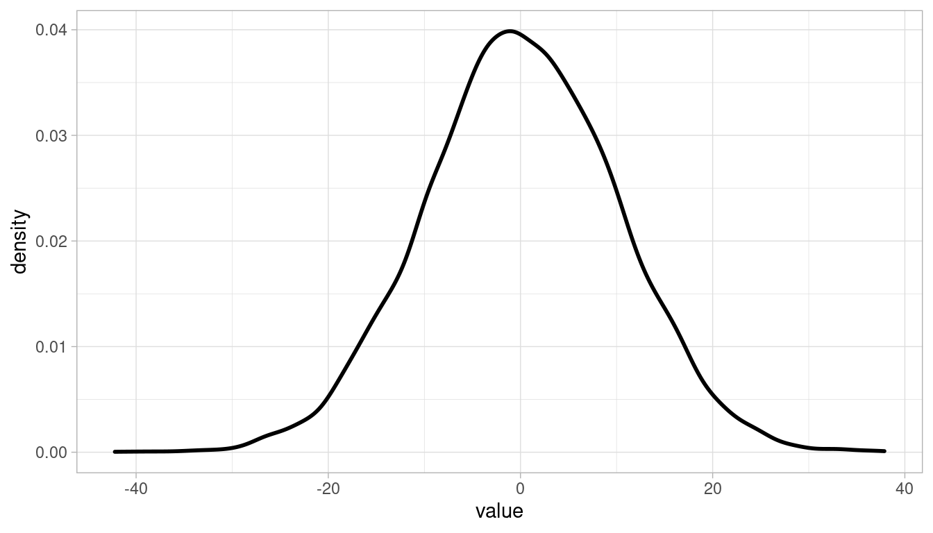
4.2 Question 4M2
Translate the model just above into a quap() formula
quap_frm <- alist(y ~ dnorm(mu, sigma),
                 mu ~ dnorm(0, 10),
                 sigma ~ dexp(1))
4.3 Question 4M3
Translate the quap() model formula below into a mathematical model definition.
flist <- alist(
  y ~ dnorm(mu, sigma),
  mu <- a + b*x,
  a ~ dnorm(0, 50),
  b ~ dunif(0, 10),
  sigma ~ dunif(0, 50))
\(y_{1} ∼ Normal(μ,σ)\)
\(μ_{1} ∼ α + βx_{1}\)
\(α ∼ Normal(0, 50)\)
\(β = Uniform(0, 10)\)
\(σ ∼ Uniform(0, 50)\)
4.4 Question 4M4
A sample of students is measured for height each year for 3 years. After the third year, you want to fit a linear regression predicting height using year as a predictor. Write down the mathematical model definition for this regression, using any variable names and priors you choose. Be prepared to defend your choice of priors.
We can use a simple linear regression approach for this.
First the likelihood, assuming that height is normally distributed:
\(h_{1} ∼ Normal(μ,σ)\)
The linear model:
\(μ_{1} ∼ α + βx_{1}\)
The prior for the intercept. It says nothing about the age of the students, so I use a weak prior for the intercept, covering elementary school to adults as shown in the plot below:
\(α ∼ Normal(150, 20)\)
tibble(height = rnorm(10000, 150, 20)) %>%
  ggplot() +
  geom_density(aes(height)) +
  theme_minimal()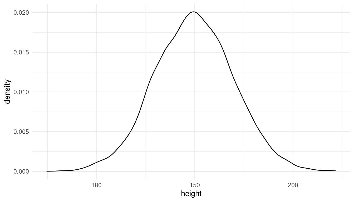
Likewise, the prior for the growth rate needs to adjust for fast growing juveniles and for smaller growing older students. We can’t use a normal distribution because students don’t shrink (to my knowledge). A uniform distribution forces only positive growth rates.
\(β = Uniform(0, 7)\)
tibble(growth = runif(10000, 0, 7)) %>%
  ggplot() +
  geom_density(aes(growth)) +
  labs(x = "Growth rate in cm/year") +
  theme_minimal()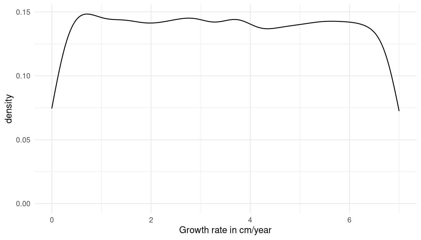
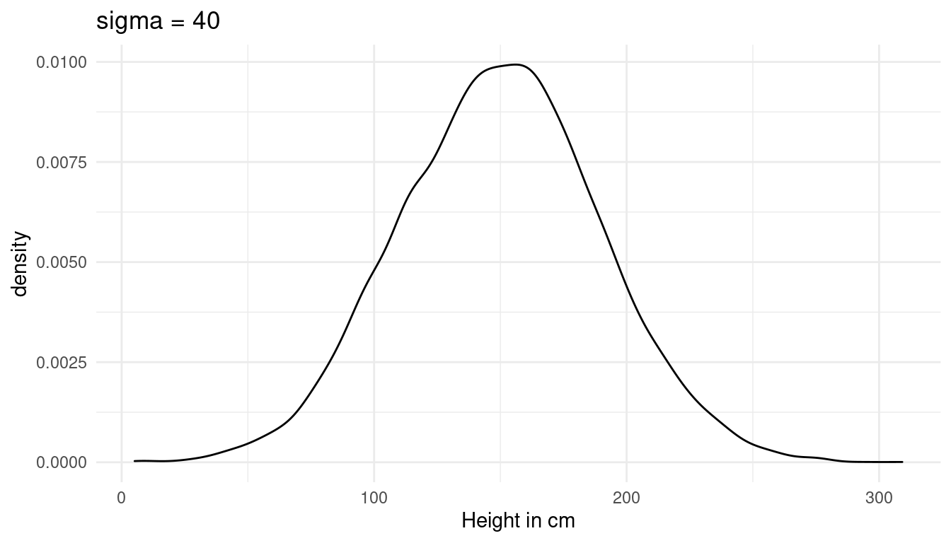
Now we just need to add a prior for sigma, the standard deviation of the height. I choose a weak prior, which is within the reasonable height space (the first plot). A sigma above 40 would lead to height values outside of this range (second plot):
\(σ ∼ Uniform(0, 30)\)
tibble(height = rnorm(10000, 150, 30)) %>%
  ggplot() +
  geom_density(aes(height)) +
  labs(x = "Height in cm", title = "sigma = 30") +
  theme_minimal()

tibble(height = rnorm(10000, 150, 40)) %>%
  ggplot() +
  geom_density(aes(height)) +
  labs(x = "Height in cm", title = "sigma = 40") +
  theme_minimal()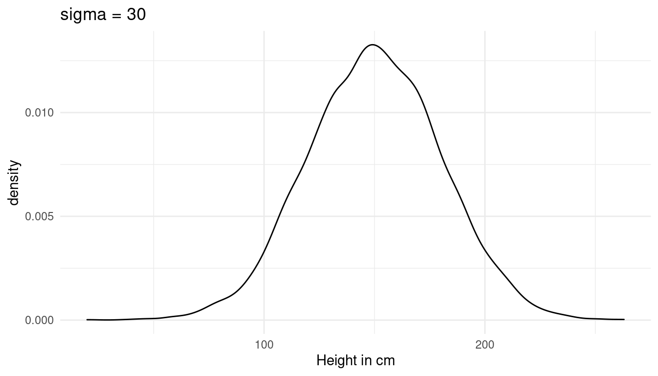
4.5 Question 4M5
Now suppose I remind you that every student got taller each year. Does this information lead you to change your choice of priors? How?
An increasing height tells us that the students are children or juveniles. We can keep our likelihood and linear model, but need to adjust the prior for alpha, beta, and sigma slightly. For alpha, we can use a new mean of 120. For beta (the growth rate), we can use a log normal distribution to force positive values and make them slightly bigger as before, as children tend to grow faster. For sigma, we can reduce it slightly as the spread is probably lower within children.
\(h_{1} ∼ Normal(μ,σ)\)
\(μ_{1} ∼ α + βx_{1}\)
\(α ∼ Normal(120, 20)\)
\(β = LogNormal(2, 0.5)\)
\(σ ∼ Uniform(0, 20)\)
4.6 Question 4M6
Now suppose I tell you that the variance among heights for students of the same age is never more than 64 cm. How does this lead you to revise your priors?
The variance is the square of σ. If the variance is never more than 64 cm, then sigma is never higher than 8 cm. We can update our prior:
\(σ ∼ Uniform(0, 8)\)
Such a low standard deviation of height has implication for our intercept prior alpha. We are now more certain that the intercept is around 120cm and can narrow the spread a bit:
\(α ∼ Normal(120, 10)\)
4.7 Question 4M7
Refit model m4.3 from the chapter but omit the mean weight xbar. Compare the new model’s posterior to that of the original model. In particular, look at the covariance among the parameters. What is difference?
First, let us take a look at the old model m4.3.
# only adults
adults <- Howell1 %>% filter(age >= 18)

# mean weight
xbar <- adults %>%
  summarise(my_mean = mean(weight)) %>%
  pull()

# fit model
m4.3 <- alist(height ~ dnorm(mu, sigma), # likelihood
                 mu <- a + b * (weight - xbar), # linear model
                 a ~ dnorm(178, 20), # alpha
                 b ~ dlnorm(0, 1), # beta
                 sigma ~ dunif(0, 50)) %>% # sigma
  quap(data = adults) # quadratic approximation
Now do the same but without xbar.
m4.3new <- alist(height ~ dnorm(mu, sigma), # likelihood
                 mu <- a + b*weight, # linear model
                 a ~ dnorm(178, 20), # alpha
                 b ~ dlnorm(0, 1), # beta
                 sigma ~ dunif(0, 50)) %>% # sigma
  quap(data = adults, start = list(a = 115, b = 0.9)) # quadratic approximation
We shall look at the covariance of each model.
m4.3new %>% vcov() %>% round(digits = 3) # lots of covariation## a b sigma
## a 3.601 -0.078 0.009
## b -0.078 0.002 0.000
## sigma 0.009 0.000 0.037m4.3 %>% vcov() %>% round(digits = 3) # low covariation ## a b sigma
## a 0.073 0.000 0.000
## b 0.000 0.002 0.000
## sigma 0.000 0.000 0.037So we seem to increase the covariation by not centering. Let’s dig deeper by looking at summaries of the posterior distribution for each parameter:
m4.3new %>%
  extract.samples() %>%
  as_tibble() %>%
  summarise(alpha = mean(a), beta = mean(b), sigma = mean(sigma))
## # A tibble: 1 x 3
## alpha beta sigma
## <dbl> <dbl> <dbl>
## 1 115. 0.891 5.07m4.3 %>%
extract.samples() %>%
as_tibble() %>%
summarise(alpha = mean(a), beta = mean(b), sigma = mean(sigma))## # A tibble: 1 x 3
## alpha beta sigma
## <dbl> <dbl> <dbl>
## 1 155. 0.904 5.07While beta and sigma are the same, alpha is drastically lower in the new model without centering. But what does this mean? Before alpha was the average height for when \(x − x\) was 0 (when the weight is equal to the average weight). In the new model, alpha is the average height for observation with weight equal 0. As there are no people with a weight of zero, this alpha is harder to interpret.
But does this actually change the way our model works? We can test this by comparing the posterior predictions by appling our prediction functions to the data:
m4.3.plot
m4.3new.plot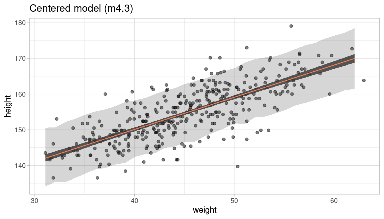
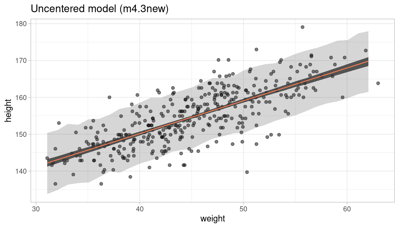
Short answer: No, it does not. We get the same prediction intervals.
4.8 Question 4M8
In the chapter, we used 15 knots with the cherry blossom spline. Increase the number of knots and observe what happens to the resulting spline. Then adjust also the width of the prior on the weights - change the standard deviation of the prior and watch what happens. What do you think the combination of knot number and the prior on the weights controls?
First of all, set up the model environment by importing the cherry_blossoms data and loading the splines package:
data("cherry_blossoms")

# remove na's
cherry_blossoms <- cherry_blossoms %>%
  as_tibble() %>%
  drop_na()

# define nr of knots
library(splines)
Instead of typing out the code all the time whenever we change the number of knots or the prior on the weights as needed, we make a function dependant on these two parameters and just call the function each time. All we change within the function is the number of knots and the prior on weights, everything else stays as it is. I already process and plot the output of the splines regression in the function.
# make function for it, dependant on number of knots and the prior on weights
cherry_spliner <- function(nr_knots, vl_sigma){

# get knot points
knot_list <- cherry_blossoms$year %>%
  quantile(probs = seq(0, 1, length.out = nr_knots)) %>%
  discard(~ . %in% c(851, 1980))

# construct basis functions
B <- cherry_blossoms$year %>% bs(knots = knot_list, degree = 3, intercept = TRUE)

# run bspline regression
m4.7 <- alist(D ~ dnorm(mu, sigma),
              mu <- a + B %*% w,
              a ~ dnorm(100, 10),
              w ~ dnorm(0, my_sigma),
              sigma ~ dexp(1)) %>%
  quap(data = list(D = cherry_blossoms$doy, B = B, my_sigma = vl_sigma),
                      start = list(w = rep(0, ncol(B))))

# get 97% posterior interval for mean
post_int <- m4.7 %>%
  link() %>% as_tibble() %>%
  map_dfr(PI, prob = 0.97) %>%
  select("lower_pi" = '2%', "upper_pi" = '98%') %>%
  add_column(year = cherry_blossoms$year) %>%
  # add doy
  left_join(cherry_blossoms, by = "year")

# plot it and add nr_knots and vl_sigma to plot title
ggplot(post_int, aes(year, doy)) +
  geom_point(colour = "steelblue4", alpha = 0.8) +
  geom_ribbon(aes(ymin = lower_pi, ymax = upper_pi), alpha = 0.9) +
  labs(y = "Day in year", x = "year",
       title = paste(nr_knots, " knots, prior on weights ~ N(0,", vl_sigma, ")")) +
  theme_minimal()
}
Now we can increase the number of knots. We start with the normal model with 15 knots and sigma = 10.
cherry_spliner(nr_knots = 15, vl_sigma = 10)

cherry_spliner(nr_knots = 20, vl_sigma = 10)

cherry_spliner(nr_knots = 30, vl_sigma = 10)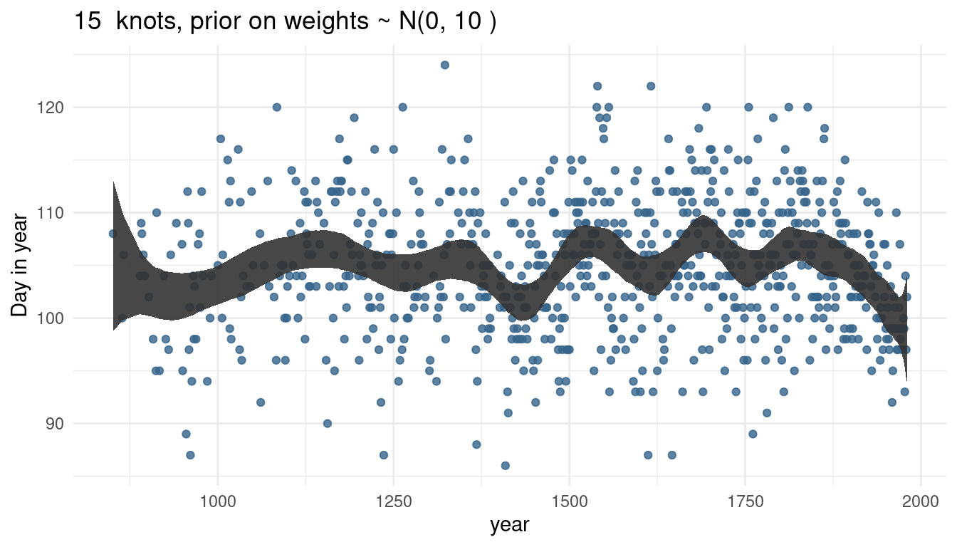

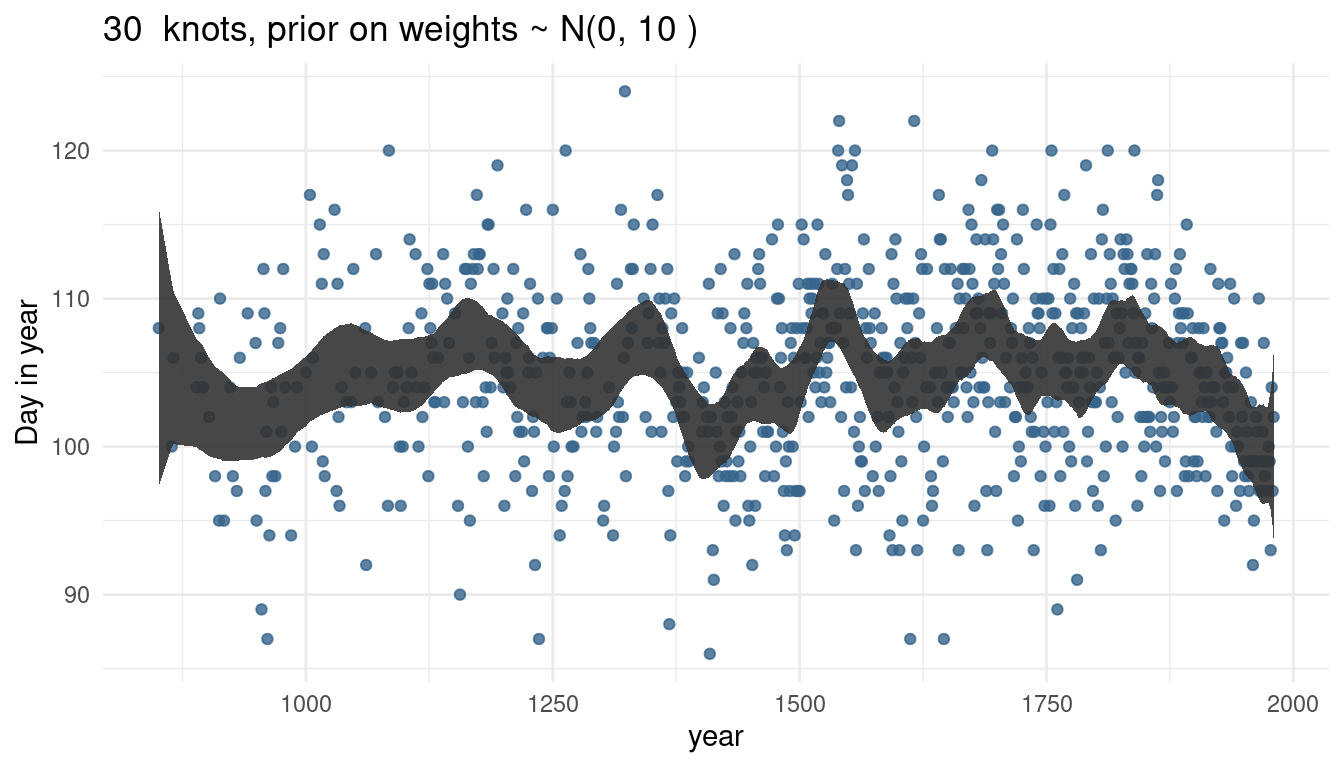
The more knots we have, the wigglier our trend line gets, as we capture more signal.
Now we can play around with the prior on weights. First, we decrease it significantly to 1, and then increase it to 100, while keeping the number of knots equal.
cherry_spliner(nr_knots = 15, vl_sigma = 1)

cherry_spliner(nr_knots = 15, vl_sigma = 10)

cherry_spliner(nr_knots = 15, vl_sigma = 100)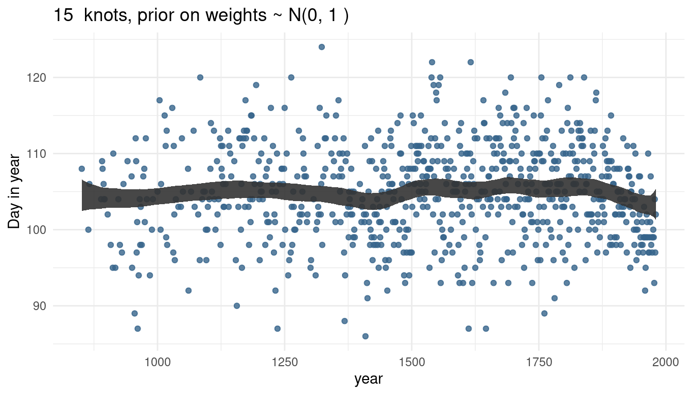
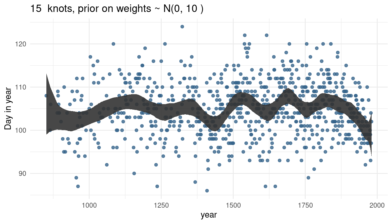
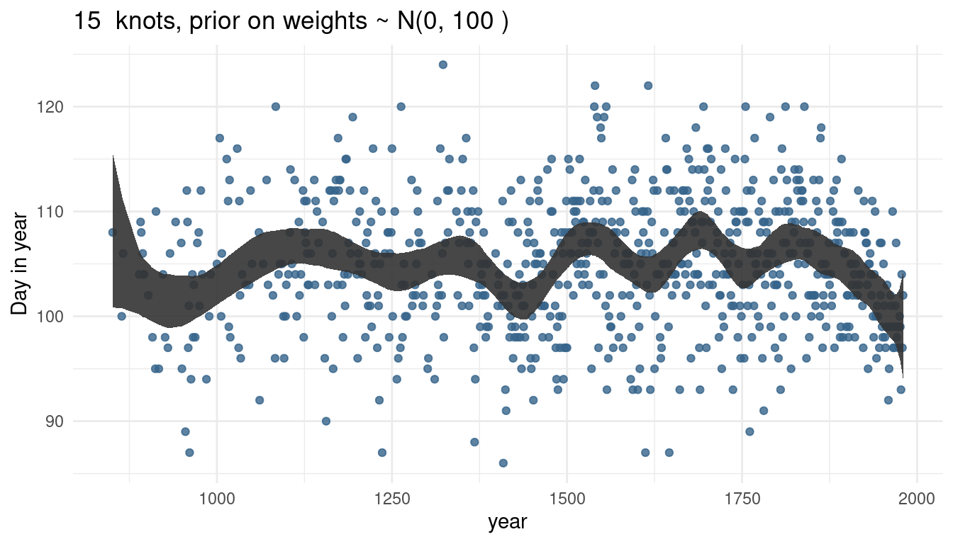
So by increasing the prior or weights, we render our trend line more wigglier as well. This makes sense as the weights will be closer to 0 and hence wiggle around closer to the mean line if the standard deviation is small. If the weights become larger, we allow the curve to have more peaks.
5 Hard practices
5.1 Question 4H1
The weights listed below were recorded in the !Kung census, but heights were not recorded for these individuals. Provide predicted heights and 89% intervals (either HPDI or PI) for each of these individuals. That is, fill in the table below, using model-based predictions.
| Individual | weight | expected height | 89% Interval |
|---|---|---|---|
| 1 | 46.95 | ||
| 2 | 43.72 | ||
| 3 | 64.78 | ||
| 4 | 32.59 | ||
| 5 | 54.63 |
This question is similar to the question 1 in the homework. We solved it there by using a linear regression, but this time we model the relationship between height (cm) and the natural logarithm of weight (log-kg). Let’s see if that makes any difference at all.
# new data to predict from
new_weight <- c(46.95, 43.72, 64.78, 32.59, 54.63)

# fit the logarithmic model
m_log <- alist(
  height ~ dnorm(mu, sigma),
  mu <- a + b * log(weight),
  a ~ dnorm(178, 20),
  b ~ dlnorm(0, 1),
  sigma ~ dunif(0, 50)) %>%
  quap(data = d,
       start = list(a = mean(d$height), b = 1.5, sigma = 9))
Now we can make predictions from our model:
# predict height
pred_height <- link(m_log, data = data.frame(weight = new_weight))

# calculate means
expected <- pred_height %>%
  as_tibble() %>%
  summarise_all(mean) %>%
  as_vector()

# calculate percentile interval
interval <- pred_height %>%
  as_tibble() %>%
  summarise_all(HPDI, prob = 0.89) %>%
  as_vector()
And add the predictions to the table.
tibble(individual = 1:5, weight = new_weight, expected = expected,
       lower = interval[c(TRUE, FALSE)], upper = interval[c(FALSE, TRUE)]) %>%
knitr::kable(align = "cccrr")| individual | weight | expected | lower | upper |
|---|---|---|---|---|
| 1 | 46.95 | 157.3319 | 156.8660 | 157.7259 |
| 2 | 43.72 | 153.9949 | 153.5659 | 154.3738 |
| 3 | 64.78 | 172.4026 | 171.7798 | 172.9538 |
| 4 | 32.59 | 140.2403 | 139.9027 | 140.6235 |
| 5 | 54.63 | 164.4245 | 163.9121 | 164.8932 |
And now we can compare our results to the predictions from the regular model, which we named table_height.
table_height| individual | weight | expected | lower | upper |
|---|---|---|---|---|
| 1 | 46.95 | 158.2820 | 157.4741 | 159.0847 |
| 2 | 43.72 | 152.5848 | 151.8624 | 153.3348 |
| 3 | 64.78 | 189.7315 | 188.2463 | 191.0629 |
| 4 | 32.59 | 132.9531 | 132.2509 | 133.5896 |
| 5 | 54.63 | 171.8284 | 170.7715 | 172.8337 |
And we can see that it actually makes a big difference, especially for those with a large weight (individual 3), or with a particularly low weight (individual 4).
5.2 Question 4H2
Select out all the rows in the Howell1 data with ages below 18 years of age. If you do it right, you should end up with a new data frame with 192 rows in it.
young <- d %>% filter(age < 18)

# double-check
str(young)
## 'data.frame': 192 obs. of 4 variables:
## $ height: num 121.9 105.4 86.4 129.5 109.2 ...
## $ weight: num 19.6 13.9 10.5 23.6 16 ...
## $ age : num 12 8 6.5 13 7 17 16 11 17 8 ...
## $ male : int 1 0 0 1 0 1 0 1 0 1 ...5.2.1 Part 1
Fit a linear regression to these data, using quap(). Present and interpret the estimates. For every 10 units of increase in weight, how much taller does the model predict a child gets?
We can use the same priors as before, but should decrease the prior on alpha to account for lower overall height in our (non-adult) data set. It is important to center the weight values for interpretation.
# again, get mean weight for centering
xbar <- young %>% summarise(xbar = mean(weight)) %>% pull

m_young <- alist(
  height ~ dnorm(mu, sigma),
  mu <- a + b * (weight - xbar),
  a ~ dnorm(120, 30),
  b ~ dlnorm(0, 1),
  sigma ~ dunif(0, 60)) %>%
  quap(data = young)

# results
m_young_res <- precis(m_young) %>%
  as_tibble() %>%
  add_column(parameter = rownames(precis(m_young)), .before = "mean") %>%
  rename("lower" = '5.5%', "upper" = '94.5%')

knitr::kable(m_young_res)| parameter | mean | sd | lower | upper |
|---|---|---|---|---|
| a | 108.323275 | 0.6089240 | 107.350097 | 109.296453 |
| b | 2.716610 | 0.0683322 | 2.607402 | 2.825818 |
| sigma | 8.439234 | 0.4308276 | 7.750689 | 9.127780 |
b can be interpreted as the slope in our regression, where with 1 unit change, height increases by 2.72. Hence, for every 10 units of increase in weight the model predicts that a child gets 27.2 cm taller.
5.2.2 Part 2
Plot the raw data, with height on the vertical axis and weight on the horizontal axis. Superimpose the quap regression line and 89% HPDI for the mean. Also superimpose the 89% HPDI for predicted heights.
And this is the reasion why we build our functions for this. We don’t need to do it manually all over again:
# define weight range
weight_seq <- seq(from = min(young$weight), to = max(young$weight), by = 1)

# calculate 89% intervals for each weight
intervals <- tidy_intervals(link, m_young, HPDI,
                            x_var = "weight", x_seq = weight_seq)

# calculate means
reg_line <- tidy_mean(m_young, data = data.frame(weight = weight_seq))

# calculate prediction intervals
pred_intervals <- tidy_intervals(sim, m_young, PI,
                                 x_var = "weight", x_seq = weight_seq)

plot_regression(young, weight, height) +
  labs(title = "Linear model (m_young)")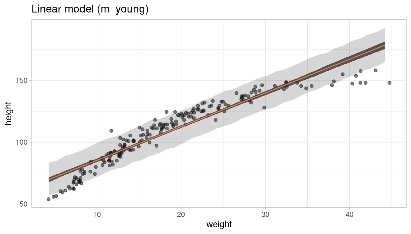
5.2.3 Part 3
What aspects of the model fit concern you? Describe the kinds of assumptions you would change, if any, to improve the model. You don’t have to write any new code. Just explain what the model appears to be doing a bad job of, and what you hypothesize would be a better model.
The model clearly fails to estimate height at both low (<10) and high (>30) weights. By just eyeballing the data, it seems that a linear relationship assumption is not realistic. To improve the model, we can either transform one of the parameters, or use a polynomial regression.
5.3 Question 4H3
Suppose a colleague of yours, who works on allometry, glances at the practice problems just above. Your colleague exclaims, “That’s silly. Everyone knows that it’s only the logarithm of body weight that scales with height!” Let’s take your colleague’s advice and see what happens.
5.3.1 Part 1
Model the relationship between height (cm) and the natural logarithm of weight (log-kg). Use the entire Howell1 data frame, all 544 rows, adults and non-adults. Can you interpret the resulting estimates.?
All we need to do is make a formula for the log of the weights, and the fit it to quap(). Remember that this uses all the data, so we should adjust our priors to it. Then we get the coefficient with precis().
# fit model
m_log <- alist(
  height ~ dnorm(mu, sigma),
  mu <- a + b * log(weight),
  a ~ dnorm(178, 100),
  b ~ dlnorm(0, 1),
  sigma ~ dunif(0, 50)) %>%
  quap(data = d)

# get coefficients
m_log_res <- precis(m_log) %>% as_tibble() %>%
  add_column(parameter = rownames(precis(m_log)), .before = "mean") %>%
  rename("lower" = '5.5%', "upper" = '94.5%')

knitr::kable(m_log_res, align = "lccc")| parameter | mean | sd | lower | upper |
|---|---|---|---|---|
| a | -23.734756 | 1.3353063 | -25.868833 | -21.600679 |
| b | 47.060955 | 0.3826012 | 46.449485 | 47.672426 |
| sigma | 5.134726 | 0.1556704 | 4.885935 | 5.383517 |
We get a weird alpha estimate of -24, what does this mean? It’s just the predicted height of an individual with the weight of 0 log-kg. Beta shows the predicted increase (41 cm) for a 1 log-kg increase in weight. The standard deviation of height prediction, sigma, is around 5 cm. We can see that using a transformation for one parameter renders the coefficients less interpretable.
5.3.2 Part 2
Begin with this plot: plot(height ~ weight, data = Howell1), col = col.alpha(rangi2, 0.4)). Then use samples from the quadratic approximate posterior of the model in (a) to superimpose on the plot: (1) the predicted mean height as a function of weight, (2) the 97% HPDI for the mean, and (3) the 97% HPDI for predicted heights.
Again, our predefined functions come in quite handy here. But first let’s recreate the plot in ggplot2.
ggplot(data = d) +
  geom_point(aes(x = weight, y = height), colour = "steelblue4", alpha = 0.5) +
  theme_minimal()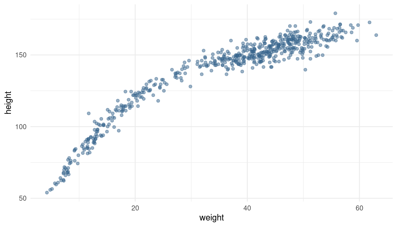
Now we can calculate the predictions from our model:
# define weight range
weight_seq <- seq(from = min(d$weight), to = max(d$weight), by = 1)

# calculate 89% intervals for each weight
intervals <- tidy_intervals(link, m_log, HPDI,
                            x_var = "weight", x_seq = weight_seq)

# calculate means
reg_line <- tidy_mean(m_log, data = data.frame(weight = weight_seq))

# calculate prediction intervals
pred_intervals <- tidy_intervals(sim, m_log, PI,
                                 x_var = "weight", x_seq = weight_seq)

# plot it
plot_regression(d, weight, height)
We can see a pretty good fit for the relationship between height (cm) and the natural logarithm of weight (log-kg).
5.4 Question 4H4
Plot the prior predictive distribution for the parabolic polynomial regression model by modifying the code that plots the linear regression prior predictive distribution. Can you modify the prior distributions of a, b1, and b2 so that the prior predictions stay withing the biologically reasonable outcome space? That is to say: Do not try to fit the data by hand. But do try to keep the curves consisten with what you know about height and weight, before seeing these exact data.
We already covered this in homework question 3 above.
5.5 Question 4H5
Return to data(cherry_blossoms) and model the association between blossom date (doy) and March temperature (temp). Note that there are many missing values in both variables. You may consider a linear model, a polynomial, or a spline on temperature. How well does temperature rend predict the blossom trend?
The easiest way to deal with missing values is to omit them. There are more sophisticated ways but for now it’s sufficient for us. Let’s load the data, select the parameters and add a column with the centered temperature in case we apply a polynomial regression.
data("cherry_blossoms")

cherry_blossoms <- cherry_blossoms %>%
  as_tibble() %>%
  select(doy, temp) %>%
  drop_na() %>%
  mutate(temp_sc = (temp - mean(temp))/ sd(temp))
Now let’s take a quick look at the data to choose which model to use.
ggplot(cherry_blossoms) +
  geom_point(aes(temp_sc, doy), alpha = 0.5) +
  labs(x = "Centered temperature", y = "Day in year") +
  theme_minimal()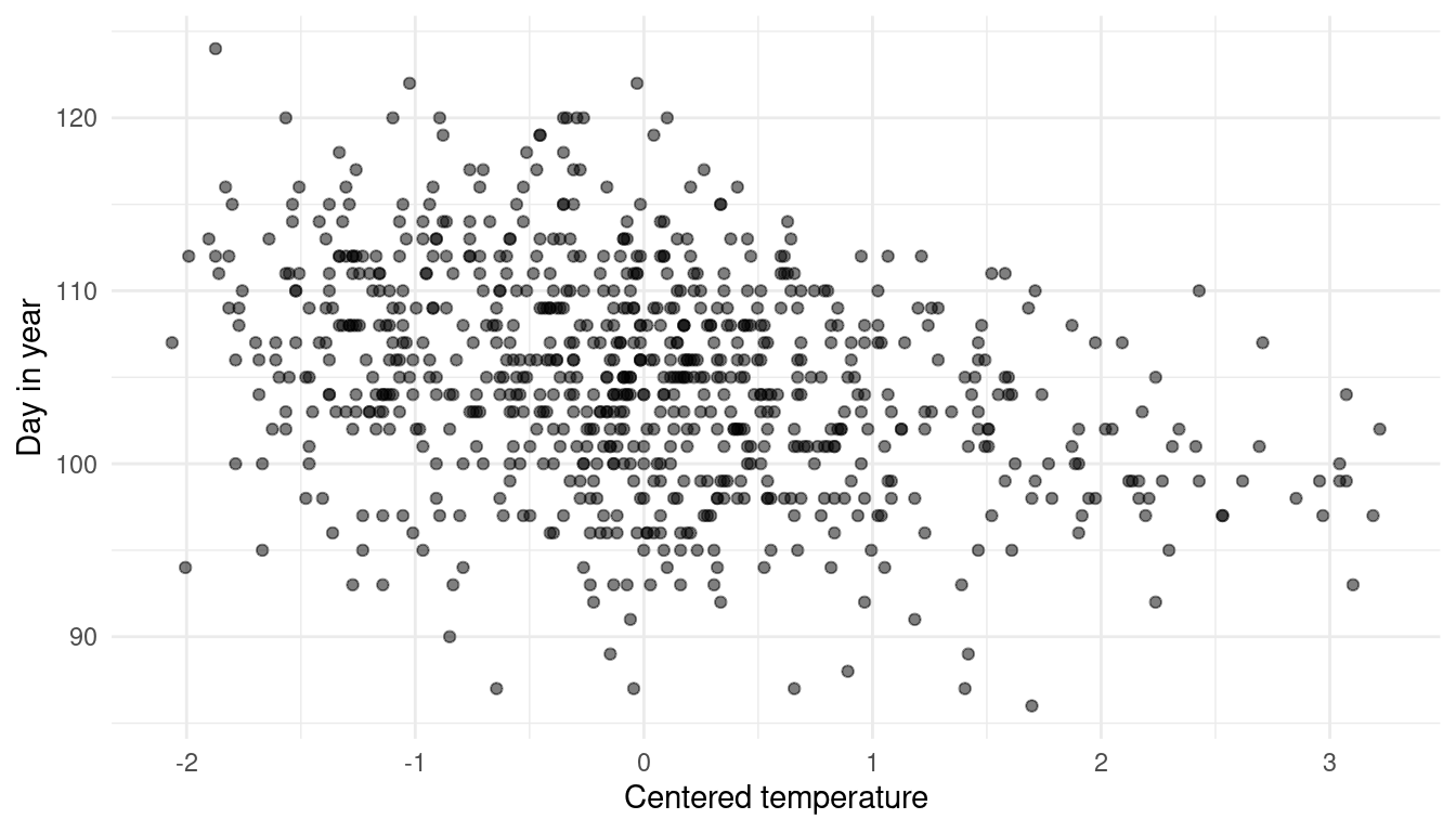
It seems like there is a nuanced negative relationship, but with a lot of noise. Using a polynomial regression or a spline would probably capture too much of this noise without providing much insight. I will therefore use a simple linear regression approach and the temperature parameter as it is (without centering). I will mainly use less informative, wide priors. There is, however enough data so that priors do not matter that much. The prior on alpha covers most realistic values and the prior on beta that favours negative values (= negative slope = negative relationship).
# define average temp
xbar <- cherry_blossoms %>%
  summarise(mean_temp = mean(temp)) %>%
  pull()

# fit modell
cherry_linear <-
  # define formula
  alist(doy ~ dnorm(mu, sigma),
        mu <- a + b * (temp - xbar),
        a ~ dnorm(115, 30),
        b ~ dnorm(-2, 5),
        sigma ~ dunif(0, 50)) %>%
  # calculate maximum a posterior
  quap(data = cherry_blossoms)
Let’s glimpse at the estimated parameters:
precis(cherry_linear) %>% as_tibble() %>%
  add_column(parameter = rownames(precis(cherry_linear))) %>%
  rename("lower" = '5.5%', "upper" = '94.5%') %>%
  select(parameter, everything()) %>%
knitr::kable(align = "lcrrr")| parameter | mean | sd | lower | upper |
|---|---|---|---|---|
| a | 104.921601 | 0.2106748 | 104.584902 | 105.258300 |
| b | -2.990052 | 0.3078881 | -3.482117 | -2.497987 |
| sigma | 5.910315 | 0.1489851 | 5.672208 | 6.148422 |
The intercept is around day 105. The relationship is indeed negative: With every degree celsius warmer, the day of blossom is 3 days earlier on average. The confidence intervals are negative as well, showing that this relationship is somewhat strong (puhh, I almost said significant).
Let’s look at the 89% prediction intervals:
# define sequence of temperature
temp_seq <- seq(from = min(cherry_blossoms$temp),
                to = max(cherry_blossoms$temp), by = 0.5)

# calculate 89% intervals for each weight
intervals <- tidy_intervals(link, cherry_linear, HPDI, "temp", temp_seq)


# calculate means
reg_line <- tidy_mean(cherry_linear, data = data.frame(temp = temp_seq))


# calculate prediction intervals
pred_intervals <- tidy_intervals(sim, cherry_linear, PI, "temp", temp_seq)


# plot it
plot_regression(cherry_blossoms, temp, doy)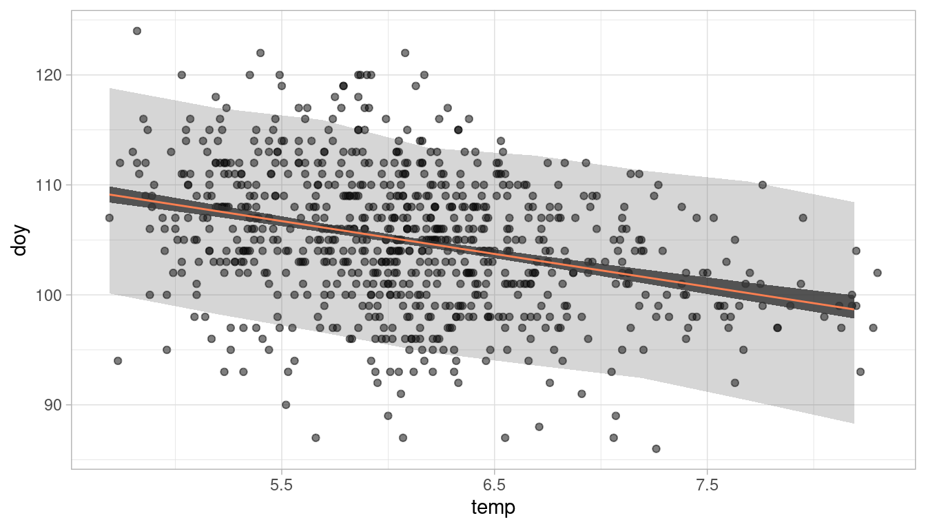
We can see the (coloured) negative trend line. The darker shaded interval around it shows the 89% plausible regions for the distribution of the mean doy. The lighter and broader interval shows the region within which the model expects to find 89% of actual height in the population. So to answer the question: Temperature is clearly associated with the blossom trend, but the scatter of the predictions is quite large. Temperature does a mediocre job in predicting the doy.
5.6 Question 4H6
Simulate the prior predictive distribution for the cherry blossom spline in the chapter. Adjust the prior on the weights and observe what happens. What do you think the prior on the weight is doing?
I had quite a hard time to wrap my head around this question. I think that we are supposed to simulate the prior predictive distribution for doy (Day in year), wich is the outcome variable of the linear model. This was quite easy in previous examples, as we just had to sample from each prior distribution and combine the results. In this case, however, we have to implement the basis functions.
But let’s first load the data again.
data("cherry_blossoms")

cherry_blossoms <- cherry_blossoms %>%
  as_tibble() %>%
  select(doy, year) %>%
  drop_na(doy)
Now let’s recreate the knots and the basis functions for the spline:
# number of knots
nr_knots <- 15

knot_list <- cherry_blossoms$year %>%
  quantile(probs = seq(0, 1, length.out = nr_knots))

# construct basis functions
B <- cherry_blossoms$year %>%
  bs(knots = knot_list, degree = 3, intercept = TRUE)
And here the hard part begins. The linear model is given on page 117:
mu <- a + B %*% w.
We have to multiply each element of w by each value in the corresponding row of B and then sum each result, and add it to a.
Now let’s first calculate the prior predictive distribution with the prior used in the chapter. For this, we sample from the priors and calculate the trend line using the linear model equation. Note that we use the basis functions calculated above (B).
Let’s first do it once by sampling a and w and then calculating mu:
N <- ncol(B)

a <- rnorm(N, 100, 10)
w <- rnorm(N, 0, 10)

mu <- purrr::map(1:nrow(B), ~ a + sum(B[.x, ]*w))
mu is a list with 827 elements (one for each year observation in the data), and each element contains 19 estimates for mu (one for each knot/ basis function). We can get the mean estimate for each knot by applying the mean function to each element in mu:
mu <- map_dbl(mu, mean)Now mu is a vector with length 827, giving us the mean estimate for one spline trend line:
cherry_blossoms %>%
  ggplot() +
  geom_point(aes(year, doy), colour = "steelblue2", alpha = 0.7) +
  geom_path(aes(year, value),
            data = mu %>% as_tibble() %>%
              add_column(year = cherry_blossoms$year),
            colour = "coral", size = 1.3) +
  labs(x = "Day in year") +
  theme_minimal()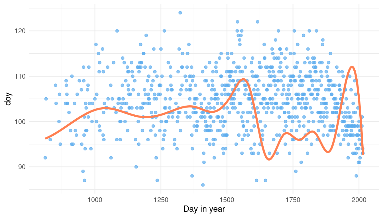
This is just one guess of the model for mean doy without seeing any data. But for a proper prior predictive simulation, we want to see many guesses of the model to get the overall distribution. For this, we need to write our sampling into a function with i as an argument. i will be later used to replicate the function.
mu_sampler <- function(i){
    a <- rnorm(N, 100, 10)
    w <- rnorm(N, 0, 10)

    mu <- purrr::map(1:nrow(B), ~ a + sum(B[.x, ]*w)) %>%
      map_dbl(mean)
  }
Now we can simulate 1,000 runs using replicate.
mu2 <- replicate(1e3, mu_sampler()) %>%
  as.vector() %>%
  as_tibble()


ggplot(mu2) +
  geom_density(aes(value)) +
  theme_minimal() +
  labs(title = paste0("w ~ dnorm(", 0, ",", 10, ")"),
         x = "Day in year")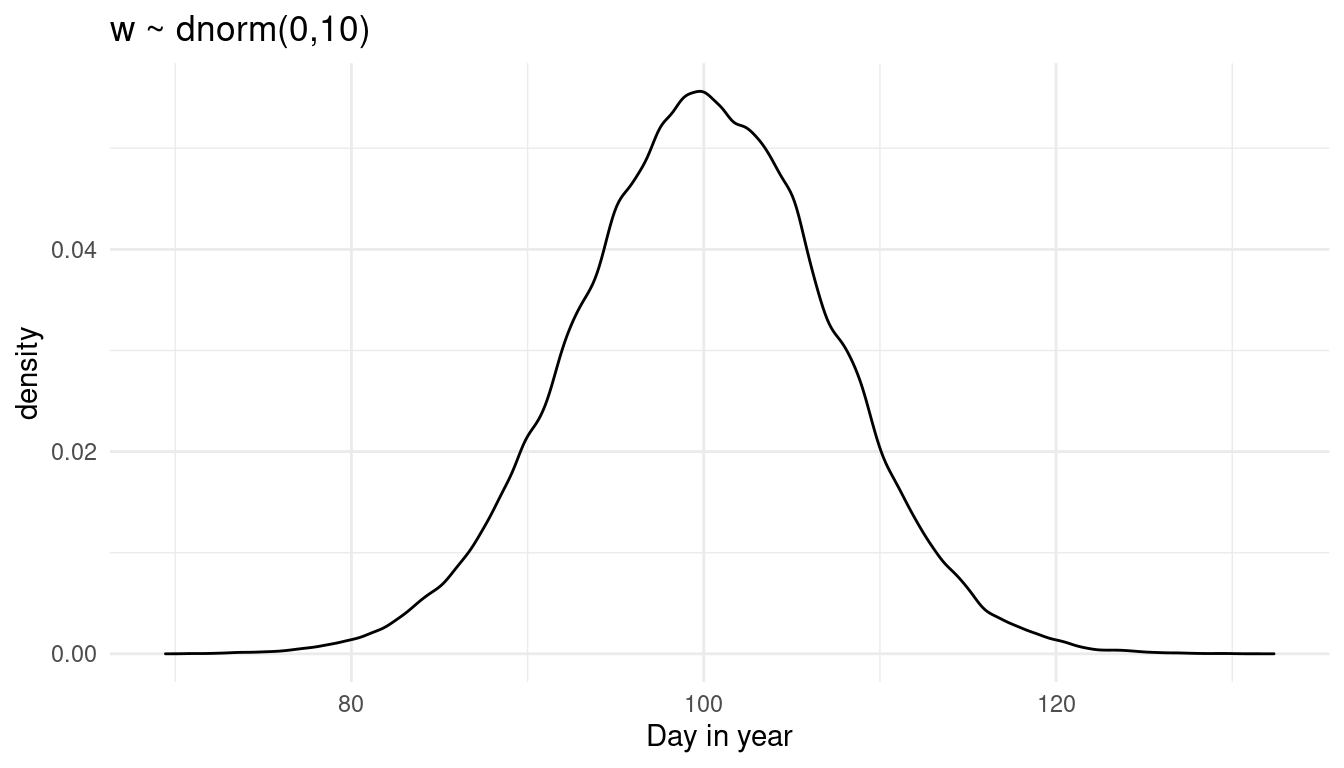
This is the prior predictive distribution for doy with the prior on w used in the chapter. The model predicts doy to be normally distributed around the day 100.
But we are supposed to play around with the prior on w and see the effect on the prior predictive distribution. So let’s make a function from the above code dependent on the prior values:
prior_weight <- function(w_mean, w_sd) {

  mu_sampler <- function(i){
    a <- rnorm(N, 100, 10)
    w <- rnorm(N, w_mean, w_sd)

    mu <- purrr::map(1:nrow(B), ~ a + sum(B[.x, ]*w)) %>%
      map_dbl(mean)
  }

  mu2 <- replicate(1e3, mu_sampler()) %>%
    as.vector() %>%
    as_tibble()


  ggplot(mu2) +
    geom_density(aes(value)) +
    theme_minimal() +
    labs(title = paste0("w ~ dnorm(", w_mean, ",", w_sd, ")"),
         x = "Day in year")
}
Now what happens if we increase the standard deviaton of w?
prior_weight(0, 20)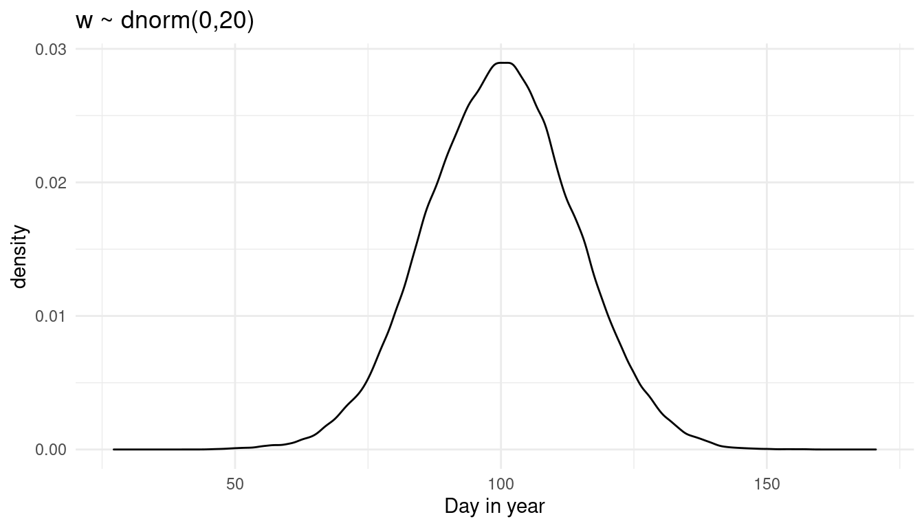
We get more uncertainty for doy. Let’s see what happens if we increase the mean instead:
prior_weight(10, 10)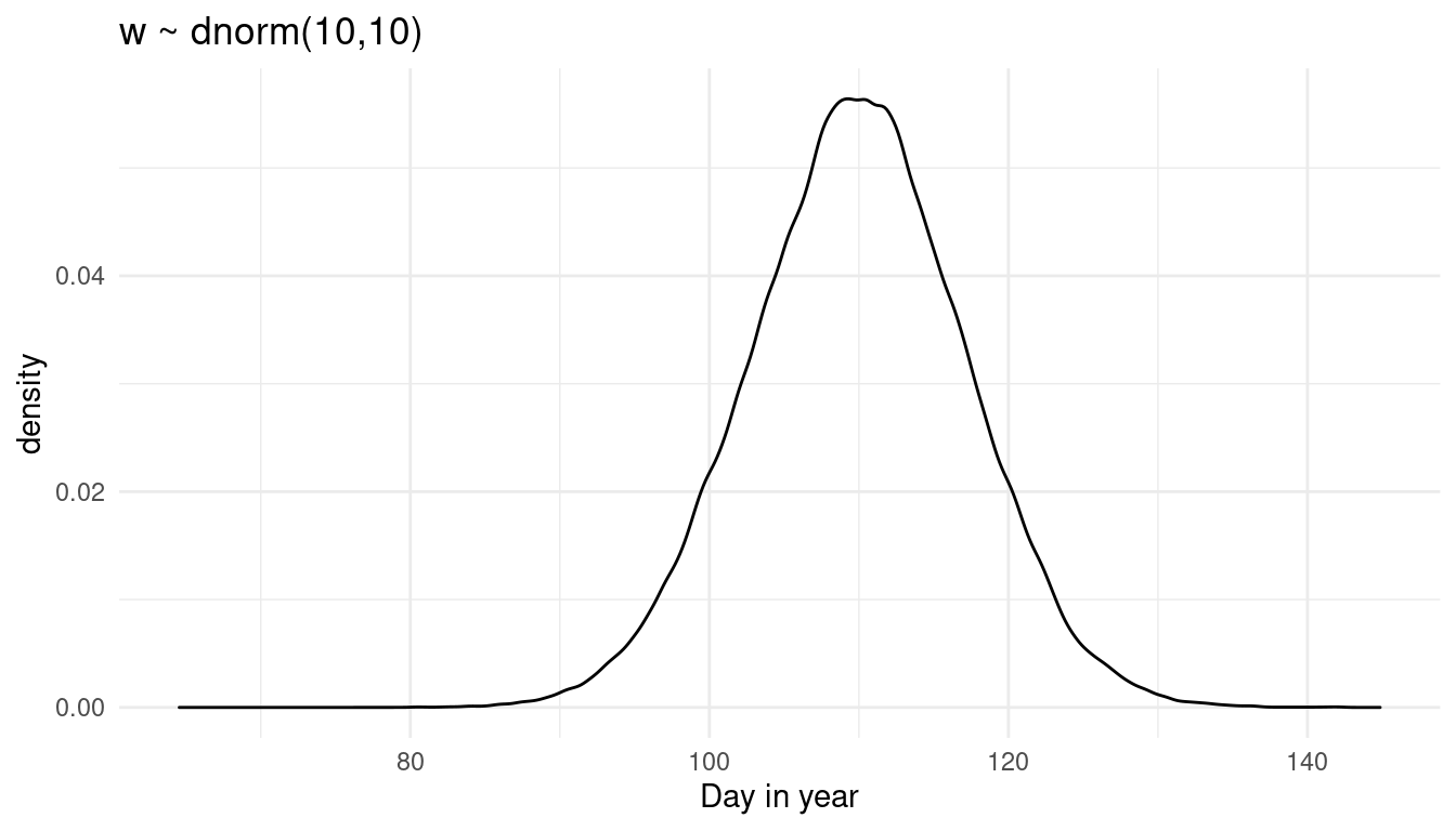
We shift the distribution to the right. So to be honest I am not sure what w is doing precisely, as it is quite hard to read that from the prior predictive distribution where all knots are combined. Instead, let’s try a prior predictive simulation for each knot.
First, set up a function that calculates the mean doyfor each knot based on the priors used in the chapter:
knot_sampler <- function(i){
  a <- rnorm(N, 100, 10)
  w <- rnorm(N, 0, 10)

  mu <- purrr::map(1:nrow(B), ~ a + sum(B[.x, ]*w)) %>%
    map_dbl(mean)
}
Now repeat the sampling for doy for each knot a thousand times:
mu2 <- replicate(1e3, knot_sampler()) %>%
  as_tibble() %>%
  magrittr::set_colnames(1:1e3)
Let’s calculate the mean and the PI for each knot from these thousand samples:
mu2_rep <- mu2 %>%
  add_column(year = cherry_blossoms$year) %>%
  pivot_longer(cols = -year,
               names_to = "trial", values_to = "doy") %>%
  group_by(year) %>%
  summarise(mean_doy = mean(doy),
            lower_val = PI(doy)[1],
            upper_val = PI(doy)[2])
And plot it:
ggplot(data = mu2_rep) +
  geom_point(aes(year, doy),
             colour = "steelblue2", alpha = 0.7,
             data = cherry_blossoms,) +
  geom_ribbon(aes(x = year, ymin = lower_val, ymax = upper_val),
                alpha = 0.3) +
  geom_path(aes(year, mean_doy),
            colour = "coral", size = 1.3) +
  labs(title = paste0("w ~ dnorm(", 0, ",", 10, ")"),
       y = "Day in year") +
  theme_minimal()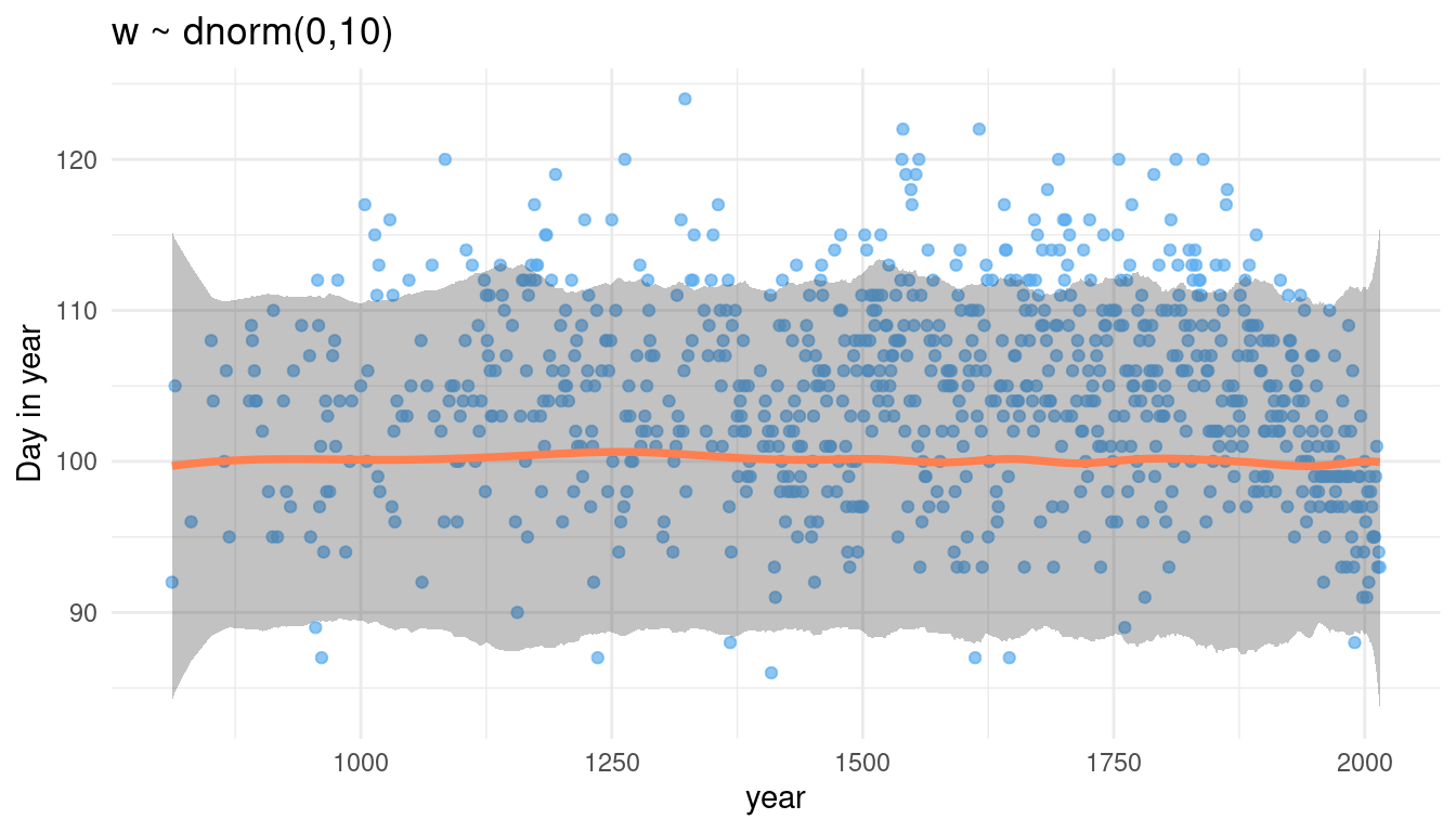
We can see that we assign the same prior distribution for each knot (flat line of the mean and the percentile interval borders), but with some edge effects. Now let’s tinker with w. First, we again make a function dependent on w:
prior_knot <- function(w_mean, w_sd) {
  knot_sampler <- function(i){
  a <- rnorm(N, 100, 10)
  w <- rnorm(N, w_mean, w_sd)

  mu <- purrr::map(1:nrow(B), ~ a + sum(B[.x, ]*w)) %>%
    map_dbl(mean)
  }

  mu2 <- replicate(1e3, knot_sampler()) %>%
    as_tibble() %>%
    magrittr::set_colnames(1:1e3)

  mu2_rep <- mu2 %>%
    add_column(year = cherry_blossoms$year) %>%
    pivot_longer(cols = -year,
               names_to = "trial", values_to = "doy") %>%
    group_by(year) %>%
    summarise(mean_doy = mean(doy),
            lower_val = PI(doy)[1],
            upper_val = PI(doy)[2])

  ggplot(data = mu2_rep) +
    geom_point(aes(year, doy),
             colour = "steelblue2", alpha = 0.7,
             data = cherry_blossoms,) +
    geom_ribbon(aes(x = year, ymin = lower_val, ymax = upper_val),
                alpha = 0.3) +
    geom_path(aes(year, mean_doy),
            colour = "coral", size = 1.3) +
    labs(title = paste0("w ~ dnorm(", w_mean, ",", w_sd, ")"),
       y = "Day in year") +
    theme_minimal()
}
And now let’s increase the standard deviation:
prior_knot(0, 20)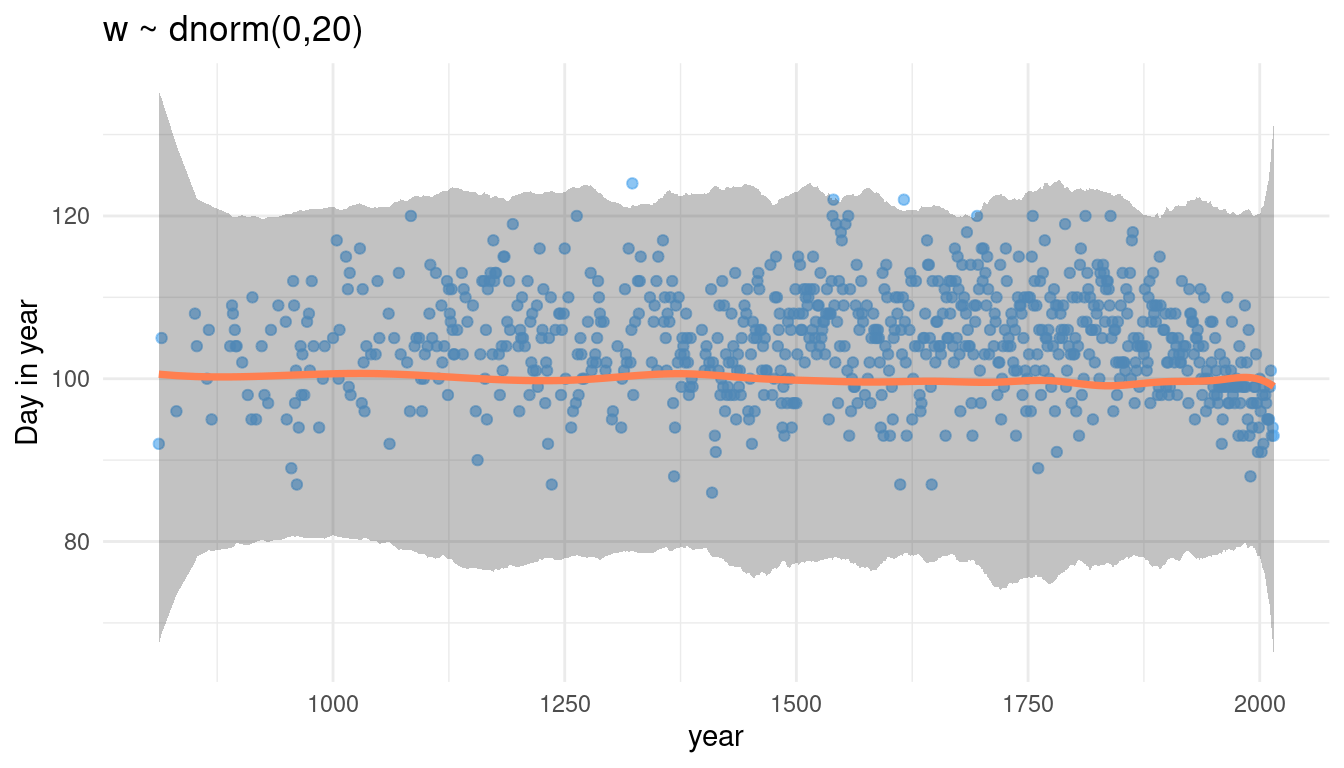
Increasing the sd for w increases the spread of the percentile interval, while the mean stays the same. What happens when we increase the mean of w?
prior_knot(10, 10)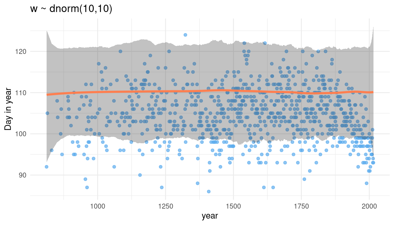
Now we increase the overall estimate for doy. It seems that w acts on each knot equally. It further seems to drive the overall estimate for doy.
5.7 Question 4H7
The cherry blossom spline in the chapter used an intercept a, but technically it doesn’t require one. The first basis function could substitute for the intercept. Try refitting the cherry blossom spline without the intercept. What else about the model do you need to change to make this work?
Let’s just try it without an intercept:
no_int <- alist(
    D ~ dnorm(mu, sigma),
    mu <- B %*% w,
    w ~ dnorm(0, 10),
    sigma ~ dexp(1)) %>%
  quap(
   data = list(D = cherry_blossoms$doy, B = B),
   start = list(w = rep(0, ncol(B))))
Let’s see what the model says by sampling from the posterior distribution.
mu <- link(no_int)

# calculate mean
mu_mean <- mu %>%
  as_tibble() %>%
  purrr::map_dbl(mean) %>%
  enframe(name = "year", value = "mean_doy") %>%
  mutate(year = cherry_blossoms$year)

# calculate 89% posterior interval
mu_pi <- mu %>%
  as_tibble() %>%
  purrr::map(PI) %>%
  enframe(name = "year", value = "PI") %>%
  mutate(lower_val = map_dbl(PI, 1),
         upper_val = map_dbl(PI, 2),
         year = cherry_blossoms$year) %>%
  select(-PI)
We can combine the mean and the pi and plot it:
mu_mean %>%
  left_join(mu_pi) %>%
  ggplot() +
  geom_point(aes(year, doy),
             colour = "steelblue2", alpha = 0.3,
             data = cherry_blossoms) +
  geom_ribbon(aes(x = year, ymin = lower_val, ymax = upper_val),
              alpha = 0.3) +
  geom_path(aes(year, mean_doy),
            colour = "coral", alpha = 0.95, size = 1) +
  labs(title = "Model with no intercept", y = "Day in year") +
  theme_minimal()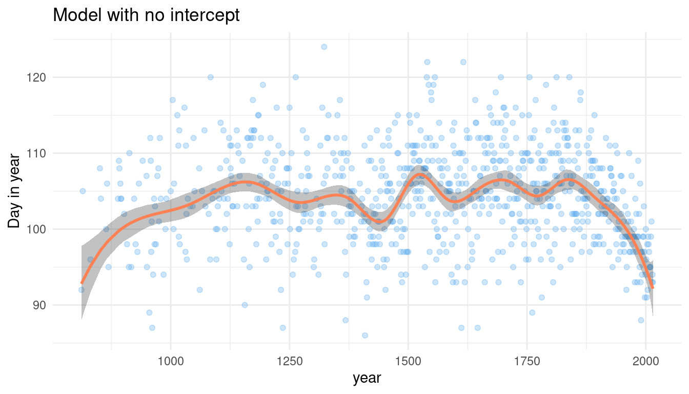
To be honest, that looks pretty convincing to me. And it obviously worked fine, so I will not change anything.
sessionInfo()## R version 4.0.3 (2020-10-10)
## Platform: x86_64-pc-linux-gnu (64-bit)
## Running under: Linux Mint 20.1
##
## Matrix products: default
## BLAS: /usr/lib/x86_64-linux-gnu/blas/libblas.so.3.9.0
## LAPACK: /usr/lib/x86_64-linux-gnu/lapack/liblapack.so.3.9.0
##
## locale:
## [1] LC_CTYPE=de_DE.UTF-8 LC_NUMERIC=C
## [3] LC_TIME=de_DE.UTF-8 LC_COLLATE=de_DE.UTF-8
## [5] LC_MONETARY=de_DE.UTF-8 LC_MESSAGES=de_DE.UTF-8
## [7] LC_PAPER=de_DE.UTF-8 LC_NAME=C
## [9] LC_ADDRESS=C LC_TELEPHONE=C
## [11] LC_MEASUREMENT=de_DE.UTF-8 LC_IDENTIFICATION=C
##
## attached base packages:
## [1] splines parallel stats graphics grDevices utils datasets
## [8] methods base
##
## other attached packages:
## [1] rethinking_2.13 rstan_2.21.2 StanHeaders_2.21.0-7
## [4] forcats_0.5.0 stringr_1.4.0 dplyr_1.0.3
## [7] purrr_0.3.4 readr_1.4.0 tidyr_1.1.2
## [10] tibble_3.0.5 ggplot2_3.3.3 tidyverse_1.3.0
##
## loaded via a namespace (and not attached):
## [1] httr_1.4.2 jsonlite_1.7.2 modelr_0.1.8 RcppParallel_5.0.2
## [5] assertthat_0.2.1 highr_0.8 stats4_4.0.3 cellranger_1.1.0
## [9] yaml_2.2.1 pillar_1.4.7 backports_1.2.1 lattice_0.20-41
## [13] glue_1.4.2 digest_0.6.27 rvest_0.3.6 colorspace_2.0-0
## [17] htmltools_0.5.1.1 pkgconfig_2.0.3 broom_0.7.3 haven_2.3.1
## [21] bookdown_0.21 mvtnorm_1.1-1 scales_1.1.1 processx_3.4.5
## [25] farver_2.0.3 generics_0.1.0 ellipsis_0.3.1 withr_2.4.1
## [29] cli_2.2.0 magrittr_2.0.1 crayon_1.3.4 readxl_1.3.1
## [33] evaluate_0.14 ps_1.5.0 fs_1.5.0 fansi_0.4.2
## [37] MASS_7.3-53 xml2_1.3.2 pkgbuild_1.2.0 blogdown_1.1
## [41] tools_4.0.3 loo_2.4.1 prettyunits_1.1.1 hms_1.0.0
## [45] lifecycle_0.2.0 matrixStats_0.57.0 V8_3.4.0 munsell_0.5.0
## [49] reprex_1.0.0 callr_3.5.1 compiler_4.0.3 rlang_0.4.10
## [53] grid_4.0.3 rstudioapi_0.13 labeling_0.4.2 rmarkdown_2.6
## [57] gtable_0.3.0 codetools_0.2-18 inline_0.3.17 DBI_1.1.1
## [61] curl_4.3 R6_2.5.0 gridExtra_2.3 lubridate_1.7.9.2
## [65] knitr_1.30 utf8_1.1.4 shape_1.4.5 stringi_1.5.3
## [69] Rcpp_1.0.6 vctrs_0.3.6 dbplyr_2.0.0 tidyselect_1.1.0
## [73] xfun_0.20 coda_0.19-4