1 Introduction
This is the fourth part of a series where I work through the practice questions of the second edition of Richard McElreaths Statistical Rethinking. Each post covers a new chapter and you can see the posts on previous chapters here.
The third part of the series will cover chapter 5, which corresponds to the first part of week 3 of the lectures and homework (which you can find here). The homework of week 3 will be covered in the next part about chapter 6.
From now on, I will set a given colour scheme for each chapter. This is mostly for me to see which colours play nice together, but additionally will make the appearance of the blog posts more consistent.
The colours for this blog post are:
red <- "#B74F35"
yellow <- "#FFB81C"
blue <- "#0E345E"
lightblue <- "#85ACA9"
(#fig:colours plot)Colour scheme used throughout each plot for this chapter.
I have joined a Bayes study group established and managed by the brilliant Erik Kusch. Erik has given us access to an online version of the second edition of Statistical Rethinking and I have noticed that some exercises in this online version differ from the print version. I have indicated from which version a particular exercise is from where relevant, but will work through both versions if feasible.
2 Easy practices
2.1 Question 5E1
Which of the linear models below are multiple linear regressions?
- \(\mu_i = \alpha + \beta_xi\)
- \(\mu_i = \beta_x x_i + \beta_z z_i\)
- \(\mu_i = \alpha + \beta(x_i – z_i)\)
- \(\mu_i = \alpha + \beta_x x_i + \beta_z z_i\)
1. contains only one predictor variable (\(\beta_xi\)) and is therefore a bivariate linear regression.
2. has two predictor variables and is a multiple linear regression without an intercept (\(\alpha\)).
3. the right side can written as \(\alpha + \beta x_i - \beta z_i\) which looks like a weird multiple regression with negatively correlated slopes for each predictor.
4. is a perfectly looking multiple linear regression.
2.2 Question 5E2
Write down a multiple regression to evaluate the claim: Animal diversity is linearly related to latitude, but only after controlling for plant diversity. You just need to write down the model definition.
Let \(\mu_i\) be the mean animal diversity, L latitude, and P plant diversity,
then \(\mu_i = \alpha + \beta_L L_i + \beta_P P_i\).
2.3 Question 5E3
Write down a multiple regression to evaluate the claim: Neither the amount of funding nor size of laboratory is by itself a good predictor of time to PhD degree; but together these variables are both positively associated with time to degree. Write down the model definition and indicate which side of zero each slope parameter should be on.
Let \(\mu_i\) be the time to PhD, F the amount of funding, and S the size of laboratory,
then \(\mu_i = \alpha + \beta_F F_i + \beta_S S_i\),
where both \(beta_F\) & \(beta_S > 0\).
2.4 Question 5E4
Suppose you have a single categorical predictor with 4 levels (unique values), labeled A, B, C, and D. Let Ai be an indicator variable that is 1 where case i is in category A. Also suppose Bi, Ci, and Di for the other categories. Now which of the following linear models are inferentially equivalent ways to include the categorical variable in a regression? Models are inferentially equivalent when it’s possible to compute one posterior distribution from the posterior distribution of another model.
- \(\mu_i = \alpha + \beta_A A_i + \beta_B B_i + \beta_D D_i\)
- \(\mu_i = \alpha + \beta_A A_i + \beta_B B_i + \beta_C C_i + \beta_D D_i\)
- \(\mu_i = \alpha + \beta_B B_i + \beta_C C_i + \beta_D D_i\)
- \(\mu_i = \alpha_A A_i + \alpha_B B_i + \alpha_C C_i + \alpha_D D_i\)
- \(\mu_i = \alpha_A (1 – B_i – C_i – D_i) + \alpha_B B_i + \alpha_C C_i + \alpha_D D_i\)
This question was a bit to complicated for me and I just copied over the answer from Jeffrey Girard:
The first model includes a single intercept (for category C) and slopes for A, B, and D. The second model is non-identifiable because it includes a slope for all possible categories (page 156). The third model includes a single intercept (for category A) and slopes for B, C, and D. The fourth model uses the unique index approach to provide a separate intercept for each category (and no slopes). The fifth model uses the reparameterized approach on pages 154 and 155 to multiply the intercept for category A times 1 when in category A and times 0 otherwise. Models 1, 3, 4, and 5 are inferentially equivalent because they each allow the computation of each other’s posterior distribution (e.g., each category’s intercept and difference from each other category).
3 Medium practices
3.1 Question 5M1
Invent your own example of a spurious correlation. An outcome variable should be correlated with both predictor variables. But when both predictors are entered in the same model, the correlation between the outcome and one of the predictors should mostly vanish (or at least be greatly reduced).
Let’s directly enter each simulation in a data frame. For each variable, we sample 100 values from a normal distribution. The outcome variable is only related to the first predictor, but the second predictor is as well dependent on the first predictor. To make the selections of priors easier, I transform each variable into z-scores using the scale().
N <- 100
dfr <- tibble(pred_1 = rnorm(N),
       pred_2 = rnorm(N, -pred_1),
       out_var = rnorm(N, pred_1)) %>%
  mutate(across(everything(), scale))
Now let’s see how the outcome is related to the first predictor within a linear regression using quadratic approximation:
Notice that I used priors that are not flat but instead are within a realistic realm. \(\alpha\) must be pretty close to 0 when we standardise the outcome and the predictor. The prior on the slope \(\beta\) is a bit more wider but still only captures realistic relationships as seen in prior predictive simulations throughout the chapter.
m1 <- alist(out_var ~ dnorm(mu, sigma),
      mu <- a + B1*pred_1,
      a ~ dnorm(0, 0.2),
      B1 ~ dnorm(0, 0.5),
      sigma ~ dexp(1)) %>%
  quap(., data = dfr) %>%
  precis() %>%
  as_tibble(rownames = "estimate")
Let’s do the same for the second predictor and the outcome, using similar priors. This is the predictor which is not causally related to the outcome, but still shows a correlation.
m2 <- alist(out_var ~ dnorm(mu, sigma),
            mu <- a + B2*pred_2,
            a ~ dnorm(0, 0.2),
            B2 ~ dnorm(0, 0.5),
            sigma ~ dexp(1)) %>%
  quap(., data = dfr) %>%
  precis() %>%
  as_tibble(rownames = "estimate")
And finally putting both predictors in a multiple linear regression, which should showcase the true relationships.
m3 <- alist(out_var ~ dnorm(mu, sigma),
            mu <- a + B1*pred_1 + B2*pred_2,
            a ~ dnorm(0, 0.2),
            B1 ~ dnorm(0, 0.5),
            B2 ~ dnorm(0, 0.5),
            sigma ~ dexp(1)) %>%
  quap(., data = dfr) %>%
  precis() %>%
  as_tibble(rownames = "estimate")
Now we can add the \(\beta\) estimates of each model, which capture the relationship between each predictor and the outcome, to a dataframe and plot it.
full_join(m1, m2) %>%
  full_join(m3) %>%
  add_column(model = rep(paste("Model", 1:3), c(3, 3, 4))) %>%
  filter(estimate %in% c("B1", "B2")) %>%
  mutate(combined = str_c(model, estimate, sep = ": ")) %>%
  rename(lower_pi = '5.5%', upper_pi = '94.5%') %>%
  ggplot() +
  geom_vline(xintercept = 0, colour = "grey20", alpha = 0.5,
             linetype = "dashed") +
  geom_pointrange(aes(x = mean, xmin = lower_pi, xmax = upper_pi,
                      combined, colour = estimate), size = 0.9,
                  show.legend = FALSE) +
  scale_color_manual(values = c(red, blue)) +
  labs(y = NULL, x = "Estimate") +
  theme_classic()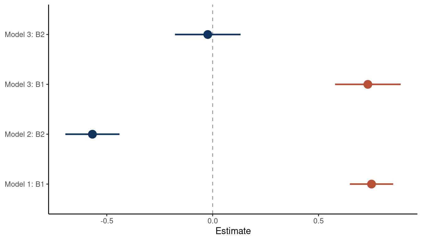
(#fig:5M1 part 5)Coeffficient plot for the bivariate models 1 and 2 and the multiple regression model 3
We can see that the bivariate regressions falsely estimate that the second predictor is related to the outcome. But in a multiple regression framework, we get the right answer: There is no new information included in the second predictor, once we know about the first predictor.
We can make a directed acyclic graph (DAG) using the ggdad package for this.
tibble(name = c("Outcome", "Predictor1", "Predictor2"),
       x    = c(1, 0, 2),
       y    = c(0, 1, 1)) %>%
  dagify(Outcome ~ Predictor1,
         Predictor2 ~ Predictor1,
         coords = .) %>%
  ggplot(aes(x = x, y = y, xend = xend, yend = yend)) +
  geom_dag_node(color = red, alpha = 0.5) +
  geom_dag_text(aes(label = abbreviate(name)), color = blue) +
  geom_dag_edges(edge_color = blue) +
  theme_void()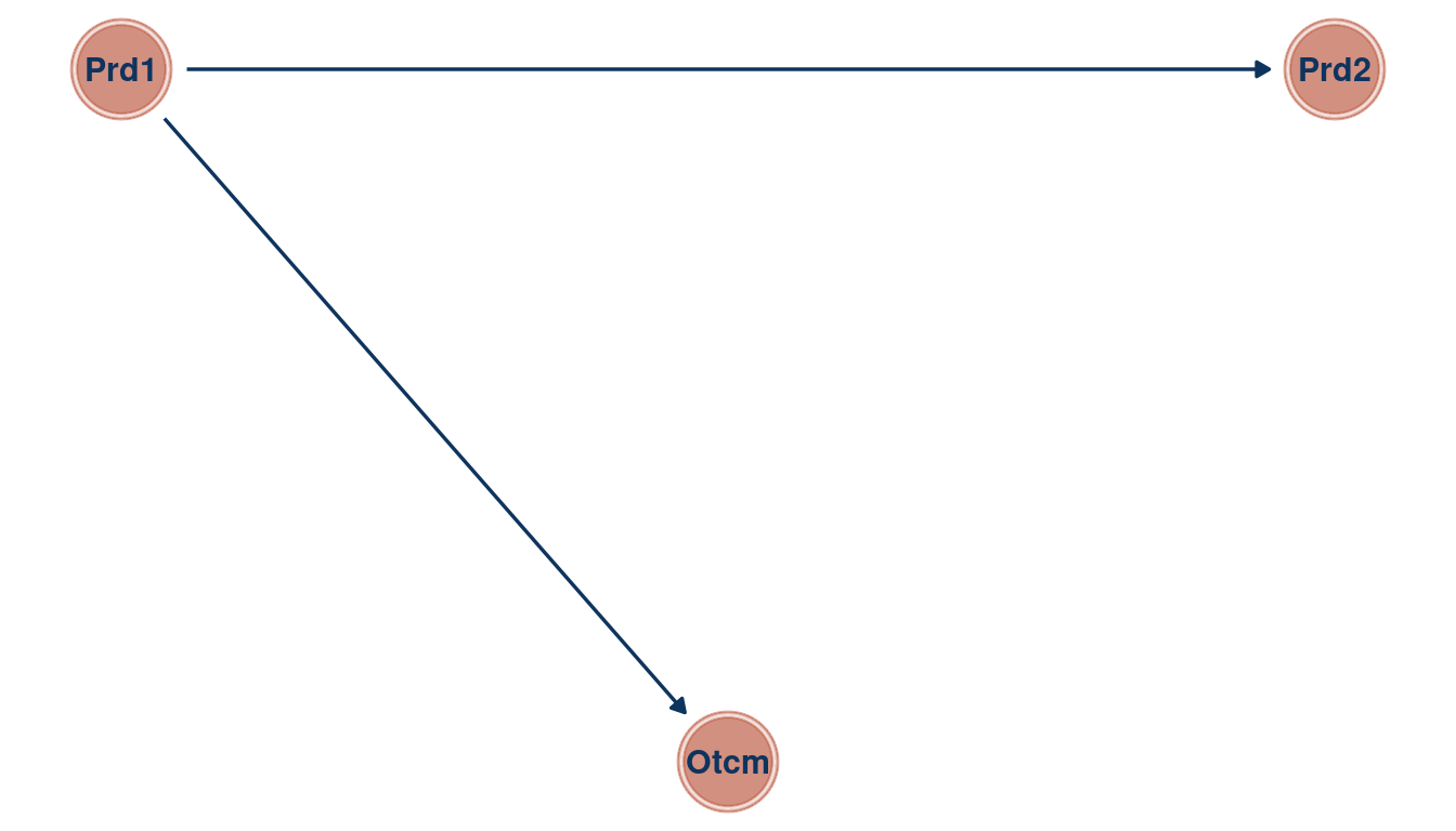
(#fig:5M1 part 6)Directed acyclic graph for Question 5M1
3.2 Question 5M2
Invent your own example of a masked relationship. An outcome variable should be correlated with both predictor variables, but in opposite directions. And the two predictor variables should be correlated with one another.
We can use the same steps as in 5M1:
First we simulate the data. We create the first predictor from a normal distribution and let the second predictor be correlated to the first one by sampling from the means of pred_1. The outcome is then simulated whit a positive correlation to pred_1 and negatively correlated to pred_2.
N <- 100
dfr <- tibble(pred_1 = rnorm(N, sd = 3),
              pred_2 = rnorm(N, pred_1, sd = 0.5),
              out_var = rnorm(N, pred_1 - pred_2)) %>%
  mutate(across(everything(), scale))
Now we approximate two bivariate and one multiple regression from the data. The model estimates are then tidied.
# bivariate regression of predictor 1 on the outcome
m1 <- alist(out_var ~ dnorm(mu, sigma),
            mu <- a + B1*pred_1,
            a ~ dnorm(0, 0.2),
            B1 ~ dnorm(0, 0.5),
            sigma ~ dexp(1)) %>%
  quap(., data = dfr) %>%
  precis() %>%
  as_tibble(rownames = "estimate")


# bivariate regression of predictor 2 on the outcome
m2 <- alist(out_var ~ dnorm(mu, sigma),
            mu <- a + B2*pred_2,
            a ~ dnorm(0, 0.2),
            B2 ~ dnorm(0, 0.5),
            sigma ~ dexp(1)) %>%
  quap(., data = dfr) %>%
  precis() %>%
  as_tibble(rownames = "estimate")


# multiple linear regression of predictor 1 and predictor 2 on the outcome
m3 <- alist(out_var ~ dnorm(mu, sigma),
            mu <- a + B1*pred_1 + B2*pred_2,
            a ~ dnorm(0, 0.2),
            B1 ~ dnorm(0, 0.5),
            B2 ~ dnorm(0, 0.5),
            sigma ~ dexp(1)) %>%
  quap(., data = dfr) %>%
  precis() %>%
  as_tibble(rownames = "estimate")
Now we combine all estimates from the model in a data frame, wrangle and plot it.
full_join(m1, m2) %>%
  full_join(m3) %>%
  add_column(model = rep(paste("Model", 1:3), c(3, 3, 4))) %>%
  filter(estimate %in% c("B1", "B2")) %>%
  mutate(combined = str_c(model, estimate, sep = ": ")) %>%
  rename(lower_pi = '5.5%', upper_pi = '94.5%') %>%
  ggplot() +
  geom_pointrange(aes(x = mean, xmin = lower_pi, xmax = upper_pi,
                      combined, colour = estimate), size = 1,
                  show.legend = FALSE) +
  geom_vline(xintercept = 0, colour = "grey20",
             linetype = "dashed", alpha = 0.5) +
  scale_color_manual(values = c(red, blue)) +
  labs(y = NULL, x = "Estimate") +
  theme_classic()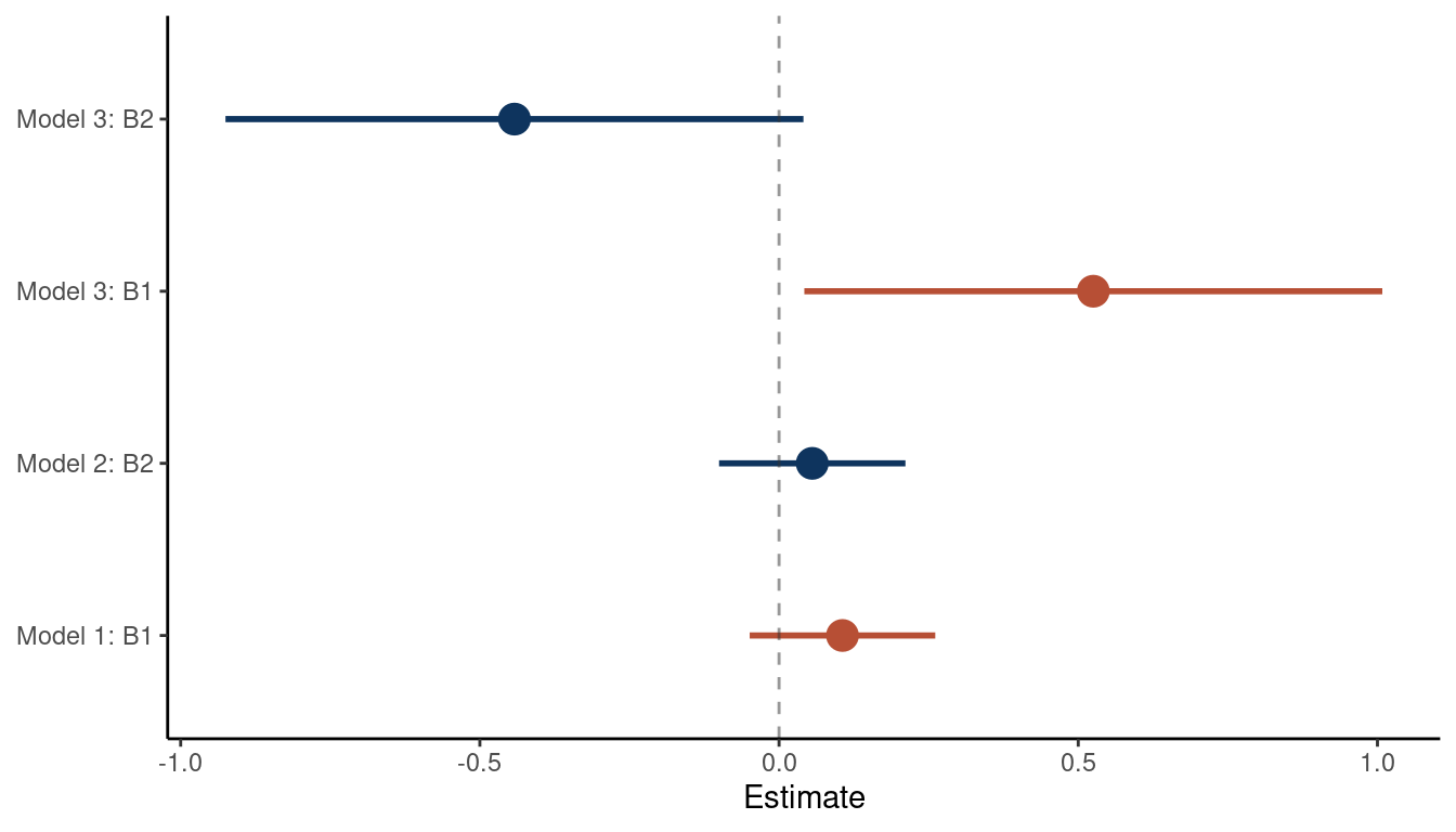
(#fig:5M2 part 3)Coefficient plot for the bivariate models 1 and 2 and the multiple regression model 3
We can see that the relationship between the outcome and each predictor is masked in a bivariate regression, but emerges in a multiple regression. As the first and the second predictor are correlated, they probably share a cause that is unobserved. Let’s build a DAG for this as well.
tibble(name = c("Outcome", "Pred1", "Pred2", "Unobserved"),
       x    = c(1, 0, 2, 1),
       y    = c(0, 1, 1, 1.5)) %>%
  dagify(Outcome ~ Pred1 + Pred2,
         Pred1 ~ Unobserved,
         Pred2 ~ Unobserved,
         coords = .) %>%
  ggplot(aes(x = x, y = y, xend = xend, yend = yend)) +
  geom_dag_node(color = red, alpha = 0.5) +
  geom_dag_text(color = blue) +
  geom_dag_edges(edge_color = blue) +
  theme_void()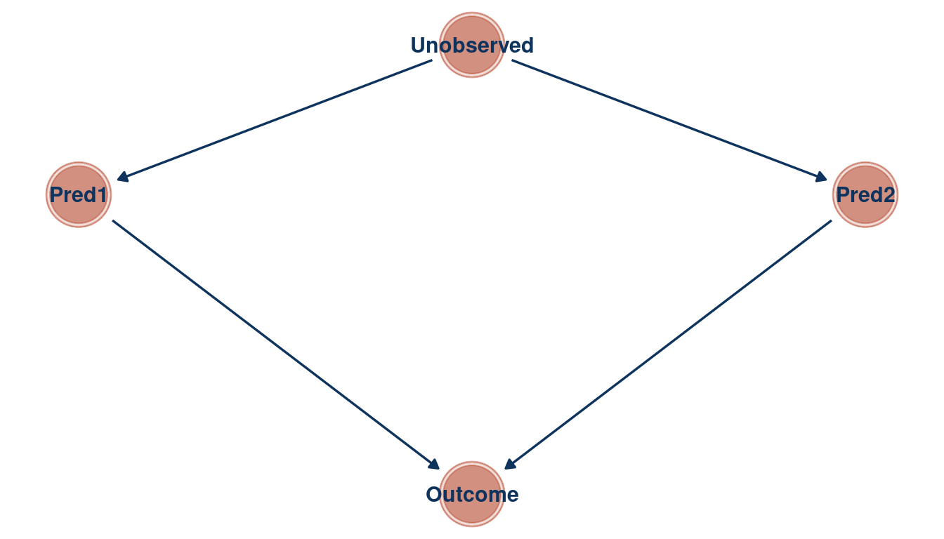
(#fig:5M2 part 4)Directed acyclic graph for question 5M2
3.3 Question 5M3
It is sometimes observed that the best predictor of fire risk is the presence of firefighters—States and localities with many firefighters also have more fires. Presumably firefighters do not cause fires. Nevertheless, this is not a spurious correlation. Instead fires cause firefighters. Consider the same reversal of causal inference in the context of the divorce and marriage data. How might a high divorce rate cause a higher marriage rate? Can you think of a way to evaluate this relationship, using multiple regression?
After a divorce, there are two new individuals on the “wedding market”. Divorce rate D could hence be related to marriage rate M by increasing the pool of potential individuals one can marry. This could be tested by tracking each individual after a divorce to see whether they get re-married again. This re-marriage rate R could then be used in a multiple linear regression framework, where marriage rate is the outcome, and divorce rate and re-marriage rate are the predictors. If divorce rate was related to marriage rate in a bivariate regression framework, but not when adding re-marriage rate in a multiple regression, then re-marriage is the driving force for the spurious correlation between divorce and marriage rate.
tibble(name = c("M", "D", "R"),
       x    = c(1, 0, 2),
       y    = c(0, 1, 1)) %>%
  dagify(M ~ R,
         R ~ D,
         coords = .) %>%
  ggplot(aes(x = x, y = y, xend = xend, yend = yend)) +
  geom_dag_node(color = red, alpha = 0.5) +
  geom_dag_text(color = blue) +
  geom_dag_edges(edge_color = blue) +
  theme_void()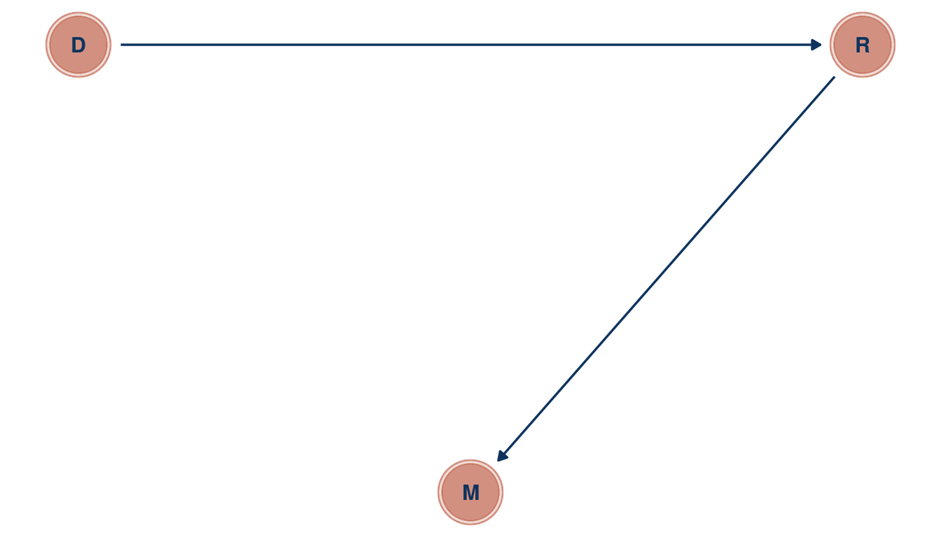
(#fig:5M3 part 1)Directed acyclic graph for question 5M3
3.4 Question 5M4
In the divorce data, States with high numbers of Mormons (members of The Church of Jesus Christ of Latter-day Saints, LDS) have much lower divorce rates than the regression models expected. Find a list of LDS population by State and use those numbers as a predictor variable, predicting divorce rate using marriage rate, median age at marriage, and percent LDS population (possibly standardized). You may want to consider transformations of the raw percent LDS variable.
First, let’s load the divorce data, assign better names and standardise each parameter.
data("WaffleDivorce")

d_waffle <- WaffleDivorce %>%
  as_tibble() %>%
  select(marriage = Marriage, age_marriage = MedianAgeMarriage,
         divorce = Divorce, location = Location)
After a quick google search, I found a downloadable csv data from worldpoulationreview. I have downloaded it and added the file to my github repo, from which you can directly assess the data without leaving the r-studio environment.
mormons <- read_csv(
  file = "https://raw.githubusercontent.com/Ischi94/statistical-rethinking/master/mormons.csv") %>%
  mutate(lds = mormonPop/Pop) %>%
  select(location = State, lds)
As we have the ‘location’ column in both data frames, we can use it as an ID for joining both into one table.
mormons %>%
  full_join(d_waffle) %>%
  drop_na() %>%
  ggplot() +
  geom_density(aes(lds)) +
  theme_minimal()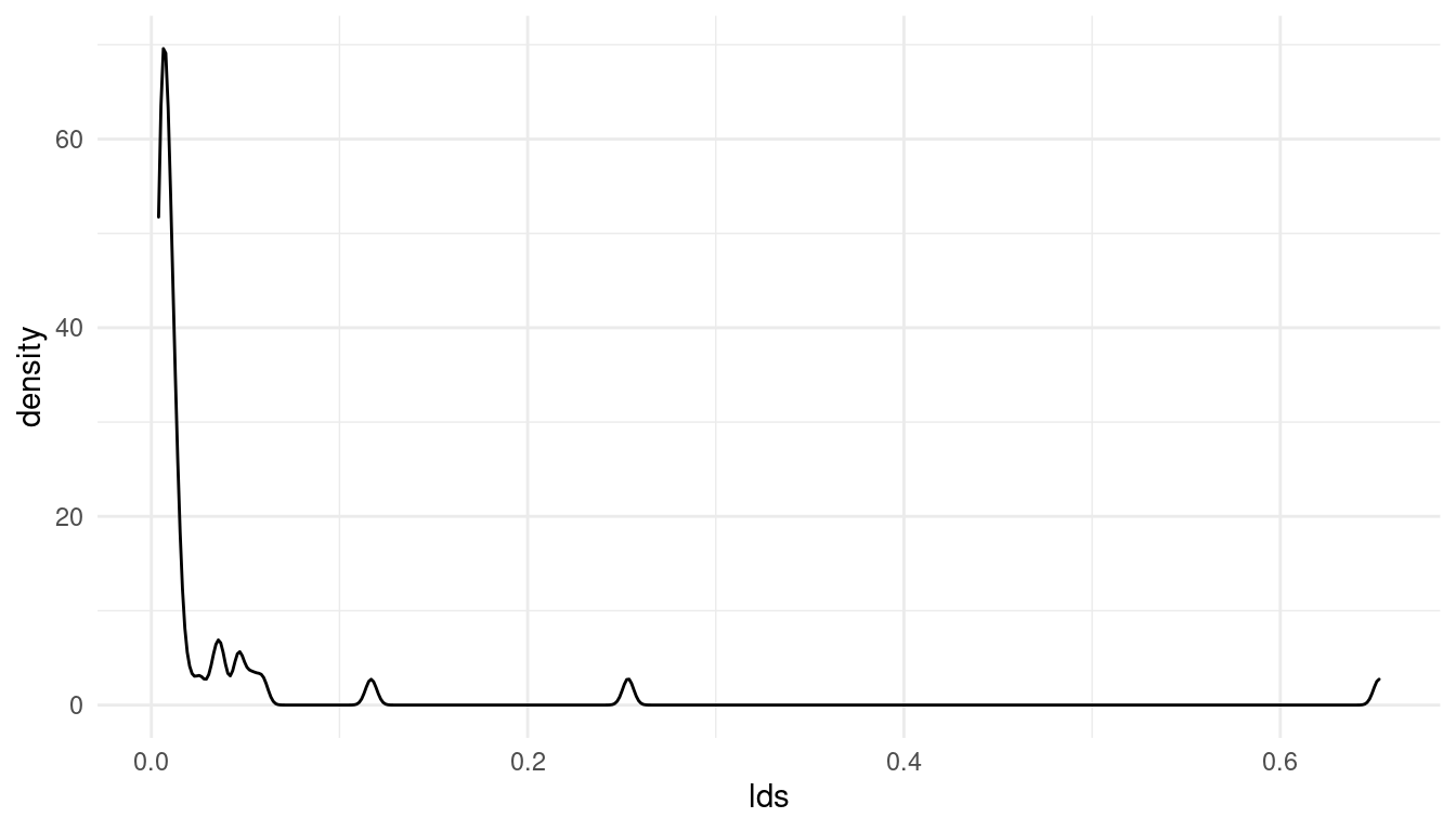
(#fig:5M4 part 3)Distribution of the added parameter percentage mormons per state (lds)
Note that I have removed all NAs. The resulting distribution for the lds (% mormons per state) is totally skewed. Let’s see if a log-transformation can deal with this skew:
mormons %>%
  full_join(d_waffle) %>%
  drop_na() %>%
  mutate(log_lds = log(lds)) %>%
  ggplot() +
  geom_density(aes(log_lds)) +
  theme_minimal()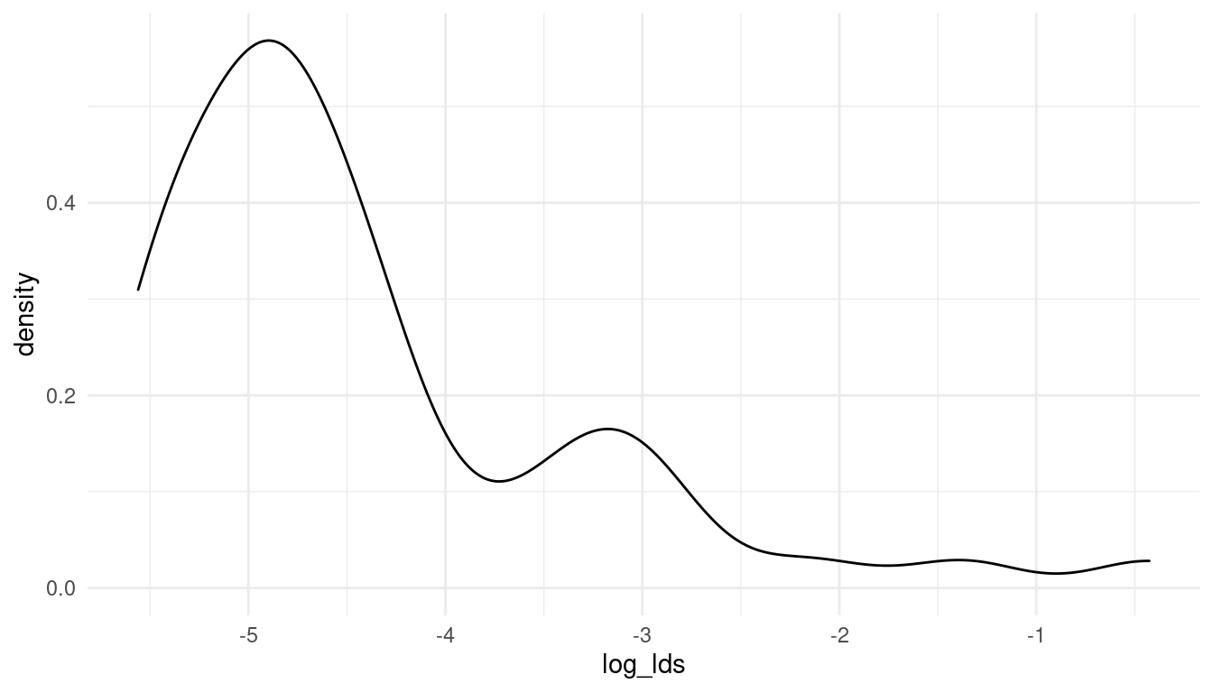
(#fig:5M4 part 4)The log-distribution of the added parameter percentage mormons per state (log_lds)
Now that looks much better. So let’s keep working with the log of lds. We can directly standardise the resulting variable for an easier prior decision.
d_waffle_sd <- mormons %>%
  full_join(d_waffle) %>%
  drop_na() %>%
  mutate(log_lds = log(lds)) %>%
  mutate(across(is.numeric, standardize))
We are ready to build a model and approximate the posterior. This might look complicated but can be broken down into: Defining the model using alist(), approximating the posterior using quap(), getting the mean and spread around the mean for each estimate using precis(), some data wrangling to get in the right plotting format, and finally plotting with ggplot().
m_lds <- alist(divorce ~ dnorm(mu, sigma),
               mu <- a + Ba*age_marriage + Bm*marriage + Bl*log_lds,
               a ~ dnorm(0, 0.2),
               Ba ~ dnorm(0, 0.5),
               Bm ~ dnorm(0, 0.5),
               Bl ~ dnorm(0, 0.5),
               sigma ~ dexp(1)) %>%
  quap(., data = d_waffle_sd)

m_lds %>%
  precis(.) %>%
  as_tibble(rownames = "estimate") %>%
  filter(str_detect(estimate, "^B")) %>%
  rename(lower_pi = '5.5%', upper_pi = '94.5%') %>%
  mutate(estimate = c("Age at marriage", "Marriage rate", "Log Mormons [%]")) %>%
  ggplot() +
  geom_vline(xintercept = 0, linetype = "dashed", alpha = 0.5) +
  geom_pointrange(aes(x = mean, xmin = lower_pi, xmax = upper_pi, estimate,
                      colour = estimate), size = 0.7, show.legend = FALSE) +
  scale_colour_manual(values = c(blue, red, yellow)) +
  labs(x = "Estimate", y = NULL) +
  theme_classic()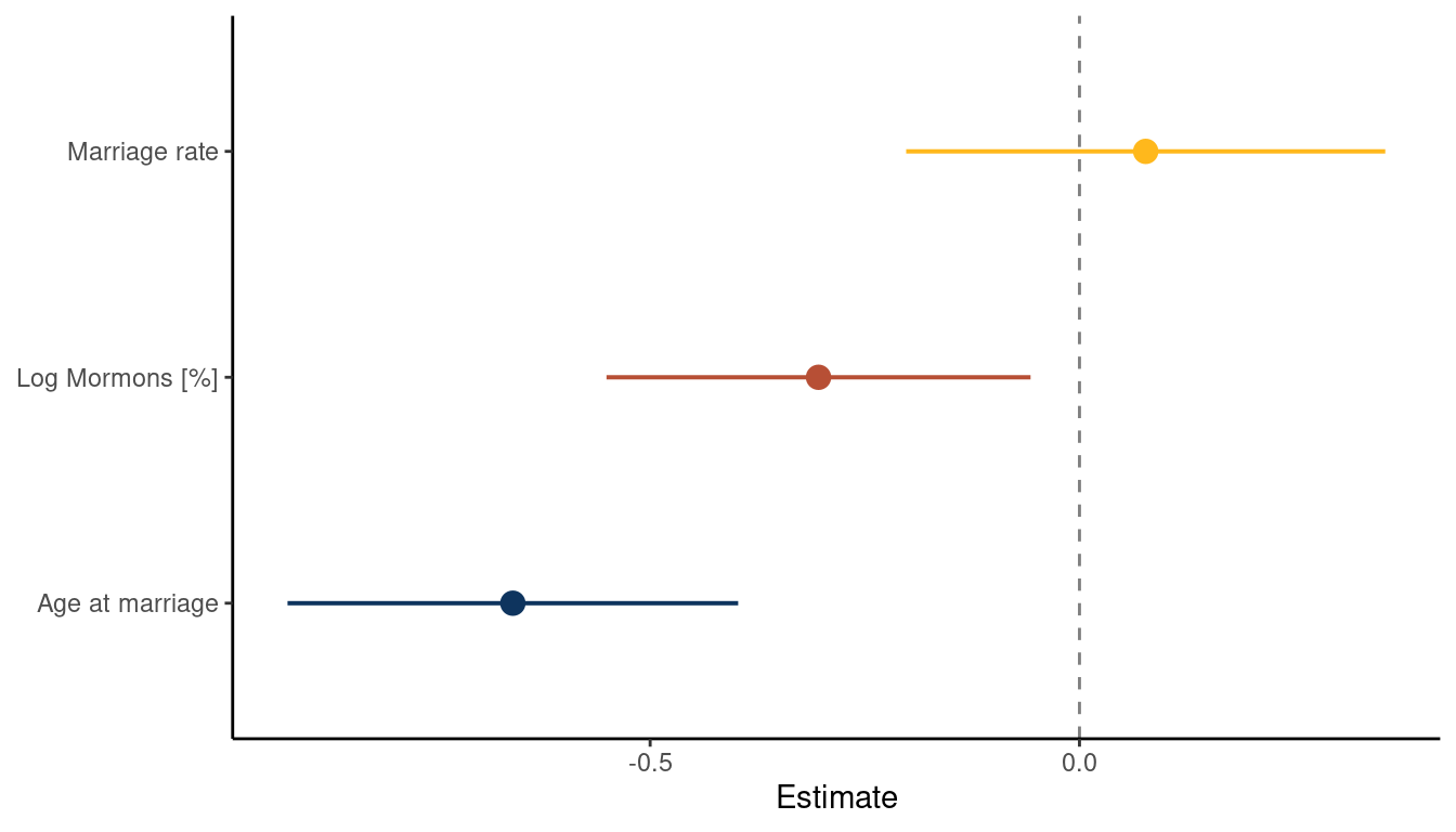
(#fig:5M4 part 6)Coefficient plot for the model Divorce rate ~ Age at Marriage + Marriage rate + log Mormons
What we can see is that the magnitude in percentage of LDS per state is negatively related to divorce rate. There is no longer a consistent trend for marriage rate and age at marriage is still negatively related to divorce rate. This indicates that states were people were getting married at a higher age as well as states with
higher percentages of Mormons have lower divorce rates.
We can additionally check the model fit by using a posterior predictive plot. We simple call link() on the actual data, which simple means sample from the posterior for each divorce value in the data. We then calculate the mean and the percentile interval using some nested tibbles and label those states which are outliers (when the difference between the observed divorce rate and predicted divorce rate is greater than |1|).
link(m_lds) %>%
  as_tibble() %>%
  pivot_longer(cols = everything(), values_to = "pred_divorce") %>%
  group_by(name) %>%
  nest() %>%
  mutate(pred_divorce = map(data, "pred_divorce"),
         mean_pred = map_dbl(pred_divorce, mean),
         pi_pred = map(pred_divorce, PI),
         pi_low = map_dbl(pi_pred, pluck(1)),
         pi_high = map_dbl(pi_pred, pluck(2))) %>%
  ungroup() %>%
  add_column(obs_divorce = d_waffle_sd$divorce,
             location = d_waffle_sd$location) %>%
  select(-c(name, data, pred_divorce, pi_pred)) %>%
  mutate(outlier = obs_divorce - mean_pred,
         outlier = if_else(outlier >= 1 | outlier <= -1, location, NA_character_)) %>%
  ggplot(aes(x = obs_divorce, y = mean_pred)) +
  geom_abline(slope = 1, intercept = 0,
              linetype = "dashed", size = 1.2, colour = yellow) +
  geom_pointrange(aes(ymin = pi_low, ymax = pi_high),
                  colour = blue) +
  geom_label(aes(label = outlier)) +
  labs(x = "Observed Divorce", y = "Predicted Divorce") +
  theme_minimal() +
  theme(panel.grid.minor = element_blank(),
        panel.grid.major = element_line(colour = "grey97"))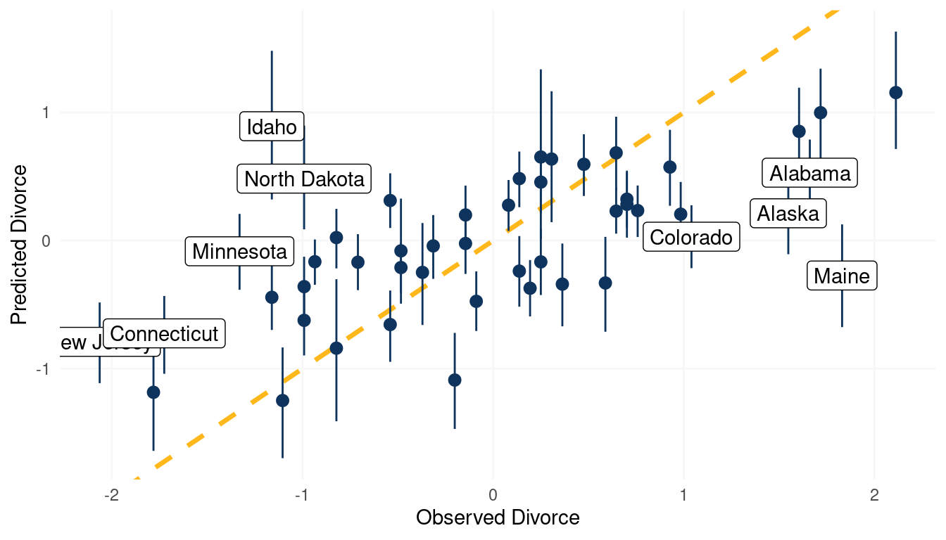
(#fig:5M4 part 7)Posterior predictive plot for the model Divorce rate ~ Age at Marriage + Marriage rate + log Mormons
3.5 Question 5M5
One way to reason through multiple causation hypotheses is to imagine detailed mechanisms through which predictor variables may influence outcomes. For example, it is sometimes argued that the price of gasoline (predictor variable) is positively associated with lower obesity rates (outcome variable). However, there are at least two important mechanisms by which the price of gas could reduce obesity. First, it could lead to less driving and therefore more exercise. Second, it could lead to less driving, which leads to less eating out, which leads to less consumption of huge restaurant meals. Can you outline one or more multiple regressions that address these two mechanisms? Assume you can have any predictor data you need.
One could use a multiple regression framework with three predictors, the first one being price of gasoline. For the second one, we need to track the time spent walking of each individual to measure the effect of driving less. For the third one, we need to track the frequency of meals consumed at restaurants for each individual. a potential model could hence be:
\[\mu_i = \alpha + \beta_g G_i + \beta_w W_i + \beta_f F_i\] where \(\mu\) is the mean obesity rate, G the price of gasoline, W the walking rate (per day), and F the amount of restaurant food.
4 Hard practices online
All three exercises below use the same data, data(foxes) (part of rethinking).The urban fox (Vulpes vulpes) is a successful exploiter of human habitat. Since urban foxes move in packs and defend territories, data on habitat quality and population density is also included. The data frame has five columns:
- group: Number of the social group the individual fox belongs to
- avgfood: The average amount of food available in the territory
- groupsize: The number of foxes in the social group
- area: Size of the territory
- weight: Body weight of the individual fox
4.1 Question 5H1
Fit two bivariate Gaussian regressions, using quap: (1) body weight as a linear function of territory size (area), and (2) body weight as a linear function of groupsize. Plot the results of these regressions, displaying the MAP regression line and the 95% interval of the mean. Is either variable important for predicting fox body weight?
Let’s load the data and standardise all variables despite group, which seems to be a dummy variable.
data("foxes")

foxes_std <- foxes %>%
  mutate(across(-group, standardize))
Let’s fit the first bivariate regression with body_weight ~ area. Similar to previous examples, standardising the variables really helps with selecting priors that cover realistic relationships.
m_1 <- alist(weight ~ dnorm(mu, sigma),
             mu <- a + Ba*area,
             a ~ dnorm(0, 0.2),
             Ba ~ dnorm(0, 0.5),
             sigma ~ dexp(1)) %>%
  quap(., data = foxes_std)
For posterior sampling, I define a sequence of values for which I want results and the number of samples I want to attain. I will use this sequence the sampling throughout many of the subsequent questions.
s <- seq(from = -2, to = 2, length.out = 30)
N <- 1e3
Now we can apply our model to each sequence value with link(), calculate the mean and percentile intervals with the help of purrr::map functions applied to list columns. After a bit of data wrangling, we can directly pipe the data to ggplot().
m_1 %>%
  link(data = list(area = s), n = N) %>%
  as_tibble() %>%
  pivot_longer(cols = everything(), values_to = "pred_weight") %>%
  add_column(area = rep(s, N)) %>%
  group_by(area) %>%
  nest() %>%
  mutate(pred_weight = map(data, "pred_weight"),
         mean_weight = map_dbl(pred_weight, mean),
         pi = map(pred_weight, PI),
         lower_pi = map_dbl(pi, pluck(1)),
         upper_pi = map_dbl(pi, pluck(2))) %>%
  select(area, mean_weight, lower_pi, upper_pi) %>%
  ggplot() +
  geom_ribbon(aes(area, ymin = lower_pi, ymax = upper_pi),
              fill = yellow, alpha = 0.3) +
  geom_line(aes(area, mean_weight),
            size = 1.5, colour = blue) +
  labs(x = "Area (std)", y = "Weight (std)") +
  theme_minimal()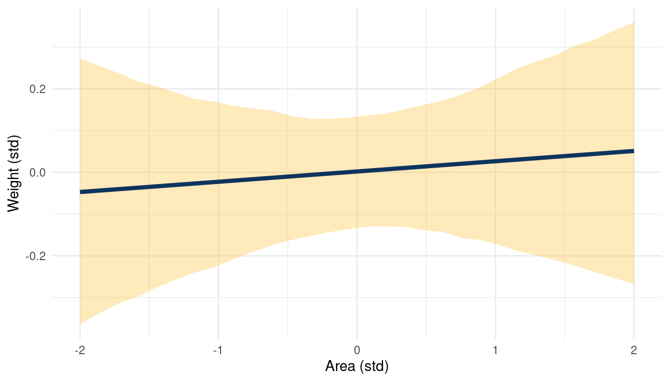
(#fig:5H1 online part 4)Body weight as a linear function of territory size (area) within a bivariate regression framework
And we can repeat the same steps for weight ~ groupsize.
m_2 <- alist(weight ~ dnorm(mu, sigma),
             mu <- a + Bg*groupsize,
             a ~ dnorm(0, 0.2),
             Bg ~ dnorm(0, 0.5),
             sigma ~ dexp(1)) %>%
  quap(., data = foxes_std)


m_2 %>%
  link(data = list(groupsize = s), n = N) %>%
  as_tibble() %>%
  pivot_longer(cols = everything(), values_to = "pred_weight") %>%
  add_column(groupsize = rep(s, N)) %>%
  group_by(groupsize) %>%
  nest() %>%
  mutate(pred_weight = map(data, "pred_weight"),
         mean_weight = map_dbl(pred_weight, mean),
         pi = map(pred_weight, PI),
         lower_pi = map_dbl(pi, pluck(1)),
         upper_pi = map_dbl(pi, pluck(2))) %>%
  select(groupsize, mean_weight, lower_pi, upper_pi) %>%
  ggplot() +
  geom_ribbon(aes(groupsize, ymin = lower_pi, ymax = upper_pi),
              fill = yellow, alpha = 0.3) +
  geom_line(aes(groupsize, mean_weight),
            size = 1.5, colour = blue) +
  labs(x = "Groupsize (std)", y = "Weight (std)") +
  theme_minimal()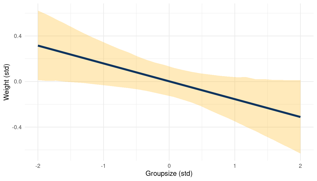
(#fig:5H1 online part 5)Body weight as a linear function of groupsize within a bivariate regression framework
While area shows no consistent trend, groupsize seems to be negatively correlated to weight.
4.2 Question 5H2
Now fit a multiple linear regression with weight as the outcome and both area and groupsize as predictor variables. Plot the predictions of the model for each predictor, holding the other predictor constant at its mean. What does this model say about the importance of each variable? Why do you get different results than you got in the exercise just above?
Here’s the model:
m_3 <- alist(weight ~ dnorm(mu, sigma),
             mu <- a + Ba*area + Bg*groupsize,
             a ~ dnorm(0, 0.2),
             Ba ~ dnorm(0, 0.5),
             Bg ~ dnorm(0, 0.5),
             sigma ~ dexp(1)) %>%
  quap(., data = foxes_std)
One advantage of standardising the predictor variables (using z-scores) is that we know that their mean is approximately zero:
mean(foxes_std$area) %>%
  near(0)
## [1] TRUEThis means that we can keep one predictor at 0 while looking at the relationship of the other predictor to the outcome. We start by looking at weight ~ area while keeping groupsize at 0.
list(area = s, groupsize = 0) %>%
  link(m_3, data = ., n = N) %>%
  as_tibble() %>%
  pivot_longer(cols = everything(), values_to = "pred_weight") %>%
  add_column(area = rep(s, N)) %>%
  group_by(area) %>%
  nest() %>%
  mutate(pred_weight = map(data, "pred_weight"),
         mean_weight = map_dbl(pred_weight, mean),
         pi = map(pred_weight, PI),
         lower_pi = map_dbl(pi, pluck(1)),
         upper_pi = map_dbl(pi, pluck(2))) %>%
  select(area, mean_weight, lower_pi, upper_pi) %>%
  ggplot() +
  geom_ribbon(aes(area, ymin = lower_pi, ymax = upper_pi),
              fill = yellow, alpha = 0.3) +
  geom_line(aes(area, mean_weight),
            size = 1.5, colour = blue) +
  labs(x = "Area (std)",
       y = "Weight (std)") +
  theme_minimal()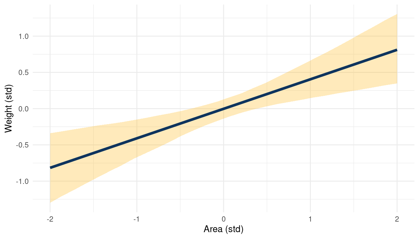
(#fig:5H2 online part 3)The relationship between weight and area in a muliple regression framework while keeping standardised groupsize at 0
The same for weight ~ groupsize while keeping area at 0.
list(groupsize = s, area = 0) %>%
  link(m_3, data = ., n = N) %>%
  as_tibble() %>%
  pivot_longer(cols = everything(), values_to = "pred_weight") %>%
  add_column(groupsize = rep(s, N)) %>%
  group_by(groupsize) %>%
  nest() %>%
  mutate(pred_weight = map(data, "pred_weight"),
         mean_weight = map_dbl(pred_weight, mean),
         pi = map(pred_weight, PI),
         lower_pi = map_dbl(pi, pluck(1)),
         upper_pi = map_dbl(pi, pluck(2))) %>%
  select(groupsize, mean_weight, lower_pi, upper_pi) %>%
  ggplot() +
  geom_ribbon(aes(groupsize, ymin = lower_pi, ymax = upper_pi),
              fill = yellow, alpha = 0.3) +
  geom_line(aes(groupsize, mean_weight),
            size = 1.5, colour = blue) +
  labs(title = "Area (std) = 0", x = "Groupsize (std)",
       y = "Weight (std)") +
  theme_minimal()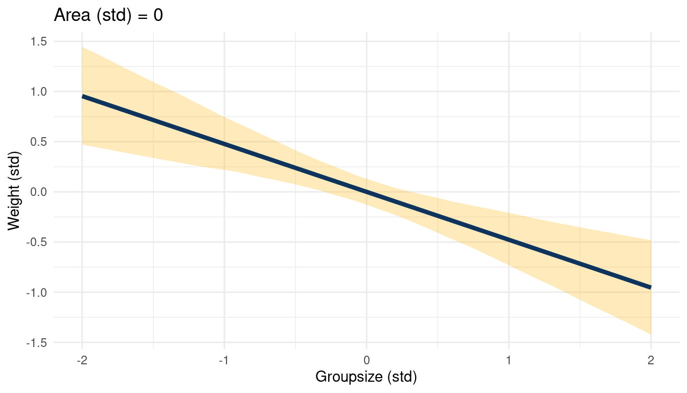
(#fig:5H2 online part 4)The relationship between weight and groupsize in a muliple regression framework while keeping standardised area at 0
This a simple but great example of a masked relationship. Area is positively related to weight, while groupsize is negatively related, canceling each other out. The multiple regression can unmask this, showing the real relationships between the outcome and the predictors.
4.3 Question 5H3
Finally, consider the avgfood variable. Fit two more multiple regressions: (1) body weight as an additive function of avgfood and groupsize, and (2) body weight as an additive function of all three variables,avgfood and groupsize and area. Compare the results of these models to the previous models you’ve fit, in the first two exercises.
Let’s fit the multiple regression of body weight as an additive function of avgfood and groupsize.
m_4 <- alist(weight ~ dnorm(mu, sigma),
             mu <- a + Bf*avgfood + Bg*groupsize,
             a ~ dnorm(0, 0.2),
             Bf ~ dnorm(0, 0.5),
             Bg ~ dnorm(0, 0.5),
             sigma ~ dexp(1)) %>%
  quap(. , data = foxes_std)
Same for body weight as an additive function of all three variables,avgfood and groupsize and area.
m_5 <- alist(weight ~ dnorm(mu, sigma),
             mu <- a + Bf*avgfood + Bg*groupsize + Ba*area,
             a ~ dnorm(0, 0.2),
             Bf ~ dnorm(0, 0.5),
             Bg ~ dnorm(0, 0.5),
             Ba ~ dnorm(0, 0.5),
             sigma ~ dexp(1)) %>%
  quap(. , data = foxes_std)
For convenience, I will define a function tidy_coef() that takes a quap() model as input and returns a tidy tibble with all \(\beta\) estimates of the model.
tidy_coef <- function(model_input) {
  suppressWarnings(

    model_input %>%
      precis(.) %>%
      as_tibble(rownames = "estimate") %>%
      filter(str_detect(estimate, "^b|B" ) )

    )
}
We can use this function to tidy all models at once by putting them in a list and calling the function with the help of purrr:map(). The rest is simple data wrangling to bring it in a tidy plotting format.
list(m_1, m_2, m_3, m_4, m_5) %>%
  map(tidy_coef) %>%
  enframe(name = "model") %>%
  unnest(value) %>%
  mutate(coef_mod = str_c("Model", model, sep = " "),
         coef_mod = str_c(coef_mod, estimate, sep = ": ")) %>%
  rename(lower_pi = '5.5%', upper_pi = '94.5%')  %>%
  ggplot() +
  geom_vline(xintercept = 0, colour = "grey40")  +
  geom_pointrange(aes(x = mean, xmin = lower_pi, xmax = upper_pi, y = coef_mod,
                  colour = estimate)) +
  scale_colour_discrete(name = "Predictor",
                        labels = c("Area", "Food", "Groupsize"),
                        type = c(red, blue, yellow)) +
  scale_y_discrete(labels = c("Model 1", "Model 2", "", "Model 3",
                              "", "Model 4", "", "", "Model 5")) +
  geom_hline(yintercept = c(0.5, 1.5, 2.5, 4.5, 6.5, 9.5),
             linetype = "dotted", colour = "grey80") +
  labs(x = "Estimate", y = NULL) +
  theme_minimal() +
  theme(panel.grid.major.y = element_blank())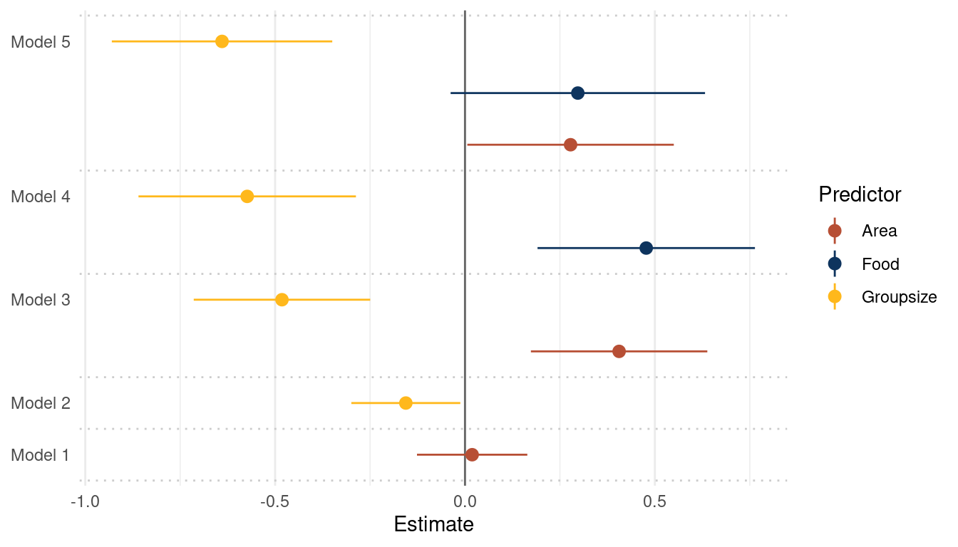
(#fig:5H3 online part 4)Coefficient plot for the bivariate models 1 and 2 and the multiple regressions 3, 4 and 5 with weight as the outcome
avgfood is positively related to weight in a model with avgfood and area as
predictors. This relationship is lost when adding groupsize as a predictor to
the model.
(a) Is avgfood or area a better predictor of bodyweight? If you had to choose one or the other to include in a model, which would it be? Support your assessment with any tables or plots you choose.
Comparing Model 3, 4, and 5 (see plot above) shows that avgfood generally has a higher effect on weight than area, even if the uncertainty is a bit higher. I would therefore choose avgfood.
However, I think that this really depends on the research question and what is already known about fox behaviour. Looking at the coefficient estimates, both are positively related to weight, but effects are reduced when they are in the same model (see b below) Assuming that more area for a fox group increases their access to food, I would use area as it is the direct causal variable. But it could as well be that more food increases the area you can roam as a fox, as you have more power. In this case, I would use food as a predictor.
(b) When both avgfood or area are in the same model, their effects are reduced (closer to zero) and their standard errors are larger than when they are included in separate models. Can you explain this result?
area and avgfood are strongly correlated.
ggplot(foxes_std) +
  geom_point(aes(area, avgfood), size = 2.5, shape = 21,
             fill = red, colour = "grey20") +
  labs(y = "Food", x = "Area") +
  theme_minimal()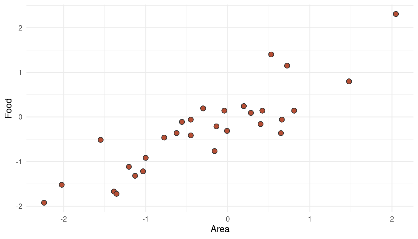
(#fig:5H3 online part 5)Multicollinearity between area and avgfood can decrease their descriptive power when used together in a multiple regression
This phenomenon is called multicollinearity (what a word, eh!). When adding both parameters as predictors in a multiple regression, the partial effect of each becomes smaller after controlling for the other (this is what we can see when comparing Model 3, 4, and 5). It could be that both parameters share a common unobserved cause, or that one parameter causes the other. Either way, it would be wiser to include only one of these parameter (food OR area) in the final model.
5 Hard practices print
5.1 Question 5H1
In the divorce example, suppose the DAG is: M -> A -> D. What are the implied conditional independencies of the graph? Are the data consistent with it?
To get the conditional independencies, we can use the daggity package. For plotting, however, I still prefer the ggplot2 extension to it, ggdad.
tibble(name = c("M", "A", "D"),
       x    = c(0, 1, 2),
       y    = c(1, 1, 1)) %>%
  dagify(D ~ A,
         A ~ M,
         coords = .) %>%
  ggplot(aes(x = x, y = y, xend = xend, yend = yend)) +
  geom_dag_node(color = red, alpha = 0.5) +
  geom_dag_text(aes(label = name), color = blue) +
  geom_dag_edges(edge_color = blue) +
  theme_void()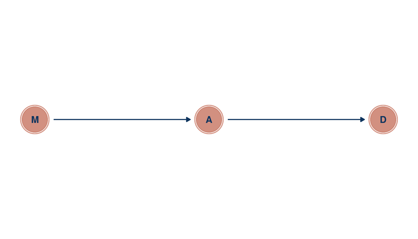
(#fig:5H1 print part 1)Directed acyclic graph for marriage rate (M), medium age at marriage (a) and divorce rate (D)
So let’s see whether there are any implied conditional independencies.
library(dagitty)

dagitty('dag{ M -> A -> D }') %>%
  impliedConditionalIndependencies()
## D _||_ M | AOur DAG implies that D is independent of M after conditioning on A. So let’s condition on A by using a multiple linear regression, basically asking: After I already know age at marriage, what additional value is there in also knowing marriage rate?
d_waffle_sd <- d_waffle %>%
  mutate(across(is.numeric, standardize))

alist(divorce ~ dnorm(mu, sigma),
      mu <- a + BM*marriage + BA*age_marriage,
      a ~ dnorm(0, 0.2),
      BM ~ dnorm(0, 0.5),
      BA ~ dnorm(0, 0.5),
      sigma ~ dexp(1)) %>%
  quap(. , data = d_waffle_sd) %>%
  precis() %>%
  as_tibble(rownames = "estimate") %>%
  filter(estimate == "BM") %>%
knitr::kable(digits = 2, caption = "Coefficient estimate for marriage rate regressed on divorce rate")| estimate | mean | sd | 5.5% | 94.5% |
|---|---|---|---|---|
| BM | -0.07 | 0.15 | -0.31 | 0.18 |
Indeed, D is independent of M after conditioning on A, as there is no consistent relationship between M and D in the model. So up to this point, our assumptions about causal relationships expressed in our DAG still hold.
5.2 Question 5H2
Assuming that the DAD for the divorce example is indeed M -> A -> D, fit a new model and use it to estimate the counterfactual effect of halving a State’s marriage rate M. Use the counterfactual example from the chapter (starting on page 140) as a template.
Let’s build a model that corresponds to our DAG.
m_5H2 <- alist(
  # M -> A
  age_marriage ~ dnorm(muA, sigmaA),
  muA <- aA + BM*marriage,
  aA ~ dnorm(0, 0.2),
  BM ~ dnorm(0, 0.5),
  sigmaA ~ dexp(1),

  # A -> D
  divorce ~ dnorm(muD, sigmaD),
  muD <- aD + BA*age_marriage,
  aD ~ dnorm(0, 0.2),
  BA ~ dnorm(0, 0.5),
  sigmaD ~ dexp(1)) %>%
  quap(., data = d_waffle_sd)


m_5H2 %>%
  precis() %>%
  as_tibble(rownames = "estimate") %>%
knitr::kable(digits = 2, caption = "Coefficient estimates for model m_5H2 corresponding to the DAG M -> A -> D")| estimate | mean | sd | 5.5% | 94.5% |
|---|---|---|---|---|
| aA | 0.00 | 0.09 | -0.14 | 0.14 |
| BM | -0.69 | 0.10 | -0.85 | -0.54 |
| sigmaA | 0.68 | 0.07 | 0.57 | 0.79 |
| aD | 0.00 | 0.10 | -0.16 | 0.16 |
| BA | -0.57 | 0.11 | -0.74 | -0.39 |
| sigmaD | 0.79 | 0.08 | 0.66 | 0.91 |
Just for convenience and as we will do this task iteratively, I will build a function count_plot() that takes samples from a model as well the name of the outcome and the predictor as arguments. The function then returns a counterfactual plot. Note that we don’t need to wrap the variable names into "", as the functions allows tidyeval, making the code more legible.
count_plot <- function(sim_output, outcome, predictor) {
  sim_output %>%
    as_tibble() %>%
    pivot_longer(cols = everything(), values_to = "{{predictor}}") %>%
    group_by(name) %>%
    nest() %>%
    add_column("{{outcome}}" := s) %>%
    ungroup() %>%
    mutate(predictor_pred = map(data, pluck("{{predictor}}")),
           predictor_mean = map_dbl(predictor_pred, mean),
           predictor_pi = map(predictor_pred, PI),
           lower_pi = map_dbl(predictor_pi, pluck(1)),
           upper_pi = map_dbl(predictor_pi, pluck(2))) %>%
    ungroup() %>%
    select({{outcome}}, predictor_mean, lower_pi, upper_pi) %>%
    ggplot() +
    geom_ribbon(aes(x = {{outcome}}, ymin = lower_pi, ymax = upper_pi),
                fill = yellow, alpha = 0.3) +
    geom_line(aes({{outcome}}, predictor_mean),
              size = 1.5, colour = blue) +
    labs(x = paste("manipulated", as_label(expr({{predictor}}))),
         y = paste("counterfactual", as_label(expr({{outcome}})))) +
    theme_minimal()
}
So let’s start with the total counterfactual effect of M on A by simulating posterior observations from M for A and D (in this order) and plucking out the results for A.
sim(m_5H2, data = list(marriage = s),
    vars = c("age_marriage", "divorce"))  %>%
  pluck("age_marriage") %>%
  count_plot(age_marriage, marriage)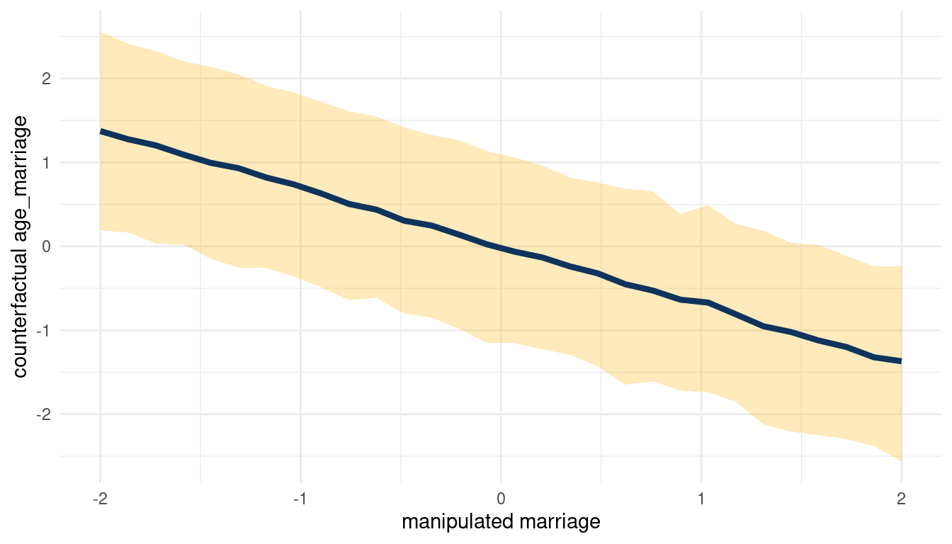
(#fig:5H2 print part 3)Total counterfactual effect of M on A
We can see that counterfactually increasing M decreases A. Now for A on D:
sim(m_5H2, data = list(age_marriage = s),
    vars = c("marriage", "divorce"))  %>%
  pluck("divorce") %>%
  count_plot(age_marriage, marriage)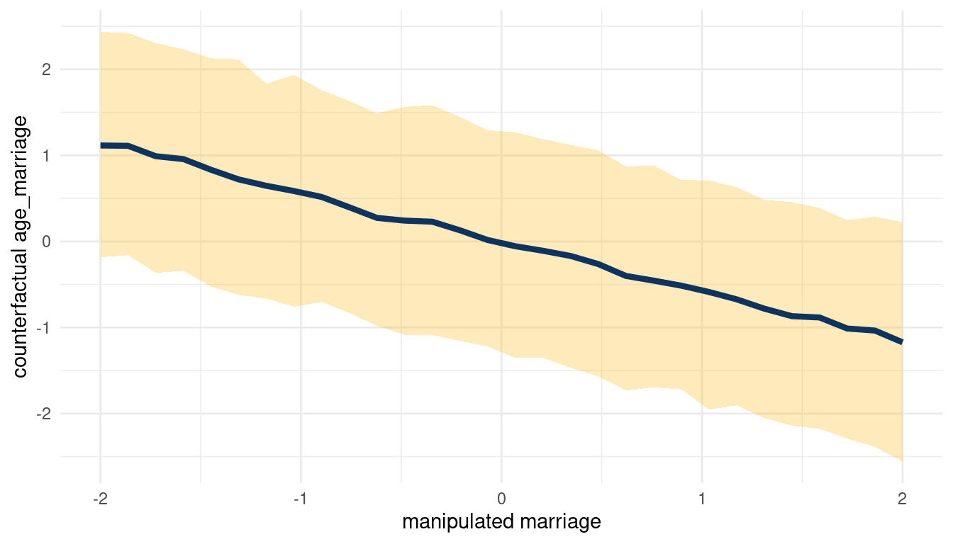
(#fig:5H2 print part 4)Total counterfactual effect of A on D
When we decrease A, we increase D. So following the DAG from left to right: Increasing M decreases A, which then increases D. We can check this by plotting the total counterfactual effect of M on D.
sim(m_5H2, data = list(marriage = s),
    vars = c("age_marriage", "divorce"))  %>%
  pluck("divorce") %>%
  count_plot(divorce, marriage)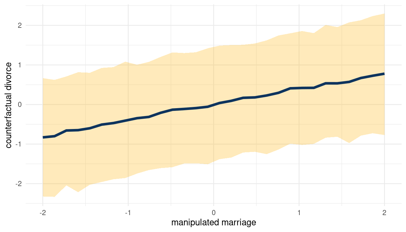
(#fig:5H2 print part 5)Total counterfactual effect of M on D
So yes, counterfactually increasing M increases D.
5.3 Question 5M3
Return to the milk energy model, m5.7. Suppose that the true causal relationship among the variables is:
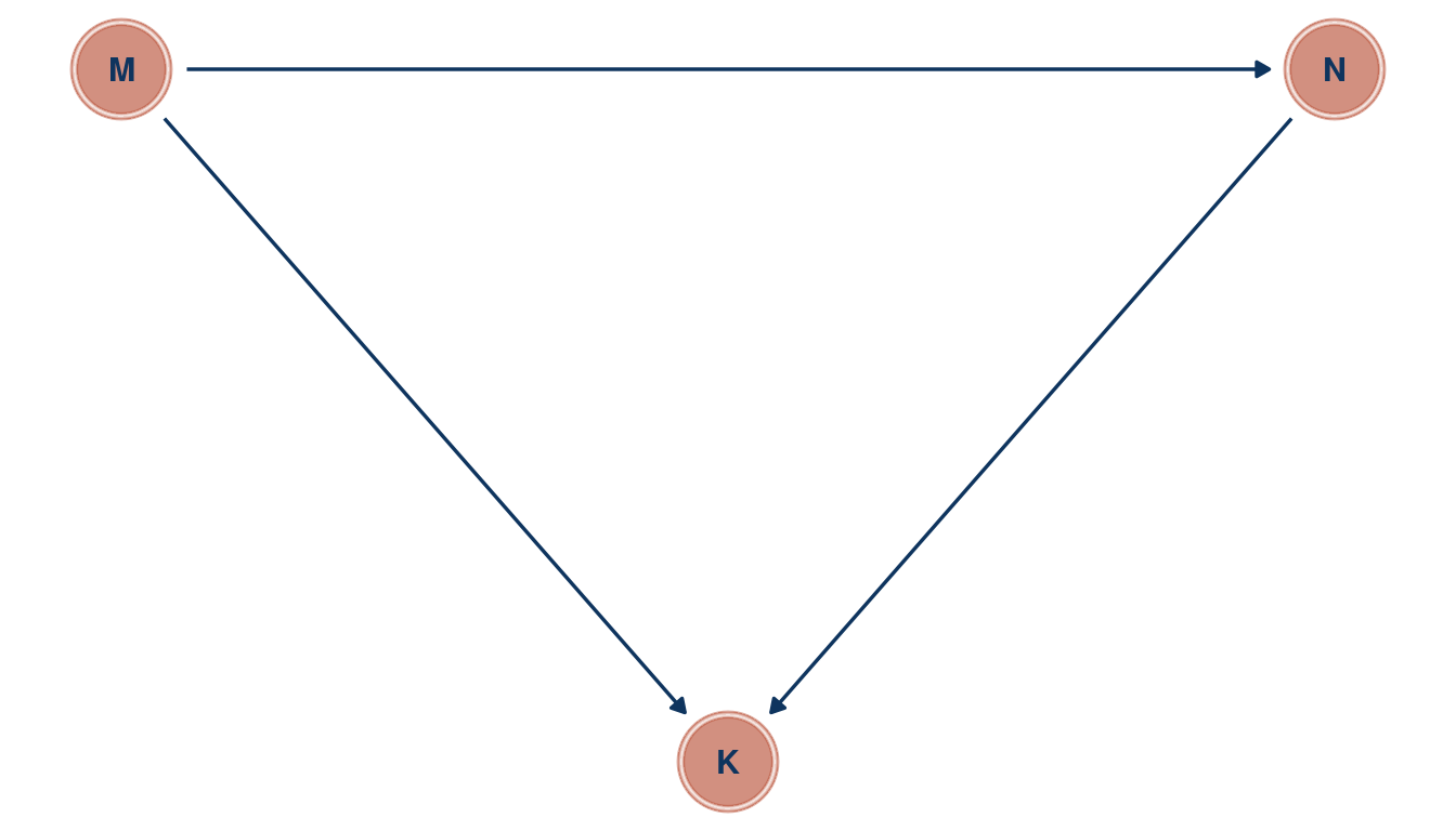
Now compute the counterfactual effect on K of doubling M. You will need to account for both the direct and indirect paths of causation. Use the counterfactual example from the chapter (starting at page 140) as a template.
Load the data, remove entries with missing data and standardise all variables.
data(milk)

milk_std <- milk %>%
  as_tibble() %>%
  select(mass, kcal.per.g, neocortex.perc) %>%
  drop_na() %>%
  mutate(across(everything(), standardize))
Now we can build a model corresponding to the DAG.
m_milk <- alist(
  # M -> K <- N
  kcal.per.g ~ dnorm(mu, sigma) ,
  mu <- a + bN*neocortex.perc + bM*mass,
  a ~ dnorm(0, 0.2),
  bN ~ dnorm(0 ,0.5),
  bM ~ dnorm(0, 0.5),
  sigma ~ dexp(1),

  ## M -> N
  neocortex.perc ~ dnorm(mu_N, sigma_N),
  mu_N <- aN + bMN*mass,
  aN ~ dnorm(0, 0.2),
  bMN ~ dnorm(0, 0.5),
  sigma_N ~ dexp(1)) %>%
  quap(., data = milk_std)
To build the counterfactual plot, the function count_plot() comes in handy.
sim_m1 <- sim(m_milk, data = list(mass = s),
             vars = c("neocortex.perc", "kcal.per.g"))  %>%
  pluck("kcal.per.g")

count_plot(sim_m1, kcal.per.g, mass)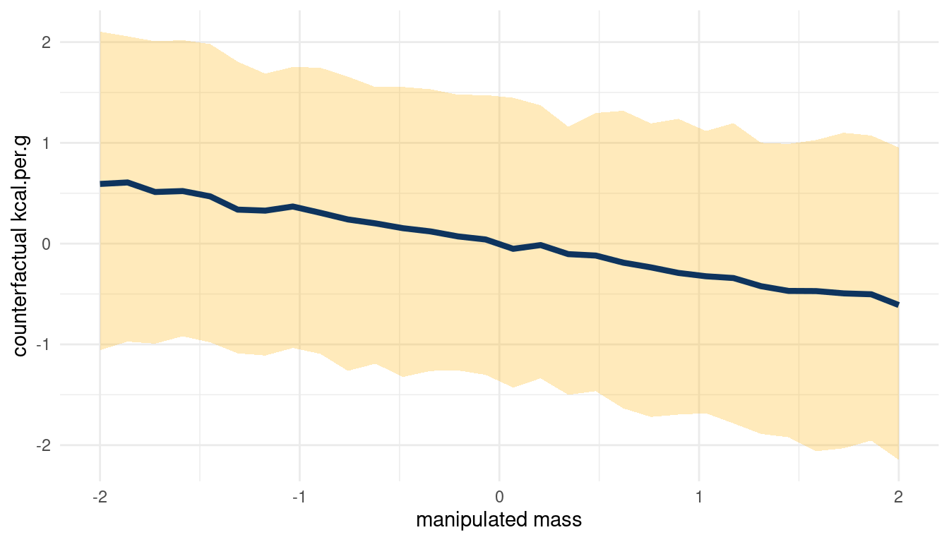
(#fig:5m3 print part 4)Total counterfactual effect of M on K
Doubling M would decrease K, but the relationship is not totally consistent.
5.4 Question 5M4
Here is an open practice problem to engage your imagination. In the divorce data, States in the souther United States have many of the highest divorce rates. Add the South indicator variable to the analysis. First, draw one or more DAGs that represent your ideas for how Southern American culture might influence any of the other three variables (D, M or A). Then list the testable implications of your DAGs, if there are any, and fit one or more models to evaluate the implications. What do you think the influence of “Southerness” is?
Let’s load and standardize the Waffle data, this time with the South variable included.
divorce_std <- WaffleDivorce %>%
  as_tibble() %>%
  select(D = Divorce, M = Marriage, A = MedianAgeMarriage,
         S = South) %>%
  mutate(across(-S, standardize),
         S = if_else(S == 0, 1, 2))
Note that S is categorical (a dummy variable) and is therefore not standardised. Instead, I assign a 1 to each non-southern state and a 2 to each southern state, to enable indexing later on.
Now, southerness (is that a word?) could drive A (medium age at marriage), as a cultural thing. If it is related to culture, it could directly influence D as well. Further, we found in the chapter that A influences both M and D, and M has low influence on D. We can therefore remove M. Let’s draw a DAG.
tibble(name = c("A", "D", "S"),
       x = c(2, 1, 0),
       y = c(1, 0, 1)) %>%
  dagify(D ~ A + S,
         A ~ S,
         coords = .) %>%
  ggplot(aes(x = x, y = y, xend = xend, yend = yend)) +
  geom_dag_node(color = red, alpha = 0.5) +
  geom_dag_text(aes(label = name), color = blue) +
  geom_dag_edges(edge_color = blue) +
  theme_void()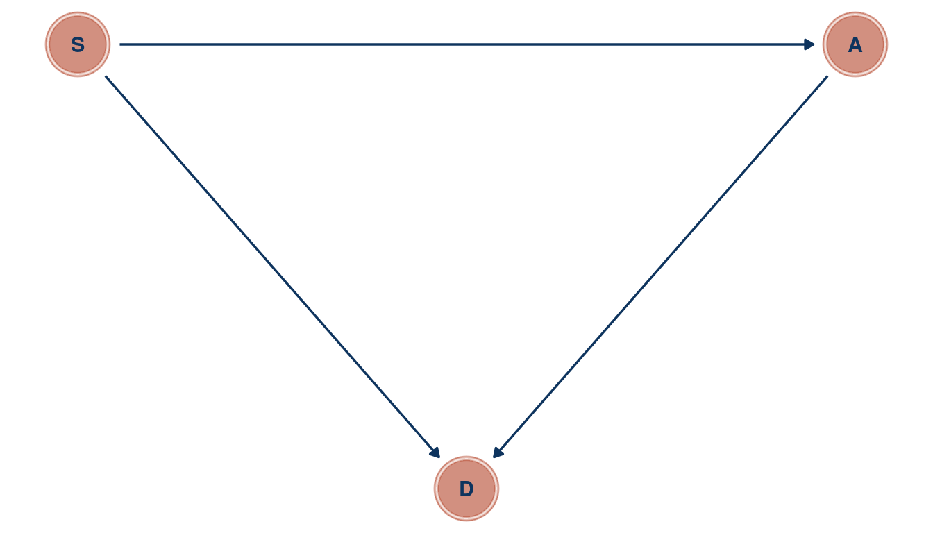
(#fig:5M4 print part 2)Directed acyclic graph for question 5M4
And check the implied conditional independencies.
dagitty('dag{A -> S
             A -> D <- S}') %>%
  impliedConditionalIndependencies() %>%
  capture.output()
## character(0)I have tried to catch the output but only get an empty character vector, which means that there are no conditional independencies. Let’s check this assumption with cor().
divorce_std %>%
  select(D, A, S) %>%
  as.matrix() %>%
  cor()
## D A S
## D 1.0000000 -0.5972392 0.3451758
## A -0.5972392 1.0000000 -0.2480568
## S 0.3451758 -0.2480568 1.0000000Well A and S are not totally correlated, but still we can see a dependency between each.
We can proceed to build a model following the categorical example in the chapter.
m_divorce1 <- alist(
  D ~ dnorm(mu, sigma),
  mu <- a[S] + bA*A ,
  a[S] ~ dnorm(0, 0.5),
  bA ~ dnorm(0 ,0.5),
  sigma ~ dexp(1)) %>%
  quap(., data = divorce_std)
Let’s extract some samples from the posterior and calculate the difference between southern and non-southern states.
post_samples <- extract.samples(m_divorce1) %>%
  as_tibble() %>%
  mutate(south_diff = a[,2] - a[,1])

post_samples %>%
  precis() %>%
  as_tibble(rownames = "estimate") %>%
  filter(estimate != "sigma") %>%
  rename(lower_pi = '5.5%', upper_pi = '94.5%')  %>%
  ggplot() +
  geom_vline(xintercept = 0, colour = "grey40")  +
  geom_pointrange(aes(x = mean, xmin = lower_pi, xmax = upper_pi,
                      y = fct_reorder(estimate, desc(estimate)),
                      colour = estimate)) +
  scale_colour_discrete(name = "Predictor",
                        labels = c("Southern State", "Non-Southern State",
                                   "Age at Marriage", "Non-Southern minus Southern"),
                        type = c(red, blue, yellow, lightblue)) +
  labs(x = "Estimate", y = NULL) +
  theme_minimal() +
  theme(panel.grid.major.y = element_blank())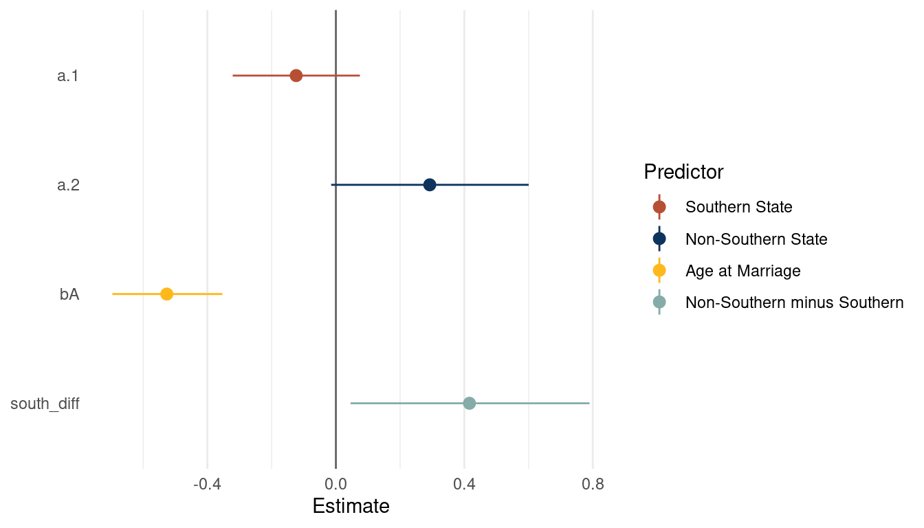
(#fig:5M4 print part 6)Coefficient plot for a multiple regression model with with divorce rate as outcome
We can already see that southern states have a consistently lower divorce rate than nonsouthern states. As we already extracted some samples, let’s look at the posterior distribution for A and S. First get some point estimates (mean and pi) for these variables, which we can then highlight in the plot.
post_samples_sum <- post_samples %>%
  select(bA, south_diff) %>%
  pivot_longer(cols = everything(), names_to = "parameter", values_to = "estimate") %>%
  group_by(parameter) %>%
  nest() %>%
  mutate(estimate = map(data, "estimate"),
         est_mean = map_dbl(estimate, mean),
         est_pi = map(estimate, PI),
         pi_low = map_dbl(est_pi, pluck(1)),
         pi_high = map_dbl(est_pi, pluck(2))) %>%
  select(parameter, est_mean, pi_low, pi_high)
Now we are ready to plot the distributions.
post_samples %>%
  select(bA, south_diff) %>%
  pivot_longer(cols = everything(), names_to = "parameter", values_to = "estimate") %>%
  ggplot() +
  geom_vline(xintercept = 0, colour = "grey20")  +
  geom_density(aes(x = estimate, fill = parameter),
               colour = "grey40", alpha = 0.8) +
  geom_pointrange(aes(est_mean, y = c(0.35, 0.35),
                       xmin = pi_low, xmax = pi_high,
                       group = parameter),
                  colour = "grey40", size = 0.6,
             data = post_samples_sum) +
  scale_fill_manual(name = "Parameter", values = c(red, yellow),
                    labels = c("Age at Marriage", "Non-Southern minus Southern State")) +
  scale_y_continuous(breaks = NULL) +
  labs(title = "Outcome = Divorce rate", x = "Estimate", y = NULL) +
  theme_minimal() +
  theme(legend.position = c(0.8, 0.8),
        legend.background = element_rect(colour = "grey20"))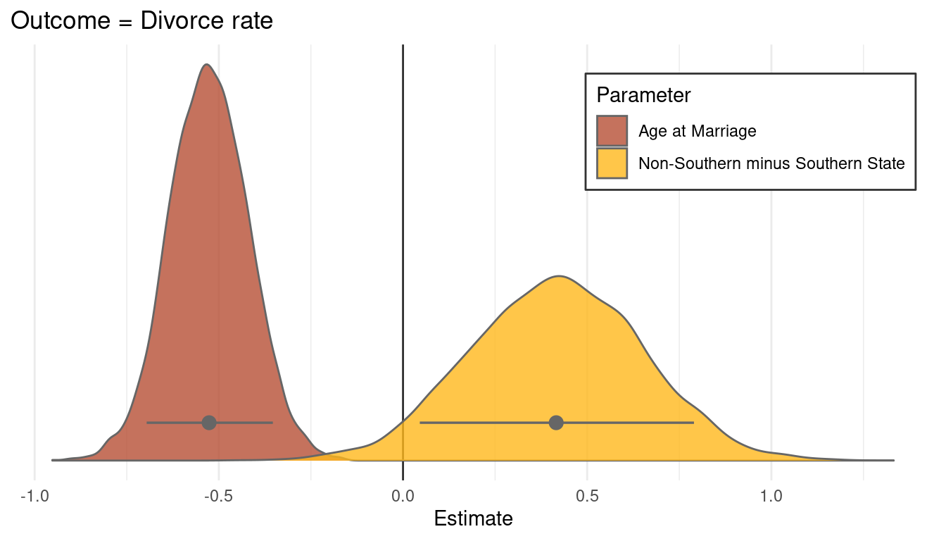
I think this plot is a nice way to end. Just to some this chapter up: I have learned a lot of powerful ways to get closer to deducing causal relationships, something that I wanted to do since reading The book of why by Dana Mackenzie and Juda Pearl. However, some concepts like confounders or such are still a bit unclear and I hope that this will be resolved throughout the next chapters.
sessionInfo()## R version 4.0.3 (2020-10-10)
## Platform: x86_64-pc-linux-gnu (64-bit)
## Running under: Linux Mint 20.1
##
## Matrix products: default
## BLAS: /usr/lib/x86_64-linux-gnu/blas/libblas.so.3.9.0
## LAPACK: /usr/lib/x86_64-linux-gnu/lapack/liblapack.so.3.9.0
##
## locale:
## [1] LC_CTYPE=de_DE.UTF-8 LC_NUMERIC=C
## [3] LC_TIME=de_DE.UTF-8 LC_COLLATE=de_DE.UTF-8
## [5] LC_MONETARY=de_DE.UTF-8 LC_MESSAGES=de_DE.UTF-8
## [7] LC_PAPER=de_DE.UTF-8 LC_NAME=C
## [9] LC_ADDRESS=C LC_TELEPHONE=C
## [11] LC_MEASUREMENT=de_DE.UTF-8 LC_IDENTIFICATION=C
##
## attached base packages:
## [1] parallel stats graphics grDevices utils datasets methods
## [8] base
##
## other attached packages:
## [1] dagitty_0.3-1 ggdag_0.2.3 rethinking_2.13
## [4] rstan_2.21.2 StanHeaders_2.21.0-7 forcats_0.5.0
## [7] stringr_1.4.0 dplyr_1.0.3 purrr_0.3.4
## [10] readr_1.4.0 tidyr_1.1.2 tibble_3.0.5
## [13] ggplot2_3.3.3 tidyverse_1.3.0
##
## loaded via a namespace (and not attached):
## [1] matrixStats_0.57.0 fs_1.5.0 lubridate_1.7.9.2 httr_1.4.2
## [5] tools_4.0.3 backports_1.2.1 R6_2.5.0 DBI_1.1.1
## [9] colorspace_2.0-0 withr_2.4.1 tidyselect_1.1.0 gridExtra_2.3
## [13] prettyunits_1.1.1 processx_3.4.5 curl_4.3 compiler_4.0.3
## [17] cli_2.2.0 rvest_0.3.6 xml2_1.3.2 labeling_0.4.2
## [21] bookdown_0.21 scales_1.1.1 mvtnorm_1.1-1 callr_3.5.1
## [25] digest_0.6.27 rmarkdown_2.6 pkgconfig_2.0.3 htmltools_0.5.1.1
## [29] dbplyr_2.0.0 highr_0.8 rlang_0.4.10 readxl_1.3.1
## [33] rstudioapi_0.13 shape_1.4.5 generics_0.1.0 farver_2.0.3
## [37] jsonlite_1.7.2 inline_0.3.17 magrittr_2.0.1 loo_2.4.1
## [41] Rcpp_1.0.6 munsell_0.5.0 fansi_0.4.2 viridis_0.5.1
## [45] lifecycle_0.2.0 stringi_1.5.3 yaml_2.2.1 ggraph_2.0.4
## [49] MASS_7.3-53 pkgbuild_1.2.0 grid_4.0.3 ggrepel_0.9.1
## [53] crayon_1.3.4 lattice_0.20-41 graphlayouts_0.7.1 haven_2.3.1
## [57] hms_1.0.0 knitr_1.30 ps_1.5.0 pillar_1.4.7
## [61] igraph_1.2.6 boot_1.3-25 codetools_0.2-18 stats4_4.0.3
## [65] reprex_1.0.0 glue_1.4.2 evaluate_0.14 blogdown_1.1
## [69] V8_3.4.0 RcppParallel_5.0.2 modelr_0.1.8 tweenr_1.0.1
## [73] vctrs_0.3.6 cellranger_1.1.0 polyclip_1.10-0 gtable_0.3.0
## [77] assertthat_0.2.1 ggforce_0.3.2 xfun_0.20 broom_0.7.3
## [81] tidygraph_1.2.0 coda_0.19-4 viridisLite_0.3.0 ellipsis_0.3.1