Introduction
This is the seventh part of a series where I work through the practice questions of the second edition of Richard McElreaths Statistical Rethinking.
Each post covers a new chapter and you can see the posts on previous chapters here. This chapter introduces linear interaction terms in regression models.
You can find the the lectures and homework accompanying the book here.
The colours for this blog post are:
purple <- "#612D55"
lightpurple <- "#C7B8CC"
red <- "#C56A6A"
grey <- "#E4E3DD"
I will not cover the homework from now on as it is mostly similar to the practice exercises. Further, I am a bit running out of time. Notice that the online version of the book is missing some of the practice exercises.
Easy practices
8E1
For each of the causal relationships below, name a hypothetical third variable that would lead to > an interaction effect.
- Bread dough rises because of yeast
- Education leads to higher income
- Gasoline makes a car go
Learned this the hard way, but (1) really depends on temperature. Yeast needs to be added to the dough at the right temperature, otherwise your dough will stay flat and sad.
- I would say that motivation or drive plays into that as well. You will not get a good position or be successful in your job if you’re a couch potato doing nothing all day, even if you have a very good education.
And (3) can be dependent on so many variables. E.g., if you’re car is broken, no amount of gasoline will make your car go.
8E2
Which of the following explanations invokes an interaction?
- Caramelizing onions requires cooking over low heat and making sure the onions do not dry out
- A car will go faster when it has more cylinders or when it has a better fuel injector
- Most people acquire their political beliefs from their parents, unless they get them instead from their friends
- Intelligent animal species tend to be either highly social or have manipulative appendages (hands, tentacles, etc.)
Only (1) is a strict interaction, as the process of caramelizing onions is both dependent on low heat and not drying out. All the others are additive relationships.
8E3
For each of the explanations in 8E2, write a linear model that expresses the stated relationship.
- Let \(u\) be the amount of caramelization, then \[mu_{i} = alpha + beta_{heat} * heat + beta_{dry} * dry + beta_{heatdry} * heat * dry\]
- Let \(u\) be the speed of a car, then \[mu_{i} = alpha + beta_{cyl} * cyl + beta_{inj} * inj\]
- Let \(u\) be the speed of a car, then \[mu_{i} = alpha + beta_{cyl} * cyl + beta_{inj} * inj\]
- Let \(u\) be the political belief, then \[mu_{i} = alpha + beta_{parent} * parent + beta_{friend} * friend\]
- Let \(u\) be the intelligence, then \[mu_{i} = alpha + beta_{social} * social + beta_{append} * append\]
Medium practices
8M1
Recall the tulips example from the chapter. Suppose another set of treatments adjusted the temperature in the greenhouse over two levels: cold and hot. The data in the chapter were collected at the cold temperature. You find none of the plants grown under the hot temperature developed any blooms at all, regardless of the water and shade levels. Can you explain this result in terms of interactions between water, shade, and temperature?
It seems like tulips don’t bloom under higher temperatures, which creates a three-way interaction. Blooming is not only dependent on the interaction between water and shade, but this interaction depends on the temperature as well. If the temperature is too high, no amount of shade and water will make the tulip bloom.
8M2
Can you invent a regression equation that would make the bloom size zero, whenever the temperature is hot?
If we code temperature as an index variable with a 0 for cold and a 1 for hot, we can multiply the whole initial model with \(1 - temperature\). If the temperature is hot (= 0), the whole model will equate to zero bloom. Cold temperature, on the other hand has no effect on the bloom as the model just gets multiplied with 1.
8M3
In parts of North America, ravens depend upon wolves for their food. This is because ravens are carnivorous but cannot usually kill or open carcasses of prey. Wolves however can and do kill and tear open animals, and they tolerate ravens co-feeding at their kills. This species relationship is generally described as a “species interaction.” Can you invent a hypothetical set of data on raven population size in which this relationship would manifest as a statistical interaction? Do you think the biological interaction could be linear? Why or why not?
I will just simulate a simple wolf population using a poisson distribution with an average number of 10 wolfs, and then dependent on this population I will simulate the raven population.
tibble(wolf = rpois(1e3, lambda = 2),
       raven = rpois(1e3, lambda = wolf + 2)) %>%
  ggplot(aes(raven, wolf)) +
  geom_jitter(shape = 21, colour = purple, fill = grey,
              size = 2, alpha = 0.8) +
  geom_smooth(colour = red, fill = lightpurple,
              alpha = 0.9) +
  scale_y_continuous(breaks = c(0, 5)) +
  labs(x = "Number of ravens", y = "Number of wolfes") +
  theme_minimal()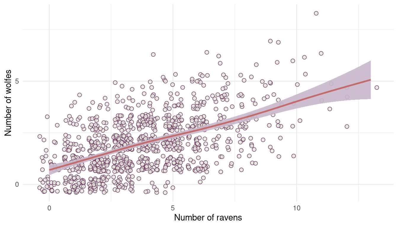
(#fig:8M3 part 1)Figure 1 | Species interaction between wolfes and ravens.
8M4
Repeat the tulips analysis, but this time use priors that constrain the effect of water to be positive and the effect of shade to be negative. Use prior predictive simulation. What do these prior assumptions mean for the interaction prior, if anything?
Let’s just update the model from the chapter with new priors, which we force to be positive by using a log-normal distribution. But first we load the data and bring it in a nicer format, centering water and shade and scaling blooms by its maximum.
data("tulips")

dat_tulips <- tulips %>%
  as_tibble() %>%
  mutate(water = water - mean(water),
         shade = shade - mean(shade),
         blooms = blooms/max(blooms))
Now the model:
m1 <- alist(blooms ~ dnorm(mu, sigma),
      mu <- a + bw*water + bs*shade + bws*water*shade,
      a ~ dnorm(0.5, 0.25),
      c(bw, bs, bws) ~ dlnorm(0, 0.25),
      sigma ~ dexp(1)) %>%
  quap(data = dat_tulips)
Now we use link() for the prior predictive simulation, simulating ten lines.
N = 100
seq_dat <- tibble(water = rep(-1:1, N),
                  shade = rep(-1:1, each = N))

extract.prior(m1, n = N) %>%
  link(m1, post = ., data = seq_dat) %>%
  as_tibble() %>%
  pivot_longer(cols = everything(), values_to = "mu_blooms") %>%
  add_column(water = rep(seq_dat$water, N),
             shade = rep(seq_dat$shade, N),
             type = rep(as.character(1:N), each = length(seq_dat$water))) %>%
  ggplot() +
  geom_line(aes(water, mu_blooms, group = type),
            colour = lightpurple, alpha = 0.4) +
  geom_point(aes(water, blooms),
             shape = 21, colour = purple, fill = red,
             size = 2, alpha = 0.8,
             data = dat_tulips %>% filter(water %in% -1:1)) +
  facet_wrap(~shade) +
  theme_minimal()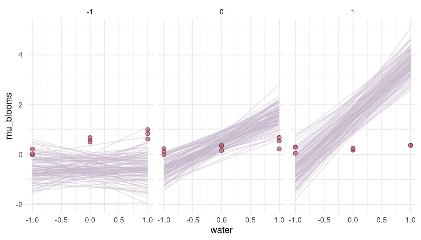
(#fig:8M4 part 3)Figure 3 | Prior simulations for positive priors.
Ehm, well. These are a bit too drastic and out of the realistic realm. It seems like we need to reduce the prior on the beta coefficients. For the log-normal distribution, we can do so by setting the meanlog to a negative number. The more negative the number, the closer we get to 0.
m2 <- alist(blooms ~ dnorm(mu, sigma),
      mu <- a + bw*water + bs*shade + bws*water*shade,
      a ~ dnorm(0.5, 0.25),
      c(bw, bs, bws) ~ dlnorm(-2, 0.25),
      sigma ~ dexp(1)) %>%
  quap(data = dat_tulips)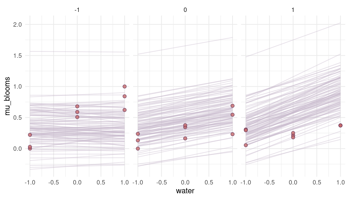
(#fig:8M4 part 6)Figure 4 | Prior simulation with more reasonable priors.
That looks a lot more reasonable. What seems to be a bit off, though, is the direction of the relationship. We would actually expect a high and positive effect of water on blooms when the shade is low (= when there is a lot of light) and no effect when it’s all shade (shade = 1). So actually the opposite of what we see in the priors. The reason for that is that we add a positive prior for shade in the model, resulting in a positive relationship. To get the relationship, we simply have to subtract it:
m3 <- alist(blooms ~ dnorm(mu, sigma),
      mu <- a + bw*water - bs*shade + bws*water*shade,
      a ~ dnorm(0.5, 0.25),
      c(bw, bs, bws) ~ dlnorm(-2, 0.25),
      sigma ~ dexp(1)) %>%
  quap(data = dat_tulips, start = list(a = 0.3, bw = 0.16, bs = 0.12, bws = 0.09, sigma = 0.2))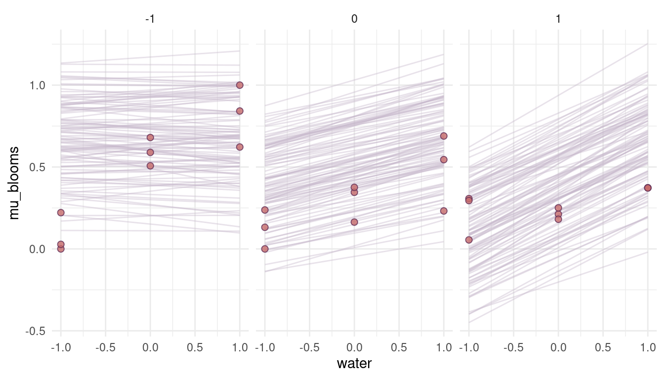
(#fig:8M4 part 8)Figure 5 | Prior simulations forcing the relationship between blooms and shade negative.
Well this has changed nothing, because the interaction term is still added. We need to modify this as well.
m4 <- alist(blooms ~ dnorm(mu, sigma),
      mu <- a + bw*water - bs*shade - bws*water*shade,
      a ~ dnorm(0.5, 0.25),
      c(bw, bs, bws) ~ dlnorm(-2, 0.25),
      sigma ~ dexp(1)) %>%
  quap(data = dat_tulips)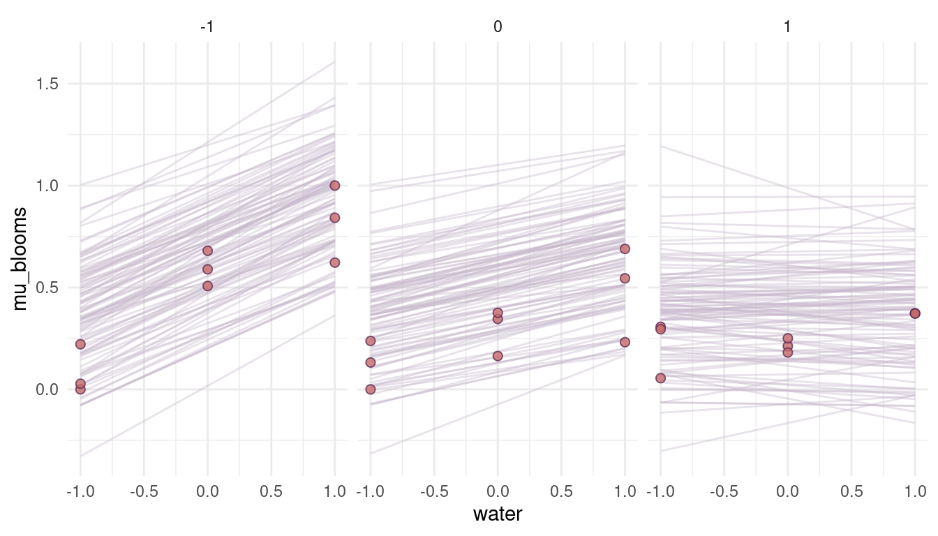
(#fig:8M4 part 10)Figure 6 | Prior simulations forcing the relationship between blooms and shade negative, as well as the relationship between blooms and the interaction of shade and water.
Yes, this is what we want. We encapsulate our knowledge in the priors, without rendering these priors too strong. They have enough variability so that the data can shine through them. They will improve the model performance however, as unrealistic values (flat priors) are not likely given the priors.
Hard practices
8H1
Return to the
data(tulips)example in the chapter. Now include the bed variable as a predictor in the interaction model. Don’t interact bed with the other predictors; just include it as a main effect. Note that bed is categorical. So to use it properly, you will need to either construct dummy variables or rather an index variable, as explained in Chapter 6.
Recall the model m8.4 from the chapter:
m8.4 <- alist(blooms ~ dnorm(mu, sigma),
      mu <- a + bw*water + bs*shade + bws*water*shade,
      a ~ dnorm(0.5, 0.25),
      c(bw, bs, bws) ~ dnorm(0, 0.25),
      sigma ~ dexp(1)) %>%
  quap(data = dat_tulips)

m8.4 %>%
  precis() %>%
  as_tibble(rownames = "estimate") %>%
  kable(digits = 2, format = "html") %>%
kable_styling()| estimate | mean | sd | 5.5% | 94.5% |
|---|---|---|---|---|
| a | 0.36 | 0.02 | 0.32 | 0.40 |
| bw | 0.21 | 0.03 | 0.16 | 0.25 |
| bs | -0.11 | 0.03 | -0.16 | -0.07 |
| bws | -0.14 | 0.04 | -0.20 | -0.09 |
| sigma | 0.12 | 0.02 | 0.10 | 0.15 |
First, I transform bed to an integer to integrate it as an index variable.
dat_tulips <- dat_tulips %>%
  mutate(bed = as.numeric(bed))
Now let’s add the bed variable to the model m8.4.
m1 <- alist(blooms ~ dnorm(mu, sigma),
      mu <- a[bed] + bw*water + bs*shade + bws*water*shade,
      a[bed] ~ dnorm(0.5, 0.25),
      c(bw, bs, bws) ~ dnorm(0, 0.25),
      sigma ~ dexp(1)) %>%
  quap(data = dat_tulips)
We can glimpse at the posterior distributions using a custom function build on precis (see the first code chunk from 8H1 for more details on tidy_precis().
tidy_precis(m1)| estimate | mean | sd | 5.5% | 94.5% |
|---|---|---|---|---|
| a[1] | 0.27 | 0.04 | 0.22 | 0.33 |
| a[2] | 0.40 | 0.04 | 0.34 | 0.45 |
| a[3] | 0.41 | 0.04 | 0.35 | 0.47 |
| bw | 0.21 | 0.03 | 0.17 | 0.25 |
| bs | -0.11 | 0.03 | -0.15 | -0.07 |
| bws | -0.14 | 0.03 | -0.19 | -0.09 |
| sigma | 0.11 | 0.01 | 0.08 | 0.13 |
We can see that including bed in the model has not changed our inferences about the effect of water, shade, and their interaction on bloom. We can also see that there are differences between the beds. To quantify these differences, we need to calculate contrasts from the posterior.
m1 %>%
  extract.samples() %>%
  pluck("a") %>%
  as_tibble() %>%
  transmute("bed1 - bed2" = V1 - V2,
            "bed1 - bed3" = V1 - V3,
            "bed2 - bed3" = V2 - V3) %>%
  pivot_longer(cols = everything(),
               values_to = "contrast", names_to = "contrast_type") %>%
  ggplot(aes(contrast, fill = contrast_type, colour = contrast_type)) +
  geom_vline(xintercept = 0, colour = grey) +
  geom_density(alpha = 0.2) +
  scale_fill_manual(values = c(lightpurple, purple, red),
                    name = NULL) +
  scale_colour_manual(values = c(lightpurple, purple, red), name = NULL) +
  labs(y = NULL, x = "Contrast") +
  theme_minimal() +
  theme(panel.grid = element_blank(),
        axis.ticks = element_line(),
        legend.position = c(0.9, 0.8))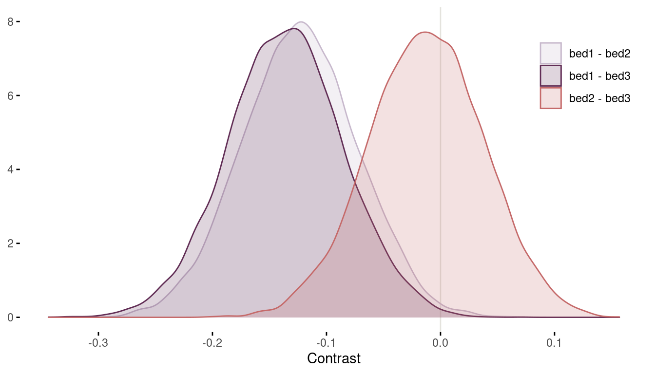
(#fig:8H1 contrasts)Figure 7 | Contrast plot per bed.
Now we can conclude that bed bed2 and bed3 have a substantially higher bloom than bed1 (even though some area of the distribution tails extend above zero). There are no distinguishable differences between bed2 and bed3.
8H2
Use WAIC to compare the model from 8H1 to a model that omits bed. What do you infer from this comparison? Can you reconcile the WAIC results with the posterior distribution of the bed coefficients?
Let’s just threw both models in the compare() function. Note that I print the output to html format using a custom function tidy_table built on knitr::kable.
compare(m8.4, m1) %>%
  as_tibble(rownames = "model") %>%
tidy_table()| model | WAIC | SE | dWAIC | dSE | pWAIC | weight |
|---|---|---|---|---|---|---|
| m1 | -23.91 | 9.72 | 0.00 | NA | 9.43 | 0.7 |
| m8.4 | -22.26 | 10.52 | 1.66 | 8.29 | 6.52 | 0.3 |
The model with beds included (m1) performs a little bit better. This is consistent with the posterior distributions of the bed coefficients, as we found some robust contrasts. This then can result in improved predictions and a better WAIC. However, the difference in WAIC between both models is very weak. It seems that the effect of bed is minor compared to all other predictors (water and shade).
8H3
Consider again the
data(rugged)data on economic development and terrain ruggedness,examined in this chapter. One of the African countries in that example, Seychelles, is far outside the cloud of other nations, being a rare country with both relatively high GDP and high ruggedness. Seychelles is also unusual, in that it is a group of islands far from the coast of mainland Africa, and its main economic activity is tourism.
- Focus on model m8.5 from the chapter. Use WAIC point-wise penalties and PSIS Pareto k values to measure relative influence of each country. By these criteria, is Seychelles influencing the results? Are there other nations that are relatively influential? If so, can you explain why?
I’m a bit confused as model m8.5 is about tulip blooms. I guess what is meant is model m8.3. First, let’s load the tulip data and repeat all the processing steps from the chapter within a pipe.
data(rugged)

dat_rugged <- rugged %>%
  as_tibble() %>%
  drop_na(rgdppc_2000) %>%
  mutate(log_gdp = log(rgdppc_2000),
         log_gdp_std = log_gdp / mean(log_gdp),
         rugged_std = rugged / max(rugged),
         cid = if_else(cont_africa == 1, 1, 2))
And now model m8.3 which includes an interaction between ruggedness and being in Africa.
m8.3 <- alist(
  log_gdp_std ~ dnorm(mu, sigma),
  mu <- a[cid] + b[cid]*(rugged_std - 0.215),
  a[cid] ~ dnorm(1, 0.1),
  b[cid] ~ dnorm(0, 0.3),
  sigma ~ dexp(1)) %>%
  quap(data = dat_rugged)
So let’s find some influential countries in the data using WAIC point-wise penalties and PSIS Pareto k values. First the Pareto k values, where we calculate the k value for each country (pointwise = TRUE) and then bind it with the original data to get the country information:
PSIS(m8.3, pointwise = TRUE) %>%
  as_tibble() %>%
  select(k) %>%
  bind_cols(dat_rugged %>%
              select(country, rugged_std, log_gdp_std)) %>%
  arrange(desc(k)) %>%
  slice_head(n = 5) %>%
tidy_table()| k | country | rugged_std | log_gdp_std |
|---|---|---|---|
| 0.45 | Lesotho | 1.00 | 0.90 |
| 0.38 | Seychelles | 0.79 | 1.15 |
| 0.28 | Tajikistan | 0.85 | 0.78 |
| 0.24 | Burundi | 0.29 | 0.76 |
| 0.23 | Switzerland | 0.77 | 1.21 |
We can see that Seychelles is one of the most influential countries, but other countries are pretty big outliers as well. Unfortunatly, I am really bad in geography and have no idea why…
Let’s try with WAIC penalties, using a similar approach:
WAIC(m8.3, pointwise = TRUE) %>%
  as_tibble() %>%
  select(penalty) %>%
  bind_cols(dat_rugged %>%
              select(country, rugged_std, log_gdp_std)) %>%
  arrange(desc(penalty)) %>%
  slice_head(n = 5) %>%
tidy_table()| penalty | country | rugged_std | log_gdp_std |
|---|---|---|---|
| 0.54 | Seychelles | 0.79 | 1.15 |
| 0.48 | Switzerland | 0.77 | 1.21 |
| 0.31 | Tajikistan | 0.85 | 0.78 |
| 0.28 | Lesotho | 1.00 | 0.90 |
| 0.21 | Equatorial Guinea | 0.09 | 1.13 |
We get similar results with WAIC penalties as with Pareto k values. Again, the interpretation why some countries show higher values is up to you.
- Now use robust regression, as described in the previous chapter. Modify m8.5 to use a Student-t distribution with ν = 2. Does this change the results in a substantial way?
We can use robust regression by setting the likelihood to the student-t distribution.
m8.3.robust <- alist(
  log_gdp_std ~ dstudent(nu = 2, mu, sigma),
  mu <- a[cid] + b[cid]*(rugged_std - 0.215),
  a[cid] ~ dnorm(1, 0.1),
  b[cid] ~ dnorm(0, 0.3),
  sigma ~ dexp(1)) %>%
  quap(data = dat_rugged)
Now, using the robust regression, we can calculate the contrast between the slope of African countries versus the slope in all other countries. Remember, to see this difference was the motivation to build the interaction model in the first place. We can do this by calculating the difference between b1 and b2 of model m8.3 and compare it to the difference of the robust regression.
m8.3_contrast <- extract.samples(m8.3) %>%
  pluck("b") %>%
  as_tibble() %>%
  transmute(countrast = V1 - V2) %>%
  add_column(model = "m8.3")

robust_contrast <- extract.samples(m8.3.robust) %>%
  pluck("b") %>%
  as_tibble() %>%
  transmute(countrast = V1 - V2) %>%
  add_column(model = "Robust regression")

m8.3_contrast %>%
  full_join(robust_contrast) %>%
  ggplot(aes(countrast, colour = model, fill = model)) +
  geom_density(alpha = 0.5) +
  scale_fill_manual(values = c(grey, lightpurple),
                    name = NULL) +
  scale_colour_manual(values = c(grey, lightpurple), name = NULL) +
  labs(y = NULL, x = "Contrast") +
  theme_minimal() +
  theme(panel.grid = element_blank(),
        axis.ticks = element_line(),
        legend.position = c(0.9, 0.8))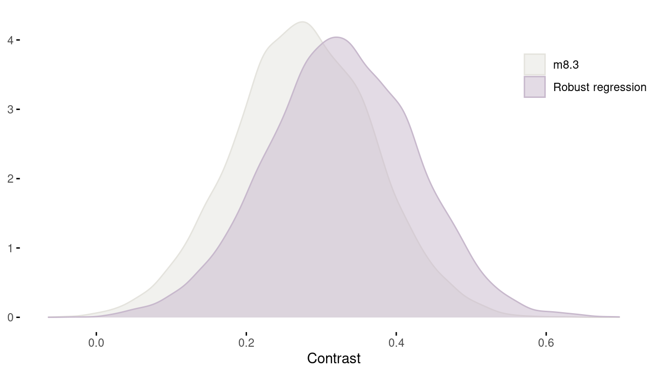
(#fig:8H3 contrast)Figure 8 | Contrast between african countries and all other between models.
We can see that using a robust regression actually resulted in an increased contrast.
8H4
The values in data(nettle) are data on language diversity in 74 nations. The meaning of each column is given below.
- country: Name of the country
- num.lang: Number of recognized languages spoken
- area: Area in square kilometers
- k.pop: Population, in thousands
- num.stations: Number of weather stations that provided data for the next two columns
- mean.growing.season: Average length of growing season, in months
- sd.growing.season: Standard deviation of length of growing season, in months
Use these data to evaluate the hypothesis that language diversity is partly a product of food security. The notion is that, in productive ecologies, people don’t need large social networks to buffer them against risk of food shortfalls. This means ethnic groups can be smaller and more self-sufficient, leading to more languages per capita. In contrast, in a poor ecology, there is more subsistence risk, and so human societies have adapted by building larger networks of mutual obligation to provide food insurance. This in turn creates social forces that help prevent languages from diversifying. Specifically, you will try to model the number of languages per capita as the outcome variable:
d$lang.per.cap <- d$num.lang / d$k.popUse the logarithm of this new variable as your regression outcome (A count model would be better here, but you’ll learn those later, in Chapter11). This problem is open ended, allowing you to decide how you address the hypotheses and the uncertain advice the modeling provides. If you think you need to use WAIC anyplace, please do. If you think you need certain priors, argue for them. If you think you need to plot predictions in a certain way, please do. Just try to honestly evaluate the main effects of bothmean.growing.seasonandsd.growing.season, as well as their two-way interaction, as outlined in parts (a), (b), and (c) below. If you are not sure which approach to use, try several.
- Evaluate the hypothesis that language diversity, as measured by
log(lang.per.cap), is positively associated with the average length of the growing season,mean.growing.season. Considerlog(area)in your regression(s) as a covariate (not an interaction). Interpret your results.
Ok, we start with loading the data and taking a glimpse.
data("nettle")

nettle %>%
  glimpse()
## Rows: 74
## Columns: 7
## $ country <fct> Algeria, Angola, Australia, Bangladesh, Benin, Bo…
## $ num.lang <int> 18, 42, 234, 37, 52, 38, 27, 209, 75, 94, 18, 275…
## $ area <int> 2381741, 1246700, 7713364, 143998, 112622, 109858…
## $ k.pop <int> 25660, 10303, 17336, 118745, 4889, 7612, 1348, 15…
## $ num.stations <int> 102, 50, 134, 20, 7, 48, 10, 245, 6, 13, 9, 35, 1…
## $ mean.growing.season <dbl> 6.60, 6.22, 6.00, 7.40, 7.14, 6.92, 4.60, 9.71, 5…
## $ sd.growing.season <dbl> 2.29, 1.87, 4.17, 0.73, 0.99, 2.50, 1.69, 5.87, 1…We can pre-process the outcome variable and standardize the predictors to set reasonable priors more easily.
dat_nettle <- nettle %>%
  as_tibble() %>%
  mutate(lang.per.cap = log(num.lang / k.pop),
         log.area = log(area)) %>%
  mutate(across(c(lang.per.cap, log.area, mean.growing.season), standardize))
Now we fit a regression model with one single variable, mean.growing.season.
m1 <- alist(
  lang.per.cap ~ dnorm(mu, sigma),
  mu <- a + bm*mean.growing.season,
  a ~ dnorm(0, 0.25),
  bm ~ dnorm(0, 0.5),
  sigma ~ dexp(1)) %>%
  quap(data = dat_nettle)
And a second model with an added predictor, log.area.
m2 <- alist(
  lang.per.cap ~ dnorm(mu, sigma),
  mu <- a + bm*mean.growing.season + ba*log.area,
  a ~ dnorm(0, 0.2),
  c(bm, ba) ~ dnorm(0, 0.5),
  sigma ~ dexp(1)) %>%
  quap(data = dat_nettle)
I will skip the prior predictive checks as we have used and checked these prior on standardized variables in other chapters. However, we can compare the model performance between these two models.
compare(m1, m2) %>%
  as_tibble(rownames = "Model") %>%
tidy_table()| Model | WAIC | SE | dWAIC | dSE | pWAIC | weight |
|---|---|---|---|---|---|---|
| m1 | 205.25 | 15.44 | 0.00 | NA | 3.39 | 0.64 |
| m2 | 206.44 | 16.22 | 1.19 | 3.59 | 5.14 | 0.36 |
There is no substantial support for including log.area if we want to increase predictive accuracy. But does including log.area change the estimate for the mean.growing.season coefficient?
tidy_m1 <- precis(m1) %>%
  as_tibble(rownames = "estimate") %>%
  add_column(model = "m1", .before = "estimate")

tidy_m2 <- precis(m2) %>%
  as_tibble(rownames = "estimate") %>%
  add_column(model = "m2", .before = "estimate")

full_join(tidy_m1, tidy_m2) %>%
  mutate(coefficient = str_c(model, estimate, sep = ": ")) %>%
  filter(estimate != "sigma") %>%
  select(lower_pi = '5.5%', upper_pi = '94.5%', everything()) %>%
  ggplot(aes(mean, coefficient, colour = model)) +
  geom_pointrange(aes(xmin = lower_pi, xmax = upper_pi),
                  show.legend = FALSE, size = 0.8) +
  labs(y = NULL, x = "Coefficient estimate") +
  scale_colour_manual(values = c(red, purple)) +
  theme_minimal()
(#fig:8H4 precis m1 m2)Figure 9 | Coefficient plot for model m1 including mean.growing.season and model m2 additionally including log.area.
The coefficient for mean.growing.season stays consistently high and strict positive. The coefficient for log.area, however, is present but not substantial. So we will stick with model m1.
Let’s plot the relationship between lang.per.cap and mean.growing.season, based on model m1.
N <-  1e4
my_seq <- seq(-2.5, 2, length.out = 20)

link(m1, n = N,
     data = data.frame(lang.per.cap = my_seq, mean.growing.season = my_seq)) %>%
  as_tibble() %>%
  pivot_longer(cols = everything(), values_to = "lang.per.cap") %>%
  add_column(mean.growing.season = rep(my_seq, N)) %>%
  group_by(mean.growing.season) %>%
  summarise(pi = list(PI(lang.per.cap)),
            lang.per.cap = mean(lang.per.cap)) %>%
  mutate(lower_pi = map_dbl(pi, pluck(1)),
         upper_pi = map_dbl(pi, pluck(2))) %>%
  ggplot(aes(x = mean.growing.season, y = lang.per.cap)) +
  geom_ribbon(aes(ymin = lower_pi, ymax = upper_pi),
              fill = red, alpha = 0.5) +
  geom_line(colour = purple, size = 2, alpha = 0.9) +
  geom_point(data = dat_nettle) +
  geom_label(aes(label = country),
             nudge_x = c(-0.25, -0.5, -0.6, -0.3),
             data = dat_nettle %>%
               filter(lang.per.cap > 2 | lang.per.cap < -2.2)) +
  theme_minimal()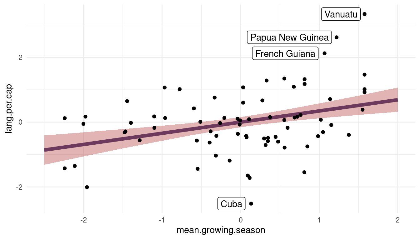
(#fig:visualize m1)Figure 10 | Language per capita as a function of mean growing seasion based on m1.
We can see that there is a robust positive relationship between lang.per.cap and mean.growing.season. However, the model substantially underpredicts lang.per.cap for French Guiana, Papua New Guinea, and Vanuatu while overpredicting for Cuba.
- Now evaluate the hypothesis that language diversity is negatively associated with the standard deviation of length of growing season,
sd.growing.season. This hypothesis follows from uncertainty in harvest favoring social insurance through larger social networks and therefore fewer languages. Again, considerlog(area)as a covariate (not an interaction). Interpret your results.
Following the same steps as above:
# standardize predictor
dat_nettle <- dat_nettle %>%
  mutate(sd.growing.season = standardize(sd.growing.season))

# model without log.area
m3 <- alist(
  lang.per.cap ~ dnorm(mu, sigma),
  mu <- a + bsd*sd.growing.season,
  a ~ dnorm(0, 0.25),
  bsd ~ dnorm(0, 0.5),
  sigma ~ dexp(1)) %>%
  quap(data = dat_nettle)

# model with log.area
m4 <- alist(
  lang.per.cap ~ dnorm(mu, sigma),
  mu <- a + bsd*sd.growing.season + ba*log.area,
  a ~ dnorm(0, 0.2),
  c(bsd, ba) ~ dnorm(0, 0.5),
  sigma ~ dexp(1)) %>%
  quap(data = dat_nettle)

# compare using model information
compare(m1, m2, m3, m4) %>%
  as_tibble(rownames = "Model") %>%
tidy_table()| Model | WAIC | SE | dWAIC | dSE | pWAIC | weight |
|---|---|---|---|---|---|---|
| m1 | 205.70 | 15.54 | 0.00 | NA | 3.61 | 0.50 |
| m2 | 205.98 | 16.25 | 0.28 | 3.64 | 4.91 | 0.44 |
| m4 | 211.04 | 17.18 | 5.34 | 6.47 | 5.00 | 0.03 |
| m3 | 211.58 | 17.57 | 5.88 | 7.39 | 3.97 | 0.03 |
Again, there is no strong support to include area. But mean.growing.season seems to fit the data a bit better than sd.growing.season. Let’s look at the posteriors of the two new models:
tidy_m3 <- precis(m3) %>%
  as_tibble(rownames = "estimate") %>%
  add_column(model = "m3", .before = "estimate")

tidy_m4 <- precis(m4) %>%
  as_tibble(rownames = "estimate") %>%
  add_column(model = "m4", .before = "estimate")

full_join(tidy_m3, tidy_m4) %>%
  mutate(coefficient = str_c(model, estimate, sep = ": ")) %>%
  filter(estimate != "sigma") %>%
  select(lower_pi = '5.5%', upper_pi = '94.5%', everything()) %>%
  ggplot(aes(mean, coefficient, colour = model)) +
  geom_pointrange(aes(xmin = lower_pi, xmax = upper_pi),
                  show.legend = FALSE, size = 0.8) +
  labs(y = NULL, x = "Coefficient estimate") +
  scale_colour_manual(values = c(red, purple)) +
  theme_minimal()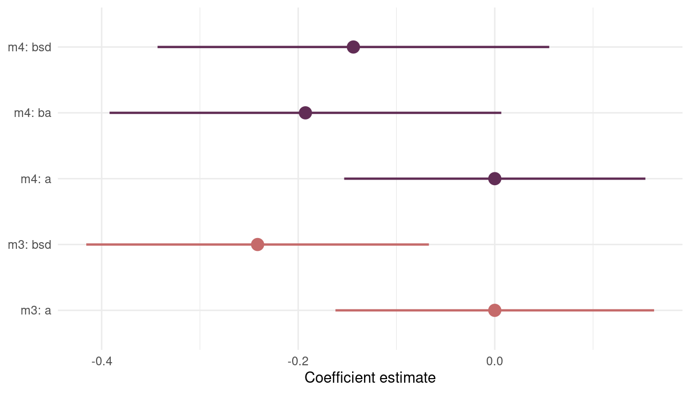
(#fig:8H4 precis m3 m4)Figure 11 | Coefficient plot for model m3 including sd.growing.season and model m4 additionally including log.area.
We can see that including area (ba) in the model introduces more uncertainty about sd.growing.season (bds). However, the mode of the posterior distribution, the maximum a posteriori probability, is negative in both models. This fits with the hypothesis that uncertainty in harvest favors social insurance through larger social networks and therefore fewer languages.
- Finally, evaluate the hypothesis that
mean.growing.seasonandsd.growing.seasoninteract to synergistically reduce language diversity. The idea is that, in nations with longer average growing seasons, high variance makes storage and redistribution even more important than it would be otherwise. That way, people can cooperate to preserve and protect windfalls to be used during the droughts. These forces in turn may lead to greater social integration and fewer languages.**
Let’s build a model with an interaction term:
m5 <- alist(
  lang.per.cap ~ dnorm(mu, sigma),
  mu <- a + bm*mean.growing.season + bsd*sd.growing.season + bmsd*mean.growing.season*sd.growing.season,
  a ~ dnorm(0, 0.25),
  c(bm, bsd, bmsd) ~ dnorm(0, 0.5),
  sigma ~ dexp(1)) %>%
  quap(data = dat_nettle)
And now we need to plot the posterior predictions, which is way harder with the interaction terms. So I will stick to the tryptich plots from the chapter. First I will define a function that returns a posterior prediction plot for a predictor at a given value of the second predictor. Note that we need a bit of tidy_eval here and there (e.g. the ‘curly-curly: {{}}’ or the assigner ‘:=’)
post_tryptich <- function(predictor1 = NULL, predictor2 = NULL, predictor2.val) {
  N <-  1e4
  my_seq <- seq(-2.5, 2, length.out = 20 )

  link(m5, n = N,
     data = tibble({{ predictor1 }} := my_seq,
                       {{ predictor2 }} := predictor2.val)) %>%
    as_tibble() %>%
    pivot_longer(cols = everything(), values_to = "lang.per.cap") %>%
    add_column({{ predictor1 }} := rep(my_seq, N)) %>%
    group_by({{ predictor1 }}) %>%
    summarise(pi = list(PI(lang.per.cap)),
              lang.per.cap = mean(lang.per.cap)) %>%
    mutate(lower_pi = map_dbl(pi, pluck(1)),
           upper_pi = map_dbl(pi, pluck(2))) %>%
    add_column({{ predictor2 }} := predictor2.val) %>%
    select({{ predictor1 }}, {{ predictor2 }}, lang.per.cap, lower_pi, upper_pi)
}
Now we can calculate the posterior predictions for mean.growing.season across values of sd.growing.season. For this, I take three quantiles from sd.growing.season, the 5%, 50%, and 95% quantile. Then I apply the above defined function post_tryptich to each of those quantiles and save all results in a data frame, which I then feed into ggplot.
quantile(dat_nettle$sd.growing.season, c(0.05, 0.5, 0.95)) %>%
  map_dfr(post_tryptich, predictor1 = mean.growing.season, predictor2 = sd.growing.season) %>%
  ggplot(aes(mean.growing.season, lang.per.cap)) +
  geom_ribbon(aes(ymin = lower_pi, ymax = upper_pi),
              fill = grey, alpha = 0.6) +
  geom_line(colour = red,
            alpha = 0.8, size = 1.5) +
  facet_wrap(~sd.growing.season) +
  theme_minimal() +
  theme(panel.grid.minor = element_blank(),
        panel.grid.major = element_blank())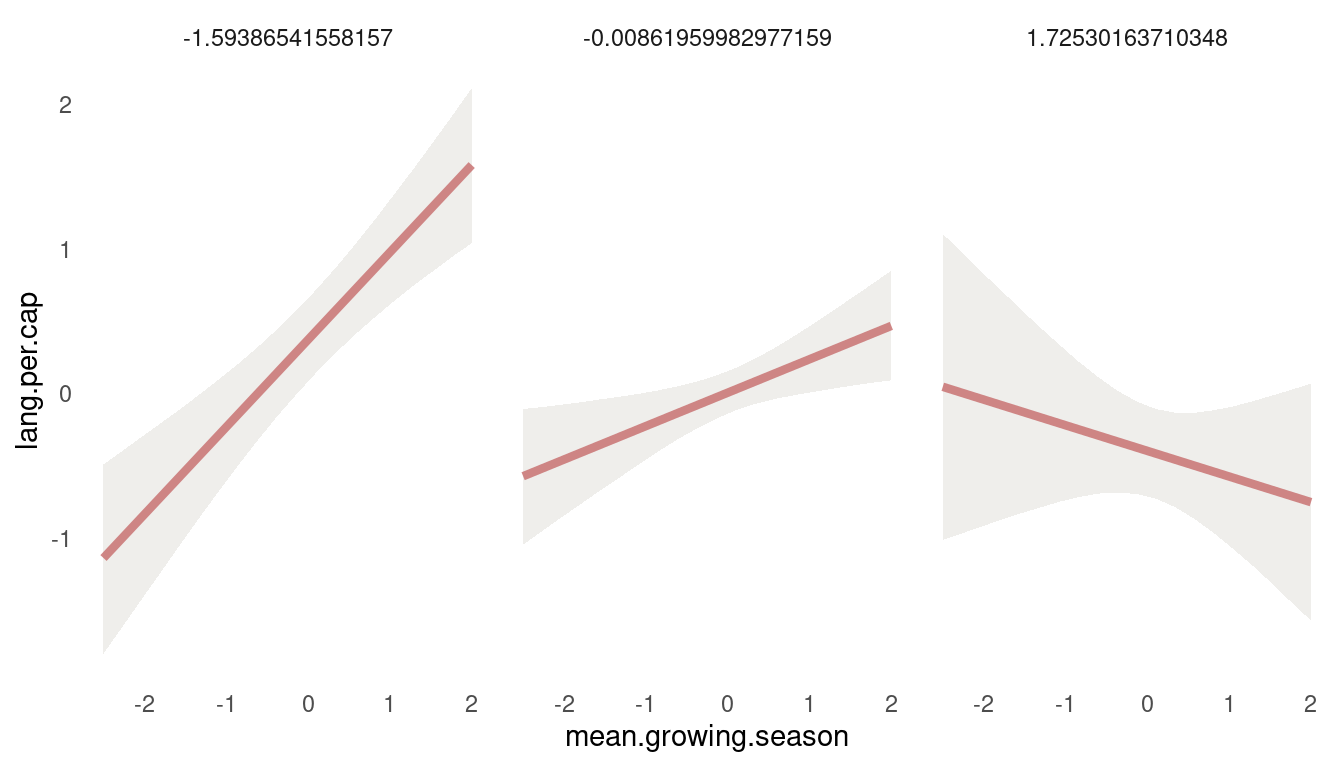
(#fig:8H4 first tryptich)Figure 12 | Tryptich plot for model m5 for average language predicted by the mean growing seasion across values of variane in growing season.
So we get a positive relationship between lang.per.cap and mean.growing.season at low values of sd.growing.season, but a negative relationship at high values. So the models suggest that mean growing season increases language diversity, unless the variance in growing season is also high. Let’s check the other way around:
quantile(dat_nettle$mean.growing.season, c(0.05, 0.5, 0.95)) %>%
  map_dfr(post_tryptich, predictor1 = sd.growing.season, predictor2 = mean.growing.season) %>%
  ggplot(aes(sd.growing.season, lang.per.cap)) +
  geom_ribbon(aes(ymin = lower_pi, ymax = upper_pi),
              fill = grey, alpha = 0.6) +
  geom_line(colour = red,
            alpha = 0.8, size = 1.5) +
  facet_wrap(~mean.growing.season) +
  theme_minimal() +
  theme(panel.grid.minor = element_blank(),
        panel.grid.major = element_blank())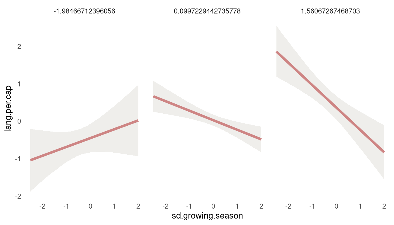
(#fig:8H4 second tryptich)Figure 13 | Tryptich plot for model m5 for average language predicted by the variance in growing seasion across values of mean growing season.
We see the same pattern: Variance in growing season decreases language diversity, unless the mean growing season is very short.
8H5
Consider the
data(Wines2012)data table. These data are expert ratings of 20 different French and American wines by 9 different French and American judges. Your goal is to model score, the subjective rating assigned by each judge to each wine. I recommend standardizing it. In this problem, consider only variation among judges and wines. Construct index variables of judge and wine and then use these index variables to construct a linear regression model. Justify your priors. You should end up with 9 judge parameters and 20 wines parameters. How do you interpret the variation among individual judges and individual wines? Do you notice any patterns, just by plotting the differences? Which judges gave the highest/ lowest ratings? Which wines were rated worst/ best on average?
First things first, loading the data and standardizing the variables to fit priors more easily.
data("Wines2012")

dat_wine <- Wines2012 %>%
  as_tibble() %>%
  mutate(score = standardize(score),
         judge = as.integer(judge),
         wine = as.integer(wine))
Now we can build the model:
m1 <- alist(
  score ~ dnorm(mu, sigma),
  mu <- j[judge] + w[wine],
  j[judge] ~ dnorm(0, 0.5),
  w[wine] ~ dnorm(0, 0.5),
  sigma ~ dexp(1)) %>%
  quap(data = dat_wine)
I have use a pretty wide prior on both index variables, to allow the values to spread. And we have no other prior information besides that it should be centered around zero. Let’s plot the coefficients:
m1 %>%
  precis(depth = 2) %>%
  as_tibble(rownames = "coefficient") %>%
  select(everything(), lower_pi = '5.5%',  upper_pi = '94.5%') %>%
  mutate(type = if_else(str_starts(coefficient, "j"), "judge", "wine"),
         coefficient = fct_reorder(coefficient, mean)) %>%
  filter(coefficient != "sigma") %>%
  ggplot(aes(mean, coefficient, colour = type)) +
  geom_segment(aes(x = -1.25, xend = lower_pi, y = coefficient, yend = coefficient),
               colour = grey, linetype = "dashed", alpha = 0.7) +
  geom_vline(xintercept = 0, colour = lightpurple) +
  geom_pointrange(aes(xmin = lower_pi, xmax = upper_pi),
                  size = 0.8) +
  labs(y = NULL, x = "Coefficient estimate", colour = NULL) +
  scale_colour_manual(values = c(red, purple)) +
  scale_x_continuous(expand = c(0,0)) +
  theme_minimal() +
  theme(panel.grid = element_blank(),
        legend.position = c(0.85, 0.2))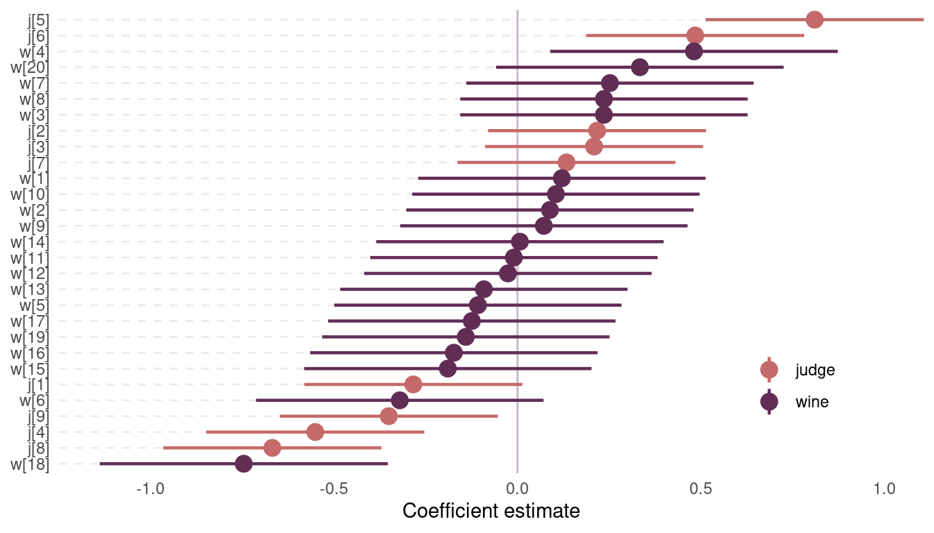
(#fig:8H5 coefficient plot)Figure 14 | Coefficient plot for wine data
Judge number 5, which corresponds to John Foy (I love inline rmarkdown code), and judge number 6 named Linda Murphy have the most positive ratings. They seem to enjoy wine in general. Notice the three judges that score wine pretty negative on average. There is only one wine with consistently positive average scores across judges, B2, which is a red wine. And then we have wine number 18, with very bad scores. This is a red wine as well.
8H6
Now consider three features of the wines and judges:
- flight: Whether the wine is red or white.
- wine.amer: Indicator variable for American wines.
- judge.amer: Indicator variable for American judges.
Use indicator or index variables to model the influence of these features on the scores. Omit the individual judge and wine index variables from Problem 1. Do not include interaction effects yet. Again, justify your priors. What do you conclude about the differences among the wines and judges? Try to relate the results to the inferences in the previous problem.
First, let’s convert the focal indicator variables to index variables for easier model fitting and interpretation.
dat_wine <- dat_wine %>%
  mutate(flight = as.numeric(flight),
         wine.amer = if_else(wine.amer == 0, 1, 2),
         judge.amer = if_else(judge.amer == 0, 1, 2))
Now we can easily fit the model.
m2 <- alist(
  score ~ dnorm(mu, sigma),
  mu <- f[flight] + w[wine.amer] + j[judge.amer],
  f[flight] ~ dnorm(0, 0.5),
  w[wine.amer] ~ dnorm(0, 0.5),
  j[judge.amer] ~ dnorm(0, 0.5),
  sigma ~ dexp(1)) %>%
  quap(data = dat_wine)
Note that I used a similar prior as in m1. It places most of the probability within one standard deviation from the mean, for each indexed category. If we would consider the knowledge from the results from m1, we could even tighten those priors a little bit. But priors should be fitted using knowledge, and not the data at hands.
Again, I will plot the results as it is much easier to see results, instead of reading tables:
m2 %>%
  precis(depth = 2) %>%
  as_tibble(rownames = "coefficient") %>%
  filter(coefficient != "sigma") %>%
  select(everything(), lower_pi = '5.5%',  upper_pi = '94.5%') %>%
  mutate(type = if_else(str_starts(coefficient, "j"), "judge",
                        if_else(str_starts(coefficient, "w"), "wine",
                                "flight")),
         coefficient = as.factor(coefficient),
         coefficient = fct_recode(coefficient,
                                  wine.red = "f[1]",
                                  wine.white = "f[2]",
                                  judge.non.amer = "j[1]",
                                  judge.amer = "j[2]",
                                  wine.non.amer = "w[1]",
                                  wine.amer = "w[2]")) %>%
  ggplot(aes(mean, coefficient, colour = type)) +
  geom_vline(xintercept = 0, colour = grey) +
  geom_pointrange(aes(xmin = lower_pi, xmax = upper_pi),
                  size = 0.8) +
  labs(y = NULL, x = "Coefficient estimate", colour = NULL) +
  scale_colour_manual(values = c(red, purple, lightpurple)) +
  scale_x_continuous(expand = c(0,0)) +
  theme_minimal() +
  theme(panel.grid = element_blank(),
        legend.position = "none")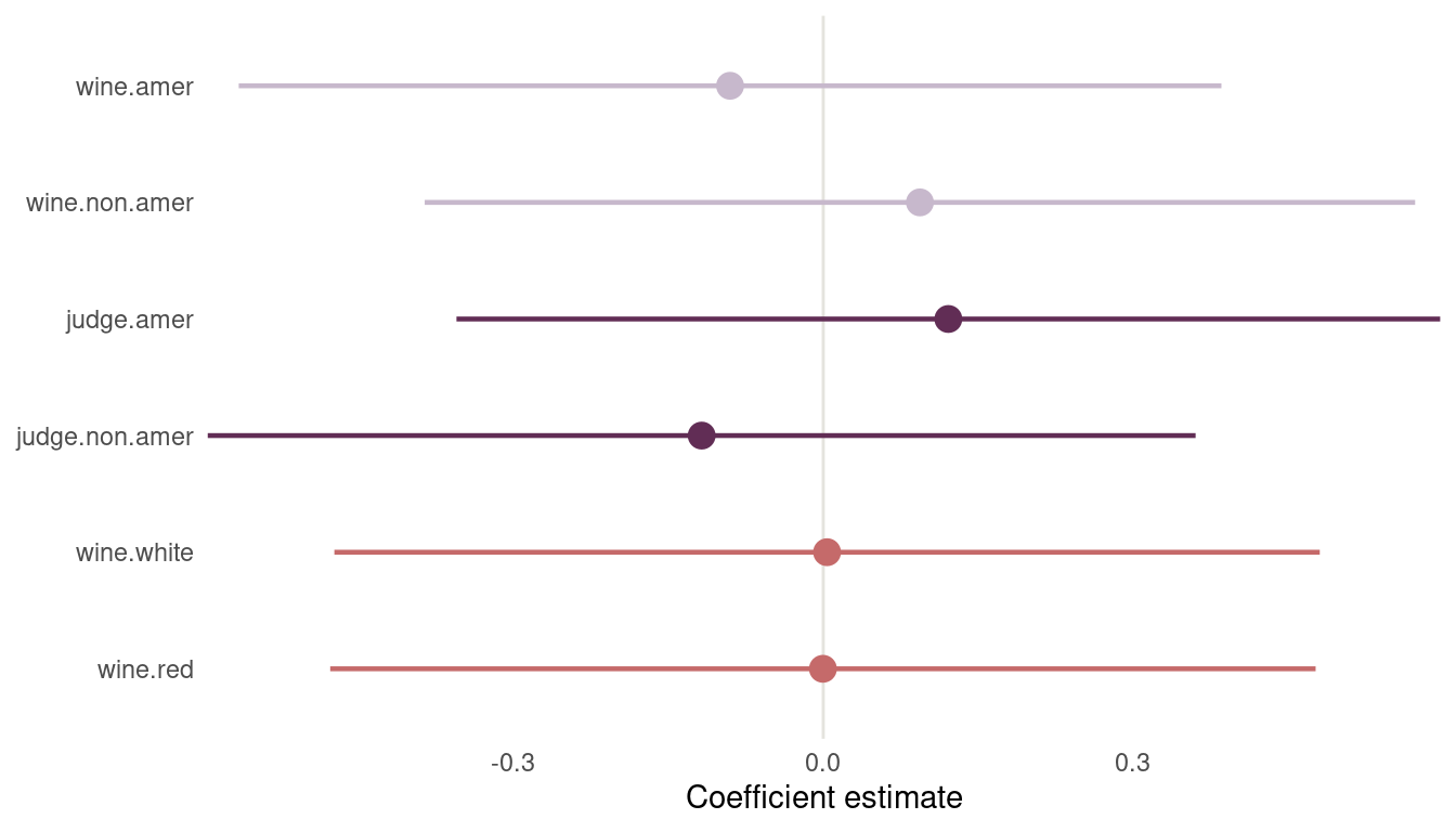
(#fig:m2 plot)Figure 14 | Second coefficient plot for wine data
Before we jump to conclusions, let’s first calculate contrasts. First, I define a function that extracts samples from the posterior, subsets to a specific predictor variable, and calculates the contrast between the first index variable and the second. The I apply this function to each predictor variable and store it in a dataframe.
calculate_contrast <- function(coefficient){
  m2 %>%
    extract.samples() %>%
    .[c(coefficient)] %>%
    as.data.frame() %>%
    as_tibble() %>%
    select(first = 1, second = 2) %>%
    transmute(contrast = first - second) %>%
    add_column(coefficient = coefficient)
}

c("j", "w", "f") %>%
  map_dfr(calculate_contrast) %>%
  mutate(coefficient = if_else(coefficient == "j", "judge.non.amer - amer",
                               if_else(coefficient == "f", "whine.red - white",
                               "wine.non.amer - amer"))) %>%
  ggplot(aes(contrast, fill = coefficient)) +
  geom_vline(xintercept = 0, colour = grey, size = 2) +
  geom_density(colour = grey, alpha = 0.5) +
  scale_fill_manual(values = c(purple, red, lightpurple)) +
  scale_y_continuous(labels = NULL) +
  labs(fill = NULL, y = NULL) +
  theme_minimal() +
  theme(panel.grid = element_blank(),
        legend.position = c(0.84, 0.85))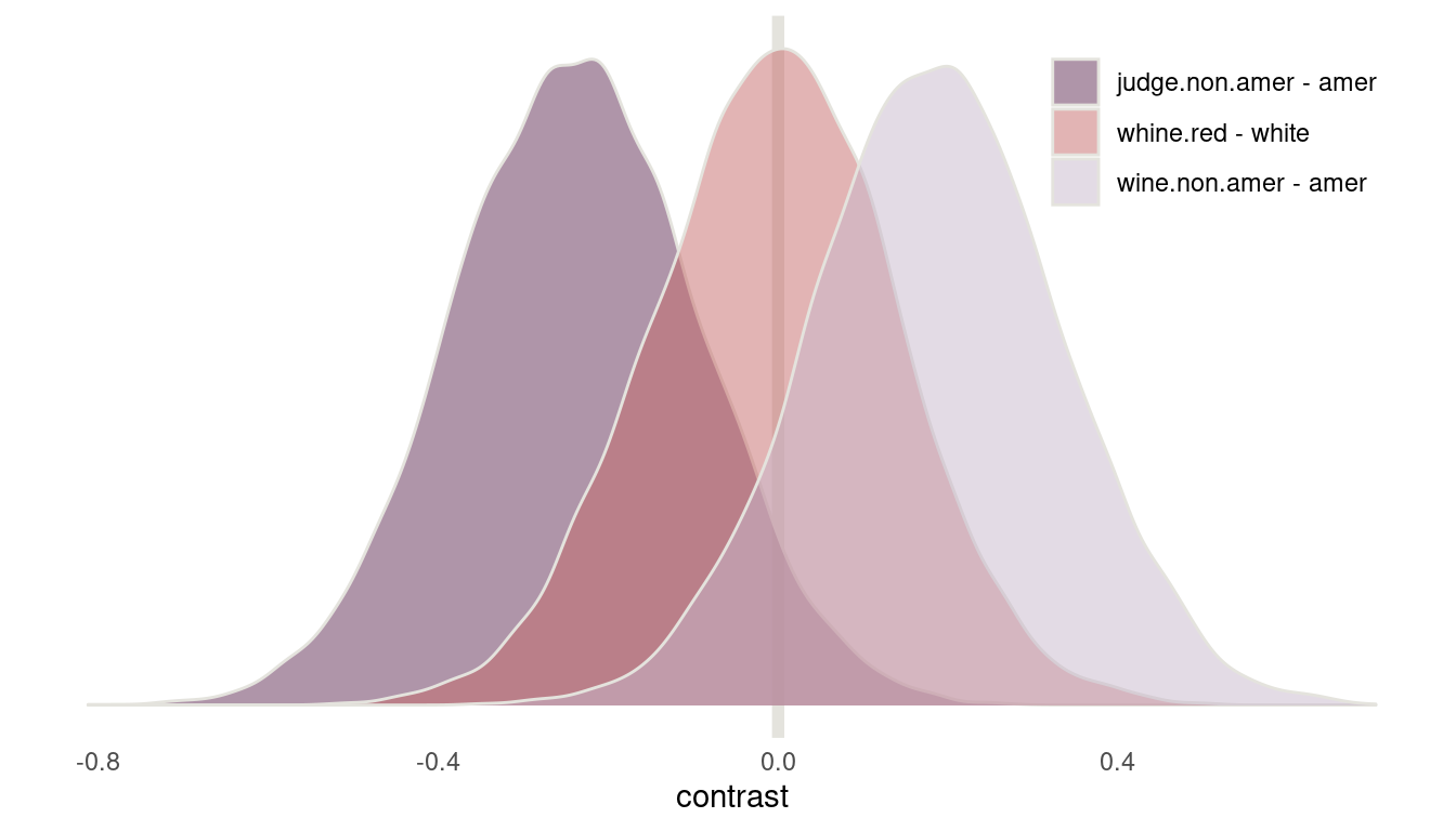
(#fig:8H6 contrasts)Figure 15 | Contrast plot for wine data
Now we can see that American judges tend to judge wines more positive. In contrast, non-American wines get worse scores on average. But note that both contrasts include zero. There is absolutely no difference in red vs. white wines, as it should be, because judges only compare within flights.
8H7
Now consider two-way interactions among the three features. You should end up with three different interaction terms in your model. These will be easier to build, if you use indicator variables. Again, justify your priors. Explain what each interaction term means. Be sure to interpret the model’s predictions on the outcome scale (\(mu\), the expected score), not on the scale of individual parameters. You can use link to help with this, or just your knowledge of the linear model instead. What do you conclude about the features and the scores? Can you relate the results of your model(s) to the individual judge and wine inferences from 8H5?
Even though I am not a big fan of indicator variables, I will do as told:
dat_wine2 <- Wines2012 %>%
  mutate(score = standardize(score),
         red.wine = if_else(flight == "white", 0, 1))
Now we can fit the new model with all the interaction terms.
m3 <- alist(
  score ~ dnorm(mu, sigma),
  mu <- a + bw*wine.amer + bj*judge.amer + br*red.wine + bwj*wine.amer*judge.amer + bwr*wine.amer*red.wine + bjr*judge.amer*red.wine,
  a ~ dnorm(0, 0.2),
  c(bw, bj, br, bwj, bwr, bjr) ~ dnorm(0, 0.5),
  sigma ~ dexp(1)) %>%
  quap(data = dat_wine2)
With the interaction terms added, it’s really impossible to see what the model thinks from the precis table output. Instead, we will build a table to apply the model to, to see the implications. The table contains all possible combinations of the indicator variables.
(dat_predict <- tibble(wine.amer = rep(c(0, 1), 4),
       judge.amer = rep(c(0, 1), each = 4),
       red.wine = c(0, 0, 1, 1, 0, 0, 1, 1)))
## # A tibble: 8 x 3
## wine.amer judge.amer red.wine
## <dbl> <dbl> <dbl>
## 1 0 0 0
## 2 1 0 0
## 3 0 0 1
## 4 1 0 1
## 5 0 1 0
## 6 1 1 0
## 7 0 1 1
## 8 1 1 1Now we can use link on this data set. Note that the column names of the link output correspond to the row values in dat_predict. So the first column predicts data for french white wine judged by a french. To label the data easier, I will first create a vector with the correct names.
lbl <- dat_predict %>%
  mutate(wine.label = if_else(wine.amer == 0, "F", "A"),
         judge.label = if_else(judge.amer == 0, "F", "A"),
         flight.label = if_else(red.wine == 0, "W", "R")) %>%
  transmute(label = str_c(judge.label, wine.label, flight.label)) %>%
  pull()
And we are ready to link:
link(m3, dat_predict) %>%
  as_tibble() %>%
  rename(!!lbl[1] := V1, !!lbl[2] := V2,
         !!lbl[3] := V3, !!lbl[4] := V4,
         !!lbl[5] := V5, !!lbl[6] := V6,
         !!lbl[7] := V7, !!lbl[8] := V8) %>%
  pivot_longer(cols = everything(), values_to = "mu", names_to = "interaction") %>%
  group_by(interaction) %>%
  summarise(across(mu, list(mean = mean, pi = PI))) %>%
  ungroup() %>%
  add_column(pi_type = rep(c("lower_pi", "upper_pi"), 8)) %>%
  pivot_wider(values_from = mu_pi, names_from = pi_type) %>%
  mutate(interaction = fct_reorder(interaction, mu_mean)) %>%
  ggplot(aes(mu_mean, interaction, xmin = lower_pi, xmax = upper_pi)) +
  geom_vline(xintercept = 0, colour = grey, size = 1) +
  geom_pointrange() +
  labs(y = NULL, x= "Predicted Score",
       subtitle = expression(paste('Read ', bold('AFR'), ' as an ',
                                   bold('A'), 'merican judge drinking ',
                                    bold('F'), 'rench ',
                                   bold('R'), 'ed wine'))) +
  theme_minimal() +
  theme(panel.grid = element_blank(),
        axis.ticks = element_line(colour = grey))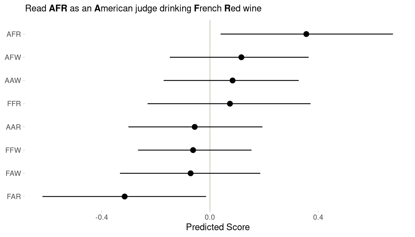
(#fig:8H7 link)Figure 16 | Coefficient plot for all interactions in the wine data.
We can clearly see that American judges tend to judge French wines more positive, for both red and white wines. And French judges clearly dislike American red wines. But looking back at m1 form 8H5, this trend is mainly driven by one American red wine, which was judged as extremely bad.
Conclusion
This was a great chapter about a topic that is closely related to my PhD (where I look at interactions in deep-time fossil data). And again, it reminds me of how powerful the teaching methods of McElreath are: He gives you full power over your models as you slowly get a grasp about the underlying concepts. I never felt more confident about using interactions.
## R version 4.0.4 (2021-02-15)
## Platform: x86_64-pc-linux-gnu (64-bit)
## Running under: Linux Mint 20.1
##
## Matrix products: default
## BLAS:   /usr/lib/x86_64-linux-gnu/blas/libblas.so.3.9.0
## LAPACK: /usr/lib/x86_64-linux-gnu/lapack/liblapack.so.3.9.0
##
## locale:
##  [1] LC_CTYPE=de_DE.UTF-8       LC_NUMERIC=C
##  [3] LC_TIME=de_DE.UTF-8        LC_COLLATE=de_DE.UTF-8
##  [5] LC_MONETARY=de_DE.UTF-8    LC_MESSAGES=de_DE.UTF-8
##  [7] LC_PAPER=de_DE.UTF-8       LC_NAME=C
##  [9] LC_ADDRESS=C               LC_TELEPHONE=C
## [11] LC_MEASUREMENT=de_DE.UTF-8 LC_IDENTIFICATION=C
##
## attached base packages:
## [1] parallel  stats     graphics  grDevices utils     datasets  methods
## [8] base
##
## other attached packages:
##  [1] kableExtra_1.3.4     knitr_1.30           rethinking_2.13
##  [4] rstan_2.21.2         StanHeaders_2.21.0-7 forcats_0.5.0
##  [7] stringr_1.4.0        dplyr_1.0.3          purrr_0.3.4
## [10] readr_1.4.0          tidyr_1.1.2          tibble_3.0.5
## [13] ggplot2_3.3.3        tidyverse_1.3.0
##
## loaded via a namespace (and not attached):
##  [1] nlme_3.1-152       matrixStats_0.57.0 fs_1.5.0           lubridate_1.7.9.2
##  [5] webshot_0.5.2      httr_1.4.2         tools_4.0.4        backports_1.2.1
##  [9] utf8_1.1.4         R6_2.5.0           DBI_1.1.1          mgcv_1.8-33
## [13] colorspace_2.0-0   withr_2.4.1        tidyselect_1.1.0   gridExtra_2.3
## [17] prettyunits_1.1.1  processx_3.4.5     curl_4.3           compiler_4.0.4
## [21] cli_2.2.0          rvest_0.3.6        xml2_1.3.2         labeling_0.4.2
## [25] bookdown_0.21      scales_1.1.1       mvtnorm_1.1-1      callr_3.5.1
## [29] systemfonts_1.0.1  digest_0.6.27      rmarkdown_2.6      svglite_2.0.0
## [33] pkgconfig_2.0.3    htmltools_0.5.1.1  highr_0.8          dbplyr_2.0.0
## [37] rlang_0.4.10       readxl_1.3.1       rstudioapi_0.13    shape_1.4.5
## [41] generics_0.1.0     farver_2.0.3       jsonlite_1.7.2     inline_0.3.17
## [45] magrittr_2.0.1     loo_2.4.1          Matrix_1.3-2       Rcpp_1.0.6
## [49] munsell_0.5.0      fansi_0.4.2        lifecycle_0.2.0    stringi_1.5.3
## [53] yaml_2.2.1         MASS_7.3-53.1      pkgbuild_1.2.0     grid_4.0.4
## [57] crayon_1.3.4       lattice_0.20-41    splines_4.0.4      haven_2.3.1
## [61] hms_1.0.0          ps_1.5.0           pillar_1.4.7       codetools_0.2-18
## [65] stats4_4.0.4       reprex_1.0.0       glue_1.4.2         evaluate_0.14
## [69] blogdown_1.1       V8_3.4.0           RcppParallel_5.0.2 modelr_0.1.8
## [73] vctrs_0.3.6        cellranger_1.1.0   gtable_0.3.0       assertthat_0.2.1
## [77] xfun_0.20          broom_0.7.3        coda_0.19-4        viridisLite_0.3.0
## [81] ellipsis_0.3.1