Introduction
This is the eigth part of a series where I work through the practice questions of the second edition of Richard McElreaths Statistical Rethinking.
Each post covers a new chapter and you can see the posts on previous chapters here. This chapter introduces Markov Chain Monte Carlo algorithms to obtain or approximate the posterior distribution.
You can find the the lectures and homework accompanying the book here.
The colours for this blog post are:
blue <- "#337677"
red <- "#C4977F"
grey <- "#ECDED2"
brown <- "#50473D"
Note that I added the 9H6 and 9H7 a few weeks after the publication of this post.
Easy practices
9E1
Which of the following is a requirement of the simple Metropolis algorithm?
- The parameters must be discrete.
- The likelihood function must be Gaussian.
- The proposal distribution must be symmetric.
A quick look into chapter 9.2 shows that parameters are allowed to be non-discrete (e.g. continuous) and that the likelihood function can be anything. The only requirement is (3). Or, keeping it in the metaphor of the islands, that there is an equal chance of proposing from Island A to Island B and from B to A.
9E2
Gibbs sampling is more efficient than the Metropolis algorithm. How does it achieve this extra efficiency? Are there any limitations to the Gibbs sampling strategy?
Hamiltonian algorithms jump from proposal to proposal in a random way. This might take some time to explore the whole posterior distribution space. Using conjugate priors, Gibbs sampling makes more intelligent proposals. In order words, it makes smart jumps in the joint posterior distribution. This way, you need less samples as you get less rejected proposals. The disadvantages of the Gibbs sampler is that it relies on conjugate priors, which you sometimes don’t want to provide, or sometimes it’s not even possible. Similar to the Metropolis MCMC, it get’s stuck in a valley of the joint posterior when there is a high correlation between parameters.
9E3
Which sort of parameters can Hamiltonian Monte Carlo not handle? Can you explain why?
Hamiltonian Monte Carlo cannot handle discrete parameters. This is because it requires a smooth surface to glide its imaginary particle over while sampling from the posterior distribution.
9E4
Explain the difference between the effective number of samples, n_eff as calculated by Stan,and the actual number of samples.
n_eff corresponds to the number of independent samples with the same estimation power as the number of autocorrelated samples. It is is a measure of how much independent information there is in autocorrelated chains. It is always smaller than the actual number of samples.
9E5
Which value should Rhat approach, when a chain is sampling the posterior distribution correctly?
A Rhat value of one is always a good sight.
9E6
Sketch a good trace plot for a Markov chain, one that is effectively sampling from the posterior distribution. What is good about its shape? Then sketch a trace plot for a malfunctioning Markov chain. What about its shape indicates malfunction?
So first a good chain. We want good mixing and the chain to be stationary, meaning that we should have some minor horizontal noise around a fixed mean.
tibble(chain = rnorm(1e3, 2, 0.25),
       steps = 1:1e3) %>%
  ggplot(aes(steps, chain)) +
  geom_line(colour = red) +
  coord_cartesian(ylim = c(0, 3)) +
  labs(x = "Steps", y = "Sample") +
  theme_minimal()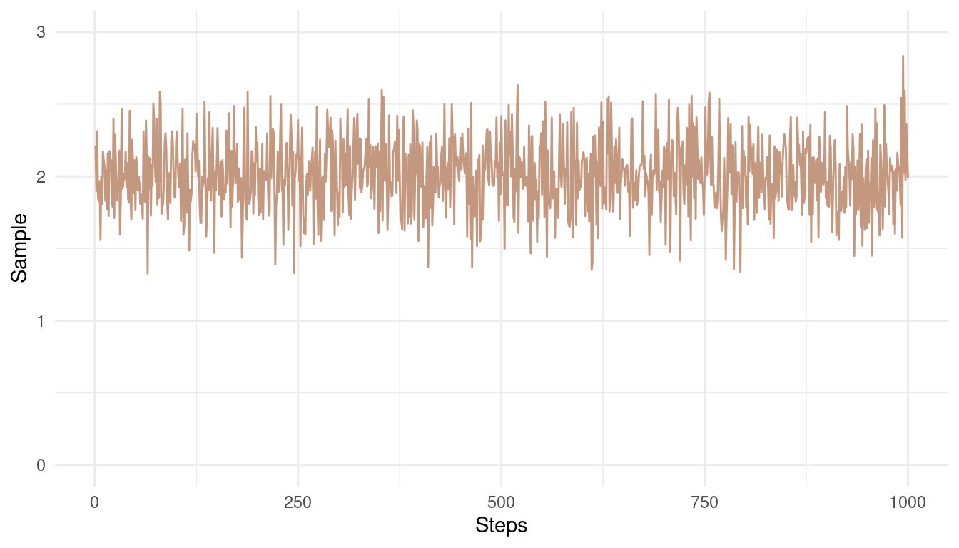
(#fig:9E6 Figure 1)A good Markow chain showing good mixing and stationarity.
Note how the chain converges around the mean of 2 and has only small and random divergence from that mean.
Now the bad chain:
tibble(mean.val = c(seq(2, 6, length.out = 400),
                seq(6, 1, length.out = 400),
                seq(1, 0.5, length.out = 200)),
       steps = 1:1e3,
       noise = rlogis(1e3, 0, 0.15)) %>%
  mutate(chain = mean.val + noise) %>%
  ggplot(aes(steps, chain)) +
  geom_line(colour = red) +
  labs(x = "Steps", y = "Sample") +
  theme_minimal()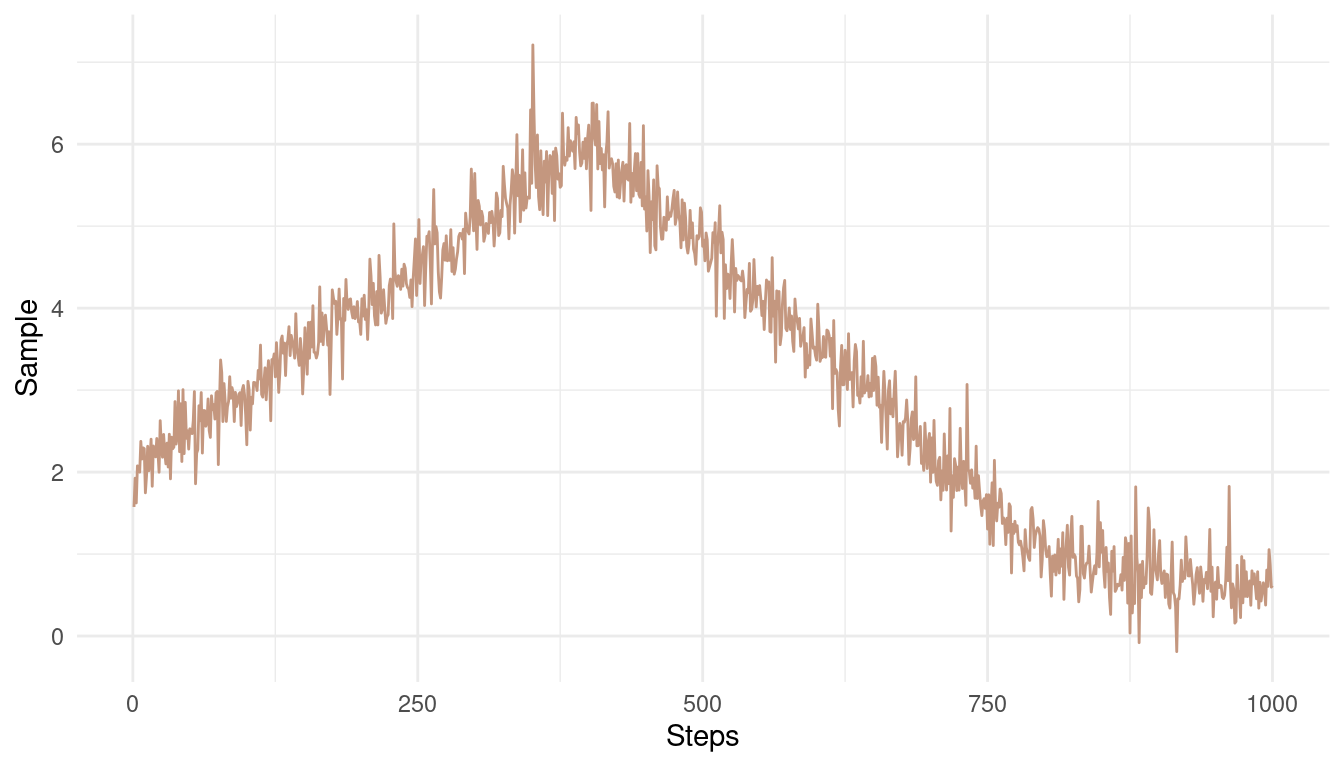
(#fig:9E6 Figure 2)A bad Markow chain showing bad mixing and non-stationarity
The chain is not stationary around a mean. Instead, it get’s stuck at some pretty unrealistic values.
Medium practices
9M1
Re-estimate the terrain ruggedness model from the chapter, but now using a uniform prior and an exponential prior for the standard deviation, sigma. The uniform prior should be
dunif(0,10)and the exponential should bedexp(1). Do the different priors have any detectible influence on the posterior distribution?
First, we fit the model from the chapter to compare the differences later on. Note that this model has the dexp(1) prior on sigma.
data("rugged")

dat_rugged <- rugged %>%
  as_tibble() %>%
  drop_na(rgdppc_2000) %>%
  transmute(log_gdp = log(rgdppc_2000),
         log_gdp_std = log_gdp/ mean(log_gdp),
         rugged_std = rugged / max(rugged),
         cid = if_else(cont_africa == 1, 1, 2)) %>%
  as.list()

m9.1 <- alist(
  log_gdp_std ~ dnorm(mu, sigma),
  mu <- a[cid] + b[cid] * (rugged_std - 0.215),
  a[cid] ~ dnorm(1, 0.1),
  b[cid] ~ dnorm(0, 0.3),
  sigma ~ dexp(1)) %>%
  ulam(data = dat_rugged, chains = 1)
And now the new model with the updated priors.
m9.1.upd <- alist(
  log_gdp_std ~ dnorm(mu, sigma),
  mu <- a[cid] + b[cid] * (rugged_std - 0.215),
  a[cid] ~ dnorm(1, 0.1),
  b[cid] ~ dnorm(0, 0.3),
  sigma ~ dunif(0, 10)) %>%
  ulam(data = dat_rugged, chains = 1)
Let’s plot the prior distributions against each other.
tibble(exponential = rexp(1e3, 1),
       uniform = runif(1e3, 0, 10)) %>%
  pivot_longer(cols = everything(),
               names_to = "type",
               values_to = "Sigma") %>%
  ggplot(aes(Sigma, fill = type)) +
  geom_density(colour = grey,
               alpha = 0.6) +
  scale_fill_manual(values = c(blue, red)) +
  labs(y = NULL, fill = NULL) +
  theme_minimal()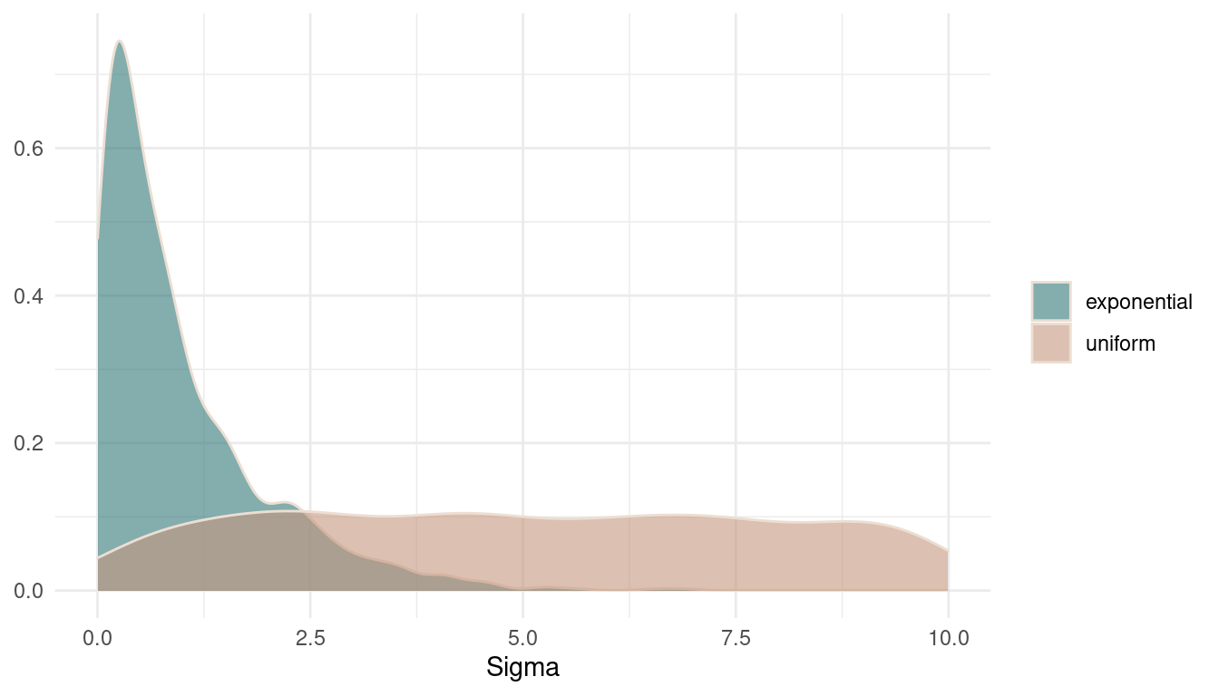
(#fig:9M1 Figure 3)Prior distributions on sigma.
Now we can look at the posteriors for sigmaand compare the models.
tibble(exponential = extract.samples(m9.1) %>%
         pluck("sigma"),
       uniform = extract.samples(m9.1.upd) %>%
         pluck("sigma")) %>%
  pivot_longer(cols = everything(),
               names_to = "model",
               values_to = "Sigma") %>%
  ggplot(aes(Sigma, fill = model)) +
  geom_density(colour = grey,
               alpha = 0.6) +
  scale_fill_manual(values = c(blue, red)) +
  labs(y = NULL, fill = NULL) +
  theme_minimal()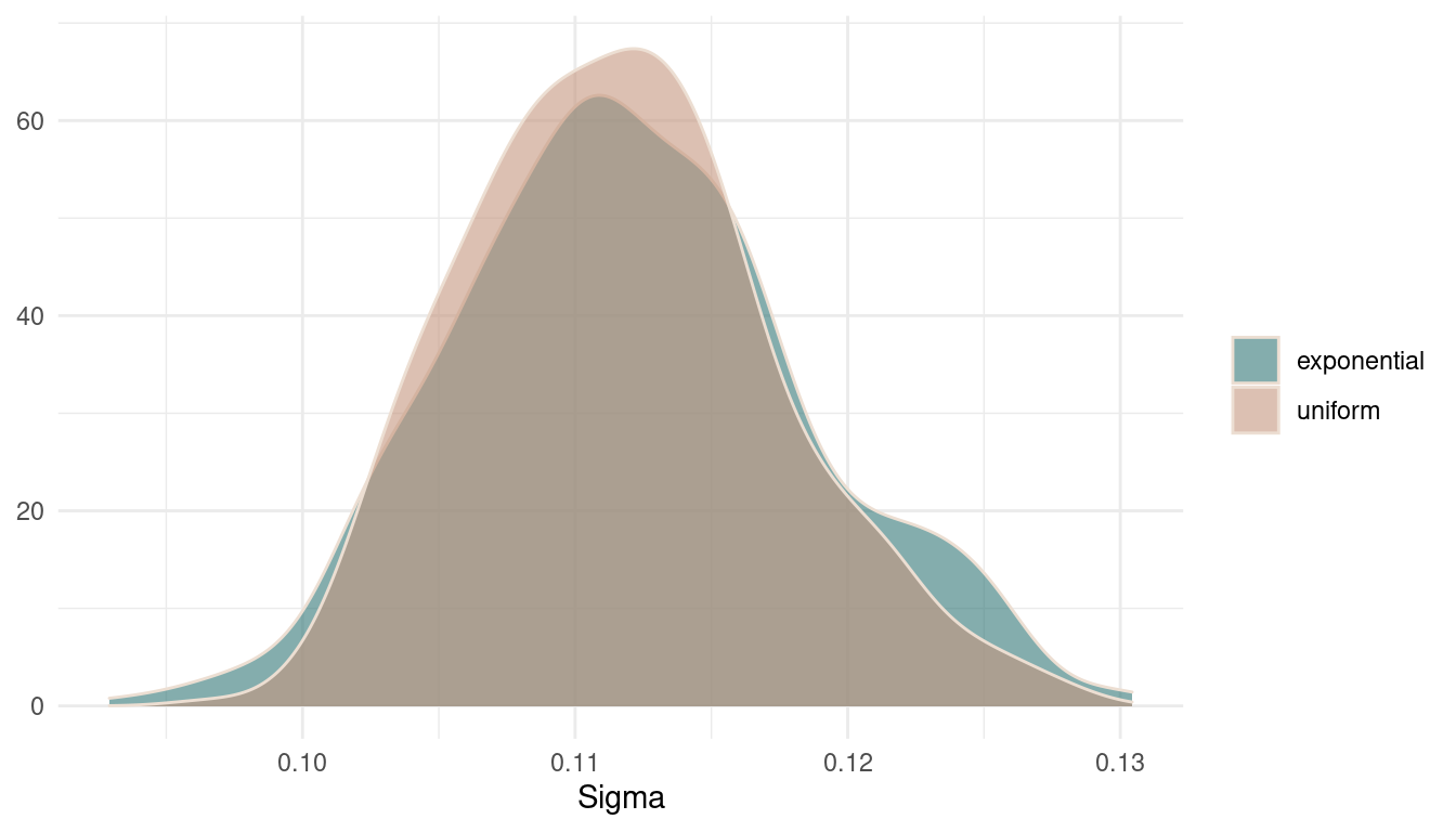
(#fig:9M1 Figure 4)Posterior distributions for sigma.
There are basically no differences in the posterior. It seems that there was so much data that the prior was just overwhelmed. However, the uniform prior results in a broader and less peaky posterior, expressing more uncertainty.
9M2
Modify the terrain ruggedness model again. This time, change the prior for
b[cid]todexp(0.3). What does this do to the posterior distribution? Can you explain it?
First, let’s take a look at the modified prior distribution:
tibble(exponential = rexp(1e3, 0.3))  %>%
  ggplot(aes(exponential)) +
  geom_density(colour = grey,
               alpha = 0.8, fill = brown) +
  labs(y = NULL, fill = NULL) +
theme_minimal()![Prior distributions on b[cid]](/post/chapter9_files/figure-html/9M2%20%20Figure%205-1.png)
(#fig:9M2 Figure 5)Prior distributions on b[cid]
And now refit the model.
m9.1.mod <- alist(
  log_gdp_std ~ dnorm(mu, sigma),
  mu <- a[cid] + b[cid] * (rugged_std - 0.215),
  a[cid] ~ dnorm(1, 0.1),
  b[cid] ~ dexp(0.3),
  sigma ~ dexp(1)) %>%
  ulam(data = dat_rugged, chains = 1)
##
## SAMPLING FOR MODEL '2d7c6a1aa2bdb94b39fe33e534d21641' NOW (CHAIN 1).
## Chain 1:
## Chain 1: Gradient evaluation took 1.1e-05 seconds
## Chain 1: 1000 transitions using 10 leapfrog steps per transition would take 0.11 seconds.
## Chain 1: Adjust your expectations accordingly!
## Chain 1:
## Chain 1:
## Chain 1: Iteration: 1 / 1000 [ 0%] (Warmup)
## Chain 1: Iteration: 100 / 1000 [ 10%] (Warmup)
## Chain 1: Iteration: 200 / 1000 [ 20%] (Warmup)
## Chain 1: Iteration: 300 / 1000 [ 30%] (Warmup)
## Chain 1: Iteration: 400 / 1000 [ 40%] (Warmup)
## Chain 1: Iteration: 500 / 1000 [ 50%] (Warmup)
## Chain 1: Iteration: 501 / 1000 [ 50%] (Sampling)
## Chain 1: Iteration: 600 / 1000 [ 60%] (Sampling)
## Chain 1: Iteration: 700 / 1000 [ 70%] (Sampling)
## Chain 1: Iteration: 800 / 1000 [ 80%] (Sampling)
## Chain 1: Iteration: 900 / 1000 [ 90%] (Sampling)
## Chain 1: Iteration: 1000 / 1000 [100%] (Sampling)
## Chain 1:
## Chain 1: Elapsed Time: 0.118896 seconds (Warm-up)
## Chain 1: 0.036644 seconds (Sampling)
## Chain 1: 0.15554 seconds (Total)
## Chain 1:Looking at the coefficient estimates, we can already see that something happened to b[2].
precis(m9.1.mod, depth = 2) %>%
  as_tibble(rownames = "coefficient") %>%
knitr::kable(digits = 2)| coefficient | mean | sd | 5.5% | 94.5% | n_eff | Rhat4 |
|---|---|---|---|---|---|---|
| a[1] | 0.89 | 0.02 | 0.86 | 0.91 | 415.43 | 1.00 |
| a[2] | 1.05 | 0.01 | 1.03 | 1.07 | 468.42 | 1.00 |
| b[1] | 0.15 | 0.08 | 0.04 | 0.28 | 247.14 | 1.01 |
| b[2] | 0.02 | 0.02 | 0.00 | 0.05 | 395.20 | 1.00 |
| sigma | 0.11 | 0.01 | 0.11 | 0.12 | 428.75 | 1.00 |
Let’s plot the posterior
extract.samples(m9.1.mod) %>%
         pluck("b") %>%
         .[,1] %>%
  as_tibble_col(column_name = "b1") %>%
  ggplot(aes(b1)) +
  geom_density(colour = grey,
               fill = brown,
               alpha = 0.8) +
  labs(y = NULL) +
theme_minimal()![Posterior distributions for b[2]](/post/chapter9_files/figure-html/Figure%206-1.png)
(#fig:Figure 6)Posterior distributions for b[2]
We can clearly see that the posterior get’s cut off at zero and only shows positive numbers. This is because the prior does not allow any numbers below zero.
9M3
Re-estimate one of the Stan models from the chapter, but at different numbers of
warmupiterations. Be sure to use the same number of sampling iterations in each case. Compare then_effvalues. How much warmup is enough?
Let’s stick to the model m9.1. Let’s define a function that fits this model dependent on the warmup number, and returns the effective number of samples. Similar to the update function from the brms package, we can use ulam on a fitted model, which makes updating much easier. This is described in the help for ?ulam.
refit_m9.1 <- function(N){
    ulam(m9.1, chains = 1, warmup = N, iter = 1000,
       cores = parallel::detectCores()) %>%
    precis() %>%
    as_tibble() %>%
    pull(n_eff)
}
Now we can iterate over the warmup numbers using purrr::map.
n_effective <- seq(1, 500, length.out = 100) %>%
  round(0) %>%
  map_dbl(refit_m9.1)
Now we just refitted 100 new models with a warmup betwenn 1 and 500. Let’s plot the results.
n_effective %>%
  as_tibble_col(column_name = "n_eff") %>%
  add_column(warmup = seq(1, 500, length.out = 100)) %>%
  ggplot(aes(warmup, n_eff)) +
  geom_line(colour = red, size = 0.9) +
  labs(x = "Warm-up", y = "ESS") +
  theme_minimal()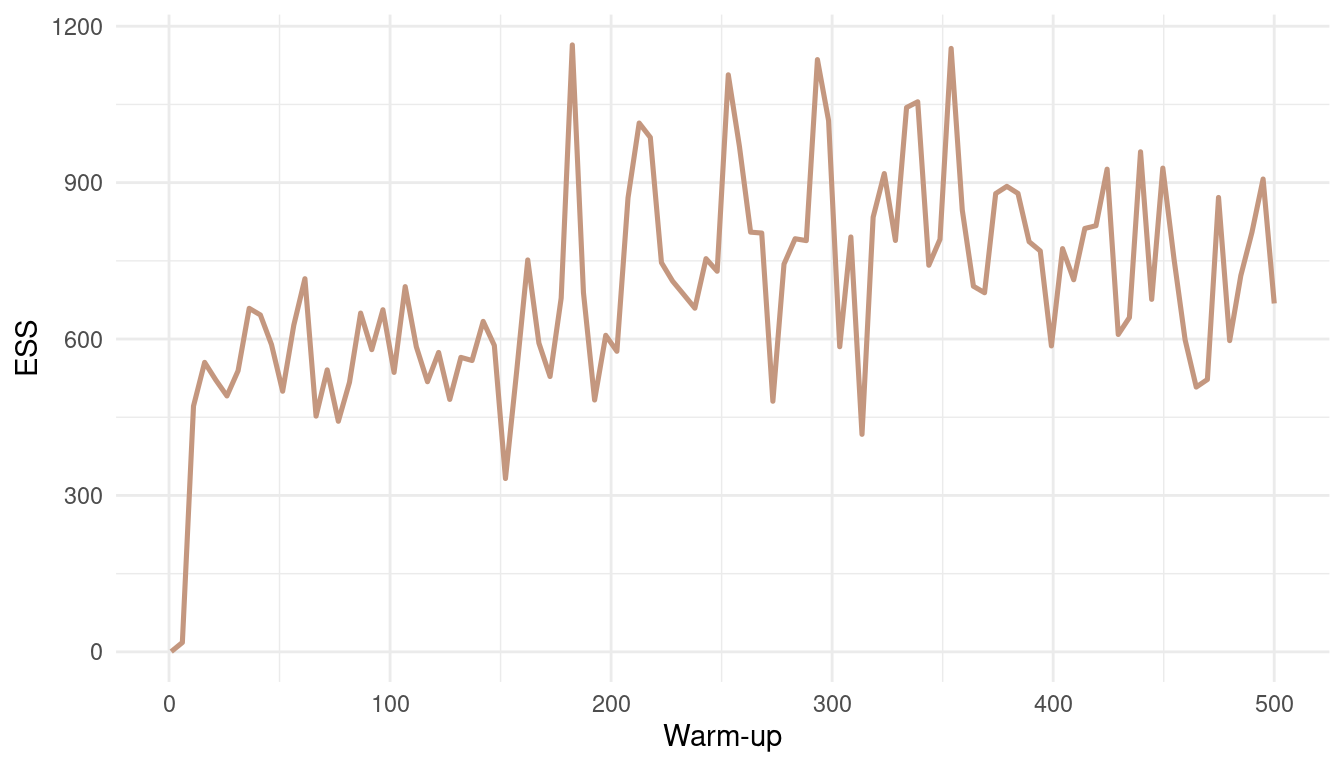
(#fig:9M3 Figure 7)Effective number of samples (ESS) as a function of warmup.
With such an easy model, and such a low correlation between parameters, the effective number of samples increases fast. We get a robust estimate for a warm-up bigger than 20. But note that this is not the case for all models.
Hard practices
9H1
Run the model below and then inspect the posterior distribution and explain what it is accomplishing.
mp <- map2stan(
  alist(
    a ~ dnorm(0,1),
    b ~ dcauchy(0,1)),
  data=list(y=1),
  start=list(a=0,b=0),
  iter=1e4,
  warmup=100,
  WAIC=FALSE )
Compare the samples for the parameters a and b. Can you explain the different trace plots, using what you know about the Cauchy distribution?
Let’s look at the priors first.
tibble(a = rnorm(1e5, 0, 1),
       b = rcauchy(1e5, 0, 1)) %>%
  pivot_longer(cols = everything(),
               names_to = "Parameter",
               values_to = "Estimate") %>%
  ggplot(aes(Estimate, fill = Parameter)) +
  geom_density(colour = brown) +
  scale_fill_manual(values = c(red, blue)) +
  facet_wrap(~ Parameter, scales = "free") +
  labs(y = NULL, fill = NULL) +
  theme_minimal()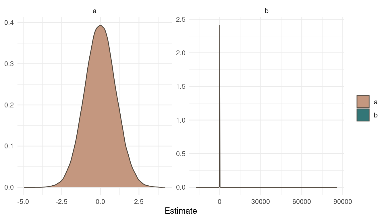
(#fig:9H1 Figure 8)Prior simulation for a and b.
The normal prior on a is pretty straight forward. But looking at b and the cauchy prior draws a different picture. The cauchy distribution places the most probability mass at the same area as a but with some very extreme outliers.
Now let’s look at the posterior:
extract.samples(mp) %>%
  as_tibble() %>%
  pivot_longer(cols = everything(),
               names_to = "Parameter",
               values_to = "Estimate") %>%
  ggplot(aes(Estimate, fill = Parameter)) +
  geom_density(colour = brown) +
  scale_fill_manual(values = c(red, blue)) +
  facet_wrap(~ Parameter, scales = "free") +
  labs(y = NULL, fill = NULL) +
  theme_minimal()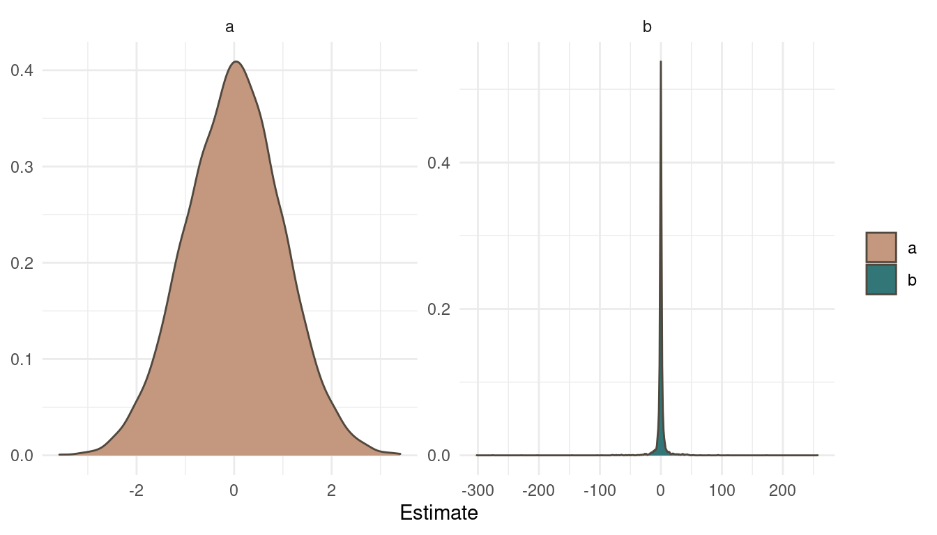
(#fig:9H1 Figure 9)Posterior distribution for a and b.
Notice a pattern? The posteriors look exactly as the priors. That’s simply because we didn’t specify any likelihood, any data to update our beliefs. So the MCMC just samples from the priors. Now what does the trace plots look like?
plot(mp, n_col = 2)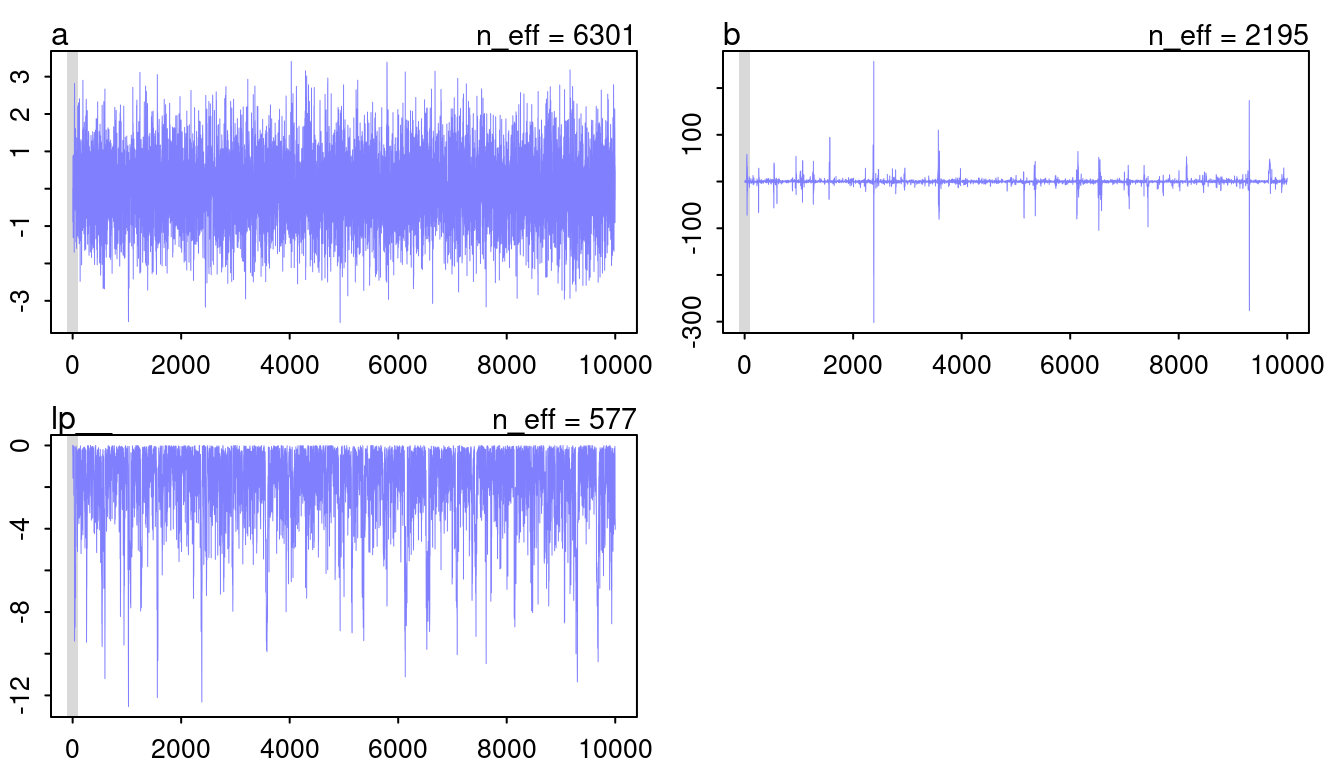
(#fig:9H1 Figure 10)Trace plots for model mp.
The chain for a looks like a beautiful and hairy caterpillar, so that’s fine. However, b looks very worrying. It seems like the chain diverges from the mean to some extremes from time to time. This normally indicates some convergence problems. However, I think it is fine in this case as it closely mirrors the cauchy distribution, with a lot of probability at a mean and some very extreme outliers.
9H2
Recall the divorce rate example from Chapter 5. Repeat that analysis, using
ulam()this time, fitting modelsm 5.1, m5.2, and m5.3. Usecompareto compare the models on the basis of WAIC orPSIS. Explain the results.
Ok, we need the data and the processing steps as in Chapter 5.
data(WaffleDivorce)

dat_waffel <- WaffleDivorce %>%
  as_tibble() %>%
  transmute(across(c(Divorce, Marriage, MedianAgeMarriage), standardize)) %>%
  select(D = Divorce, M = Marriage, A = MedianAgeMarriage)
And here are the models, now refit with ulam(). Note that we need to set log_lik = TRUE to enable the calculation of WAIC and LOO.
m5.1 <- alist(
  D ~ dnorm(mu, sigma),
  mu <- a + bA * A,
  a ~ dnorm(0, 0.2),
  bA ~ dnorm(0, 0.5),
  sigma ~ dexp(1)) %>%
  ulam(data = dat_waffel, cores = 8, log_lik = TRUE)

m5.2 <- alist(
  D ~ dnorm(mu, sigma),
  mu <- a + bM * M,
  a ~ dnorm(0, 0.2),
  bM ~ dnorm(0, 0.5),
  sigma ~ dexp(1)) %>%
  ulam(data = dat_waffel, cores = 8, log_lik = TRUE)

m5.3 <- alist(
  D ~ dnorm(mu, sigma),
  mu <- a + bM * M + bA * A,
  a ~ dnorm(0, 0.2),
  c(bM, bA) ~ dnorm(0, 0.5),
  sigma ~ dexp(1)) %>%
  ulam(data = dat_waffel, cores = 8, log_lik = TRUE)
We should check the MCMC performance.
c(m5.1, m5.2, m5.3) %>%
  walk(traceplot)
## [1] 1000
## [1] 1
## [1] 1000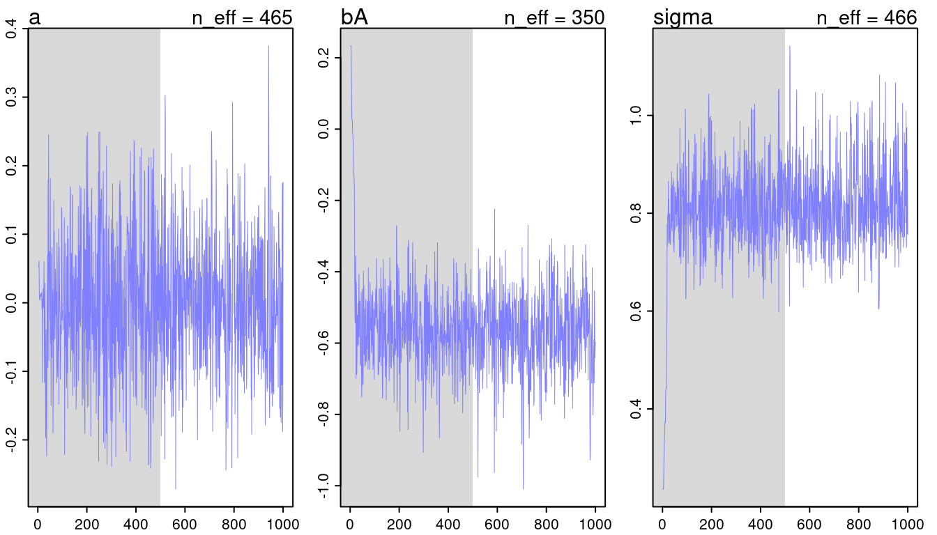
(#fig:9H2 Figure 11-1)Trace plots for all models from chapter 5.
## [1] 1000
## [1] 1
## [1] 1000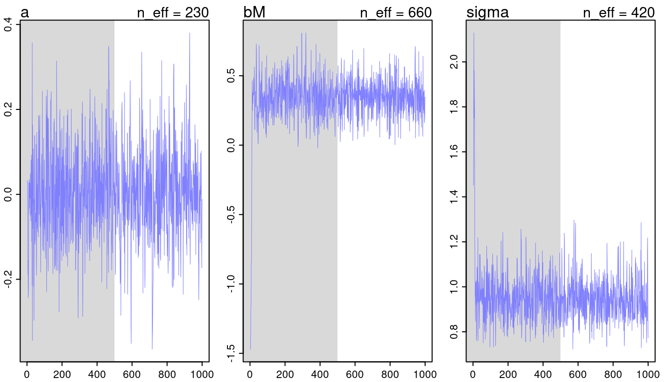
(#fig:9H2 Figure 11-2)Trace plots for all models from chapter 5.
## [1] 1000
## [1] 1
## [1] 1000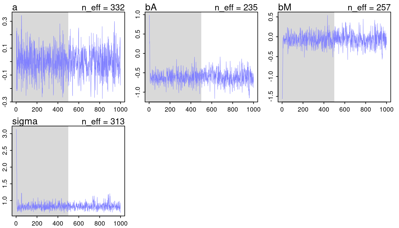
(#fig:9H2 Figure 11-3)Trace plots for all models from chapter 5.
They look all fine and the numbers of effective samples is fine as well for all. However, it’s substantially lower for the parameters in m5.3, indicating correlation. Now checking the rhat values.
get_rhat <- function(model.input) {
  model.input %>%
  precis() %>%
  as_tibble(rownames = "estimate") %>%
  select(estimate, rhat = Rhat4)
}

c(m5.1, m5.2, m5.3) %>%
  map_dfr(get_rhat) %>%
  add_column(model = c(rep("5.1", 3),
                       rep("5.2", 3),
                       rep("5.3", 4)), .before = "estimate") %>%
knitr::kable(digits = 3)| model | estimate | rhat |
|---|---|---|
| 5.1 | a | 1.000 |
| 5.1 | bA | 1.002 |
| 5.1 | sigma | 1.008 |
| 5.2 | a | 1.008 |
| 5.2 | bM | 1.000 |
| 5.2 | sigma | 1.000 |
| 5.3 | a | 0.998 |
| 5.3 | bA | 1.017 |
| 5.3 | bM | 1.006 |
| 5.3 | sigma | 0.998 |
They look all good. But note that they are slightly increased in model m5.3, probably due to the correlation between parameters.
Now we can compare the models via the compare() function.
compare(m5.1, m5.2, m5.3, func = PSIS) %>%
  as_tibble(rownames = "Model") %>%
knitr::kable(digits = 2)| Model | PSIS | SE | dPSIS | dSE | pPSIS | weight |
|---|---|---|---|---|---|---|
| m5.1 | 126.15 | 13.05 | 0.00 | NA | 3.87 | 0.74 |
| m5.3 | 128.28 | 13.03 | 2.14 | 0.84 | 5.12 | 0.26 |
| m5.2 | 139.19 | 9.91 | 13.04 | 9.48 | 2.90 | 0.00 |
Model m5.1 with only median age at marriage as a predictor performs best, but is not really distinguishable from model m5.3. However, the model with marriage rate only, m5.2 clearly performs worse than both.
9H3
Sometimes changing a prior for one parameter has unanticipated effects on other parameters. This is because when a parameter is highly correlated with another parameter in the posterior, the prior influences both parameters. Here’s an example to work and think through. Go back to the leg length example in Chapter 5. Here is the code again, which simulates height and leg lengths for 100 imagined individuals:
N <- 100 # number of individuals
height <- rnorm(N,10,2) # sim total height of each
leg_prop <- runif(N,0.4,0.5) # leg as proportion of height
leg_left <- leg_prop*height + # sim left leg as proportion + error
  rnorm( N , 0 , 0.02 )
leg_right <- leg_prop*height +    # sim right leg as proportion + error
  rnorm( N , 0 , 0.02 )

# combine into data frame
d <- data.frame(height,leg_left,leg_right)
And below is the model you fit before, resulting in a highly correlated posterior for the two beta parameters. This time, fit the model using
ulam():
m5.8s <- ulam(
  alist(
    height ~ dnorm( mu , sigma ),
    mu <- a + bl*leg_left + br*leg_right,
    a ~ dnorm( 10 , 100 ),
    bl ~ dnorm( 2 , 10 ),
    br ~ dnorm( 2 , 10 ),
    sigma ~ dexp( 1 )),
  data=d, chains=4, start=list(a=10,bl=0,br=0.1,sigma=1),
  log_lik = TRUE)
Compare the posterior distribution produced by the code above to the posterior distribution produced when you change the prior forbrso that it is strictly positive:
m5.8s2 <- ulam(
  alist(
    height ~ dnorm( mu , sigma ),
    mu <- a + bl*leg_left + br*leg_right,
    a ~ dnorm( 10 , 100 ),
    bl ~ dnorm( 2 , 10 ),
    br ~ dnorm( 2 , 10 ),
    sigma ~ dexp( 1 )),
  data=d, chains=4,
  constraints=list(br="lower=0"),
  start=list(a=10,bl=0,br=0.1,sigma=1),
  log_lik = TRUE)
Note the
constraintslist. What this does is constrain the prior distribution ofbrso that it has positive probability only above zero. In other words, that prior ensures that the posterior distribution forbrwill have no probability mass below zero. Compare the two posterior distributions form5.8sandm5.8s2. What has changed in the posterior distribution of both beta parameters? Can you explain the change induced by the change inprior?
First let’s take a look at both model summaries:
precis(m5.8s) %>%
  as_tibble(rownames = "estimate") %>%
  add_column(model = "m5.8s", .before = "estimate") %>%
  full_join(

    precis(m5.8s2) %>%
      as_tibble(rownames = "estimate") %>%
      add_column(model = "m5.8s2", .before = "estimate")

  ) %>%
  arrange(estimate) %>%
knitr::kable(digits = 3)| model | estimate | mean | sd | 5.5% | 94.5% | n_eff | Rhat4 |
|---|---|---|---|---|---|---|---|
| m5.8s | a | 0.794 | 0.284 | 0.342 | 1.236 | 835.337 | 1.001 |
| m5.8s2 | a | 0.796 | 0.290 | 0.337 | 1.255 | 881.540 | 1.001 |
| m5.8s | bl | 0.338 | 2.155 | -3.095 | 3.617 | 603.926 | 1.004 |
| m5.8s2 | bl | -0.353 | 1.504 | -2.905 | 1.659 | 533.978 | 1.004 |
| m5.8s | br | 1.690 | 2.158 | -1.604 | 5.121 | 597.346 | 1.004 |
| m5.8s2 | br | 2.382 | 1.504 | 0.357 | 4.920 | 544.298 | 1.004 |
| m5.8s | sigma | 0.619 | 0.047 | 0.548 | 0.695 | 1131.295 | 1.000 |
| m5.8s2 | sigma | 0.622 | 0.045 | 0.554 | 0.698 | 930.755 | 1.008 |
We can already see that changing the prior on one parameter (br) results in a change in the other parameter (bl).
We can and should plot the whole posterior distributions:
extract.samples(m5.8s) %>%
  as_tibble() %>%
  add_column(model = "m5.8s") %>%
  full_join(

    extract.samples(m5.8s2) %>%
      as_tibble() %>%
      add_column(model = "m5.8s2")

  ) %>%
  pivot_longer(cols = -model,
               names_to = "estimate") %>%
  ggplot(aes(value, fill = model)) +
  geom_density(colour = grey, alpha = 0.7) +
  facet_wrap(~estimate, scales = "free") +
  scale_fill_manual(values = c(red, blue)) +
  scale_y_continuous(breaks = 0, labels = NULL) +
  theme_minimal() +
  labs(y = NULL, fill = "Model",
       x = "Posterior estimate") +
  theme(legend.position = c(0.9, 0.9),
        legend.background = element_rect(colour = "white"))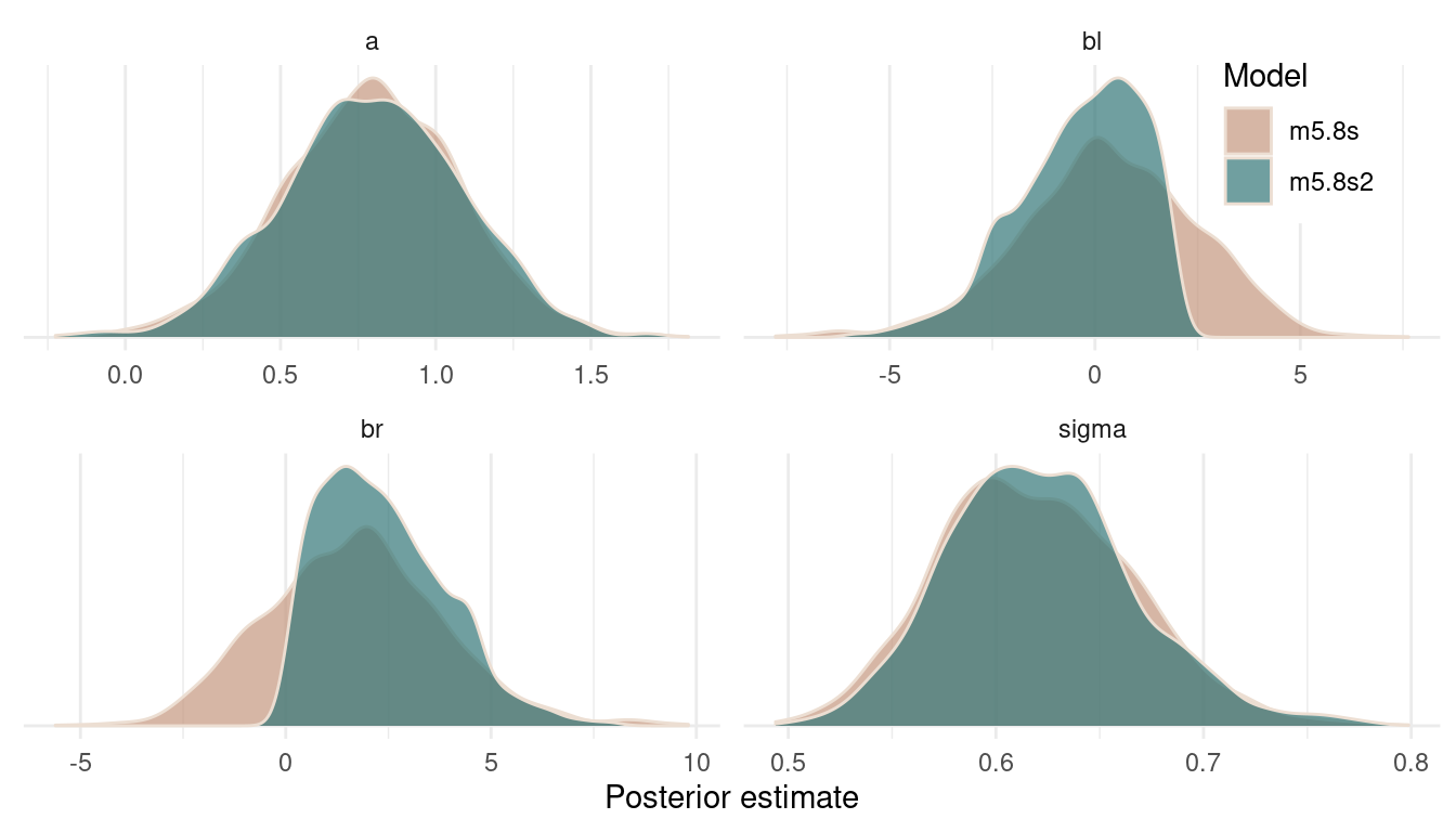
(#fig:9H3 Figure 12)Posterior distributions for all estimates of both models.
We can see that the posterior on the intercept and on sigma remains constant. But forcing br to be positive shifts the posterior for bl to the left. That’s because br and bl are negatively correlated in the likelihood (the data) and the model wants to keep this information. And the only way to express this information in the posterior is to shift the estimate for bl to the left, when br is shifted to the right. It’s just a necessity arising from the extreme negative correlation in the data.
9H4
For the two models fit in the previous problem, use WAIC or PSIS to compare the effective numbers of parameters for each model. You will need to use log_lik=TRUE to instruct ulam() to compute the terms that both WAIC and PSIS need. Which model has more effective parameters? Why?
We can just throw both models into the compare() function with Pareto smoothed importance sampling (PSIS).
compare(m5.8s, m5.8s2, func = "PSIS") %>%
  as_tibble(rownames = "Estimate") %>%
knitr::kable(digits = 2)| Estimate | PSIS | SE | dPSIS | dSE | pPSIS | weight |
|---|---|---|---|---|---|---|
| m5.8s2 | 190.02 | 11.04 | 0.00 | NA | 2.84 | 0.61 |
| m5.8s | 190.91 | 11.21 | 0.89 | 0.62 | 3.32 | 0.39 |
The important column here is pPSIS containing the effective number of parameters given by PSIS, or “the overfitting penalty”. There is not much difference in these models, but m5.8s2 is a bit less flexible as the prior is more informative. At the same time, the model fits the data slightly worse as indicated by the other PSIS estimates.
9H5
Modify the Metropolis algorithm code from the chapter to handle the case that the island populations have a different distribution than the island labels. This means the island’s number will not be the same as its population.
Here’s the code from the chapter:
num_weeks <- 1e5
positions <- rep(0, num_weeks)
current <- 10

for (i in 1:num_weeks) {

  # record current position
  positions[i] <- current

  # flip coin to generate proposal
  proposal <- current + sample(c(-1, 1) , size = 1)

  # now make sure he loops around the archipelago
  if (proposal < 1)
    proposal <- 10
  if (proposal > 10)
    proposal <- 1

  # move?
  prob_move <- proposal / current
  current <- ifelse(runif(1) < prob_move , proposal , current)

}
Let’s set up a data frame with the number of the islands (1 to 10) and population for each islands.
set.seed(123)
island <- tibble(current = 1:10,
                 population = rpois(10, 10))

island %>%
  arrange(desc(population)) %>%
knitr::kable()| current | population |
|---|---|
| 6 | 15 |
| 3 | 14 |
| 10 | 13 |
| 7 | 11 |
| 4 | 10 |
| 5 | 10 |
| 2 | 9 |
| 1 | 8 |
| 8 | 5 |
| 9 | 4 |
Island 6 has the highest population, and island 9 the lowest.
Now to refit the code, we simply make the probability to move prob_move dependent on the population, and not on the number of the island (which was equal to the population in the original code).
num_weeks <- 1e5
positions <- rep(0, num_weeks)
current <- 10

for (i in 1:num_weeks) {

  # record current position
  positions[i] <- island$current[current]

  # flip coin to generate proposal
  proposal <- island$current[current] + sample(c(-1, 1), size = 1)

  # now make sure he loops around the archipelago
  if (proposal < 1)
    proposal <- 10
  if (proposal > 10)
    proposal <- 1

  # move?
  prob_move <- island$population[proposal] / island$population[current]
  current <- ifelse(runif(1) < prob_move , island$current[proposal] , island$current[current])

}
Now we can plot the results. We start by plotting the first 100 weeks:
tibble(positions = positions[1:100], week = 1:100) %>%
  ggplot(aes(week, positions)) +
  geom_point(shape = 21, size = 2,
    stroke = 1.1,  alpha = 0.8,
    fill = blue, colour = brown) +
  labs(y = "Island", x = "Week") +
  scale_y_continuous(breaks = seq(2, 10, by = 2)) +
  theme_minimal() +
  theme(panel.grid.major.x = element_blank(),
        panel.grid.minor.x = element_blank())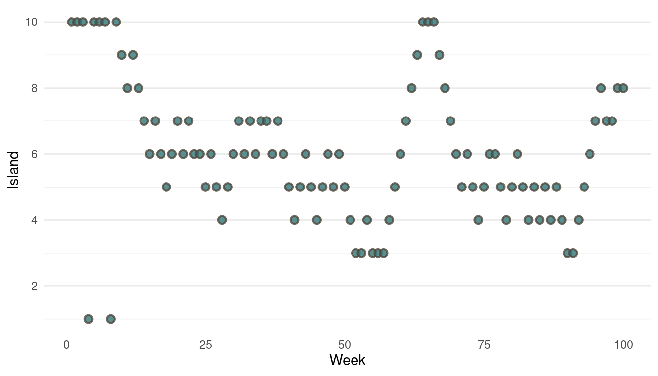
(#fig:9H5 Figure 13)Walk-through the first 100 island visits.
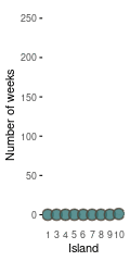
The movement looks all good, now we should take a look at the absolute visits for each islands.
tibble(positions = positions) %>%
  count(positions, name = "n_weeks") %>%
  mutate(positions = as_factor(positions),
         positions = fct_reorder(positions, n_weeks)) %>%
  ggplot(aes(positions, n_weeks)) +
  geom_segment(aes(xend = positions, y = 0, yend = n_weeks),
               size = 2, colour = grey) +
  geom_point(shape = 21, size = 4,
             stroke = 1.1, alpha = 0.8,
             fill = blue, colour = brown) +
  labs(x = "Island", y = "Number of weeks") +
  theme_minimal() +
  theme(panel.grid = element_blank(),
        axis.ticks.y = element_line())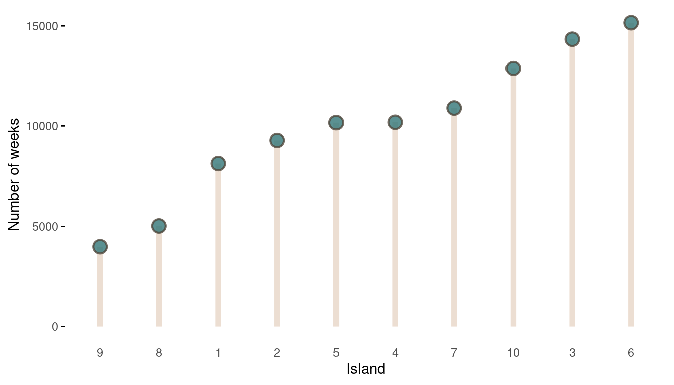
(#fig:9H5 Figure 14)The long-run behaviour of the algorithm.
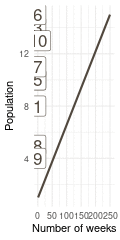
That’s a perfect results, with island 9 having the fewest visits, and island 6 the most. Another way to visualise this is to plot the number of weeks for each island against it’s population size.
island %>%
  rename(positions = current) %>%
  left_join(

    tibble(positions = positions) %>%
  count(positions, name = "n_weeks")

  ) %>%
  ggplot(aes(n_weeks, population,
             label = positions)) +
  geom_label(colour = brown, size = 6) +
  labs(x = "Number of weeks", y = "Population") +
  theme_minimal()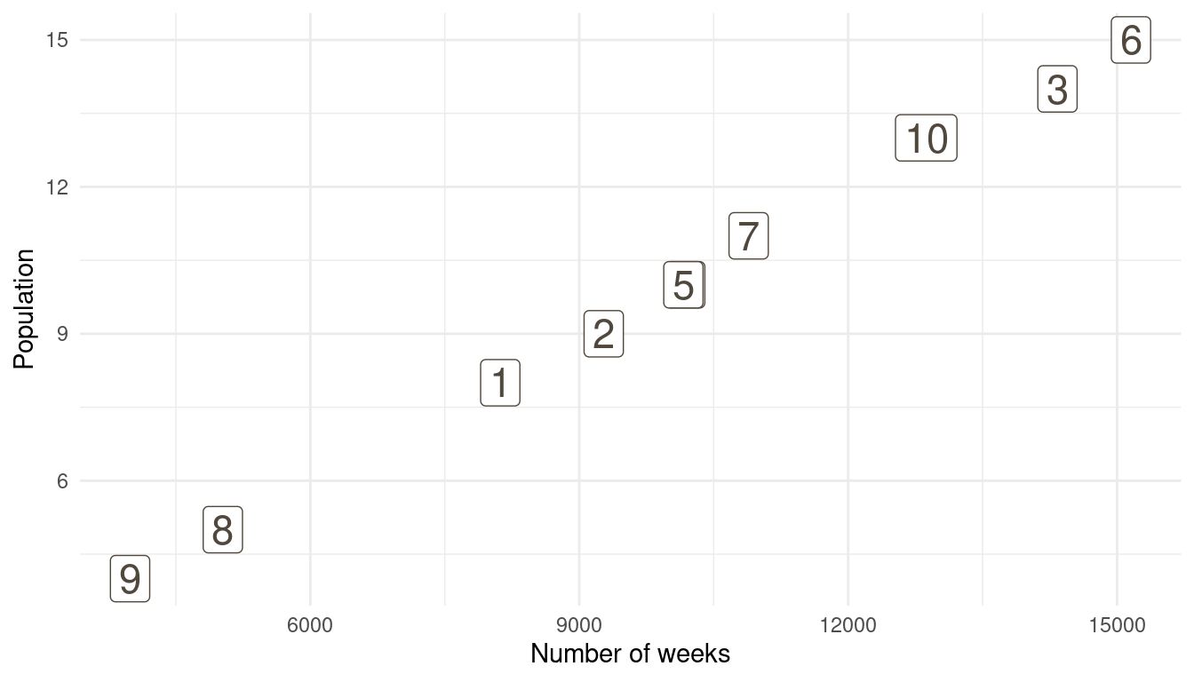
(#fig:9H5 Figure 15)Population size of each island plotted against the number of weeks each island was visited.
So with these three plots at hand, and some magick as well as gganimate, we can make a nice Gif with the build-up of the Markov Chain for the first 100 steps.
library(magick)
library(gganimate)

# first plot
walk_through <- tibble(positions = positions[1:100],
                       week = 1:100) %>%
  ggplot(aes(week, positions)) +
  geom_point(aes(week2, positions2),
             shape = 21, size = 2,
    stroke = 1.1,  alpha = 0.3,
    fill = grey, colour = brown,
    data = tibble(positions2 = positions[1:100],
                       week2 = 1:100)) +
  geom_point(shape = 21, size = 4,
    stroke = 1.1,  alpha = 0.8,
    fill = blue, colour = brown) +
  labs(y = "Island", x = "Week") +
  scale_y_continuous(breaks = seq(2, 10, by = 2)) +
  theme_minimal() +
  theme(panel.grid.major.x = element_blank(),
        panel.grid.minor.x = element_blank()) +
  transition_reveal(week) +
  ease_aes()

walk_through_gif <- animate(walk_through, width = 240, height = 240)


# second plot
week_counts <- tibble(positions = positions[1:100],  week = 1:100) %>%
  count(positions, week) %>%
  group_by(positions) %>%
  arrange(week) %>%
  mutate(n_weeks = cumsum(n)) %>%
  ungroup()


lollipop <- week_counts %>%
  expand(positions, week) %>%
  left_join(week_counts) %>%
  replace_na(list(n_weeks = 0)) %>%
  group_by(positions) %>%
  mutate(n_weeks = cumsum(n_weeks),
         positions = as_factor(positions)) %>%
  ggplot(aes(positions, n_weeks)) +
  geom_segment(aes(xend = positions, y = 0, yend = n_weeks),
               size = 2, colour = grey) +
  geom_point(shape = 21, size = 4,
             stroke = 1.1, alpha = 0.8,
             fill = blue, colour = brown) +
  labs(x = "Island", y = "Number of weeks") +
  theme_minimal() +
  theme(panel.grid = element_blank(),
        axis.ticks.y = element_line()) +
  transition_time(week)


lollipop_gif <- animate(lollipop, width = 240/2, height = 240)


# third plot
corr_plot <- island %>%
  rename(positions = current) %>%
  mutate(positions = as_factor(positions)) %>%
  full_join(

    week_counts %>%
      expand(positions, week) %>%
      left_join(week_counts) %>%
      replace_na(list(n_weeks = 0)) %>%
      group_by(positions) %>%
      mutate(n_weeks = cumsum(n_weeks),
             positions = as_factor(positions))

  ) %>%
  drop_na(week) %>%
  ggplot(aes(n_weeks, population)) +
  geom_smooth(aes(x, y), colour = brown,
              method = "lm", se = FALSE,
              data = tibble(x = 1:250,
                            y = seq(1, 15, length.out = 250))) +
  geom_label(aes(label = positions),
             colour = brown, size = 6) +
  labs(x = "Number of weeks", y = "Population") +
  theme_minimal() +
  transition_time(week)

corr_plot_gif <- animate(corr_plot, width = 240/2, height = 240)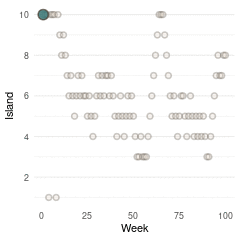
Here we see the problem of the Metropolis algorithm. After 100 weeks, you start to see a pattern, but it does not really reflect the true posterior. It just needs more time to converge.
9H6
Modify the Metropolis algorithm code from the chapter to write your own simple MCMC estimator for globe tossing data and model from Chapter 2.
So first let’s take a look at the model from chapter 6. We were tossing the globe 9 times (N) and it landed on water (w) 6 times out of these 9. We were assuming that every toss is independent of the other tosses and that the probability of w is the same on every toss. So we can describe w as being binomial distributed: \[w~Binomial(N, p)\],
where N is the sum of how many times it landed on water and on land. p is the probability and is an unobserved parameter:
\[p∼Uniform(0,1)\]
We give p a uniform prior, ranging from zero to one, which is obviously not the best. But we will stick to the chapter. Let’s define some parameters: We will run the algorithm for 100,000 steps. Our data is w = 6, and n = 9. Our starting point for p will be 0.5, which is in the middle of our prior on p. One proposal step size will be 0.1.
Let’s transform this into R code:
# set seed
set.seed(123)
# iteration
n_iter <- 1e4
# water count
w <- 6
# total tosses
n <- 9
# starting point
current <- 0.5
# empty vector to record data
positions <- rep(NA, n_iter)

sample_metro <- function() {

  for (i in 1:n_iter) {

  # record current position
  positions[i] <- current

  # generate proposal
  proposal <- current + runif(1, -0.1, 0.1)

  # make sure that the posterior is bounded between zero and one
  if (proposal < 0) proposal <- abs(proposal)
  if (proposal > 1) proposal <- 1-(proposal - 1)

  # compute likelihoods
  lkhd_current <- dbinom(w, n, prob = current)
  lkhd_proposal <- dbinom(w, n, prob = proposal)

  # compute posteriors
  prob_current <- lkhd_current * dunif(current)
  prob_proposal <- lkhd_proposal * dunif(proposal)


  # move
  prob_move <- prob_proposal/prob_current
  current <- if_else(runif(1) < prob_move, proposal, current)
  }

  # print positions
  positions
}

# run function
results <- sample_metro()
Let’s recap what we did. We first generated a proposal that is either a bit (0.01) on the left side of the current position (which was 0.5 at the start), or a bit on the right side. This means we treat the continuous posterior space ranging from zero to one as a discrete space with bins of 0.01 width. Think of it like there are 100 islands, each placed next to each other. When the King is at island 50 (the starting point), he can either go at island 49 or island 51 (the proposal), or stay at the current island. What happens when he reaches the first (1) or the last (100) island? He simply moves in the other direction. This is what we did at the section make sure that the posterior is bounded between zero and one. This just means that we do not have a circle of islands as in the chapter, but rather a straight line of islands placed next to each other. We then compute the likelihood for both the current position and the proposal, which we defined as being binomial distributed. We then transform the likelihood into the posterior for each, as always by multiplying it with the prior. As the prior is uniform, we multiply the likelihood by one. We then calculate the ratio of the posterior between the proposal and the current position. If this ratio is larger than a randomly sampled number between one and zero, we stay at the current position, if it is smaller we move to the proposal. I moved the for loop into a function, so we can call it repeatedly later and get some results printed.
Now let’s take a look at the results. Here is each sample from the posterior over time:
tibble(results = results) %>%
  ggplot() +
  geom_line(aes(x = 1:1e4, results),
            colour = red) +
  labs(y = "Probability water",
       x = "Step") +
  theme_minimal()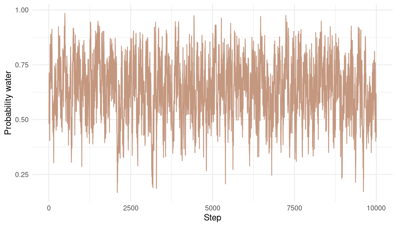
We can see that the chain is quite autocorrelated, which shouldn’t be a big problem for this easy example. We still explore the whole posterior and don’t get stuck anywhere. Let’s see what the posterior looks like:
tibble(results = results) %>%
  ggplot() +
  geom_density(aes(results),
               colour = red, fill = red,
               alpha = 0.8) +
  theme_minimal() +
  labs(x = "Probability water",
       y = NULL) +
  scale_y_continuous(breaks = NULL) +
  geom_function(fun = dbeta, args = c(shape1 = 7, shape2 = 4),
                colour = blue, size = 1.5)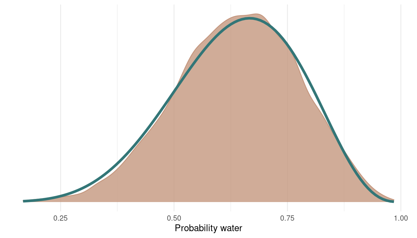
I added the analytically derived posterior for this model in blue. We can see that we get quite a nice fit. We can even improve this by sampling from more chains:
results2 <- sample_metro()
results3 <- sample_metro()
results4 <- sample_metro()

multi_chains <- tibble(p_samples = c(results, results2,
                     results3, results4),
       chain = as_factor(rep(1:4, each = 1e4)))

multi_chains %>%
  add_column(steps = rep(1:1e4, 4)) %>%
  ggplot() +
  geom_line(aes(steps, p_samples,
                colour = chain),
            alpha = 0.8) +
  scale_colour_manual(values = c(red, blue, brown, grey)) +
  labs(y = "Probability water",
       x = "Step") +
  theme_minimal()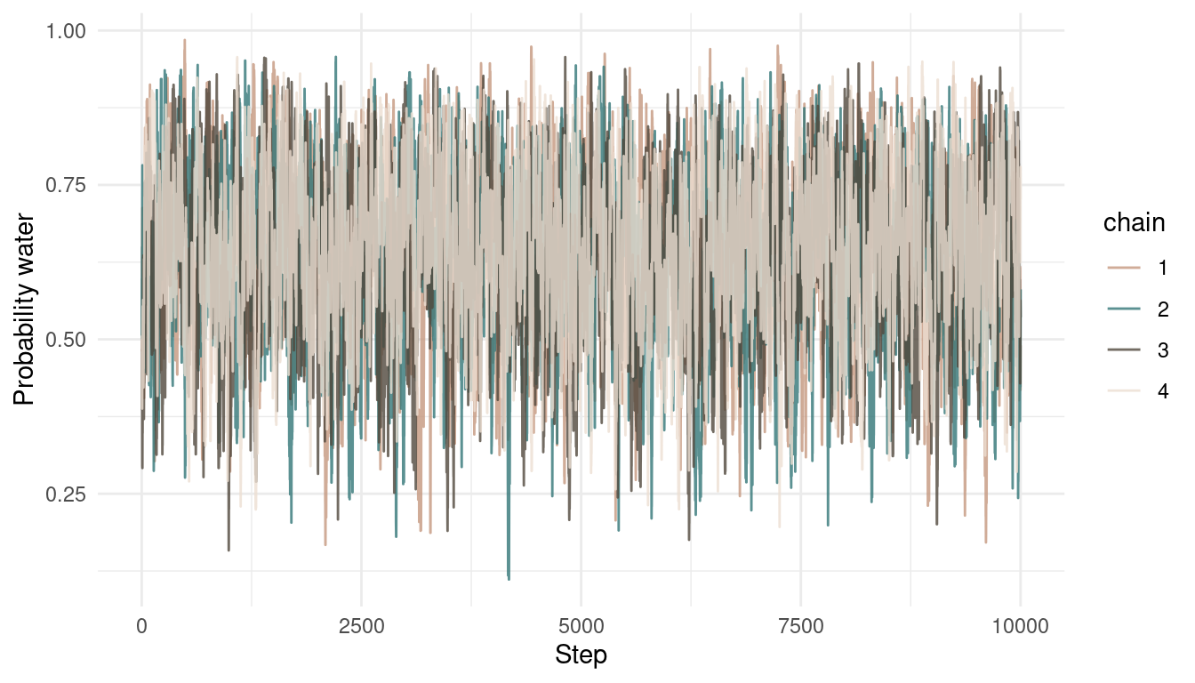
And here’s the posterior with the samples from all 4 chains:
multi_chains %>%
  ggplot() +
  geom_density(aes(p_samples),
               colour = red, fill = red,
               alpha = 0.8) +
  theme_minimal() +
  geom_function(fun = dbeta, args = c(shape1 = 7, shape2 = 4),
       colour = blue, size = 1.5) +
  scale_y_continuous(breaks = NULL) +
  labs(x = "Probability water",
y = NULL) 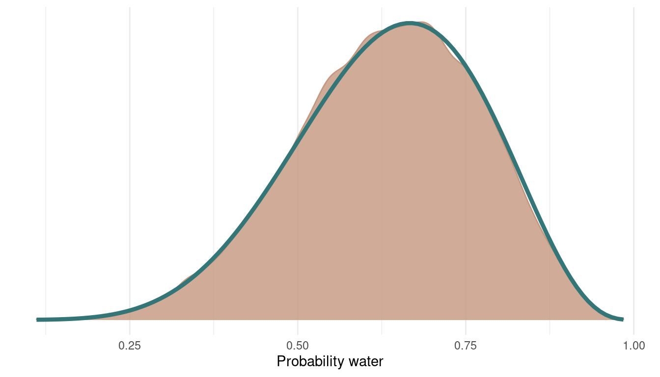
9H6
Can you write your own Hamiltonian Monte Carlo algorithm for the globe tossing data, using the R code in the chapter? You will have to write your own functions for the likelihood and gradient, but you can use the
HMC2function.
So what we need to start with is a function neg_log_prob that returns the negative log-probability of the data at the current position (parameter values). We get that by summing the log likelihood to log priors, to get the posterior probability at the current position q.
neg_log_prob <- function(q) {

  # calculate log-probability at q
  U <- dbinom(w, n, q, log = TRUE) + dunif(q, log = TRUE)

  # return negative probability
  -U
}
Then we need the gradient function, which is the derivative of the logarithm of the binomial. I simply stole this one from McElreath:
neg_log_gradient <- function(q) {

  # calculate the derivative of the binomial log-probability
  G <- (w - n*q) / (q*(1 - q))

  # return the negative
  -G

}
Now we can simply modify the code from the chapter to run the Hamiltonian Monte Carlo simulation.
# the data from chapter 2
w <- 6
n <- 9

# set up Q for HMC2
Q <- list()
Q$q <- 0.5

# the number of samples
n_samples <- 1000

# size of the leapfrog step
epsilon <- 0.03

# number of leapfrog steps
L <- 10

# initalize empty vectors to store data
samples <- rep(NA, n_samples)
accepted <- rep(NA, n_samples)


# start the simulation
for (i in 1:n_samples) {
  Q <- HMC2(U = neg_log_prob,
          grad_U = neg_log_gradient,
          epsilon = epsilon,
          L = L,
          current_q = Q$q)

  samples[i] <- Q$q
  accepted[i] <- Q$accept
}
We end up with two vectors, one with the actual samples, and the other one indicating whether the focal sample is accepted or not. Let’s plot:
tibble(samples = samples,
       accepted = accepted,
       time = 1:1000) %>%
  ggplot(aes(time, samples,
             colour = as_factor(accepted)), ) +
  geom_point() +
  scale_color_manual(values = c(red, blue),
                     name = NULL,
                     labels = c("rejected", "accepted")) +
  labs(x = "Step",
       y = "Probability water") +
  theme_minimal()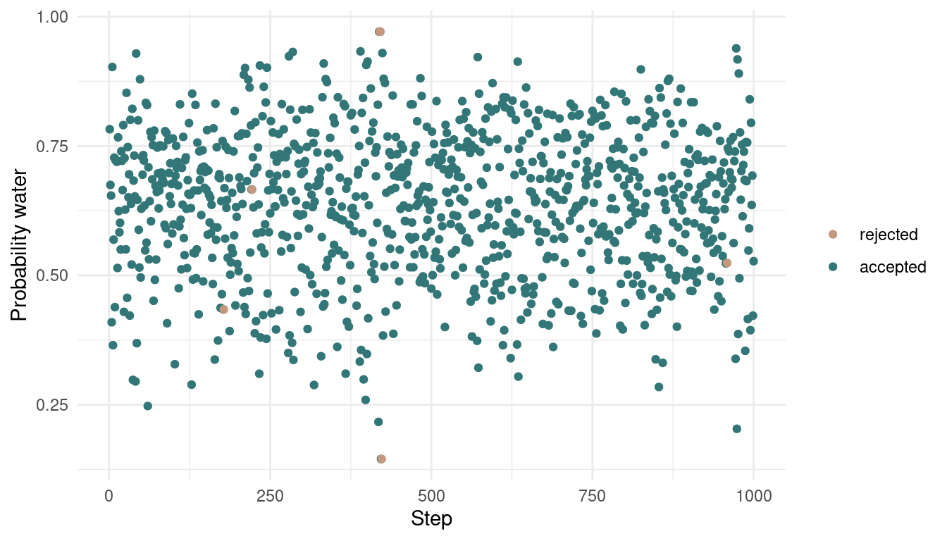
As we can see, we rejected only a tiny bit of samples, indeed 6 out of 1000. Let’s see how the posterior looks:
tibble(samples = samples,
       accepted = accepted) %>%
  filter(accepted == 1) %>%
  ggplot() +
  geom_density(aes(samples),
               colour = red, fill = red,
               alpha = 0.8) +
  theme_minimal() +
  geom_function(fun = dbeta, args = c(shape1 = 7, shape2 = 4),
       colour = blue, size = 1.5) +
  scale_y_continuous(breaks = NULL) +
  labs(x = "Probability water",
y = NULL) 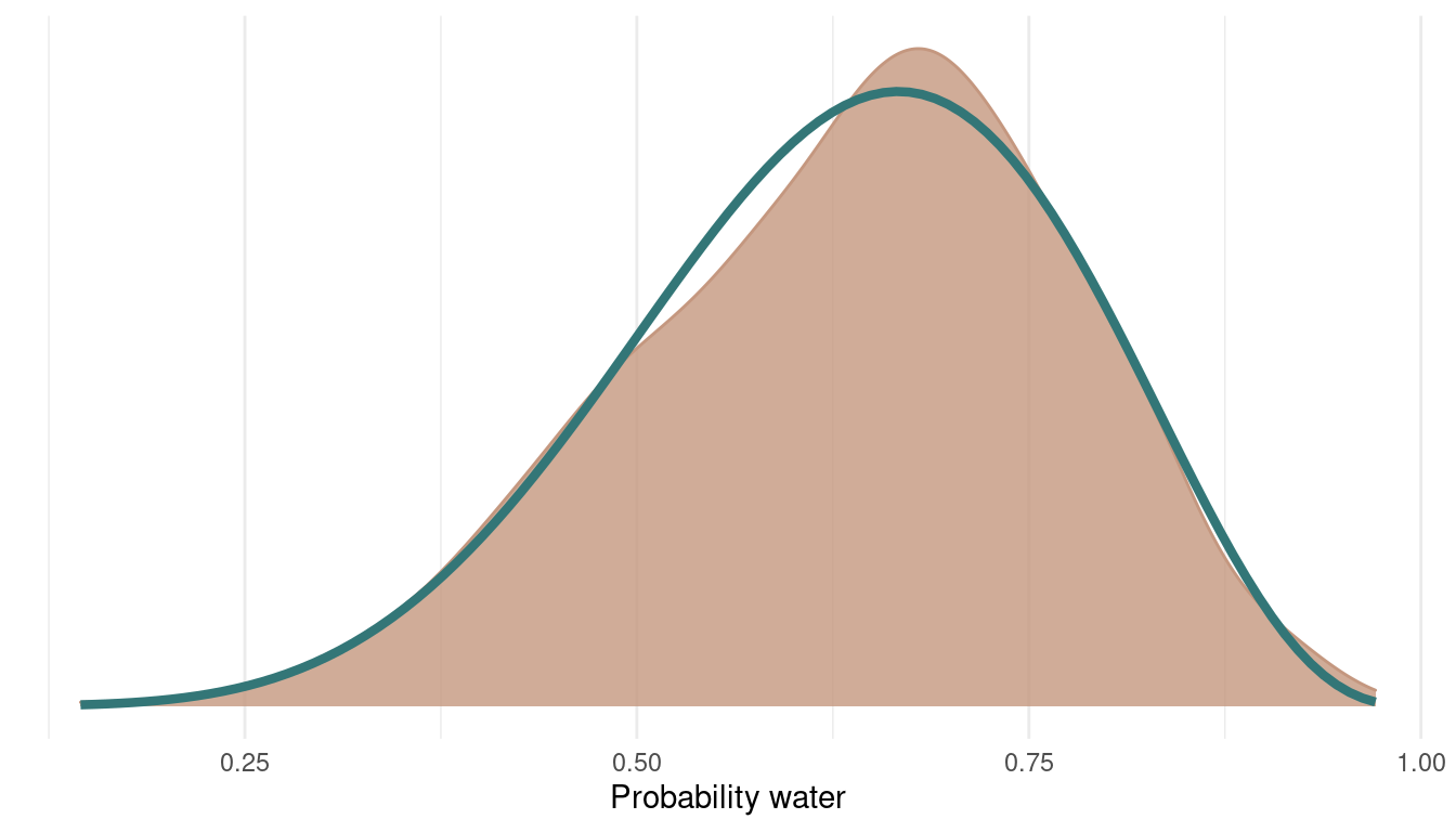
We can see that we can get a very good representation of the posterior with a low number of samples, and this in a very fast fashion.
sessionInfo()## R version 4.1.1 (2021-08-10)
## Platform: x86_64-pc-linux-gnu (64-bit)
## Running under: Linux Mint 20.2
##
## Matrix products: default
## BLAS: /usr/lib/x86_64-linux-gnu/blas/libblas.so.3.9.0
## LAPACK: /usr/lib/x86_64-linux-gnu/lapack/liblapack.so.3.9.0
##
## locale:
## [1] LC_CTYPE=de_DE.UTF-8 LC_NUMERIC=C
## [3] LC_TIME=de_DE.UTF-8 LC_COLLATE=de_DE.UTF-8
## [5] LC_MONETARY=de_DE.UTF-8 LC_MESSAGES=de_DE.UTF-8
## [7] LC_PAPER=de_DE.UTF-8 LC_NAME=C
## [9] LC_ADDRESS=C LC_TELEPHONE=C
## [11] LC_MEASUREMENT=de_DE.UTF-8 LC_IDENTIFICATION=C
##
## attached base packages:
## [1] parallel stats graphics grDevices utils datasets methods
## [8] base
##
## other attached packages:
## [1] kableExtra_1.3.4 knitr_1.36 rethinking_2.13
## [4] rstan_2.21.2 StanHeaders_2.21.0-7 forcats_0.5.1
## [7] stringr_1.4.0 dplyr_1.0.7 purrr_0.3.4
## [10] readr_2.0.1 tidyr_1.1.3 tibble_3.1.4
## [13] ggplot2_3.3.5 tidyverse_1.3.1
##
## loaded via a namespace (and not attached):
## [1] matrixStats_0.61.0 fs_1.5.0 lubridate_1.7.10 webshot_0.5.2
## [5] httr_1.4.2 tools_4.1.1 backports_1.2.1 bslib_0.3.0
## [9] utf8_1.2.2 R6_2.5.1 DBI_1.1.1 colorspace_2.0-2
## [13] withr_2.4.2 tidyselect_1.1.1 gridExtra_2.3 prettyunits_1.1.1
## [17] processx_3.5.2 curl_4.3.2 compiler_4.1.1 cli_3.0.1
## [21] rvest_1.0.2 xml2_1.3.2 labeling_0.4.2 bookdown_0.24
## [25] sass_0.4.0 scales_1.1.1 mvtnorm_1.1-3 callr_3.7.0
## [29] systemfonts_1.0.3 digest_0.6.27 svglite_2.0.0 rmarkdown_2.11
## [33] pkgconfig_2.0.3 htmltools_0.5.2 highr_0.9 dbplyr_2.1.1
## [37] fastmap_1.1.0 rlang_0.4.11 readxl_1.3.1 rstudioapi_0.13
## [41] farver_2.1.0 shape_1.4.6 jquerylib_0.1.4 generics_0.1.0
## [45] jsonlite_1.7.2 inline_0.3.19 magrittr_2.0.1 loo_2.4.1
## [49] Rcpp_1.0.7 munsell_0.5.0 fansi_0.5.0 lifecycle_1.0.1
## [53] stringi_1.7.5 yaml_2.2.1 MASS_7.3-54 pkgbuild_1.2.0
## [57] grid_4.1.1 crayon_1.4.1 lattice_0.20-45 haven_2.4.3
## [61] hms_1.1.0 ps_1.6.0 pillar_1.6.3 codetools_0.2-18
## [65] stats4_4.1.1 reprex_2.0.1 glue_1.4.2 evaluate_0.14
## [69] blogdown_1.5 V8_3.4.2 RcppParallel_5.1.4 modelr_0.1.8
## [73] vctrs_0.3.8 tzdb_0.1.2 cellranger_1.1.0 gtable_0.3.0
## [77] assertthat_0.2.1 xfun_0.26 broom_0.7.9 coda_0.19-4
## [81] viridisLite_0.4.0 ellipsis_0.3.2